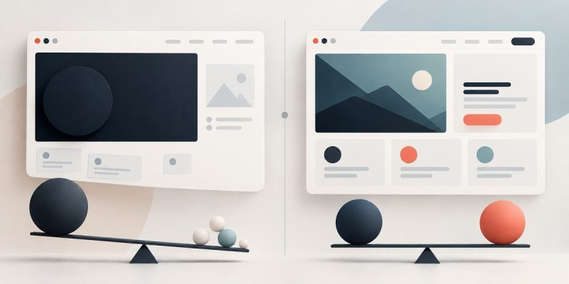
You have spent hours tweaking margins, picking fonts, and adjusting colors. Yet when you step back, something still feels off. The layout pulls your eye to one corner, or the page feels heavier on one side. This is not a mystery. It is a problem with visual weight in web design. Every element on your page has weight. A large image feels heavy. A bright red button feels heavier than a pale gray one. When you understand how to measure and balance that weight, you can fix that unsettled feeling for good.
Visual weight is the perceived heft of design elements like color, size, texture, and spacing. An unbalanced layout happens when too much weight sits on one side. You can fix it by adjusting contrast, repositioning heavy elements, or adding counterbalancing objects. This guide gives you a repeatable process to diagnose and correct visual weight issues in any web design project.
What Visual Weight Actually Means in Web Design
Think of your browser window as a simple scale. Each element adds a bit of pull. A large hero image pulls the eye toward it. A dense block of text pulls attention to that area. A bright accent color on a button creates a focal point that feels heavier than the surrounding white space.
Visual weight in web design is the perceived importance or pull of an element based on its visual properties. It is not about actual file size or pixel count. It is about how the human eye reacts to contrast, size, color, and texture. When you distribute that weight evenly, the page feels stable and professional. When you do not, users feel that subtle discomfort. They might not name it, but they will click away.
Properties That Add Weight
Different design properties contribute different amounts of weight. Here is how they stack up:
- Size: A large element always feels heavier than a small one. A full-width banner image dominates the page.
- Color: Warm colors (red, orange, yellow) advance and feel heavier. Cool colors (blue, green) recede and feel lighter. Saturation also matters. A vivid hue carries more weight than a muted pastel.
- Contrast: High contrast between an element and its background creates a strong focal point. A black button on a white background pulls more weight than a gray button on a light gray background.
- Texture and pattern: Busy textures add visual noise, which feels heavy. Smooth, flat areas feel lighter.
- Spacing: Dense content packed together feels heavier than the same content spread out with generous margins.
- Position: Elements placed at the top or left of the screen (for left-to-right reading cultures) naturally feel more prominent. You need to compensate for this bias.
The Common Mistakes That Throw Off Balance
Most beginners make the same errors. They place a large, high-contrast element on one side without a counterbalance. Or they cluster several medium-weight items together, creating a heavy zone. The table below shows the most frequent mistakes and their fixes.
| Mistake | What It Looks Like | Why It Feels Off | The Fix |
|---|---|---|---|
| Giant hero image on the left, nothing on the right | The page lists to the left | The eye is pulled hard and has nowhere to land | Add a matching visual weight on the right, such as a bold headline or a colored shape |
| Bright red CTA button in the bottom left corner | The corner feels heavy and isolated | High contrast in a low-weight area creates a visual anchor that fights the layout | Move the button to a more central position or balance it with a secondary element on the opposite side |
| Dense sidebar with five widgets | The sidebar pulls attention away from the main content | Too many medium-weight items stacked together create a heavy column | Reduce widget count, use subtle backgrounds, or increase spacing |
| Single large image centered with no text | The page feels empty below the fold | The weight is concentrated in one spot, leaving the rest of the page ungrounded | Add supporting text or a secondary visual element below |
How to Diagnose Visual Weight Problems in Your Layout
You do not need a fancy tool to check balance. You can do it with your own eyes and a simple trick.
- Squint test: Stand back from your screen or zoom out until the text is unreadable. Squint your eyes. This blurs details and leaves only shapes and contrast. Look for heavy blobs on one side.
- Grayscale preview: Take a screenshot of your page and convert it to grayscale. Color bias disappears. You see only value contrast. If one side is significantly darker, you have a weight problem.
- The mirror flip: This is the most reliable method. Flip your page horizontally (you can do this in Photoshop, Figma, or even by holding a mirror to your screen). A balanced layout will still look balanced when flipped. An unbalanced one will feel noticeably wrong.
- Ask a friend: Fresh eyes catch what you have stopped seeing. Show someone your page for three seconds and ask where their eye lands first. If it lands on a non-essential element, you have a weight issue.
3 Actionable Fixes for Visual Weight in Web Design
Once you have spotted the problem, you can fix it. These three techniques cover most scenarios.
1. Counterbalance with a secondary element
If you have a large image or a heavy block on one side, add a smaller but high-contrast element on the opposite side. For example, a bright call-to-action button or a bold pull quote can act as a counterweight. The goal is not to make both sides identical. It is to make the total pull feel equal.
2. Reduce contrast where you do not want attention
Sometimes the easiest fix is to tone down an element that is pulling too hard. If your sidebar feels heavy, try reducing the background color saturation or using a lighter font weight. If a button is too dominant, make it smaller or use a less saturated color. You can see this principle in action when you read about how to choose the perfect color palette for your website in 5 steps.
3. Use white space as a deliberate tool
White space is not empty. It is an active design element that gives the eye a place to rest. If your page feels cluttered and heavy, add more padding around elements. This spreads the visual weight across a larger area. A page that feels cramped is often a page where the weight is too concentrated. Our guide on why your website looks cluttered (and how to fix it with white space) covers this in more detail.
“Visual weight is not about symmetry. It is about equilibrium. A small, bright object can balance a large, muted one. The trick is to think in terms of pull, not size.” — A practical rule from experienced designers.
How to Apply Visual Weight to Different Page Elements
Typography and Text Blocks
Text has weight. A large, bold heading pulls the eye. A long paragraph of small body text creates a gray mass. To balance a page with a lot of text, break it up with headings, subheadings, and bullet points. Use a heavier font weight for important headings and a lighter one for body copy. If you want to avoid common pitfalls, check out 7 typography mistakes that make your website look unprofessional.
Images and Media
Images are usually the heaviest elements on a page. When you place an image, think about what is around it. A large photo on the left needs a headline, a caption, or a graphic element on the right. If you have multiple images, arrange them so the weight is distributed. A grid layout with equal-sized thumbnails distributes weight evenly. A single large hero image needs careful positioning.
Navigation and Menus
A sticky header can become a heavy band across the top of the page. If your header has a dark background, bold text, and multiple menu items, it pulls attention away from the content. Consider a lighter header design or a transparent header that only becomes solid on scroll. For more on this, see how to build a sticky header with pure CSS (no JavaScript required).
Calls to Action
Your primary CTA should have enough weight to be noticed but not so much that it overwhelms the rest of the page. Use color and size to give it prominence, but keep it in proportion to the surrounding elements. If your CTA is fighting with your headline for attention, reduce the contrast of one of them.
A Practical Checklist for Your Next Project
Use this list to audit any page before you publish.
- [ ] Run the squint test. Do you see a heavy blob on one side?
- [ ] Convert to grayscale. Is one side darker?
- [ ] Flip the layout horizontally. Does it feel wrong?
- [ ] Check the hero area. Is the weight balanced between the image and the text?
- [ ] Check the sidebar. Does it pull more attention than the main content?
- [ ] Check your primary CTA. Is it the most prominent element, or is something else competing?
- [ ] Check your color contrast. Are warm colors concentrated on one side?
- [ ] Check your spacing. Does the content feel evenly distributed?
For a deeper look at how to guide the user through your content, read how to create a visual hierarchy that guides users through your content. It pairs naturally with the concept of visual weight.
Building Balance into Your Design Process
Do not save the balance check for the end. Incorporate it from the start. When you sketch a wireframe, think about where the heavy elements will go. Plan your counterweights. If you know your hero image will be on the left, plan for a strong headline and a supporting graphic on the right. If your sidebar contains several widgets, plan to use muted colors and generous spacing to keep it from overpowering the main column.
This is also where responsive design gets tricky. An element that is perfectly balanced on a desktop screen might become too heavy on a mobile layout. On a small screen, a large image takes up the full width and pushes everything below it. The weight shifts to the top. To handle this, always test your balance at multiple breakpoints. You can learn more about this in the beginner’s guide to responsive breakpoints: when and where to use them.
When to Break the Rules on Purpose
Visual weight is a guideline, not a law. Sometimes you want a page to feel heavy on one side. A landing page for a dramatic product launch might use a large, dark image on one side to create tension. A minimalist portfolio might use a single, centered image with a lot of white space. The key is that you break the rule on purpose, not by accident. If you understand the weight, you can control the feeling.
Your Next Step: Audit One Page Today
Pick a page from your own site or a client site. Run the squint test and the mirror flip. Identify one area where the weight feels off. Apply one of the fixes above. Then run the test again. You will see the difference immediately. Once you get the hang of it, you will start to see visual weight everywhere. It becomes a lens through which you view every layout. And that is when your designs will stop feeling off and start feeling right.