You built your website yourself. You added features, images, widgets, and text. Then one day you stepped back and realized it looks like a digital garage sale.
Everything competes for attention. Nothing stands out. Visitors leave within seconds because they can’t find what they need.
The good news? You don’t need to hire a designer or start from scratch. Most cluttered websites suffer from the same handful of problems, and each one has a straightforward fix.
Cluttered website design stems from too many elements, insufficient white space, inconsistent fonts, and poor visual hierarchy. Fix it by removing unnecessary content, increasing spacing, limiting fonts to two families, organizing information with clear headings, and creating focal points that guide visitor attention through your pages naturally.
Why websites look cluttered in the first place
Most DIY website creators pack too much onto each page. You want visitors to see everything you offer, read every benefit, and click every button.
But human brains can’t process that much information at once. When faced with visual chaos, people simply leave.
Clutter happens when you:
- Add every widget your theme offers
- Use multiple font styles to make things “interesting”
- Fill every pixel with content because empty space feels wasteful
- Include too many calls to action on one page
- Skip organizing information into clear sections
The result looks busy, unprofessional, and hard to navigate.
The seven step process to clean up your design
Follow these steps in order. Each builds on the previous one.
1. Remove half of what’s on your homepage
Open your homepage and count every distinct element. Sliders, text blocks, images, buttons, forms, social media feeds, testimonials, feature lists.
Now cut that number in half.
This sounds extreme, but most homepages try to do too much. Your homepage should answer three questions:
- What do you offer?
- Who is it for?
- What should visitors do next?
Everything else can move to interior pages or disappear entirely.
Remove sidebars on your homepage if your theme allows it. Eliminate auto-playing videos, rotating testimonials, and any widget you added “just because.”
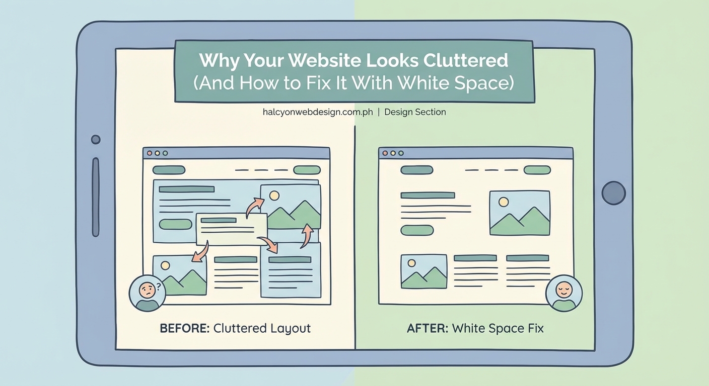
2. Increase white space everywhere
White space (also called negative space) is the empty area around your content. It’s not wasted space. It gives your content room to breathe.
Most cluttered websites have margins and padding set too tight. Here’s how to fix that:
- Increase the space above and below headings
- Add more line height to paragraphs (1.6 to 1.8 is ideal)
- Put more space between sections
- Widen the margins around images
- Create bigger gaps between navigation menu items
In your page builder or theme settings, look for spacing controls. Increase padding by 50% as a starting point, then adjust based on how it looks.
3. Limit yourself to two font families
Using five different fonts makes your site look like a ransom note. Professional websites stick to two font families maximum.
Choose one font for headings and one for body text. Make sure they contrast well. A common pairing uses a bold sans-serif for headings (like Montserrat or Poppins) and a readable serif or sans-serif for body text (like Georgia or Open Sans).
Go through your site and replace every font with one of your two choices. This single change will make your design feel instantly more cohesive.
4. Create a clear visual hierarchy
Visual hierarchy means organizing content so visitors know what to look at first, second, and third.
Use size, weight, and spacing to show importance:
- Make your main headline the biggest text on the page
- Use subheadings that are smaller than headlines but larger than body text
- Keep body text at a comfortable reading size (16px minimum)
- Make important buttons stand out with color and size
- Use bold text sparingly for emphasis
Walk through each page and ask yourself: “If someone glances at this for three seconds, will they know what’s most important?”
If the answer is no, adjust your heading sizes and spacing until the hierarchy becomes obvious.
5. Organize content into clear sections
Breaking content into distinct sections prevents the wall-of-text problem that makes sites feel overwhelming.
Each section should cover one topic or idea. Separate sections with:
- Background color changes (alternating white and light gray works well)
- Horizontal lines or borders
- Extra vertical spacing
- Clear headings that announce what each section covers
Think of your page like a magazine article with clear chapters. Visitors should be able to scan headings and understand your content structure without reading every word.
6. Reduce your color palette
Using too many colors creates visual noise. Professional websites typically use three to five colors total:
- One primary brand color
- One secondary accent color
- One or two neutral colors (grays or beiges)
- Black for text
Look at your current site. If you’re using eight different button colors, five different background shades, and multiple accent colors, scale back.
Pick your colors and use them consistently. Every button should be the same color. Every heading should use the same color scheme. This consistency reduces mental load for visitors.
7. Align everything to a grid
Random placement makes designs feel chaotic. Professional layouts align elements to an invisible grid.
Most page builders include grid or column features. Use them. Instead of placing images and text blocks wherever they fit, align them to columns.
Common grid structures:
- Single column for mobile and simple pages
- Two columns for feature comparisons or image-text pairs
- Three columns for service listings or team members
- Four columns for logos or small icons
Keep your grid consistent across pages. If your services page uses three columns, your products page should too.
Common mistakes that add clutter
| Mistake | Why it clutters | Better approach |
|---|---|---|
| Using multiple sliders on one page | Competing motion distracts visitors | Pick one hero image or video |
| Adding social media feeds | Constantly changing content creates visual noise | Use simple social icons instead |
| Including every testimonial | Too many quotes blur together | Show 2-3 strong testimonials |
| Displaying full blog posts on homepage | Creates endless scrolling | Show excerpts with “read more” links |
| Using animated backgrounds | Movement fights for attention | Stick with static backgrounds |
| Adding popup overlays | Interrupts the browsing experience | Use inline forms or exit-intent only |
What white space actually does for your design
White space isn’t about being minimalist for its own sake. It serves specific purposes that improve how visitors experience your site.
Proper spacing helps people:
- Focus on one thing at a time
- Understand relationships between elements
- Rest their eyes between sections
- Navigate without feeling overwhelmed
“White space is to be regarded as an active element, not a passive background.” This design principle applies perfectly to websites. The empty space around your content works just as hard as the content itself.
Think about luxury brand websites. They use tons of white space because it communicates quality and makes products feel premium. Your small business site can use the same principle to look more professional.
Testing your changes with real users
After you make changes, get feedback before considering the job done. Ask three people who aren’t familiar with your business to:
- Look at your homepage for 10 seconds
- Look away and tell you what they remember
- Explain what they think you do
- Point out what they would click first
Their answers tell you if your decluttering worked. If they can’t quickly understand your site or they feel confused about where to click, you still have work to do.
Pay attention to where their eyes go first. That spot should contain your most important message.
Tools that help maintain clean design
You don’t need expensive software to keep your site looking clean. These free tools help:
- Browser zoom function: View your site at 50% zoom to see overall balance and spacing
- Squint test: Squint your eyes while looking at your page. The blurry view shows if your hierarchy works
- Screenshot method: Take screenshots of your pages and view them as images. This helps you see design problems you miss while editing
- Mobile preview: Always check how your spacing and layout look on phone screens
Most page builders include spacing controls. Learn where yours are located and use them consistently.
When to break the rules
These guidelines work for most small business websites, but some situations call for different approaches.
If you run an online magazine or news site, you’ll naturally have more content density. That’s expected in that format. Focus on organizing that density with clear sections and consistent styling.
If your brand identity is intentionally bold and energetic, you might use more colors or bigger fonts. Just make sure the energy comes from intentional choices, not accidental clutter.
The key is making conscious decisions. Every element on your page should have a reason for being there.
Maintaining your cleaner design over time
Clutter creeps back in slowly. You add a new widget here, an extra section there, and six months later your site feels messy again.
Prevent this by creating simple rules for yourself:
- Before adding anything new, remove something old
- Audit your homepage every three months
- Keep a “maximum elements per page” limit
- Stick to your chosen fonts and colors
- Ask “does this help visitors or just fill space?” before adding features
Treat your website like your closet. Regular decluttering keeps it functional and presentable.
Making your site easier to scan
Most visitors don’t read every word on your website. They scan for relevant information.
Make scanning easier by:
- Using descriptive headings that work as standalone phrases
- Breaking long paragraphs into shorter ones (3-4 sentences maximum)
- Adding bullet points for lists of features or benefits
- Highlighting important phrases with bold text
- Including relevant images that support your message
Each page should communicate its main point even if someone only reads the headings and scans the first sentence of each paragraph.
Your website should work for you, not against you
A cluttered website pushes potential customers away before they learn what you offer. It makes you look unprofessional even if your actual work is excellent.
The fixes covered here don’t require design skills or coding knowledge. They need honest assessment and willingness to cut what doesn’t serve your visitors.
Start with your homepage today. Remove unnecessary elements, increase your spacing, and limit your fonts. Those three changes alone will make a noticeable difference.
Your website represents your business online. Make sure it looks as professional as you are. Clean design isn’t about following trends. It’s about respecting your visitors’ time and attention by giving them a clear, comfortable path to the information they need.