You’ve spent hours perfecting your website copy. Your offer is solid. Traffic is flowing. But when you check your analytics, the conversion numbers tell a different story. People are landing on your page, scrolling through your content, and then leaving without clicking your call-to-action button.
CTA buttons fail because of poor visibility, vague copy, weak color contrast, or misalignment with user intent. Fixing these issues requires understanding button psychology, testing design elements systematically, and matching your CTA message to what visitors actually want. Most conversion problems can be diagnosed and fixed using simple design principles and user behavior data.
Your Button Might Be Invisible
Contrast is not optional. If your CTA button blends into your background, visitors won’t see it.
This happens more often than you’d think. A blue button on a navy background looks elegant in your design software but disappears on actual screens. A white button on a light gray section creates the same problem.
Test your button contrast using the WebAIM contrast checker. Your button and background should have a contrast ratio of at least 4.5:1. Better yet, aim for 7:1.
Size matters too. A tiny button tucked into the corner of your page won’t get attention, no matter how well it contrasts. Your CTA should be large enough to notice immediately but not so oversized that it looks out of place.
Mobile screens make this worse. That button that looks perfectly sized on your desktop might shrink to a barely tappable dot on a phone. Make sure your buttons are at least 44×44 pixels on mobile devices.
“The best CTA button is the one users can find without thinking. If they have to hunt for it, you’ve already lost them.”
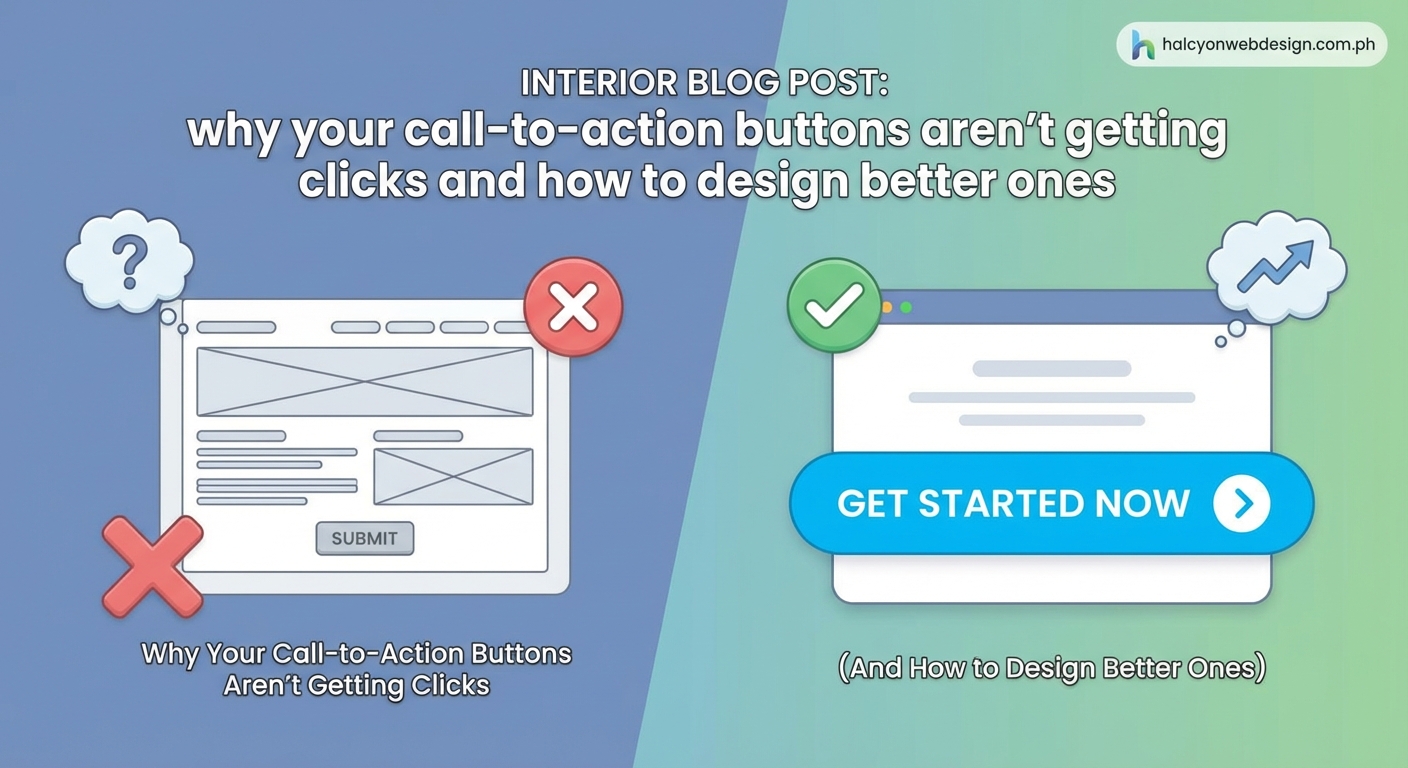
Vague Copy Kills Conversions
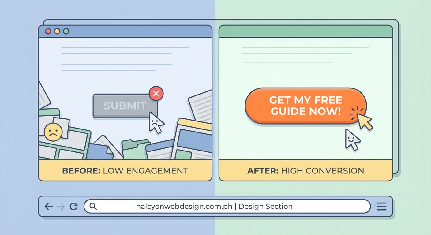
“Submit” tells users nothing. “Click here” is barely better. Generic button text is one of the fastest ways to tank your conversion rate.
Your button copy should tell visitors exactly what happens when they click. “Get my free guide” is better than “Download.” “Start my 14-day trial” beats “Sign up.”
Use first-person language. “Get my guide” performs better than “Get your guide” in most tests. It helps users visualize themselves taking action.
Action words matter. Start with verbs that create urgency or excitement:
- Start
- Get
- Claim
- Join
- Build
- Create
- Access
Avoid words that create friction or hesitation:
- Submit
- Enter
- Register
- Buy (sometimes)
Keep it short. Your button text should be scannable in under two seconds. Three to five words is usually the sweet spot.
You’re Offering Too Many Choices
Every additional button on your page splits attention. When visitors see three different CTAs, they often click none of them.
This is called decision paralysis. The more options you present, the harder it becomes for people to choose. They get overwhelmed and bail.
One page should have one primary goal. If you’re asking people to download an ebook, that should be your main CTA. Don’t also ask them to schedule a call, watch a video, and follow you on social media.
Secondary CTAs are fine, but make them visually distinct. Your primary button should be bold and prominent. Secondary options can be text links or ghost buttons that don’t compete for attention.
Here’s how to prioritize:
- Identify the one action that matters most for this page
- Make that CTA the most visually prominent element
- Remove or minimize any competing calls to action
- Test the page with just the primary CTA to establish a baseline
Your Button Location Is Wrong
Placing your CTA “above the fold” sounds like good advice. Sometimes it is. Often it’s not.
The fold is not a magic line. Visitors scroll. They scroll a lot, actually. If your CTA appears before you’ve made your case, people won’t click it because they don’t understand why they should.
Your button should appear after you’ve built desire. On a landing page, that might mean placing it after your main benefit statements. On a product page, it should come after key features and social proof.
Multiple CTAs work well on long pages. Place one near the top for visitors who are already convinced. Add another after your main content section. Include a final one at the bottom for people who scrolled through everything.
Test different positions. Run A/B tests with your button in different locations. Track scroll depth to see where most visitors stop reading. Place your CTA just before that point.
| Button Position | Best For | Avoid When |
|---|---|---|
| Top of page | Returning visitors, hot traffic | Complex products, cold audiences |
| After main content | Educational content, detailed offers | Simple actions, urgent offers |
| Multiple locations | Long pages, detailed explanations | Short pages, single-message campaigns |
| Sticky footer | Mobile users, long pages | Desktop-focused sites, short pages |
The Design Doesn’t Look Clickable
Flat design trends have made some buttons look like decorative boxes. If your button doesn’t look clickable, people won’t try to click it.
Visual cues matter. Subtle shadows, gradients, or borders help buttons look three-dimensional and pressable. Rounded corners often test better than sharp rectangles because they look more button-like.
Hover states confirm clickability. When someone moves their mouse over your button, something should change. The color might shift slightly. A shadow might appear. This feedback tells users they’re in the right place.
Mobile users don’t get hover states, so make sure your buttons look obviously clickable without them. Sufficient padding around button text helps. So does choosing colors that clearly stand out as interactive elements.
Typography mistakes can hurt your buttons too. If your button text is hard to read, conversions will suffer.
You Haven’t Created Urgency
Without a reason to act now, visitors will bookmark your page and forget about it. Creating urgency gives people a push to click immediately.
Time-limited offers work. “Start your free trial today” is better than “Start your free trial.” Adding a deadline creates pressure to act.
Scarcity helps too. “Only 3 spots left” or “Limited to 100 participants” triggers fear of missing out. Just make sure your scarcity is real. Fake countdown timers destroy trust.
Risk reversal reduces hesitation. “Try free for 14 days” or “Cancel anytime” removes barriers. When people know they can back out easily, they’re more likely to take the first step.
Social proof near your CTA reinforces urgency. “Join 10,000 other marketers” shows that others have already taken action. It makes clicking feel safer and more normal.
Your Value Proposition Is Unclear
Before someone clicks your button, they need to understand what they’re getting. If your value proposition is buried or confusing, your CTA will underperform.
The content immediately surrounding your button matters as much as the button itself. A headline above your CTA should clearly state the benefit. Bullet points can highlight key features or outcomes.
Match your button copy to your headline. If your headline promises “Learn how to double your email list,” your button shouldn’t say “Get started.” It should say something like “Show me how to grow my list.”
Remove any conflicting messages. If your page talks about multiple products or services, visitors won’t know what they’re clicking for. Stay focused on one offer per page.
Test your page by showing it to someone unfamiliar with your business. Ask them what they’d get if they clicked the button. If they can’t answer immediately, your messaging needs work.
Color Psychology Isn’t Working
Red doesn’t always mean “stop” and green doesn’t always mean “go.” Button color matters, but not in the way most people think.
The best button color is the one that contrasts most with your page. If your site uses a lot of blue, an orange button will stand out. If your brand is red, a green or yellow button might perform better.
Color should match your brand personality. A law firm might avoid bright yellow buttons because they don’t convey professionalism. A children’s toy company could use them effectively.
Cultural context affects color perception. Colors carry different meanings in different markets. Red signals luck and prosperity in some Asian markets but danger in Western contexts.
Test multiple colors systematically. Don’t guess based on color psychology articles. Run actual split tests with your audience to see what converts best.
The Page Loads Too Slowly
A beautiful CTA button is worthless if visitors leave before it loads. Page speed directly impacts conversion rates.
Every second of delay costs you conversions. Studies show that a one-second delay can reduce conversions by 7%. Three seconds of load time can lose you 40% of visitors.
Slow WordPress sites are particularly common culprits. Heavy plugins, unoptimized images, and poor hosting choices all add up.
Buttons that load last are especially problematic. If your CTA requires JavaScript to render and that script is slow to load, visitors might scroll past an empty space where your button should be.
Test your page speed using Google PageSpeed Insights. Focus on mobile performance since most traffic comes from phones. Optimize images, minimize scripts, and consider a better hosting plan if your site consistently loads slowly.
Your Button Doesn’t Match User Intent
Someone searching for “how to fix a leaky faucet” doesn’t want to “schedule a consultation.” They want instructions or a video tutorial.
Understanding search intent is critical. If people land on your page looking for information, your CTA should offer more information. If they’re ready to buy, your button should facilitate that purchase.
Match your CTA to the traffic source. Visitors from organic search often need more education. People clicking paid ads are usually closer to conversion. Social media traffic might need trust-building before they’re ready to act.
Blog posts need different CTAs than product pages. An educational article might offer a related guide or checklist. A product page should focus on purchase or trial actions.
Survey your audience if you’re not sure what they want. Ask what would make them click. The answers might surprise you and will definitely inform better CTA strategy.
Technical Issues Are Breaking Your Buttons
Sometimes the problem is technical, not design-related. Broken buttons obviously can’t convert.
Check that your buttons actually work. Click them yourself on different devices and browsers. Make sure they link to the right destination and that the destination page loads correctly.
Form submissions fail more often than you’d think. If your CTA triggers a form, test the entire submission process. Fill out the form and verify that it actually sends. Check your spam folder for confirmation emails.
Mobile taps can be finicky. If your button is too close to other clickable elements, users might accidentally tap the wrong thing. Leave adequate spacing around your CTA.
JavaScript errors can prevent buttons from functioning. Open your browser’s developer console and check for errors. A single broken script can disable all your CTAs.
WordPress plugins sometimes conflict with each other and break button functionality. If your CTAs stopped working after a plugin update, that’s likely the cause.
You’re Not Testing Systematically
Guessing why your CTA isn’t working wastes time. Systematic testing gives you real answers.
A/B testing should be standard practice. Test one element at a time so you know what actually made the difference. Change your button color, run the test, analyze results. Then test copy. Then position.
Track the right metrics. Click-through rate tells you if people are clicking. Conversion rate tells you if those clicks lead to desired outcomes. Both matter, but conversion rate matters more.
Give tests enough time to reach statistical significance. Running a test for two days with 50 visitors proves nothing. You need adequate sample size and time to account for daily variations.
Heat mapping tools show where people actually click. Crazy Egg, Hotjar, and similar tools reveal if visitors are clicking near your CTA but missing it. This data helps you refine placement and size.
How to Fix Your CTA Buttons Right Now
You don’t need to overhaul your entire website. Start with these immediate improvements:
- Check contrast ratios and increase them if needed
- Rewrite button copy to be specific and action-oriented
- Remove competing CTAs from your most important pages
- Test your buttons on mobile devices
- Verify that all buttons actually work when clicked
Make one change at a time. Measure the impact. Then make another change. This methodical approach helps you understand what actually moves the needle for your specific audience.
Document your tests and results. Keep a spreadsheet tracking what you changed, when you changed it, and what happened to conversion rates. This creates a knowledge base you can reference later.
Turning Clicks Into Conversions
Getting people to click your CTA button is just the beginning. The real goal is converting those clicks into customers, subscribers, or leads.
Your button is part of a larger system. The traffic source, page content, value proposition, and post-click experience all work together. A great button on a poor landing page still won’t convert well.
Start by auditing your current buttons against the issues covered here. Most sites have multiple problems, not just one. Fix the most obvious issues first, then test more subtle refinements.
Remember that what works for one audience might not work for another. Your industry, offer type, and visitor intent all influence which CTA strategies perform best. Test everything with your actual users rather than following generic best practices blindly.
The best CTA button is the one that gets your specific visitors to take your specific desired action. Find that through testing, refinement, and constant attention to what your data tells you.