
Your website might look perfect in Chrome, but screen reader users are hitting walls you can’t see. A button that works with a mouse click does nothing when accessed by keyboard. An image carousel spins through photos without announcing what’s on screen. A form field sits there, silent, with no label to explain what information belongs inside.
These aren’t edge cases. They happen on thousands of websites every day, and they turn simple tasks into impossible ones for people who rely on assistive technology.
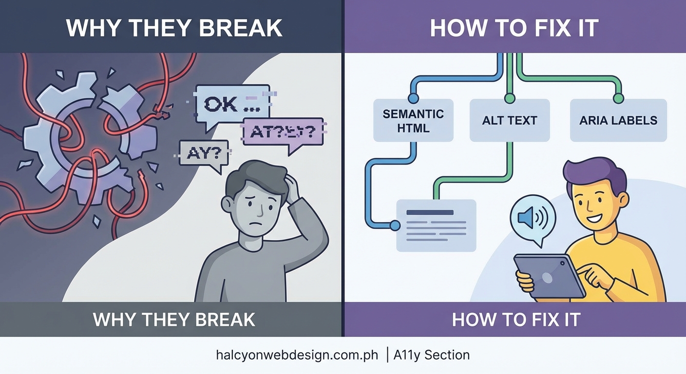
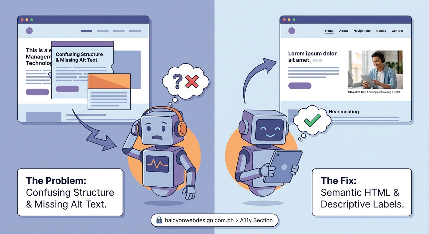
Screen readers break when websites use non-semantic HTML, apply improper ARIA labels, hide content incorrectly, or create keyboard traps. Most failures stem from visual-first development that ignores how assistive technology interprets page structure. Fixing these issues requires semantic markup, proper labeling, logical focus management, and testing with actual screen readers to catch problems before users encounter them.
Screen readers rely on semantic HTML to make sense of your page
Screen readers don’t see your website the way sighted users do. They read the underlying code and translate it into speech or braille output. When you use a <div> with an onclick handler instead of a <button>, the screen reader has no idea that element is interactive. It announces it as generic text, and keyboard users can’t even focus on it.
This happens constantly. Developers build custom components that look like buttons, dropdowns, or tabs but lack the semantic foundation that assistive technology needs. A screen reader scanning your page builds a mental map based on landmarks, headings, and roles. Strip those away, and users are left guessing.
Use native HTML elements whenever possible. A <button> comes with built-in keyboard support, focus management, and role announcement. A <nav> tells screen readers this section contains navigation links. An <h2> creates a hierarchy that users can jump through to find content faster.
When you must build custom components, add ARIA roles and properties to fill the gaps. But start with semantic HTML first. It solves most problems before they start.
Missing or incorrect ARIA attributes create confusion
ARIA (Accessible Rich Internet Applications) exists to patch holes in HTML semantics, but developers often misuse it. Slapping aria-label on everything doesn’t fix accessibility. It can make things worse.
A common mistake is adding aria-hidden="true" to decorative icons but forgetting to provide alternative text elsewhere. The icon disappears from the accessibility tree, but if that icon was the only indication of what a button does, screen reader users are left in the dark.
Another issue is conflicting information. If you add role="button" to a <div> but don’t include tabindex="0", the screen reader announces it as a button, but keyboard users can’t reach it. Or you set aria-expanded="false" on a collapsed accordion but never update it to true when the section opens. The screen reader keeps announcing the old state.
Here’s what breaks and what fixes it:
| Problem | Why It Breaks | Solution |
|---|---|---|
| Icon button with no text | Screen reader announces nothing or generic role | Add aria-label describing the action |
| Custom dropdown with no state | Users can’t tell if it’s open or closed | Use aria-expanded and update it on interaction |
| Decorative image with alt text | Screen reader reads unnecessary description | Use empty alt (alt="") or aria-hidden="true" |
Live region without aria-live |
Dynamic content changes go unannounced | Add aria-live="polite" or aria-live="assertive" |
| Modal without focus trap | Focus escapes to background content | Manage focus programmatically and trap it inside modal |
ARIA is powerful, but only when used correctly. Test every attribute you add to make sure it does what you expect.
Invisible content still exists in the accessibility tree
Developers often hide content using CSS properties like display: none or visibility: hidden. These remove elements from the accessibility tree, which is usually fine for truly hidden content. But sometimes you want something visually hidden yet still available to screen readers.
A classic example is “skip to main content” links. These sit at the top of the page, invisible until a keyboard user tabs to them. If you hide them with display: none, screen readers never announce them. Users miss the shortcut entirely.
Another problem is using opacity: 0 or positioning elements off-screen without considering what happens when a screen reader encounters them. The element is still in the tab order, but sighted keyboard users can’t see where focus went. They press Tab, focus vanishes, and they have no idea where they are on the page.
Use the right technique for the right situation:
- Visually hidden but screen reader accessible: Use a CSS class that clips the element to a 1px box and positions it off-screen.
- Hidden from everyone: Use
display: noneorvisibility: hidden. - Decorative and irrelevant: Use
aria-hidden="true"to remove it from the accessibility tree but keep it visible.
Mixing these up causes screen readers to announce things that shouldn’t be there or skip things that should.
Keyboard traps and broken focus management stop navigation cold
A keyboard trap happens when focus enters a component but can’t leave. A modal dialog opens, and pressing Tab cycles through the modal’s buttons forever. Pressing Escape does nothing. The user is stuck.
This breaks screen reader navigation because keyboard access and screen reader access are intertwined. If keyboard users can’t reach an element, screen reader users can’t either.
Focus management is just as critical. When you open a modal, focus should move to the first interactive element inside it. When you close the modal, focus should return to the element that triggered it. Skip these steps, and users lose their place on the page.
Here’s a step-by-step process to fix focus issues:
- Identify all interactive components on your page: modals, dropdowns, tabs, carousels, custom menus.
- Test keyboard navigation through each one. Can you reach every interactive element? Can you exit without a mouse?
- Add focus trapping to modals and overlays. Use JavaScript to listen for Tab and Shift+Tab, cycling focus within the component.
- Return focus to the triggering element when closing. Store a reference to the element that opened the modal and restore focus on close.
- Test with a screen reader to confirm focus announcements match visual focus. If they diverge, users get lost.
Broken focus management is one of the most disorienting experiences for screen reader users. Fixing it requires deliberate attention to how focus moves through your interface.
Dynamic content updates without announcements leave users behind
Single-page applications and interactive components often update content without reloading the page. A user submits a form, and an error message appears. Or a shopping cart updates when they add an item. Or a notification pops up in the corner.
Sighted users see these changes instantly. Screen reader users hear nothing unless you tell the assistive technology to announce them.
This is where ARIA live regions come in. Adding aria-live="polite" to a container tells the screen reader to announce changes when it’s convenient. Using aria-live="assertive" interrupts whatever the screen reader is currently saying to announce the update immediately.
But live regions only work if you use them correctly. The element with aria-live must already exist in the DOM when the page loads. If you inject it dynamically along with the content, the screen reader might miss it. The content you want announced should be inserted inside the live region, not replace the region itself.
Another common mistake is announcing too much. If every tiny state change triggers an announcement, you overwhelm users with noise. Be selective. Announce critical updates like form errors, confirmation messages, or status changes. Skip minor UI tweaks that don’t affect user understanding.
“The best live region is one the user doesn’t notice until they need it. Announce what matters, stay silent on the rest.” — Anonymous accessibility consultant
Poor heading structure makes navigation impossible
Screen reader users navigate by headings. They pull up a list of all headings on the page and jump to the section they want. If your headings are out of order or missing entirely, this navigation method falls apart.
A page that goes from <h1> to <h3> without an <h2> creates confusion. Users expect a logical hierarchy. Skipping levels suggests missing content or poor structure.
Even worse is using headings for styling instead of structure. A developer wants bold, large text, so they use an <h4> because it looks right. But that <h4> sits at the top of the page, before any <h1> or <h2>. Screen readers announce it as a fourth-level heading, implying it’s nested under three other levels that don’t exist.
Here’s how to structure headings correctly:
- Start with one
<h1>per page, describing the main topic. - Use
<h2>for major sections. - Use
<h3>for subsections under each<h2>. - Don’t skip levels. If you have an
<h4>, there should be an<h3>above it. - Don’t use headings for styling. Use CSS to make text bold or large without changing its semantic meaning.
Proper heading structure turns a wall of text into a navigable outline. Skip it, and you force users to read linearly from top to bottom, wasting their time.
Forms without labels are impossible to complete
A form field with no label is a black box. Sighted users might infer what goes there from placeholder text or visual context. Screen reader users get nothing.
Placeholder text disappears when you start typing, and screen readers don’t always announce it. Visual proximity doesn’t translate to the accessibility tree. If a label sits above a field but isn’t associated with it using a <label> element or aria-labelledby, the screen reader announces “edit text” with no hint about what information belongs there.
Every form field needs an explicit label. Use the <label> element with a for attribute matching the input’s id. Or wrap the input inside the <label>. Either approach creates a programmatic association that screen readers can announce.
For complex forms, add aria-describedby to provide additional instructions. A password field might have a label saying “Password” and a description saying “Must be at least 8 characters with one number.”
Error messages need the same treatment. When a user submits a form with errors, focus should move to the first invalid field, and the screen reader should announce what went wrong. Use aria-invalid="true" on the field and aria-describedby to link it to the error message.
Forms are where accessibility failures become most obvious. Users can’t complete tasks, can’t submit information, can’t recover from errors. Fixing form accessibility should be a top priority.
Testing with actual screen readers reveals what automated tools miss
Automated accessibility checkers catch obvious mistakes like missing alt text or low color contrast. They can’t catch everything. A button might have an aria-label, but if that label says “click here” instead of describing the action, an automated tool won’t flag it. A screen reader user will still be confused.
You need to test with real screen readers to understand how your site actually sounds. NVDA and JAWS are popular on Windows. VoiceOver comes built into macOS and iOS. Each one behaves slightly differently, and each one will expose issues you didn’t know existed.
Here’s a basic testing process:
- Turn on the screen reader and close your eyes or look away from the screen.
- Navigate using only the keyboard and listen to what the screen reader announces.
- Try to complete a task like filling out a form, opening a modal, or adding an item to a cart.
- Note every moment of confusion. If you don’t understand what an element does or where focus is, users won’t either.
- Fix the issues and test again.
Testing takes time, but it’s the only way to catch problems that exist in the interaction layer. Code can be technically correct and still create a terrible user experience.
Building accessibility into your workflow prevents most issues
Most screen reader problems happen because accessibility is treated as an afterthought. Developers build features, designers create mockups, and nobody thinks about how a screen reader will interpret the result until someone files a bug report.
The solution is to build accessibility into every stage of development:
- Design phase: Include keyboard navigation and screen reader announcements in mockups and prototypes.
- Development phase: Use semantic HTML by default. Add ARIA only when necessary. Test with a screen reader as you build.
- Code review phase: Check for accessibility issues the same way you check for bugs or performance problems.
- QA phase: Include screen reader testing in your test plan. Don’t ship features that fail basic accessibility checks.
Accessibility isn’t a separate task. It’s part of building a functional website. Treat it that way, and you’ll catch problems before they reach production.
Your website works for everyone or it works for no one
Screen readers break because developers build for the visual layer and forget the semantic one. Every custom component, every dynamic update, every form field is an opportunity to either include or exclude users.
Fixing these issues isn’t about adding a plugin or running a scan. It’s about understanding how assistive technology interprets your code and making deliberate choices to support that interpretation. Use semantic HTML. Label everything. Manage focus. Test with real screen readers.
Your users will notice the difference. And they’ll actually be able to use your site.