
You’ve built a beautiful website with custom icons, hamburger menus, and interactive elements. Everything looks great.
But when someone using a screen reader visits your site, they hear “button” with no context. They have no idea what that button does.
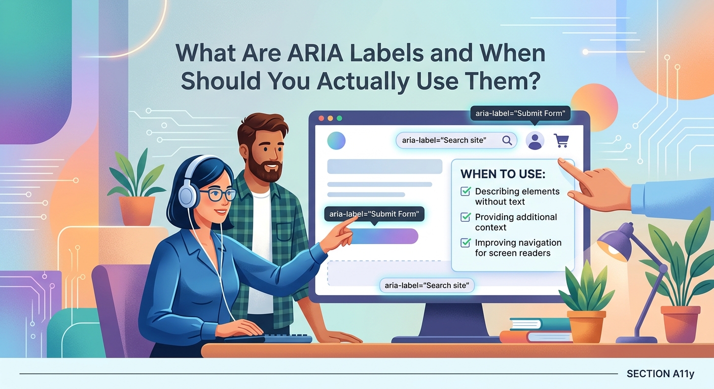
This is where ARIA labels come in.
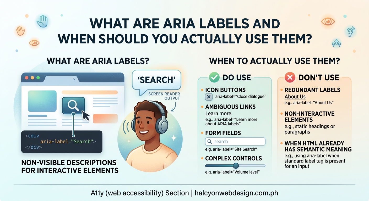
An ARIA label is an HTML attribute that provides accessible text descriptions for elements that lack visible labels. Screen readers announce these labels to help visually impaired users understand what interactive elements do. You should use ARIA labels only when native HTML semantic elements can’t provide the necessary context, particularly for icon buttons, custom controls, and dynamically updated content.
Understanding what ARIA labels actually do
ARIA stands for Accessible Rich Internet Applications. It’s a set of attributes you add to HTML elements to make web content more accessible to people using assistive technologies.
An ARIA label specifically provides a text alternative that screen readers announce when users navigate to an element.
Think of it this way. A sighted user sees a magnifying glass icon and knows it’s a search button. A screen reader user hears only “button” without additional context. The ARIA label fills that gap.
Here’s a basic example:
<button aria-label="Search the website">
  <svg>...</svg>
</button>
The screen reader announces “Search the website, button” instead of just “button.”
The visual appearance stays the same. The code simply adds meaning for assistive technology users.
When you should actually add ARIA labels
ARIA labels solve specific problems. They’re not a universal solution for every element on your page.
Use ARIA labels when an element has no visible text but needs to be understood by screen reader users.
Icon-only buttons and links
Your navigation might include social media icons, a hamburger menu, or action buttons with only icons.
These need ARIA labels:
<button aria-label="Open navigation menu">
  <span class="hamburger-icon"></span>
</button>

<a href="https://twitter.com/yourcompany" aria-label="Follow us on Twitter">
  <svg class="twitter-icon">...</svg>
</a>
Without these labels, screen reader users hear “button” or “link” with no indication of what they do.
Custom interactive controls
When you build custom dropdowns, sliders, or toggles that don’t use native HTML elements, ARIA labels help describe their purpose.
<div role="button" aria-label="Increase font size" tabindex="0">
  A+
</div>
This tells screen readers both what the element is (a button) and what it does (increases font size).
Elements with ambiguous visible text
Sometimes visible text doesn’t provide enough context when heard out of context.
A “Read more” link repeated throughout a blog listing page becomes confusing. Which article does each link refer to?
<a href="/article-1" aria-label="Read more about ARIA labels">
  Read more
</a>
The visible text stays concise. The ARIA label provides full context.
When you should NOT use ARIA labels
Adding ARIA labels everywhere actually makes your site less accessible.
Here’s what not to do.
Don’t add them to elements with visible text
If a button already has text inside it, don’t add an ARIA label:
<!-- Wrong -->
<button aria-label="Submit form">Submit</button>

<!-- Right -->
<button>Submit</button>
The ARIA label overrides the visible text. Screen reader users hear something different from what sighted users see. This creates confusion.
Don’t use them instead of proper semantic HTML
ARIA is a supplement, not a replacement for semantic HTML.
Use a real button element instead of styling a div and adding ARIA attributes:
<!-- Wrong -->
<div aria-label="Close dialog" onclick="closeDialog()">×</div>

<!-- Right -->
<button aria-label="Close dialog" onclick="closeDialog()">×</button>
Semantic HTML elements come with built-in keyboard support and accessibility features. ARIA attributes alone don’t provide these.
Don’t duplicate information that’s already accessible
If an image has proper alt text, don’t add an ARIA label to its parent link:
<!-- Wrong -->
<a href="/products" aria-label="View our products">
  <img src="products.jpg" alt="Our product collection">
</a>

<!-- Right -->
<a href="/products">
  <img src="products.jpg" alt="Our product collection">
</a>
The alt text already provides the necessary information.
How to write effective ARIA labels
The content of your ARIA label matters as much as when you use it.
Good ARIA labels are concise, descriptive, and action-oriented.
Be specific about the action
Instead of generic labels, describe what actually happens:
| Weak Label | Better Label |
|---|---|
| “Click here” | “Download pricing guide” |
| “Button” | “Add to cart” |
| “Icon” | “Share on Facebook” |
| “Menu” | “Open main navigation” |
The better labels tell users exactly what to expect when they activate the element.
Keep them brief
Screen reader users often navigate by jumping between interactive elements. Long labels slow them down.
Aim for labels under 100 characters. Get to the point.
<!-- Too verbose -->
<button aria-label="Click this button to open the navigation menu and see all available pages on our website">

<!-- Better -->
<button aria-label="Open navigation menu">
Match the tone of your visible content
Your ARIA labels should sound like they belong to the same website as your visible text.
If your site uses casual language, your ARIA labels should too. If you’re formal and professional, keep that consistency.
Common ARIA label mistakes that break accessibility
Even experienced developers make these errors.
Mistake 1: Using aria-label on non-interactive elements
ARIA labels work on interactive elements and landmarks. They don’t work reliably on static elements like spans or divs without roles.
<!-- Doesn't work as expected -->
<span aria-label="Important note">!</span>

<!-- Better approach -->
<span role="img" aria-label="Important note">!</span>
If you need to label non-interactive content, consider using aria-describedby or visible text instead.
Mistake 2: Forgetting to update dynamic labels
If your button text changes based on state, your ARIA label needs to change too.
A play/pause button should update its label:
// Update both icon and label
if (isPlaying) {
  button.innerHTML = '<svg>pause icon</svg>';
  button.setAttribute('aria-label', 'Pause audio');
} else {
  button.innerHTML = '<svg>play icon</svg>';
  button.setAttribute('aria-label', 'Play audio');
}
Static labels on dynamic content confuse users about the current state.
Mistake 3: Adding labels to decorative elements
Not every icon needs an ARIA label. Decorative elements should be hidden from screen readers entirely.
<!-- Decorative icon next to text -->
<button>
  <svg aria-hidden="true">...</svg>
  Search
</button>
The aria-hidden="true" tells screen readers to skip the icon. The visible text “Search” provides all necessary information.
Testing your ARIA labels properly
You can’t know if your ARIA labels work without testing them.
Here’s how to verify they’re actually helping users.
1. Test with a screen reader
Download a free screen reader and navigate your site:
- NVDA for Windows
- VoiceOver for Mac (built-in)
- TalkBack for Android (built-in)
Turn off your monitor or close your eyes. Try to complete common tasks using only the screen reader.
If you get confused or stuck, your ARIA labels need work.
2. Use browser accessibility inspectors
Modern browsers include accessibility trees that show what assistive technologies actually see.
In Chrome DevTools:
1. Right-click an element
2. Select “Inspect”
3. Click the “Accessibility” tab
You’ll see the computed accessible name. This is what screen readers announce.
3. Run automated accessibility tests
Tools like axe DevTools catch common ARIA mistakes:
- Missing labels on interactive elements
- Conflicting labels and visible text
- Invalid ARIA attributes
These tools won’t catch everything, but they find obvious problems fast.
Choosing between ARIA label alternatives
ARIA labels aren’t your only option for providing accessible names.
Sometimes other attributes work better.
aria-labelledby for referencing existing text
If descriptive text already exists on the page, reference it instead of duplicating content:
<h2 id="contact-heading">Contact Us</h2>
<form aria-labelledby="contact-heading">
  ...
</form>
This keeps your code DRY and ensures consistency between visible and accessible text.
aria-describedby for additional context
Use this when you need to provide supplementary information beyond the label:
<input
  type="password"
  aria-label="Password"
  aria-describedby="password-requirements">
<p id="password-requirements">
  Must be at least 8 characters with one number
</p>
The label identifies the field. The description provides usage instructions.
title attribute as a last resort
The title attribute creates tooltips on hover and provides fallback accessible names.
But screen reader support is inconsistent. Use it only when ARIA attributes aren’t appropriate.
<iframe src="map.html" title="Store location map"></iframe>
For iframes and similar embedded content, the title attribute is often the best choice.
Building an ARIA label implementation checklist
Use this process when adding ARIA labels to your site.
Before adding any ARIA:
- Check if semantic HTML solves the problem first
- Verify the element actually needs a label
- Confirm visible text isn’t sufficient
When writing the label:
- Describe the action or purpose clearly
- Keep it under 100 characters
- Match your site’s tone and language
- Avoid redundant words like “button” or “link”
After implementation:
- Test with at least one screen reader
- Check the accessibility tree in DevTools
- Run automated accessibility tests
- Verify labels update when content changes
This systematic approach prevents most common mistakes.
Real examples from popular websites
Seeing ARIA labels in context helps you understand when and how to use them.
Search buttons
Most sites use icon-only search buttons in their headers:
<button type="submit" aria-label="Search">
  <svg>magnifying glass icon</svg>
</button>
The icon provides visual clarity. The ARIA label provides context for screen readers.
Social media sharing
Share buttons often use brand icons without text:
<a href="https://twitter.com/share" aria-label="Share this article on Twitter">
  <svg>Twitter logo</svg>
</a>
The brand logo is recognizable visually. The label explains both the platform and the action.
Modal close buttons
The X button in the corner of dialogs needs clear labeling:
<button aria-label="Close dialog">
  <span aria-hidden="true">×</span>
</button>
The × symbol is decorative and hidden from screen readers. The ARIA label describes what the button does.
Making ARIA labels work with your design system
If you’re building a component library, standardize your ARIA label patterns.
Create reusable components with built-in accessibility:
// Icon button component
function IconButton({ icon, label, onClick }) {
  return (
    <button aria-label={label} onClick={onClick}>
      <Icon name={icon} aria-hidden="true" />
    </button>
  );
}
This ensures every icon button in your system gets a proper label automatically.
Document your patterns so your team knows when to use each approach. Include examples of good and bad implementations.
When you’re working on building accessible forms that every user can complete, ARIA labels become part of a larger accessibility strategy that includes proper input labels, error messages, and field descriptions.
The first rule of ARIA is don’t use ARIA. Use native HTML elements and attributes whenever possible. ARIA should supplement, not replace, semantic HTML.
Fixing common screen reader problems with ARIA labels
Sometimes screen readers announce unexpected content even when your HTML looks correct.
Problem: Screen readers announce “button button”
This happens when you add an ARIA label to a button that already has text:
<!-- Causes double announcement -->
<button aria-label="Submit form">
  Submit
</button>
Fix: Remove the ARIA label. The visible text is sufficient.
Problem: Custom icons aren’t being announced
Icon fonts and SVGs need explicit labeling:
<!-- Screen readers skip this -->
<button>
  <i class="icon-search"></i>
</button>

<!-- Screen readers announce this -->
<button aria-label="Search">
  <i class="icon-search" aria-hidden="true"></i>
</button>
Fix: Add aria-hidden="true" to decorative icons and aria-label to the button.
Problem: Links with images have redundant announcements
When a link contains an image with alt text, adding an ARIA label creates duplication:
<!-- Announces both alt and aria-label -->
<a href="/about" aria-label="Learn about our company">
  <img src="about.jpg" alt="About us">
</a>
Fix: Remove the ARIA label. The alt text provides the necessary information.
If you’re troubleshooting these issues alongside other accessibility problems, understanding why screen readers break on your site and how to fix it provides broader context for common patterns that cause issues.
Combining ARIA labels with other accessibility features
ARIA labels work best as part of a complete accessibility strategy.
Pair them with proper keyboard navigation. Users who rely on screen readers often navigate by keyboard. Your interactive elements need focus styles and keyboard event handlers.
The complete guide to keyboard navigation shows you how to ensure every interactive element works without a mouse.
Ensure sufficient color contrast. Screen reader users aren’t your only audience. People with low vision need adequate contrast between text and backgrounds.
Add focus indicators. When keyboard users tab through your page, they need visible feedback showing which element has focus. Check whether your website’s focus indicator is visible enough to guide users effectively.
Write meaningful alt text for images. ARIA labels handle interactive elements. Alt text handles informative images. Learn how to write alt text that actually helps visually impaired users.
Maintaining ARIA labels as your site evolves
Your site changes over time. New features get added. Designs get updated. Components get refactored.
ARIA labels need maintenance too.
Set up automated testing in your deployment pipeline. Tools like axe-core can run in your continuous integration system and catch accessibility regressions before they reach production.
Include accessibility checks in your code review process. Train your team to look for missing or incorrect ARIA labels when reviewing pull requests.
Test with real users when possible. Automated tools catch technical errors. Real users find usability problems. If you can recruit people who use screen readers regularly, their feedback is invaluable.
Keep a style guide for your ARIA patterns. Document when to use each attribute, how to write effective labels, and common mistakes to avoid. This helps maintain consistency as your team grows.
Making accessibility a natural part of your workflow
ARIA labels shouldn’t feel like extra work you do at the end of a project.
Build them in from the start.
When you design a new button, decide how screen readers should announce it. When you add an icon, write its label before moving on. When you build a custom control, test it with a screen reader immediately.
This approach takes the same amount of time overall. But it prevents the frustrating cycle of building features, discovering accessibility problems, and refactoring everything.
Your users deserve websites that work for everyone. ARIA labels are one small but important piece of that puzzle. Use them thoughtfully, test them thoroughly, and remember that they supplement good semantic HTML rather than replacing it.