
You’ve probably stared at a layout problem and wondered whether to reach for CSS Grid or Flexbox. Both are powerful layout tools, but they solve different problems. Choosing the wrong one can turn a simple task into a frustrating mess of workarounds and nested containers.
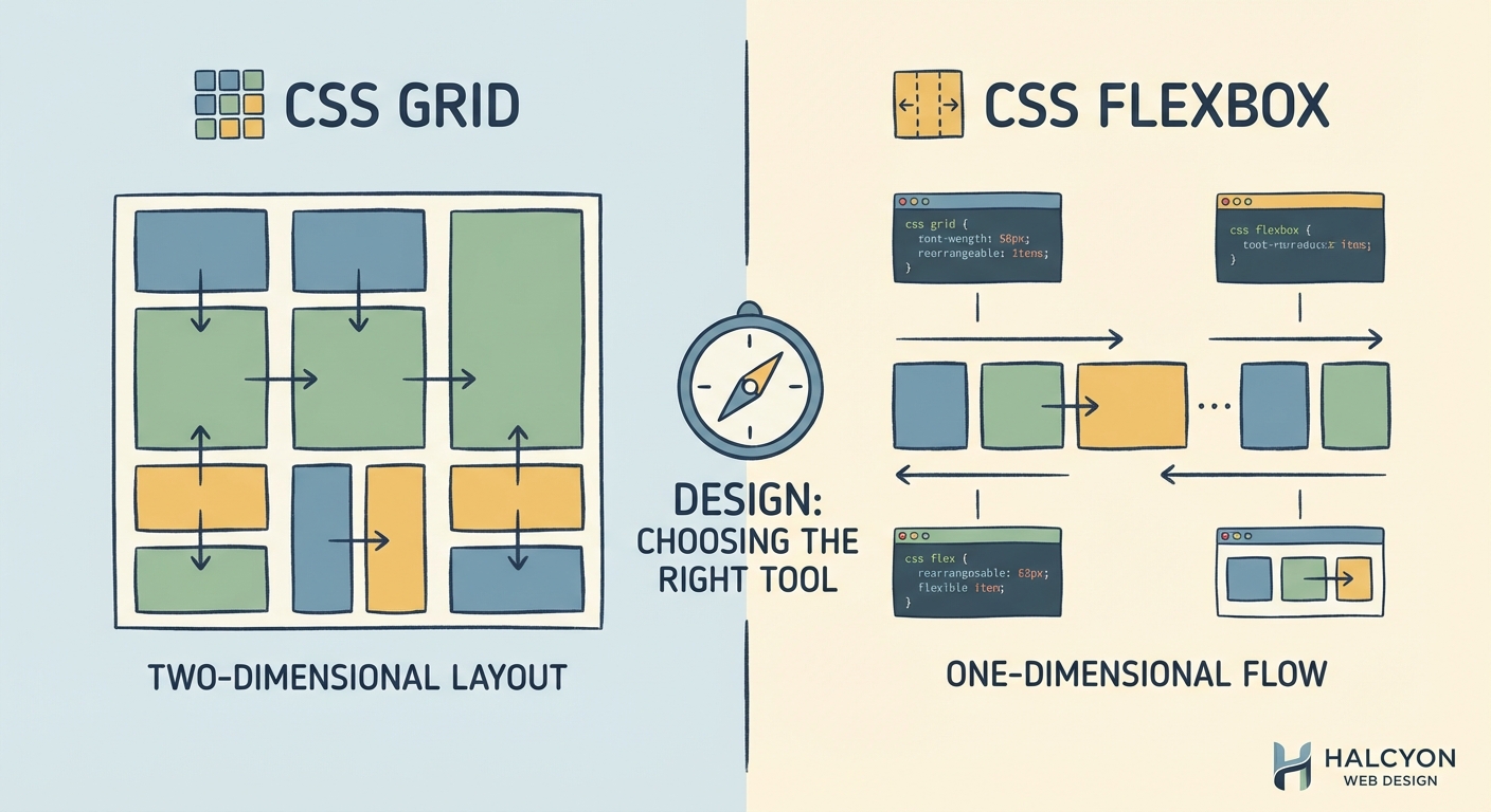
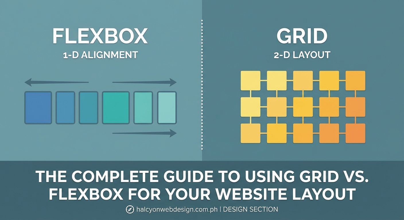
CSS Grid excels at two-dimensional layouts where you need precise control over rows and columns simultaneously. Flexbox works best for one-dimensional layouts where items flow in a single direction. Use Grid for page-level structure and Flexbox for component-level alignment. Most modern websites benefit from combining both systems strategically rather than choosing one exclusively.
Understanding what each layout system does best
Flexbox was designed to distribute space along a single axis. Think of it as arranging items in a line, either horizontally or vertically. You can wrap that line, but the fundamental model remains one-dimensional.
Grid creates a two-dimensional layout system. You define rows and columns, then place items anywhere within that structure. It gives you precise control over both axes at once.
The distinction matters because each system optimizes for different layout challenges. Using the right tool makes your code cleaner and your layouts more maintainable.
When Flexbox makes your life easier
Flexbox shines in specific scenarios where its one-dimensional model fits naturally.
Navigation bars benefit from Flexbox because menu items typically flow in a single direction. You can easily space them evenly, align them vertically, and handle wrapping on smaller screens.
Card components work well with Flexbox when you need to align content inside each card. The title, description, and button can stack vertically while staying properly aligned regardless of content length.
Form layouts become simpler with Flexbox. Labels and inputs can sit side by side or stack vertically based on screen size, and you can align everything consistently without fighting the layout.
Practical Flexbox use cases
- Centering content both horizontally and vertically inside a container
- Creating equal-height columns without knowing the content size in advance
- Building responsive navigation that collapses gracefully on mobile devices
- Aligning items along a baseline regardless of their individual sizes
- Reordering visual elements without changing the HTML structure
“Use Flexbox when you’re thinking about alignment and distribution along a single axis. If you find yourself wrapping multiple Flexbox containers to create rows and columns, that’s a sign you probably need Grid instead.”
When CSS Grid solves problems Flexbox can’t
Grid becomes essential when you need to control layout in two dimensions simultaneously. Page-level layouts almost always benefit from Grid because you’re thinking about both horizontal and vertical structure.
Magazine-style layouts with overlapping elements or items that span multiple rows and columns become trivial with Grid. Flexbox would require complex nesting and positioning hacks to achieve the same result.
Dashboard layouts with sidebars, headers, content areas, and footers map naturally to Grid’s row and column system. You can define the entire structure in one place rather than nesting multiple containers.
How to decide between Grid and Flexbox
- Identify whether your layout problem is primarily one-dimensional or two-dimensional
- Check if you need items to align across rows and columns simultaneously
- Consider whether content should determine the layout or layout should constrain the content
- Evaluate if you need precise control over item placement or flexible distribution
- Test if combining both systems would give you the cleanest solution
Comparing layout capabilities side by side
| Feature | Flexbox | CSS Grid |
|---|---|---|
| Layout dimension | One-dimensional (row or column) | Two-dimensional (rows and columns) |
| Content flow | Items flow in sequence, wrapping if needed | Items placed in defined grid cells |
| Alignment control | Strong axis-based alignment options | Precise placement in both dimensions |
| Responsive behavior | Items resize and reflow naturally | Explicit control with template areas |
| Browser support | Excellent (IE11 with prefixes) | Excellent (IE11 with older syntax) |
| Learning curve | Moderate, intuitive for simple layouts | Steeper, but powerful once mastered |
| Best for | Components, navigation, small-scale layouts | Page structure, complex layouts, overlays |
Common mistakes that signal you’re using the wrong tool
Nesting multiple Flexbox containers to create a grid-like structure means you should probably use Grid instead. If you’re three or four containers deep just to align items in rows and columns, Grid will simplify your code dramatically.
Using Grid for a simple horizontal navigation bar adds unnecessary complexity. Flexbox handles this scenario with less code and better readability.
Fighting with flex-grow, flex-shrink, and flex-basis to create equal-width columns suggests Grid’s fr unit would serve you better. Grid’s fractional units make equal-width layouts trivial.
Adding empty elements just to fill grid cells indicates your layout might work better with Flexbox’s natural flow. Grid works best when you have actual content for most cells.
Combining both systems for real-world layouts
Most production websites use both layout systems together. Grid handles the overall page structure while Flexbox manages component-level alignment.
A typical blog layout might use Grid for the header, sidebar, main content, and footer areas. Inside the main content area, Flexbox could handle the article metadata, author bio, and related posts section.
The key is recognizing that these tools complement each other. Grid creates the scaffolding. Flexbox fine-tunes the details.
Setting up a hybrid layout approach
“`css
.page-container {
display: grid;
grid-template-columns: 250px 1fr;
grid-template-rows: auto 1fr auto;
gap: 20px;
}
.header {
display: flex;
justify-content: space-between;
align-items: center;
}
.navigation {
display: flex;
gap: 15px;
list-style: none;
}
This pattern gives you Grid’s structural power with Flexbox’s alignment flexibility exactly where you need it.
Browser support and fallback strategies
Both Grid and Flexbox enjoy excellent browser support in modern environments. Flexbox works in all browsers released after 2015 with vendor prefixes for older versions.
Grid support is equally strong, though Internet Explorer 11 uses an older specification. If you need to support IE11, you’ll write Grid code differently or provide Flexbox fallbacks.
Feature queries let you provide alternative layouts for browsers without Grid support. You can serve a Flexbox layout by default and enhance with Grid where available.
“`css
.container {
display: flex;
flex-wrap: wrap;
}
@supports (display: grid) {
.container {
display: grid;
grid-template-columns: repeat(3, 1fr);
}
}
This progressive enhancement approach ensures your layout works everywhere while taking advantage of Grid in capable browsers.
Performance considerations for layout systems
Both Grid and Flexbox perform well for typical layouts. The browser’s layout engine handles both efficiently, so performance differences rarely matter for most projects.
Grid can actually improve performance in complex layouts by reducing the number of DOM elements needed. Fewer nested containers mean less for the browser to calculate and paint.
Flexbox might trigger more reflows when content changes dynamically because items affect each other’s sizes. Grid’s explicit sizing can prevent this cascading effect.
The real performance impact comes from how you structure your HTML and CSS, not which layout system you choose. Clean, semantic markup with minimal nesting beats clever CSS tricks every time. Just like avoiding common typography mistakes keeps your site looking professional, choosing the right layout system keeps your code maintainable.
Debugging layout issues in Grid and Flexbox
Browser DevTools make debugging both layout systems straightforward. Firefox and Chrome both offer Grid and Flexbox inspectors that visualize your layout structure.
For Flexbox issues, check the main axis direction first. Many problems stem from confusion about whether justify-content or align-items controls the alignment you want.
Grid problems often relate to implicit versus explicit tracks. Items might create unexpected rows or columns if you haven’t defined enough tracks in your template.
The Grid inspector shows you exactly where grid lines fall and which cells items occupy. This visual feedback makes tracking down placement issues much faster than guessing from code alone.
Accessibility implications of layout choices
Both Grid and Flexbox let you separate visual order from source order. This power comes with responsibility because screen readers follow the HTML order, not the visual layout.
Using order in Flexbox or grid-row/grid-column in Grid to rearrange content can create confusing experiences for keyboard and screen reader users. The tab order follows the DOM, not your visual design.
Maintain logical source order in your HTML. Use layout systems to enhance the visual presentation without breaking the semantic structure. This approach serves all users regardless of how they access your content.
Responsive design patterns with Grid and Flexbox
Flexbox naturally adapts to available space through its flexibility model. Items grow and shrink based on content and container size without media queries.
Grid excels at creating dramatically different layouts at different breakpoints. You can completely restructure your grid template areas to transform a multi-column desktop layout into a single-column mobile layout.
The auto-fit and auto-fill keywords in Grid create responsive column layouts without media queries. Combined with minmax(), you can build layouts that adapt fluidly to any screen size.
“`css
.responsive-grid {
display: grid;
grid-template-columns: repeat(auto-fit, minmax(250px, 1fr));
gap: 20px;
}
This pattern creates as many columns as fit the container width, with each column at least 250px wide. The layout responds naturally to viewport changes.
Learning resources and next steps
Start by building small components with Flexbox. Create a navigation bar, a card layout, and a centered modal. These exercises build intuition for one-dimensional layouts.
Move to Grid by recreating classic page layouts. Build a holy grail layout, a magazine-style grid, and a dashboard. You’ll quickly see where Grid saves you from Flexbox complexity.
Practice combining both systems. Take a complete page design and identify which parts need Grid’s two-dimensional control and which work better with Flexbox’s flow model.
Browser DevTools are your best learning aid. Turn on the layout inspectors and watch how your properties affect the layout in real time. This visual feedback accelerates understanding far better than reading documentation alone.
Making layout decisions stick
The css grid vs flexbox decision becomes intuitive with practice. You’ll start recognizing patterns in designs that signal which tool fits best.
Single-direction layouts with flexible spacing point to Flexbox. Two-dimensional structures with precise placement call for Grid. Mixed requirements suggest using both together.
Your layout code should feel natural to write and easy to read later. If you’re fighting the layout system with workarounds and hacks, step back and reconsider your approach. The right tool makes the work feel easy.
Start with your next project. Pick one layout challenge and consciously choose Grid or Flexbox based on the dimensional requirements. Build it, test it, and pay attention to how the code feels. That hands-on experience will teach you more than any article can.