
Responsive typography used to mean writing endless media queries for every breakpoint. You’d set one font size for mobile, another for tablets, and yet another for desktops. That approach works, but it’s clunky and creates sudden jumps in text size as users resize their browsers.
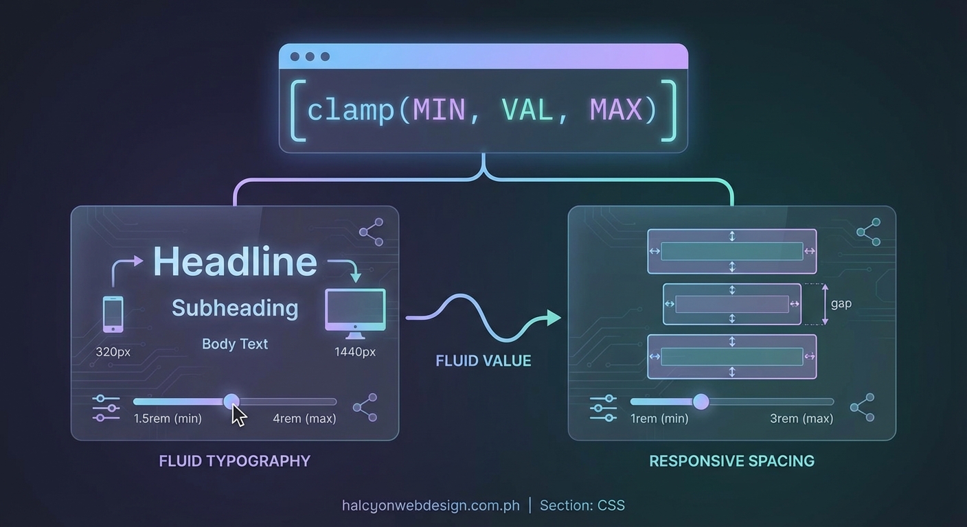
CSS clamp changes everything. It lets you define typography that scales fluidly between minimum and maximum values based on viewport width. No breakpoints. No jumps. Just smooth, responsive text that looks great at every screen size.
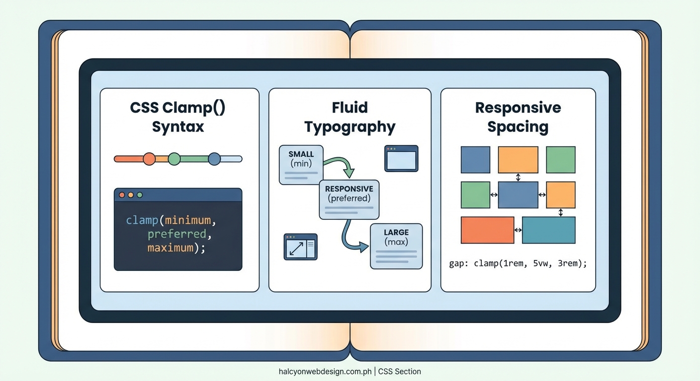
CSS clamp fluid typography uses three values (minimum, preferred, and maximum) to create text that scales smoothly across all viewport sizes. The preferred value typically combines a fixed base size with a viewport-relative unit, eliminating the need for multiple media queries. This approach creates more natural reading experiences while reducing CSS complexity and maintenance overhead for modern web projects.
Understanding how CSS clamp works for typography
The clamp function takes three parameters: a minimum value, a preferred value, and a maximum value. The browser calculates the preferred value and constrains it between the min and max boundaries.
Here’s the basic syntax:
``css
font-size: clamp(1rem, 0.5rem + 2vw, 3rem);
The browser evaluates the middle value first. If
0.5rem + 2vw` falls below 1rem, it uses 1rem instead. If it exceeds 3rem, it caps at 3rem. Otherwise, it uses the calculated value.
This creates a linear scale between your minimum and maximum values. The viewport width determines where along that scale your text lands.
The magic happens in that middle value. Combining a fixed unit with a viewport unit creates the scaling behavior. The fixed part sets your baseline. The viewport part adds responsiveness.
Building your first fluid typography scale
Start with your body text. This is your foundation. Get this right, and everything else falls into place more easily.
- Choose your minimum font size for small mobile screens (typically 16px or 1rem).
- Pick your maximum font size for large desktop screens (usually 18px to 20px for body text).
- Calculate the preferred value using the formula:
min + (max - min) * (100vw - min-viewport) / (max-viewport - min-viewport).
That formula looks intimidating. Let’s break it down with real numbers.
Say you want 16px at 320px viewport width and 20px at 1280px viewport width:
Difference in font size: 20 – 16 = 4px
Difference in viewport: 1280 – 320 = 960px
Slope: 4 / 960 = 0.004167
Preferred value: 16px + 4.167vw – (320 * 0.004167)
Simplified: 16px + 4.167vw – 1.333px
Final: 14.667px + 4.167vw
Your CSS becomes:
“`css
body {
font-size: clamp(1rem, 0.917rem + 4.167vw, 1.25rem);
}
Converting pixels to rems respects user font size preferences. Divide pixel values by 16 to get rems.
Setting up a complete typographic system
Body text is just the start. You need headings, subheadings, captions, and other text elements. Each needs its own clamp values.
Create a modular scale. Choose a ratio (1.2, 1.25, 1.333, or 1.5 work well) and apply it consistently across your type sizes.
Here’s a practical scale using a 1.25 ratio:
| Element | Min Size | Max Size | Clamp Value |
|---|---|---|---|
| Body | 1rem | 1.25rem | clamp(1rem, 0.917rem + 4.167vw, 1.25rem) |
| Small | 0.8rem | 1rem | clamp(0.8rem, 0.733rem + 3.333vw, 1rem) |
| H6 | 1rem | 1.25rem | clamp(1rem, 0.917rem + 4.167vw, 1.25rem) |
| H5 | 1.25rem | 1.563rem | clamp(1.25rem, 1.146rem + 5.208vw, 1.563rem) |
| H4 | 1.563rem | 1.953rem | clamp(1.563rem, 1.433rem + 6.510vw, 1.953rem) |
| H3 | 1.953rem | 2.441rem | clamp(1.953rem, 1.791rem + 8.138vw, 2.441rem) |
| H2 | 2.441rem | 3.052rem | clamp(2.441rem, 2.239rem + 10.172vw, 3.052rem) |
| H1 | 3.052rem | 3.815rem | clamp(3.052rem, 2.799rem + 12.715vw, 3.815rem) |
This table gives you a complete system. Each level scales proportionally. Your visual hierarchy stays consistent across all screen sizes.
Avoiding common typography mistakes becomes easier when your entire scale moves together smoothly.
Calculating clamp values without the headache
Manual calculations get tedious fast. You need tools.
Several online calculators generate clamp values for you:
- Input your min/max sizes and viewport widths
- Get formatted CSS output
- Adjust values and see results instantly
You can also use CSS custom properties to make your system more maintainable:
“`css
:root {
–fluid-min-width: 320;
–fluid-max-width: 1280;
–fluid-screen: 100vw;
–fluid-bp: calc(
(var(–fluid-screen) – var(–fluid-min-width) / 16 * 1rem) /
(var(–fluid-max-width) – var(–fluid-min-width))
);
}
h1 {
–fluid-min: 2.5;
–fluid-max: 4;
font-size: calc(
(var(–fluid-min) * 1rem) +
(var(–fluid-max) – var(–fluid-min)) * var(–fluid-bp)
);
}
This approach centralizes your viewport breakpoints. Change them once, and all your fluid sizes adjust automatically.
Custom properties also make it easier to create design tokens for your entire system. Define your scale once and reference it everywhere.
Handling line height and spacing with clamp
Font size isn’t the only thing that should scale. Line height, margins, and padding benefit from fluid sizing too.
Line height should decrease slightly as text gets larger. Large headings look better with tighter line heights. Small body text needs more breathing room.
“`css
h1 {
font-size: clamp(2rem, 1.5rem + 2.5vw, 4rem);
line-height: clamp(1.1, 1.3 – 0.2vw, 1.3);
}
p {
font-size: clamp(1rem, 0.917rem + 0.417vw, 1.25rem);
line-height: clamp(1.5, 1.4 + 0.1vw, 1.6);
margin-bottom: clamp(1rem, 0.5rem + 2vw, 2rem);
}
Spacing between elements should scale too. Tight spacing on mobile. More generous spacing on desktop.
This creates visual rhythm that adapts to available space. Your layouts feel more polished without any extra media queries.
“The goal of fluid typography isn’t to eliminate all media queries. It’s to reduce the number you need while creating smoother transitions between sizes. Use clamp for continuous scaling and media queries for layout shifts that truly need breakpoints.”
Troubleshooting common clamp problems
Your clamp values might not behave as expected. Here are the usual suspects.
Text scales too aggressively: Your viewport unit coefficient is too high. Reduce the vw value in your preferred calculation. Try cutting it in half and adjusting from there.
Text doesn’t scale at all: Check that your preferred value actually falls between your min and max at some viewport width. If the calculated value is always below the minimum or above the maximum, clamp will never use it.
Sudden jumps still appear: You’re probably hitting your minimum or maximum too early. Expand your viewport range or adjust your min/max values to create a longer scaling zone.
Text too small on mobile: Your minimum value is too low. Never go below 16px (1rem) for body text. Smaller text fails accessibility standards and frustrates users.
Text too large on desktop: Your maximum value is too high. For body text, stay between 18px and 22px. Larger sizes reduce readability on wide screens.
Test your values at multiple viewport widths. Open your browser’s responsive design mode and drag the viewport slowly from 320px to 1920px. Watch how your text scales. It should feel smooth and natural, never jarring.
Combining clamp with CSS custom properties
Custom properties make fluid typography systems more maintainable. Define your values once and reference them throughout your stylesheet.
“`css
:root {
–font-size-sm: clamp(0.8rem, 0.733rem + 0.333vw, 1rem);
–font-size-base: clamp(1rem, 0.917rem + 0.417vw, 1.25rem);
–font-size-lg: clamp(1.25rem, 1.146rem + 0.521vw, 1.563rem);
–font-size-xl: clamp(1.563rem, 1.433rem + 0.651vw, 1.953rem);
–space-xs: clamp(0.5rem, 0.25rem + 1vw, 1rem);
–space-sm: clamp(1rem, 0.5rem + 2vw, 2rem);
–space-md: clamp(1.5rem, 0.75rem + 3vw, 3rem);
–space-lg: clamp(2rem, 1rem + 4vw, 4rem);
}
h1 {
font-size: var(–font-size-xl);
margin-bottom: var(–space-md);
}
p {
font-size: var(–font-size-base);
margin-bottom: var(–space-sm);
}
This approach separates your design tokens from their implementation. Update a value in one place, and it propagates everywhere.
You can also create theme variations by overriding custom properties in different contexts. A sidebar might use a smaller scale than your main content area.
Accessibility considerations for fluid text
Fluid typography must respect user preferences. Some users increase their browser’s default font size. Others use zoom. Your clamp values should accommodate both.
Using rem units for all three clamp values ensures your text scales with user preferences. Pixel values ignore user settings.
“`css
/ Good – respects user preferences /
font-size: clamp(1rem, 0.917rem + 0.417vw, 1.25rem);
/ Bad – ignores user preferences /
font-size: clamp(16px, 14.667px + 0.417vw, 20px);
Test your site at 200% zoom. Text should remain readable. Layouts might break, but text must stay legible.
Also test with increased default font sizes. In most browsers, users can set a minimum font size. Your clamp minimum should never fight this setting.
Some users disable viewport units entirely due to motion sensitivity. Always provide fallback values:
“`css
h1 {
font-size: 2rem; / fallback /
font-size: clamp(2rem, 1.5rem + 2.5vw, 4rem);
}
The fallback should be close to your clamp minimum or a comfortable middle value.
Performance benefits of fluid typography
Fewer media queries mean less CSS. Your stylesheets become smaller and faster to parse.
A traditional responsive typography system might include 5 to 10 breakpoints. Each breakpoint adds rules for every text element. That adds up fast.
“`css
/ Traditional approach – lots of code /
h1 { font-size: 2rem; }
@media (min-width: 480px) { h1 { font-size: 2.25rem; } }
@media (min-width: 768px) { h1 { font-size: 2.75rem; } }
@media (min-width: 1024px) { h1 { font-size: 3.25rem; } }
@media (min-width: 1280px) { h1 { font-size: 3.5rem; } }
@media (min-width: 1536px) { h1 { font-size: 4rem; } }
/ Fluid approach – one line /
h1 { font-size: clamp(2rem, 1.5rem + 2.5vw, 4rem); }
The difference multiplies across your entire type system. You might reduce your CSS by 30% to 50% just by switching to fluid typography.
Smaller CSS files load faster. Browsers parse them faster. Users see styled content sooner.
This matters more than you might think. Performance improvements affect everything from user engagement to search rankings. Sites that load faster keep visitors around longer.
Integrating fluid typography into existing projects
You don’t need to rebuild everything at once. Start small.
- Identify your most important text elements (body, H1, H2, H3).
- Calculate clamp values for those elements using your current sizes as min/max values.
- Replace your existing media query rules with clamp values.
- Test thoroughly across viewport sizes.
- Expand to remaining text elements once you’re confident.
Keep your old media queries commented out during testing. If something breaks, you can revert easily.
Watch for interactions with existing CSS techniques like sticky headers that might depend on specific font sizes at certain breakpoints.
Some legacy browsers don’t support clamp. Provide fallbacks for Internet Explorer and older mobile browsers if your analytics show significant traffic from those sources.
“`css
h1 {
font-size: 2.5rem; / fallback for old browsers /
font-size: clamp(2rem, 1.5rem + 2.5vw, 4rem);
}
Modern browsers use the clamp value. Older browsers use the fixed fallback.
Advanced techniques for complex layouts
Sometimes you need different scaling rates for different viewport ranges. Maybe you want aggressive scaling on mobile but conservative scaling on desktop.
You can nest clamp functions or combine them with calc:
“`css
font-size: clamp(
1rem,
calc(0.5rem + 1vw + 0.5vh),
clamp(1.5rem, 2vw, 2rem)
);
This gets complicated fast. Use sparingly and document your reasoning.
You can also use container queries with clamp for component-based scaling:
“`css
.card {
container-type: inline-size;
}
.card h2 {
font-size: clamp(1.25rem, 5cqw, 2rem);
}
Container query units (cqw) scale based on the container width instead of viewport width. This makes components truly modular.
Your card headings scale based on card size, not screen size. The same component works in a sidebar or main content area without modification.
Creating a fluid typography checklist
Use this checklist when implementing fluid typography:
- Set minimum font size at or above 16px (1rem) for body text
- Choose maximum font size between 18px and 22px for body text
- Calculate preferred values using viewport width units
- Use rem units for all three clamp parameters
- Test at viewport widths from 320px to 1920px
- Verify text remains readable at 200% zoom
- Provide fallback values for browsers without clamp support
- Check that line heights scale appropriately
- Ensure spacing scales with font sizes
- Document your type scale for team reference
This checklist helps you catch common issues before they reach production.
Fluid typography for different content types
Different content needs different approaches. Blog posts aren’t landing pages. Documentation isn’t marketing copy.
Long-form content: Use conservative scaling. Readers spend extended time with this text. Comfort matters more than visual impact.
“`css
article p {
font-size: clamp(1.063rem, 1rem + 0.313vw, 1.25rem);
line-height: clamp(1.6, 1.5 + 0.1vw, 1.7);
}
Marketing pages: Use aggressive scaling for headings. You want impact. Grab attention.
“`css
.hero h1 {
font-size: clamp(2.5rem, 1rem + 7.5vw, 6rem);
}
Documentation: Prioritize readability over aesthetics. Keep scaling minimal.
“`css
.docs p {
font-size: clamp(1rem, 0.95rem + 0.25vw, 1.125rem);
}
Data tables: Often better with fixed sizes. Fluid typography can break table layouts.
Match your scaling strategy to your content goals. There’s no one-size-fits-all approach.
Why fluid typography matters for modern websites
Devices come in countless sizes now. Phones, tablets, laptops, desktops, TVs, and everything in between. Users resize browser windows constantly.
Fixed breakpoints can’t keep up. There are too many screen sizes to target individually. You’ll always miss some configuration.
Fluid typography adapts to every screen automatically. Your text looks intentional at every size. No awkward in-between states where text is too small or too large.
This improves user experience. Readers don’t struggle with tiny mobile text or overwhelming desktop headings. Everything feels proportional and comfortable.
It also simplifies your development workflow. Write less CSS. Maintain fewer breakpoints. Spend more time on features and less time tweaking font sizes.
The web is fluid by nature. Your typography should be too. CSS clamp gives you the tools to make it happen without complexity or compromise.
Start with your body text. Get comfortable with the syntax. Then expand to your entire type system. You’ll wonder how you ever managed without it.