
Lazy loading sounds like a performance silver bullet. Load only what users see, defer everything else, and watch your page speed scores soar. But here’s the catch: lazy loading in the wrong places can actually make your site slower, hurt user experience, and damage your Core Web Vitals.
The technique works brilliantly for some assets and catastrophically for others. Knowing the difference means understanding what happens during page load, how browsers prioritize resources, and what metrics Google actually measures.
Lazy loading defers non-critical images and iframes until users scroll near them, reducing initial page weight and speeding up perceived load times. Use it for below-the-fold content, image galleries, and embedded media. Avoid it for hero images, above-the-fold content, and critical layout elements. Poor implementation can increase Largest Contentful Paint and create layout shifts that hurt both user experience and search rankings.
Understanding how lazy loading actually works
Lazy loading delays resource requests until the browser determines they’re needed. Instead of fetching every image when the page loads, the browser waits until each image enters or approaches the viewport.
The native HTML implementation looks like this:
<img src="product.jpg" loading="lazy" alt="product photo">
That single attribute tells the browser to defer loading until the image is about 1,250 pixels from entering the viewport. Different browsers use slightly different thresholds, but the behavior remains consistent.
JavaScript libraries like lazysizes offer more control. They let you set custom distance thresholds, add placeholder images, and handle background images that the native attribute doesn’t support.
The performance benefit comes from reducing initial payload. A page with 50 images might load only 6 initially, cutting bandwidth usage and speeding up the critical rendering path.
Best scenarios for implementing lazy loading
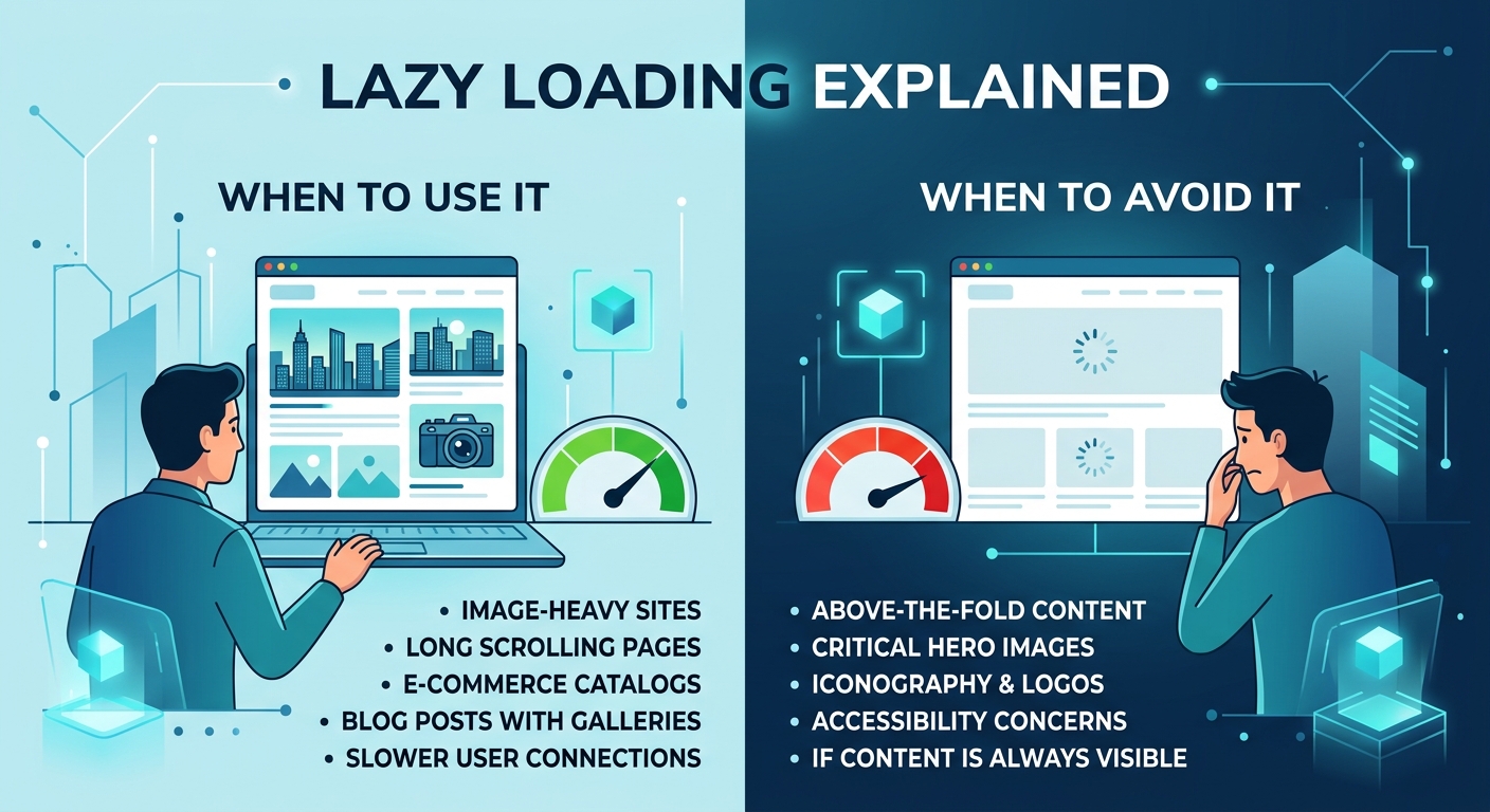
Below-the-fold images are perfect candidates. If an image sits three screens down, users who bounce early never needed it loaded. Deferring it saves bandwidth for visitors who leave after reading your introduction.
Product galleries benefit enormously. An e-commerce page showing 100 thumbnails can lazy load everything except the first visible row. Users scrolling through products trigger loads progressively, keeping the initial page light.
Blog archives and infinite scroll feeds need lazy loading. Loading 50 article thumbnails upfront wastes resources when most readers click the first three posts. Load images as users scroll through the archive.
Embedded iframes for YouTube videos, maps, and third-party widgets should almost always use lazy loading. These resources pull in dozens of additional requests, scripts, and stylesheets. Deferring them until needed prevents them from blocking your critical content.
Comment sections with user avatars make good targets. Most readers never scroll to comments, so loading 200 profile images upfront serves no purpose.
Here’s a practical checklist for good lazy loading candidates:
- Identify all images positioned more than one viewport height below the fold
- Find galleries, carousels, and grids with multiple images
- Locate embedded third-party content like videos, maps, and social feeds
- Review image-heavy sections that users might skip entirely
- Test on mobile viewports where “below the fold” starts much earlier
When lazy loading damages performance
Hero images and above-the-fold content should never use lazy loading. These elements define your Largest Contentful Paint, the metric measuring when your main content becomes visible. Lazy loading them adds delay, worsening LCP and hurting your Core Web Vitals score.
Background images in CSS present problems. The loading="lazy" attribute only works on <img> and <iframe> elements. CSS backgrounds load normally regardless, so JavaScript solutions add complexity and potential failures.
Logo images need immediate loading. Your site identity should appear instantly, and logos typically weigh only a few kilobytes. The lazy loading overhead exceeds any bandwidth savings.
Navigation icons and critical UI elements must load immediately. Delaying them creates confusing layouts where buttons appear but their icons don’t, frustrating users trying to navigate your site.
First-screen product images on e-commerce pages hurt conversions when lazy loaded. Users arriving from Google Shopping or social media expect to see the product instantly. Making them wait even 200 milliseconds increases bounce rates.
| Element Type | Use Lazy Loading? | Reason |
|---|---|---|
| Hero images | Never | Defines LCP metric |
| Below-fold images | Always | Reduces initial payload |
| Product thumbnails (first row) | Never | Critical for conversions |
| Product thumbnails (rows 2+) | Always | Progressive enhancement |
| Logo and branding | Never | Instant identity needed |
| Navigation icons | Never | Critical UI elements |
| YouTube embeds | Always | Heavy third-party scripts |
| Comment avatars | Always | Secondary content |
Implementation mistakes that hurt user experience
Layout shifts happen when lazy loaded images lack dimensions. The browser reserves no space, content jumps when images load, and your Cumulative Layout Shift score suffers. Always specify width and height attributes:
<img src="photo.jpg" loading="lazy" width="800" height="600" alt="description">
Modern browsers use aspect ratio calculations from these dimensions, scaling images responsively while preventing shifts.
Overly aggressive thresholds cause visible loading delays. Setting your lazy load trigger too close to the viewport means users see placeholder boxes or blank spaces while scrolling. Native lazy loading’s 1,250-pixel threshold works well for most cases.
Missing fallbacks for older browsers create broken experiences. Safari versions before 15.4 and older mobile browsers don’t support native lazy loading. They ignore the attribute and load images immediately, which works fine. But JavaScript implementations need polyfills or graceful degradation.
Lazy loading critical path resources breaks functionality. Some developers lazy load CSS or fonts, creating flash-of-unstyled-content problems and rendering delays that destroy user experience.
The biggest lazy loading mistake I see is applying it universally without testing the impact on Core Web Vitals. Developers add
loading="lazy"to every image thinking it helps, then wonder why their LCP score got worse. Always measure before and after, especially on your most important landing pages.
Testing and measuring lazy loading impact
Performance testing requires real user metrics, not just lab scores. Tools like PageSpeed Insights show field data from actual Chrome users visiting your site.
Compare these metrics before and after implementation:
- Largest Contentful Paint should improve or stay neutral
- Cumulative Layout Shift must not increase
- Total Blocking Time might improve slightly
- First Contentful Paint typically stays similar
The 7 free tools to test and improve your Core Web Vitals score article covers measurement approaches in detail, but focus on LCP changes specifically.
Network throttling reveals problems. Test on simulated 3G connections where lazy loading’s benefits become most apparent. Fast connections might show minimal difference, but slower networks demonstrate the technique’s value.
Scroll behavior testing catches threshold issues. Have real users scroll through pages while you watch for visible loading delays or placeholder flashes. If users notice images popping in, your threshold needs adjustment.
A/B testing provides definitive answers. Split traffic between lazy loaded and eager loaded versions, then compare bounce rates, time on page, and conversion metrics alongside technical performance scores.
Combining lazy loading with other optimization techniques
Image optimization multiplies lazy loading benefits. Properly sized, compressed images load faster whether eager or lazy. The how to optimize images for web without losing quality guide covers compression strategies that pair perfectly with deferred loading.
Responsive images using srcset work seamlessly with lazy loading. Browsers still select appropriate image sizes based on viewport width, they just defer the request:
<img
  srcset="small.jpg 400w, medium.jpg 800w, large.jpg 1200w"
  sizes="(max-width: 600px) 400px, 800px"
  src="medium.jpg"
  loading="lazy"
  alt="responsive image">
Preloading critical images overrides lazy loading when necessary. If you must lazy load an above-the-fold image for technical reasons, preload it to maintain performance:
This tells the browser to fetch the image immediately despite the lazy loading attribute.
Caching strategies complement lazy loading. Once loaded, images stay in browser cache. Return visitors see instant loads regardless of lazy loading settings. The 5 caching strategies that actually work for WordPress sites article explains how to configure effective caching.
Framework-specific implementation patterns
WordPress handles lazy loading automatically for content images since version 5.5. The CMS adds loading="lazy" to images in posts and pages, but not to featured images or header elements.
You can disable WordPress lazy loading when needed:
add_filter('wp_lazy_loading_enabled', '__return_false');
Or disable it selectively:
add_filter('wp_lazy_loading_enabled', function($default, $tag_name) {
    if ('img' === $tag_name) {
        return false;
    }
    return $default;
}, 10, 2);
React applications often use react-lazyload or react-lazy-load-image-component. These libraries handle intersection observer logic and provide loading placeholders:
import LazyLoad from 'react-lazyload';

<LazyLoad height={200} offset={100}>
  <img src="photo.jpg" alt="description" />
</LazyLoad>
Next.js Image component includes built-in lazy loading with the loading prop. Setting it to “eager” disables lazy loading for critical images:
import Image from 'next/image';

<Image
  src="/hero.jpg"
  width={1200}
  height={600}
  loading="eager"
  alt="hero image"
/>
Common troubleshooting scenarios
Images not loading at all usually means JavaScript errors blocking the lazy load library. Check browser console for error messages and verify your script loaded correctly.
Images loading too early defeats the purpose. Native lazy loading uses browser defaults you can’t modify, but JavaScript libraries let you adjust intersection observer thresholds.
SEO concerns about lazy loaded images are mostly outdated. Google’s crawlers execute JavaScript and trigger lazy loading during indexing. However, providing proper alt text and structured data remains critical.
Lighthouse warnings about offscreen images suggest lazy loading opportunities. The audit identifies images below the fold that could benefit from deferred loading.
Print stylesheets need special handling. Lazy loaded images might not print correctly. Add print-specific CSS to ensure all images load:
@media print {
  img[loading="lazy"] {
    display: block;
  }
}
Making the right decision for your content
Content type determines strategy. Blogs and news sites benefit most from lazy loading because users rarely scroll through entire articles. Portfolio sites showing visual work might avoid it to ensure smooth browsing.
User behavior patterns matter. Analytics showing 80% of users never scroll past the first screen means aggressive lazy loading makes sense. Sites with high scroll depth need more conservative approaches.
Mobile considerations change calculations. Smaller viewports mean less above-the-fold content, so more images qualify for lazy loading. But slower connections make proper implementation more critical.
Performance budgets guide decisions. If your performance budget allows 1.5MB initial payload and images total 800KB, you might skip lazy loading. But 5MB of images demands aggressive deferral.
Business goals override technical preferences. An e-commerce site prioritizing conversions might eager load more product images than technically optimal, accepting slightly worse performance scores for better user experience and sales.
Building a sustainable lazy loading strategy
Start with native lazy loading for simplicity. The HTML attribute requires zero JavaScript, works in modern browsers, and degrades gracefully in older ones. Add JavaScript solutions only when you need features like custom thresholds or background image support.
Document your decisions. Create guidelines specifying which image types get lazy loading and which don’t. This prevents future developers from accidentally lazy loading your hero image.
Monitor performance continuously. Core Web Vitals change as you add content and features. Regular testing catches regressions before they impact rankings or user experience.
Review implementation quarterly. New browser features, changing traffic patterns, and content updates might shift your optimal strategy over time.
The understanding Core Web Vitals guide explains how lazy loading fits into broader performance optimization efforts.
Performance gains worth measuring
Lazy loading done right delivers measurable improvements. Pages loading 2 seconds faster see better engagement, lower bounce rates, and higher conversion rates. But the technique requires thoughtful implementation, not blanket application.
Test your specific content with your actual users. What works for a photography portfolio might fail on a documentation site. What succeeds on desktop might frustrate mobile users. Measure, adjust, and measure again until you find the balance between technical performance and user experience that serves your specific audience and business goals.