
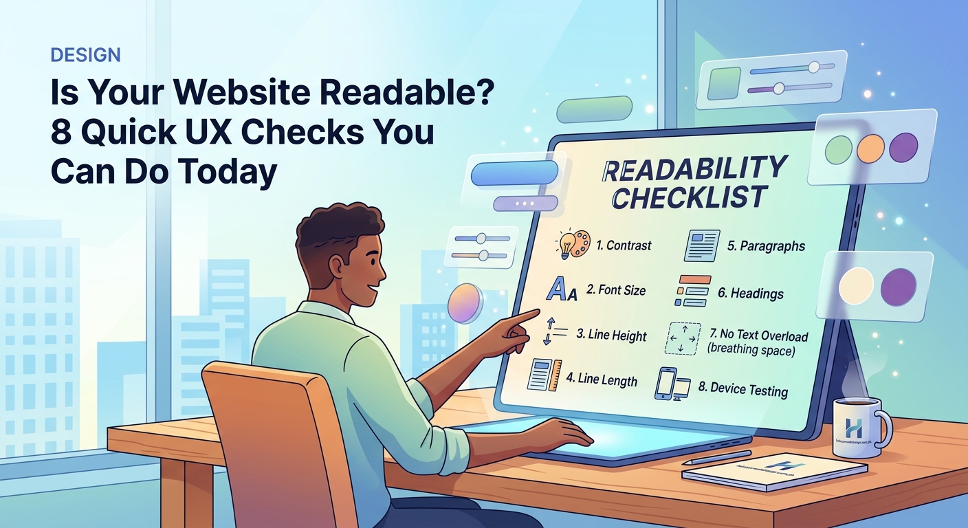
Your website might have stunning visuals and powerful features, but if visitors struggle to read your content, they’ll leave before converting. Readability isn’t just about font size. It’s about contrast, spacing, hierarchy, and how easily someone can scan your page and find what they need.
This website readability checklist covers 12 practical checks you can run today to improve typography, color contrast, spacing, navigation, and content structure. Each item includes specific fixes you can apply without needing advanced technical skills, helping you create a more accessible and user-friendly experience for every visitor.
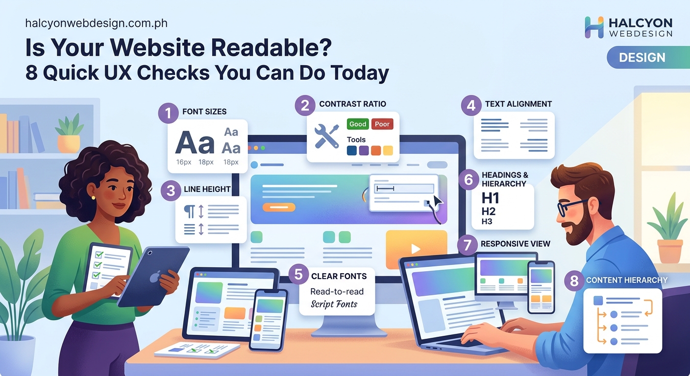
Start with typography that people can actually read
Typography mistakes kill readability faster than anything else.
Your font size should be at least 16px for body text. Anything smaller forces users to zoom in or squint.
Line height matters just as much. Set it between 1.5 and 1.8 for body text. Cramped lines make reading exhausting.
Limit line length to 50 to 75 characters per line. Longer lines force readers to work harder to track from one line to the next.
Choose fonts designed for screen reading. System fonts like Arial, Georgia, and Verdana work well. If you’re using custom fonts, test them on multiple devices first.
Avoid using more than two font families on one page. Mixing too many typefaces creates visual chaos.
If you’re making common font mistakes, review this guide on typography mistakes that make your website look unprofessional to catch issues you might have missed.
Check color contrast between text and background
Low contrast makes text invisible to many users.
Your body text should have a contrast ratio of at least 4.5:1 against its background. Headings and larger text need at least 3:1.
Use a free contrast checker like WebAIM or Contrast Ratio to test your colors. Paste your hex codes and see if they pass.
Light gray text on white backgrounds fails most contrast tests. So does white text on pale yellow or light blue.
If your brand colors don’t meet contrast requirements, adjust the shade. Darken your text color or lighten your background until you hit the minimum ratio.
Don’t rely on color alone to communicate information. Use icons, labels, or underlines for links and buttons.
For more guidance on building a palette that works, check out this resource on how to choose the perfect color palette for your website in 5 steps.
Test your headings for clear hierarchy
Headings guide readers through your content.
Every page should have one H1 that describes the main topic. Don’t skip heading levels. Go from H1 to H2 to H3 in order.
Make headings visually distinct. They should be larger, bolder, or a different color than body text.
Use headings to break up long sections. If you have more than three paragraphs in a row, add a subheading.
Write headings that make sense out of context. Users scan pages by reading headings first. Each one should tell them what the section covers.
Avoid vague headings like “More Information” or “Details.” Be specific.
Creating a strong visual hierarchy helps users navigate your content. Learn more about how to create a visual hierarchy that guides users through your content.
Add enough white space around content blocks
Cluttered pages overwhelm visitors.
White space (also called negative space) gives content room to breathe. It makes pages easier to scan and reduces cognitive load.
Add margin between paragraphs. At least 1em of space helps separate ideas.
Increase padding inside content containers. Text that touches the edges of a box feels cramped.
Leave space around images, buttons, and form fields. Don’t let elements crowd each other.
Use white space to group related items. Items close together look related. Items farther apart look separate.
If your site feels cramped, this guide on why your website looks cluttered and how to fix it with white space will help you identify problem areas.
Make sure your navigation is easy to understand
Confusing navigation frustrates users and increases bounce rates.
Your main menu should be visible on every page. Don’t hide it behind icons unless you’re on mobile.
Limit your top-level menu items to seven or fewer. Too many choices paralyze users.
Use clear, descriptive labels. “Services” is better than “What We Do.” “Contact” is better than “Get in Touch.”
Keep your menu structure shallow. Users should reach any page within three clicks.
Add a search bar if you have more than 20 pages. Let users find content their own way.
For more tips on building navigation that works, read this article on how to design a navigation menu that users actually understand.
Optimize content width for comfortable reading
Wide text blocks strain the eyes.
Your main content column should be between 600px and 800px wide. Anything wider makes it hard to track from line to line.
On large screens, center your content or add sidebars. Don’t let text stretch across a 1920px monitor.
Use CSS max-width to control content width:
.content {
  max-width: 700px;
  margin: 0 auto;
}
Test your layout on different screen sizes. What looks good on a laptop might be unreadable on a tablet.
If you’re building responsive layouts, this guide on mobile-first design principles every beginner should know will help you plan for all devices.
Review your link styles for visibility
Links should be obvious.
Underline text links in body content. It’s the most recognizable link indicator.
Use a distinct color for links. Blue is standard, but any color works as long as it contrasts with your text.
Change link color on hover. Give users feedback when they move their cursor over a link.
Make visited links a different color. This helps users track where they’ve been.
Don’t underline text that isn’t a link. Users will click it and get frustrated.
Button links should look clickable. Add padding, background color, and rounded corners.
Check your content for scannability
Most users don’t read every word. They scan.
Break up long paragraphs. Keep them to three or four sentences.
Use bullet points for lists. They’re easier to scan than comma-separated items in a sentence.
Highlight important information with bold text. Don’t overdo it. Too much bold text loses impact.
Add descriptive subheadings every few paragraphs. They act as signposts.
Front-load your sentences. Put the most important information first.
Use short sentences. Aim for 15 to 20 words per sentence on average.
Test readability on mobile devices
More than half of web traffic comes from mobile devices.
Your text should be at least 16px on mobile. Smaller sizes force users to zoom.
Increase tap target size for buttons and links. Make them at least 44px by 44px.
Avoid horizontal scrolling. Your content should fit the screen width.
Test your site on real devices, not just browser emulators. Touch interactions behave differently.
Check your font rendering on iOS and Android. Fonts can look different across operating systems.
If your theme causes mobile issues, this article on signs your WordPress theme is slowing down your website covers performance problems that affect mobile users.
Verify keyboard navigation works properly
Not everyone uses a mouse.
Press Tab to move through interactive elements. The focus indicator should be visible.
Make sure you can reach every link, button, and form field with the keyboard.
Test your dropdown menus. They should open with Enter or Space.
Check that modals and popups can be closed with the Escape key.
Don’t remove the focus outline with CSS unless you replace it with a custom style.
For a complete accessibility check, read this guide on keyboard navigation and making your site usable without a mouse.
Audit your forms for clarity
Complicated forms drive users away.
Label every form field clearly. Place labels above or to the left of inputs.
Use placeholder text for examples, not instructions. Placeholders disappear when users start typing.
Group related fields together. Use fieldsets for things like billing and shipping addresses.
Show error messages next to the field with the problem. Don’t just highlight the field in red.
Make required fields obvious. Use an asterisk or the word “required.”
Add helpful hints for complex fields like passwords or phone numbers.
If you need more detailed form guidance, this resource on how to build accessible forms that every user can complete covers best practices.
Compare your site against readability standards
Testing helps you catch issues you might miss.
| Check | Tool | What It Tests |
|---|---|---|
| Color contrast | WebAIM Contrast Checker | Text and background contrast ratios |
| Reading level | Hemingway Editor | Sentence complexity and grade level |
| Mobile usability | Google Mobile-Friendly Test | Responsive design and tap targets |
| Accessibility | WAVE | WCAG compliance and screen reader support |
| Page speed | PageSpeed Insights | Load time and Core Web Vitals |
Run these tests monthly. Readability can degrade as you add content and features.
Document your results. Track improvements over time.
Fix high-priority issues first. Start with contrast failures and keyboard navigation problems.
For performance-specific checks, this guide on free tools to test and improve your Core Web Vitals score offers additional testing resources.
Review your content structure for logic
Good structure makes content easier to follow.
Start with a clear introduction. Tell users what they’ll learn.
Use numbered lists for steps or processes. Use bullet points for unordered items.
Add a table of contents for long articles. Let users jump to sections.
Include relevant images, but don’t overload the page. Every image should serve a purpose.
End sections with a clear transition or summary. Guide users to the next step.
Break complex topics into smaller sections. Don’t try to cover everything in one block.
“Readability isn’t a nice-to-have feature. It’s the foundation of user experience. If people can’t read your content comfortably, nothing else matters.” — Jakob Nielsen, UX researcher
Making readability a regular practice
A website readability checklist isn’t something you use once and forget.
User needs change. Browsers update. Your content grows.
Schedule a readability audit every quarter. Go through this checklist and fix what’s broken.
Test with real users when possible. Ask them to complete tasks and watch where they struggle.
Keep learning about accessibility and UX best practices. Standards evolve.
Make readability part of your content workflow. Check new pages before publishing.
Your website exists to serve your visitors. When you make it easier to read, you make it easier for them to take action. Start with one item from this checklist today. Fix it. Then move to the next. Small improvements add up to a better experience for everyone who visits your site.