
Forms are the backbone of web interaction. They collect data, process payments, and connect users to services. But when forms aren’t accessible, they lock out millions of people who rely on assistive technology, keyboard navigation, or alternative input methods.
Building forms that work for everyone isn’t just about compliance. It’s about ensuring every visitor can complete their task without frustration or confusion. The good news? Most accessibility improvements also make forms easier for everyone to use.
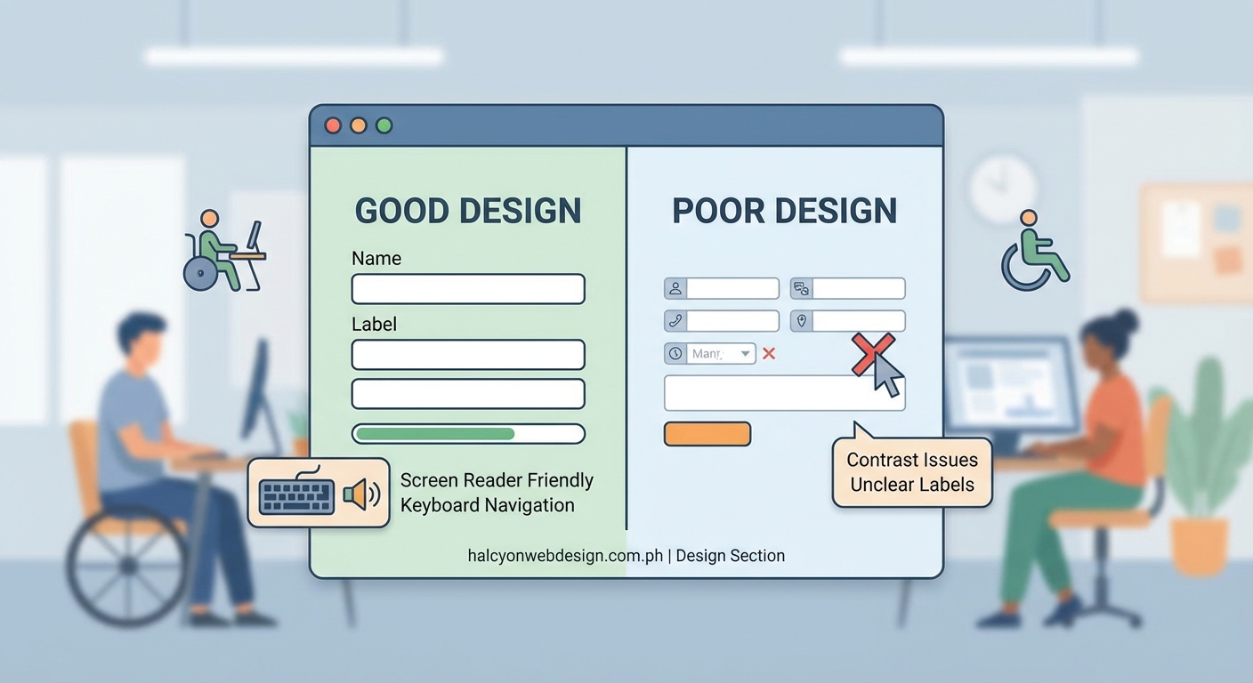
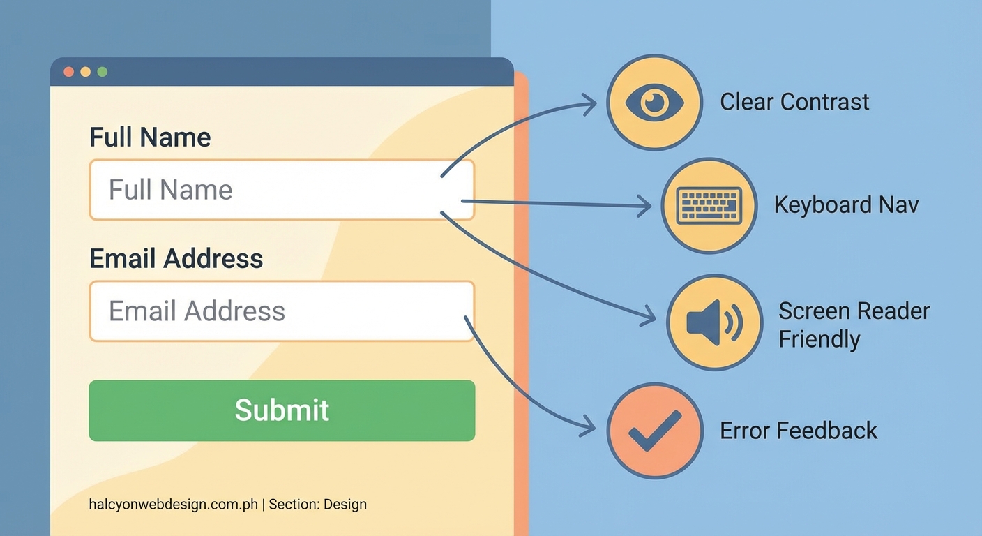
Creating accessible forms requires semantic HTML, clear labels, keyboard navigation support, and proper error handling. Use native form elements, provide visible focus indicators, group related fields with fieldsets, and test with screen readers. These practices ensure WCAG compliance while improving usability for all users, reducing abandonment rates, and protecting against legal risks.
Start with semantic HTML
Native HTML form elements come with built-in accessibility features. Browsers and assistive technologies already know how to handle them.
Use <input>, <select>, <textarea>, and <button> elements instead of building custom controls with divs and spans. Custom elements require extra ARIA attributes and JavaScript to work properly, and they often fail in unexpected ways.
Each form field needs a proper type attribute. Use type="email" for email addresses, type="tel" for phone numbers, and type="date" for dates. Mobile devices will display appropriate keyboards, and screen readers will announce the field type.
Avoid placeholder text as the only label. Placeholders disappear when users start typing, forcing them to delete their input to remember what the field requires. They also have insufficient contrast and confuse screen reader users.
Label every input clearly
Every form field needs a label that describes its purpose. Screen readers announce these labels, helping users understand what information to provide.
Connect labels to inputs using the for attribute. The label’s for value must match the input’s id value:
“`html
This connection lets users click the label to focus the input, which is especially helpful on mobile devices where touch targets need to be larger.
Write labels in plain language. “Email address” works better than “Enter your email here” or “Email:”. Keep labels short but descriptive enough to eliminate confusion.
Position labels above or beside inputs, never below. Users need to see what a field requires before they start typing. If you’re dealing with text-heavy forms, avoiding common typography mistakes helps maintain readability across all form elements.
Enable complete keyboard navigation
Many users navigate forms without a mouse. They use the Tab key to move between fields, Enter to submit, and arrow keys to select options.
Ensure all interactive elements can receive keyboard focus. This includes inputs, buttons, links, and custom controls. The default tab order should follow the visual layout from top to bottom, left to right.
Never remove focus indicators with CSS like outline: none unless you provide an alternative that’s equally visible. Users need to see which element currently has focus.
Test your form by unplugging your mouse. Can you fill out every field? Can you submit the form? Can you access error messages? If you get stuck, keyboard users will too.
Custom controls like date pickers or dropdown menus need extra attention. They must respond to arrow keys, Enter, Escape, and other expected keyboard shortcuts.
Group related fields together
Long forms become overwhelming without clear organization. Group related fields using the <fieldset> element and label each group with a <legend>.
“`html
Screen readers announce the legend when users enter the fieldset, providing context for all fields within it. This is especially helpful for radio buttons and checkboxes where individual labels might not make sense alone.
Break long forms into logical sections with headings. Use <h2> for major sections and <h3> for subsections. Screen reader users can jump between headings to navigate the form structure.
Consider a multi-step approach for complex forms. Show progress indicators so users know how much remains. Save partial data so users don’t lose their work if they need to pause.
Write helpful instructions and hints
Some fields need extra explanation beyond the label. Provide instructions that clarify format requirements, character limits, or other constraints.
Link instructions to inputs using aria-describedby:
“`html
Must be at least 12 characters with one number and one symbol
Screen readers will announce the hint after the label, giving users the information they need before they start typing.
Mark required fields clearly. Add “required” to the label text or use an asterisk with a legend explaining its meaning. Don’t rely on color alone to indicate required fields.
Provide examples for complex formats. Instead of just saying “Enter your phone number,” show the format you expect: “Phone number (555-123-4567)”.
Handle errors with clarity
Error messages need to be specific, helpful, and announced by screen readers. “This field is required” tells users what went wrong. “Invalid input” does not.
Display errors near the relevant field. Users should see the error message immediately when they encounter a problem.
Use aria-invalid="true" and aria-describedby to connect error messages to inputs:
“`html
Username must be at least 6 characters
The role="alert" attribute tells screen readers to announce the error immediately.
Add an error summary at the top of the form listing all problems. Link each error to its corresponding field so users can jump directly to the issue.
Validate inline when possible, but don’t show errors while users are still typing. Wait until they’ve moved to the next field or attempted to submit.
Choose the right input types
HTML5 provides specific input types that improve both accessibility and user experience.
| Input Type | Purpose | Benefit |
|---|---|---|
| Email addresses | Shows @ key on mobile keyboards | |
| tel | Phone numbers | Shows numeric keypad |
| url | Web addresses | Shows .com and / keys |
| number | Numeric values | Prevents non-numeric input |
| date | Calendar dates | Provides date picker |
| search | Search queries | Adds clear button |
These input types help browsers provide appropriate keyboards on mobile devices and enable better validation. They also help screen readers announce the expected format.
For radio buttons and checkboxes, use the correct elements. Don’t fake them with styled divs. Real form controls work with keyboard navigation and assistive technology.
Provide a “select all” option for long checkbox lists. Users shouldn’t need to check dozens of boxes individually if they want everything.
Maintain sufficient color contrast
Text and form controls need enough contrast against their backgrounds. WCAG requires a contrast ratio of at least 4.5:1 for normal text and 3:1 for large text and UI components.
This applies to labels, input text, placeholder text, error messages, and button text. Low contrast makes forms harder to read for people with low vision or color blindness.
Don’t rely on color alone to convey information. If you use red borders to indicate errors, also include an error icon and error message text.
Test your color choices with a contrast checker. Many browser developer tools include built-in contrast analyzers.
Focus indicators need sufficient contrast too. The default browser outline usually works fine, but if you customize it, ensure it remains visible against all background colors.
Build forms that adapt to different needs
Users interact with forms in many ways. Some zoom the page to 200% or 400%. Others use screen magnifiers that show only a small portion of the screen at once.
Design forms that remain usable when zoomed. Text should reflow without horizontal scrolling. Buttons should stay visible and clickable.
Avoid fixed pixel widths on form containers. Use percentage-based or flexible layouts that adapt to different viewport sizes.
Allow users to resize text without breaking the layout. Test your forms at different zoom levels to catch issues early.
Some users need more time to complete forms. Don’t implement aggressive session timeouts. If timeouts are necessary, warn users before the session expires and let them extend the time limit.
Test with real assistive technology
The only way to know if your form truly works is to test it with the tools people actually use.
- Test with a screen reader like NVDA (Windows), JAWS (Windows), or VoiceOver (Mac/iOS).
- Navigate the entire form using only your keyboard.
- Try voice control software to fill out fields and submit the form.
- Use browser zoom to test at 200% magnification.
- Check the form with automated accessibility testing tools.
Automated tools catch obvious problems like missing labels or insufficient contrast, but they miss context issues that only manual testing reveals.
Ask people with disabilities to test your forms. Their feedback will highlight problems you never considered.
Document your testing process. Note which assistive technologies you tested with and what issues you found and fixed.
“Accessibility isn’t a feature you add at the end. It’s a fundamental aspect of good form design that benefits everyone. When you build forms that work for people with disabilities, you create better experiences for all users.”
Common mistakes to avoid
Even experienced developers make accessibility errors. Here are patterns to watch for:
- Using
<div>or<span>elements as buttons instead of<button> - Hiding labels with CSS while keeping them in the HTML
- Disabling form submission until all fields are valid without explaining why
- Using custom select dropdowns that break keyboard navigation
- Implementing CAPTCHA without audio alternatives
- Creating multi-column layouts that confuse tab order
- Using auto-advancing carousels or slideshows within forms
- Triggering navigation or submission on focus or input events
- Requiring mouse hover to reveal important information
Each of these mistakes creates barriers for users with disabilities. They also often frustrate users without disabilities.
Performance matters for accessibility
Slow forms frustrate everyone, but they particularly impact users with cognitive disabilities who need more time to process information. If your site loads slowly, you might want to check out why your WordPress site loads slowly for practical optimization tips.
Minimize JavaScript dependencies. Forms should work with basic HTML and CSS, with JavaScript enhancing rather than enabling functionality.
Load forms quickly. Users shouldn’t wait for multiple scripts to download before they can start typing.
Provide immediate feedback for long-running processes. If form submission takes more than a second, show a loading indicator and disable the submit button to prevent duplicate submissions.
Progressive enhancement keeps forms working
Build forms that function without JavaScript. Then add JavaScript to improve the experience.
Basic HTML forms work everywhere. They submit data, validate required fields, and display error messages. Start with this foundation.
Add JavaScript for inline validation, dynamic field updates, and better error handling. But ensure the form still works if JavaScript fails to load or breaks.
This approach benefits users on slow connections, users with JavaScript disabled, and users with assistive technology that doesn’t handle complex JavaScript well.
Test your forms with JavaScript disabled. Can users still complete and submit them? If not, rethink your implementation.
Make your forms work for everyone
Accessible forms aren’t harder to build. They just require thinking about different user needs from the start.
Use semantic HTML. Label everything clearly. Support keyboard navigation. Handle errors with helpful messages. Test with real assistive technology.
These practices create forms that work for people using screen readers, keyboard navigation, voice control, screen magnifiers, and other assistive technologies. They also create better experiences for everyone else.
Start with one form. Apply these principles. Test thoroughly. Then move on to the next one. Each accessible form you create makes the web more inclusive.