
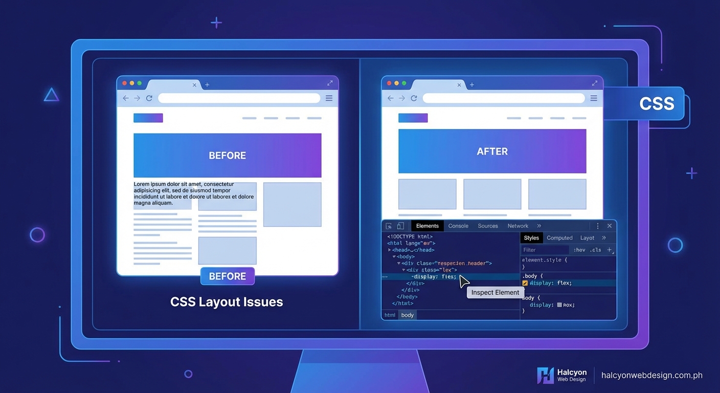
CSS layout problems can drain hours from your workday. A flexbox container refuses to center. Grid columns overlap mysteriously. Margins collapse in ways you didn’t predict. These frustrations are universal, but the solution isn’t guessing or randomly tweaking values until something works.
Browser DevTools transform CSS debugging from guesswork into systematic problem solving. By mastering element inspection, computed styles, box model visualization, and layout tools, you can identify specificity conflicts, understand cascade behavior, and fix positioning issues in minutes instead of hours. This guide walks you through proven workflows that professional developers use daily.
Opening DevTools and inspecting elements
Most modern browsers include powerful developer tools. Chrome, Firefox, Edge, and Safari all offer similar features with slight interface differences.
Press F12 on Windows or Linux. Use Command+Option+I on Mac. Right-click any element and select “Inspect” to jump directly to that element in the DOM tree.
The Elements panel shows the live DOM structure. This differs from viewing page source because it reflects JavaScript modifications and dynamic content. You see what the browser actually renders, not just what the server sent.
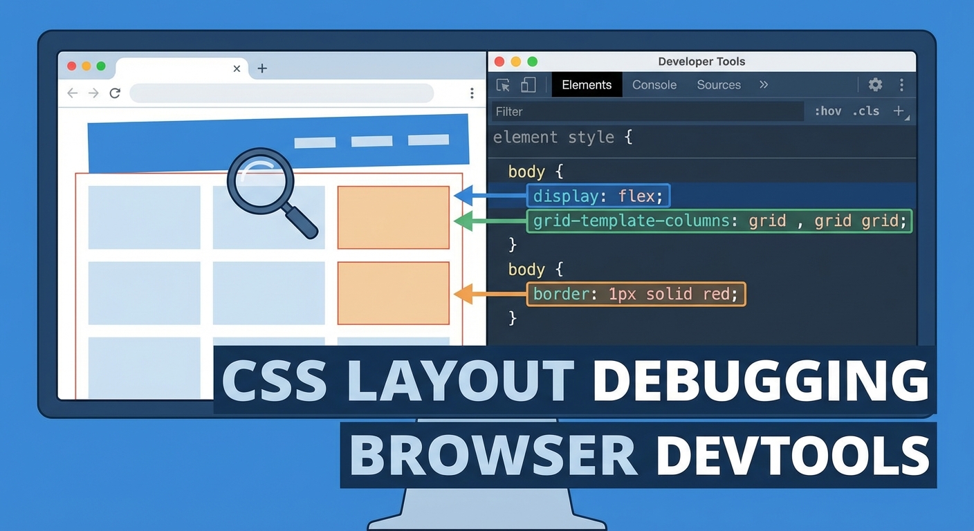
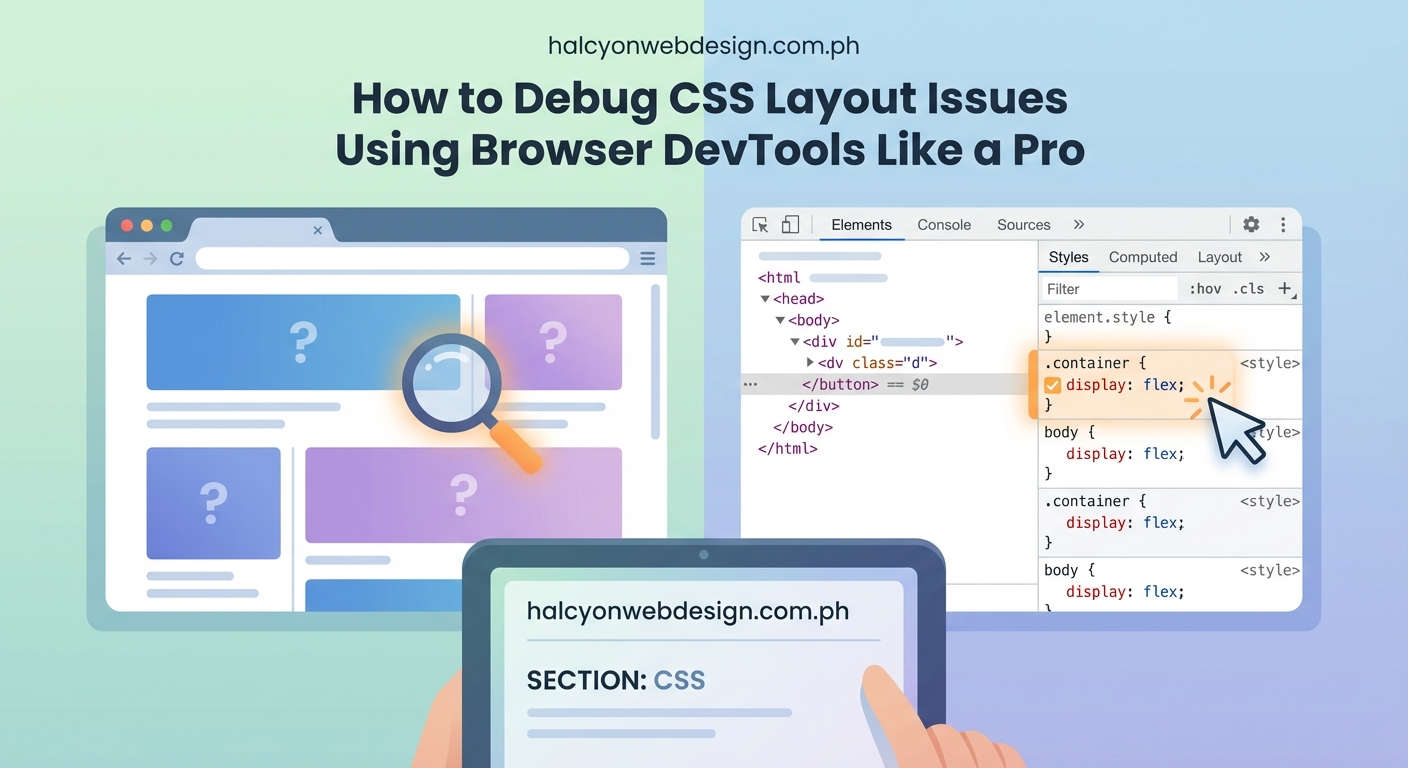
Click the element picker icon (usually top-left of DevTools) or press Ctrl+Shift+C. Hover over page elements to highlight them. Click to select. The Styles panel updates to show all CSS rules affecting that element.
Understanding the Styles panel hierarchy
The Styles panel displays rules in specificity order. Rules at the top override those below. Strikethrough text indicates overridden properties.
Each rule shows its source file and line number. Click these links to view the full stylesheet. This helps when tracking down where conflicting styles originate.
User agent styles appear at the bottom. These are browser defaults. They explain why elements have margins or padding you didn’t explicitly set.
Hover over color values to see a color picker. Hover over timing functions to see animation curves. DevTools make abstract CSS values tangible and editable.
Analyzing the box model visually
The box model diagram appears in the Styles panel or a dedicated Computed tab. It shows content, padding, border, and margin dimensions as nested rectangles.
Each layer displays pixel values. Hover over the diagram to highlight corresponding areas on the page. This reveals which spacing value causes unexpected gaps or overlaps.
Pay attention to these common issues:
- Margins that collapse vertically between siblings
- Padding that increases total element width beyond container limits
- Borders that add unexpected pixels to dimensions
- Box-sizing values that change how width and height calculations work
The box model viewer instantly shows whether box-sizing: border-box is applied. Without it, padding and borders add to declared width values. With it, they’re included within the width.
Checking computed values versus authored styles
The Computed tab shows final calculated values for every CSS property. This differs from the Styles panel, which shows authored rules.
Authored styles might say width: 50%. Computed values show the actual pixel result, like width: 480px. This helps debug percentage-based layouts where the parent width isn’t what you expected.
Filter the computed properties list to find specific values faster. Type “margin” to see all margin properties. Type “flex” to see flexbox-related values.
Computed values reveal inherited properties. Text color, font family, and line height often inherit from ancestors. Tracking these down manually through HTML is tedious. The Computed tab lists the source element immediately.
Editing CSS live for testing
Click any property value in the Styles panel to edit it. Press Tab to move to the next property. Press Enter to add a new property below.
Changes apply instantly without page refresh. Test different values rapidly. Try display: grid instead of flex. Adjust gap values. Change alignment properties. See results immediately.
Edited styles don’t save to your files. Refresh the page to revert. This makes DevTools perfect for experimentation without risk.
Add entirely new CSS rules by clicking the plus icon in the Styles panel. Write a new selector and properties. Test whether a different approach would work before modifying your actual stylesheets.
Using layout debugging tools for flexbox and grid
Modern DevTools include specialized overlays for flexbox and grid containers.
In Chrome, look for small badges next to display: flex or display: grid in the Styles panel. Click these to toggle visual overlays.
Flexbox overlays show:
- Main axis and cross axis directions
- Flex item boundaries
- Available space distribution
- Alignment lines
Grid overlays show:
- Grid line numbers
- Track sizes
- Gap dimensions
- Named grid areas
These visualizations make abstract layout concepts concrete. You see exactly why an item doesn’t align as expected or why tracks don’t size correctly.
Firefox offers particularly robust grid tools. The Layout panel shows all grid containers on the page. Toggle overlays for multiple grids simultaneously. Adjust overlay colors for clarity when grids nest.
Diagnosing specificity and cascade problems
Specificity conflicts cause most CSS frustration. Your rule exists but doesn’t apply because another rule wins the specificity battle.
The Styles panel shows all matching rules, even overridden ones. Strikethrough indicates a property that’s present but losing to a more specific rule.
Check these specificity factors in order:
- Inline styles (highest specificity)
- ID selectors
- Class selectors, attribute selectors, pseudo-classes
- Element selectors and pseudo-elements
- Universal selector (lowest specificity)
!important declarations override normal specificity but create maintenance problems. DevTools show these clearly. If you see !important scattered throughout, you’ve got a specificity management issue, not a debugging problem.
Some browsers show specificity values numerically. Chrome displays them when you hover over selectors. Firefox shows them in the Rules panel.
Tracking down layout shift causes
Elements that move unexpectedly often result from positioning context misunderstandings.
Check the position property first. Values like absolute or fixed remove elements from normal document flow. They position relative to the nearest positioned ancestor (any element with position other than static).
DevTools don’t automatically show positioning context. You need to walk up the DOM tree manually, checking each ancestor’s position value.
Look for these positioning gotchas:
- Absolutely positioned elements with no positioned ancestor (they position relative to the viewport)
- Fixed elements that appear in the wrong place due to
transformorfilteron ancestors - Sticky elements that don’t stick because the parent has
overflow: hidden - Z-index that doesn’t work because the element isn’t positioned
The 3D view in some browsers (Chrome’s Layers panel) shows stacking contexts visually. This helps debug complex z-index issues where elements stack unexpectedly.
Identifying overflow and clipping issues
Content that disappears or gets cut off usually relates to overflow handling.
Check the overflow property on the element and its ancestors. Values like hidden or clip prevent content from displaying outside boundaries.
DevTools highlight overflowing content when you inspect elements. Chrome shows scrollable regions with special indicators.
Common overflow problems include:
- Text that extends beyond container width without wrapping
- Images larger than their containers
- Absolutely positioned children extending beyond parent boundaries
- Flex or grid items that don’t shrink as expected
The overflow property has separate overflow-x and overflow-y values. Sometimes only one direction causes problems. Check computed values for both.
Debugging responsive layouts with device emulation
DevTools include device emulation for testing responsive designs without physical devices.
Click the device toggle icon (usually looks like a phone and tablet) or press Ctrl+Shift+M. Choose preset devices or set custom viewport dimensions.
Device emulation changes more than viewport size. It simulates:
- Touch events instead of mouse events
- Device pixel ratio for high-DPI screens
- User agent strings
- Network throttling
Test your media queries by resizing the viewport gradually. Watch which breakpoints trigger. Verify that layouts adapt smoothly.
Some developers set breakpoints based on common device sizes, but content should drive breakpoint decisions. Use DevTools to find where your layout breaks, then add breakpoints there.
Systematic workflow for solving layout problems
Follow this process to debug CSS layout issues methodically:
-
Identify the affected element. Use the element picker to select it in DevTools. Verify you’re inspecting the right element, not a child or parent.
-
Check the box model. Look for unexpected padding, margins, or borders. Verify that
box-sizingis set as intended. -
Review applied styles. Read through the Styles panel from top to bottom. Note which rules apply and which are overridden.
-
Examine layout properties. Check
display,position,float, and related properties. Verify they match your mental model. -
Test changes live. Edit values directly in DevTools. Try different approaches. Note what works.
-
Trace inheritance and cascade. If properties seem missing, check whether they should inherit. Look for rules that might reset values unexpectedly.
-
Verify parent constraints. Walk up the DOM tree. Check whether parent dimensions, positioning, or overflow settings constrain the child.
-
Isolate the problem. Disable CSS rules temporarily using checkboxes in the Styles panel. Remove rules one by one until the problem disappears. This identifies the culprit.
Common layout mistakes and their DevTools signatures
This table shows frequent CSS problems and how they appear in DevTools:
| Problem | DevTools Signature | Solution |
|---|---|---|
| Flexbox items overflow container | Box model shows content wider than parent | Add flex-wrap: wrap or adjust flex-shrink |
| Grid items overlap | Grid overlay shows tracks smaller than content | Use minmax() or adjust grid-template-columns |
| Element not centering | Computed margin shows 0 instead of auto |
Verify display: block and explicit width |
| Absolute element in wrong position | No positioned ancestor in DOM tree | Add position: relative to intended parent |
| Z-index not working | Element has position: static |
Change to relative, absolute, or fixed |
| Margin collapse unexpected | Box model shows smaller margin than authored | Use padding, border, or flexbox to prevent collapse |
| Percentage width not working | Computed width shows 0px |
Parent has no explicit width, percentages have no reference |
Advanced DevTools features for complex debugging
Modern browsers add new debugging capabilities regularly.
CSS layers: Chrome shows @layer rules clearly in the Styles panel. Layers help manage cascade order across large codebases.
Container queries: DevTools display which container an element queries against. This helps debug size-based responsive behavior.
Scroll-driven animations: Some browsers visualize scroll timelines and animation ranges, making it easier to debug animations triggered by scrolling.
Accessibility tree: The Accessibility panel shows how assistive technologies interpret your layout. Sometimes CSS that looks correct visually creates problems for screen readers.
Performance profiling: The Performance panel identifies layout thrashing (forced reflows) and expensive style recalculations. These cause jank and slow rendering.
Creating a debugging mindset
Effective debugging requires shifting from “why doesn’t this work” to “what is actually happening.”
DevTools show you reality. Your mental model might be wrong. The browser always does exactly what the CSS specifies, even when that’s not what you intended.
“The computer is always right. If your layout doesn’t match expectations, your expectations are wrong, not the computer’s interpretation.” This principle keeps you focused on understanding actual behavior rather than fighting the browser.
Stop making random changes hoping something works. Each edit should test a specific hypothesis. “If the problem is margin collapse, removing margin-top should change the spacing.” Then verify with DevTools.
Document your findings. When you solve a tricky problem, note what caused it and how DevTools revealed the issue. Build a personal reference for future debugging.
Preventing layout issues before they happen
Debugging skills matter, but prevention saves more time.
Use DevTools while building, not just when fixing. Inspect elements as you write CSS. Verify that properties apply as intended. Catch problems immediately instead of discovering them later.
Test responsive behavior continuously. Don’t wait until the design is “done” to check mobile layouts. Use device emulation throughout development.
Validate your HTML. Invalid markup causes unpredictable CSS behavior. Browsers try to correct errors, but their corrections might not match your intentions.
Consider whether building components with clear positioning rules from the start reduces debugging time later. Consistent patterns mean fewer surprises.
Tools that complement DevTools
Browser DevTools handle most debugging, but specialized tools help with specific problems.
CSS Stats analyzers show specificity graphs and selector complexity across entire stylesheets. They identify problem areas before you encounter bugs.
Linting tools like Stylelint catch common mistakes during development. They warn about invalid properties, vendor prefix issues, and specificity problems.
Visual regression testing compares screenshots across code changes. This catches unintended layout shifts that manual testing might miss.
Browser compatibility checkers verify that CSS properties work across target browsers. DevTools show what works in your current browser but don’t warn about incompatibilities elsewhere.
Debugging across different browsers
Each browser implements DevTools differently. Learn the strengths of each.
Firefox excels at grid debugging. Its grid inspector offers the most detailed visualizations and controls.
Chrome leads in performance profiling. Its Lighthouse integration identifies optimization opportunities.
Safari’s Web Inspector includes unique features for debugging iOS-specific issues. Test on actual Safari, not just Chrome, since WebKit differs from Blink.
Edge follows Chrome closely but includes some unique Microsoft-specific features.
Test in multiple browsers during development, not just at the end. CSS that works perfectly in Chrome might break in Firefox due to subtle rendering differences or incomplete feature support.
When DevTools aren’t enough
Some problems require looking beyond the browser.
Build tool issues: CSS might look correct in DevTools but break in production because your bundler transformed it incorrectly. Check the actual deployed CSS files.
Caching problems: Browsers might serve old CSS even after changes. Hard refresh (Ctrl+Shift+R) or disable cache in DevTools Network settings.
Framework-specific behavior: React, Vue, and other frameworks might apply styles in ways that complicate debugging. Check framework DevTools extensions for additional insights.
Third-party CSS conflicts: External stylesheets from plugins or libraries might override your rules. DevTools show these, but you might need to increase specificity or use cascade layers to win.
If DevTools show that your CSS applies correctly but the layout still breaks, the problem might be in your HTML structure, JavaScript manipulation, or conceptual misunderstanding of how CSS properties interact.
Building debugging speed through practice
Debugging mastery comes from repetition. The more layout problems you solve, the faster you recognize patterns.
Create deliberate practice scenarios. Build broken layouts intentionally, then fix them. This builds pattern recognition faster than waiting for real bugs.
Study other developers’ debugging sessions. Watch screen recordings or pair program. You’ll learn techniques you wouldn’t discover alone.
Keep notes on tricky problems. Your future self will thank you when encountering similar issues. Build a personal knowledge base of solutions.
Time yourself occasionally. How long does it take to identify a specificity conflict? How fast can you debug a flexbox alignment issue? Tracking improvement motivates continued skill development.
Making DevTools part of your workflow
DevTools shouldn’t be a last resort when everything breaks. Make them a constant companion.
Keep DevTools open while writing CSS. Verify each rule as you add it. This catches problems immediately when context is fresh.
Use DevTools to learn, not just debug. Inspect sites you admire. See how they achieve specific effects. Reverse-engineer techniques by examining their CSS.
Customize DevTools to match your workflow. Most browsers let you adjust panel layouts, color schemes, and keyboard shortcuts. A comfortable environment speeds up debugging.
Performance matters even during development. Slow sites frustrate users regardless of how they look. Use DevTools to check that your layout choices don’t cause performance problems. Watch for layout thrashing in the Performance panel. Monitor paint times. Verify that animations run smoothly at 60fps.
Turning debugging knowledge into better code
Every bug you fix teaches something about CSS behavior. Apply those lessons to future work.
If margin collapse caused problems, remember that flexbox and grid don’t collapse margins. Choose layout methods that avoid the issue.
If specificity conflicts wasted time, establish naming conventions that prevent them. BEM, SMACSS, or other methodologies reduce specificity wars.
If positioning context confusion delayed you, document your positioning strategy. Make it clear which elements create new contexts and why.
The goal isn’t just fixing individual bugs. It’s understanding CSS deeply enough that fewer bugs appear in the first place. DevTools accelerate that understanding by showing exactly how browsers interpret your code.
Mastering the tools that matter
Browser DevTools represent your most valuable debugging asset. They’re free, powerful, and constantly improving. Learning them thoroughly pays dividends across every project.
Start with basic inspection and work toward advanced features. You don’t need to master everything immediately. Focus on the techniques that solve your most frequent problems first.
Build systematic debugging habits. Follow consistent workflows instead of random experimentation. Trust the tools to show you reality, then adjust your mental model to match.
The ability to debug CSS layout issues efficiently separates experienced developers from beginners. DevTools give you that capability. Invest time in mastering them, and you’ll solve problems in minutes that once took hours.