
Forms are the backbone of user interaction on the web. They collect data, process transactions, and connect people to services. But when forms aren’t accessible, they create barriers that exclude millions of users with disabilities from completing essential tasks.
Accessible forms require proper semantic HTML, clear labels, descriptive error messages, and keyboard navigation. Following WCAG guidelines ensures users with visual, motor, or cognitive disabilities can complete forms independently. Implementation involves using native form elements, ARIA attributes when needed, and thorough testing with assistive technologies to verify usability across different disability types and input methods.
Why accessibility matters in form design
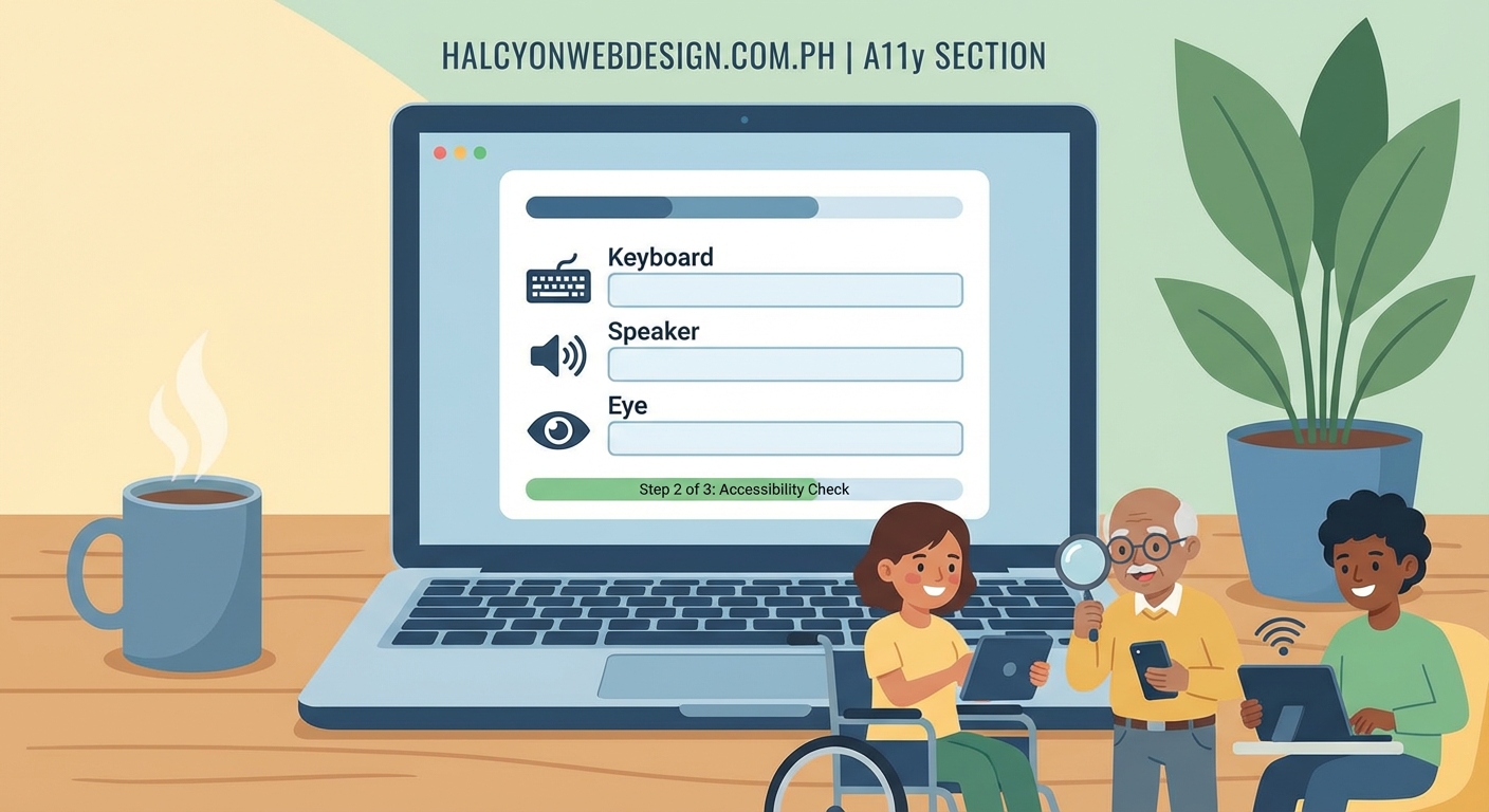
Around 15% of the global population lives with some form of disability. Screen readers, keyboard navigation, voice control, and other assistive technologies help these users interact with digital content. Forms that ignore accessibility guidelines create frustration and exclusion.
Consider a user with limited vision trying to complete a checkout form. If labels aren’t properly associated with input fields, their screen reader can’t announce what information goes where. Or think about someone with motor impairments who relies on keyboard navigation. If focus indicators are invisible or the tab order jumps around illogically, they can’t move through the form efficiently.
Accessible forms benefit everyone. Clear labels reduce confusion. Good error messages help all users fix mistakes faster. Logical structure makes forms easier to scan and complete, regardless of ability.
Start with semantic HTML elements
Native HTML form elements come with built-in accessibility features. Browsers and assistive technologies understand them automatically. Custom components built with divs and spans require extra ARIA attributes and JavaScript to achieve the same functionality.
Use the right element for each task:
<input>for text fields, checkboxes, and radio buttons<select>for dropdown menus<textarea>for multi-line text<button>for actions<label>for field descriptions<fieldset>and<legend>for grouping related inputs
These elements provide keyboard support, focus management, and semantic meaning without additional code. Screen readers announce them correctly. Browser autofill works better. Validation happens naturally.
Avoid recreating native elements with JavaScript unless absolutely necessary. If you must build custom components, test them thoroughly with keyboard navigation and screen readers.
Associate labels with every input field
Every form field needs a visible label that describes its purpose. Labels must be programmatically associated with their inputs so assistive technologies can announce them correctly.
The most reliable method uses the for attribute on the label element, matching it to the input’s id:
<label for="email-address">Email address</label>
<input type="email" id="email-address" name="email">
This creates an explicit association. When a screen reader focuses on the input, it announces “Email address, edit text.” Users understand what information belongs in that field.
You can also wrap the input inside the label element:
<label>
  Phone number
  <input type="tel" name="phone">
</label>
Both methods work. Choose one and stay consistent throughout your forms.
Never rely on placeholder text as the only label. Placeholders disappear when users start typing, making it impossible to verify what information goes in each field. They also have contrast issues and don’t work well with screen readers.
Provide clear instructions and context
Users need to understand what information you’re asking for and why. Provide instructions before the form starts, especially for complex or sensitive data collection.
Group related fields together using <fieldset> and <legend> elements. This creates semantic relationships that screen readers announce:
<fieldset>
  <legend>Shipping address</legend>
  <!-- address fields here -->
</fieldset>
When users enter the fieldset, their screen reader announces “Shipping address, group.” This context helps them understand the purpose of the following fields.
For individual fields that need extra explanation, use the aria-describedby attribute to link the input with additional help text:
<label for="password">Password</label>
<input type="password" id="password" aria-describedby="password-requirements">
<div id="password-requirements">
  Must be at least 8 characters with one number and one special character
</div>
Screen readers announce both the label and the description when users focus on the field.
Handle errors with helpful messages
Error handling makes or breaks form accessibility. Generic messages like “Invalid input” or “Error on page” leave users confused about what went wrong and how to fix it.
Follow these principles for accessible error messages:
- Identify which fields have errors clearly
- Explain what’s wrong in plain language
- Suggest how to fix the problem
- Make error messages visible and programmatically available
Use aria-invalid="true" on fields with errors and aria-describedby to link them with specific error messages:
<label for="birthdate">Date of birth</label>
<input type="date" id="birthdate" aria-invalid="true" aria-describedby="birthdate-error">
<div id="birthdate-error" role="alert">
  Please enter a valid date in MM/DD/YYYY format
</div>
The role="alert" attribute makes screen readers announce the error immediately when it appears.
Display error messages near their associated fields. Don’t just show a summary at the top of the form. Users need to see the problem in context when they’re trying to fix it.
| Error approach | Why it fails | Better alternative |
|---|---|---|
| Red border only | Color alone doesn’t convey meaning to screen readers or colorblind users | Add error icon and text message |
| Generic “Error” message | Doesn’t explain what’s wrong | “Email address must include @ symbol” |
| Error summary only | Users must scroll to find problems | Show errors next to each field |
| Validation on blur | Interrupts users before they finish typing | Validate on submit, then on blur for corrections |
Support keyboard navigation completely
Many users can’t use a mouse. They navigate with keyboards, switch controls, or other input devices that simulate keyboard commands. Your forms must work perfectly without a mouse.
Test every form by tabbing through it. The focus order should follow the visual order. Users should be able to:
- Reach every interactive element with Tab
- Activate buttons and links with Enter or Space
- Select radio buttons and checkboxes with Space
- Navigate dropdown menus with arrow keys
- Submit forms with Enter when focused on text inputs
Make focus indicators clearly visible. The default browser outline works fine. If you customize it, ensure sufficient contrast:
input:focus,
button:focus {
  outline: 3px solid #0066cc;
  outline-offset: 2px;
}
Never use outline: none without providing an alternative focus indicator. Users need to see where they are in the form.
Skip links help keyboard users bypass repeated navigation. Add a hidden link at the top of the page that jumps to the main form:
<a href="#main-form" class="skip-link">
  Skip to form
</a>
Style it to appear only when focused.
Choose the right input types
HTML5 input types provide built-in validation, appropriate keyboards on mobile devices, and better semantics for assistive technologies.
Use specific types instead of defaulting to type="text":
type="email"validates email format and shows @ on mobile keyboardstype="tel"displays numeric keypads on phonestype="url"validates web addresses and shows .com shortcutstype="number"restricts input to numbers with increment controlstype="date"provides accessible date pickerstype="search"indicates search functionality to assistive tech
These types improve usability for everyone while providing semantic meaning that helps screen reader users understand what information you’re requesting.
Add the autocomplete attribute to help browsers and password managers fill forms automatically:
<input type="email" name="email" autocomplete="email">
<input type="tel" name="phone" autocomplete="tel">
This reduces typing burden, especially for users with motor impairments.
Make required fields obvious
Users need to know which fields are mandatory before they start filling out the form. Use multiple methods to indicate required fields:
- Add the
requiredattribute to the input element - Include “(required)” in the label text
- Use
aria-required="true"for extra clarity - Explain your required field convention at the start of the form
Don’t rely solely on asterisks or color. Screen reader users might not hear them, and colorblind users might not see red indicators.
<label for="full-name">
  Full name (required)
</label>
<input type="text" id="full-name" name="name" required aria-required="true">
This approach combines visual, semantic, and programmatic indicators that work across different assistive technologies.
“The most accessible forms are the ones that don’t make users guess. Clear labels, obvious required fields, and helpful error messages remove barriers before they appear. Every design decision should ask: can a screen reader user complete this independently?” — WebAIM accessibility guidelines
Test with real assistive technologies
You can’t verify accessibility by looking at code alone. Test your forms with the same tools your users rely on.
Screen readers to test with:
- NVDA (free, Windows)
- JAWS (paid, Windows)
- VoiceOver (built into macOS and iOS)
- TalkBack (built into Android)
Navigate through your entire form with each screen reader. Listen to what gets announced. Can you understand what each field requires? Do error messages make sense when heard out loud? Can you complete the form without looking at the screen?
Test keyboard navigation in multiple browsers. Tab order should be logical. Focus indicators should be visible. All interactive elements should be reachable.
Use automated testing tools as a first pass:
- axe DevTools browser extension
- WAVE evaluation tool
- Lighthouse accessibility audit in Chrome DevTools
These tools catch common issues like missing labels, insufficient contrast, and invalid ARIA attributes. But they can’t verify whether your form actually makes sense to real users.
Manual testing reveals problems that automated tools miss. Invite users with disabilities to test your forms. Their feedback will highlight issues you never considered.
Common mistakes to avoid
Even developers who care about accessibility make these errors:
Using placeholder text as labels. Placeholders disappear when users type, have contrast problems, and aren’t reliably announced by screen readers.
Hiding labels visually. If sighted users can understand your form without visible labels, you’ve created a confusing interface. Labels help everyone.
Disabling paste in password fields. This security theater hurts users who rely on password managers. It makes forms less secure by discouraging strong passwords.
Auto-advancing focus. Moving focus automatically after users complete a field (like in phone number inputs) disorients screen reader users and breaks their mental model.
Timeout warnings without extensions. If your form has a timeout, warn users before it expires and provide a simple way to extend the session.
CAPTCHAs without alternatives. Visual puzzles exclude blind users. Audio alternatives often have poor quality. Consider honeypot fields or other bot detection methods.
Building forms that work for everyone
Accessible forms aren’t a separate version or an extra feature. They’re the baseline for good design. When you structure forms with semantic HTML, clear labels, helpful errors, and keyboard support, you create better experiences for all users.
Start your next form project by choosing the right HTML elements. Associate every label properly. Test with a keyboard before adding any mouse interactions. Listen to your form with a screen reader to hear what users actually experience.
Accessibility isn’t a checklist you complete once. It’s an ongoing practice of testing, learning, and improving. Every form you make more accessible removes barriers and opens your content to more people.