
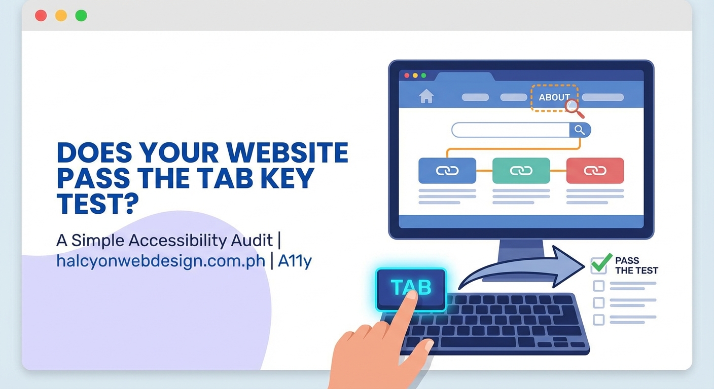
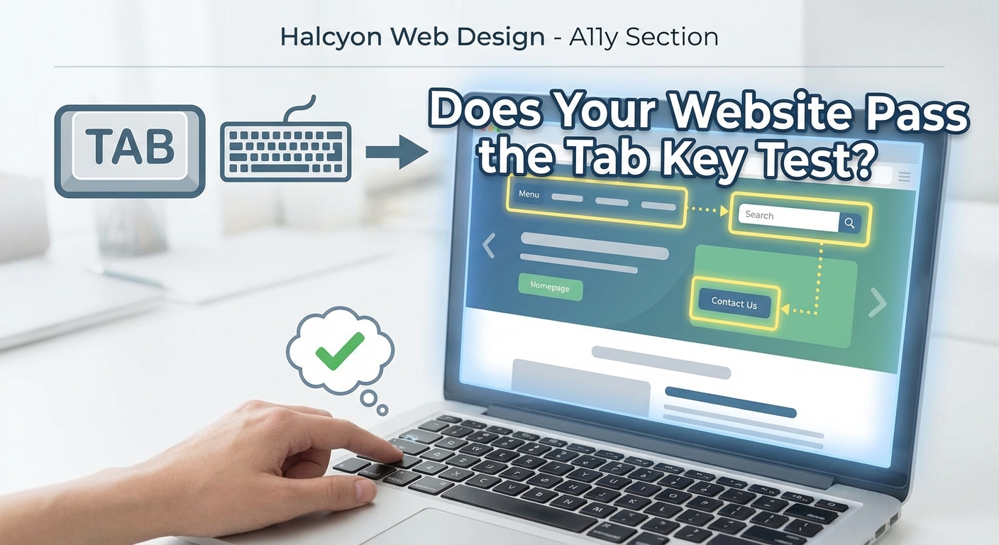
Your keyboard’s Tab key is one of the most powerful accessibility testing tools you own. No software license required. No installation needed. Just you, your keyboard, and about five minutes to uncover navigation barriers that affect millions of users.
Many people can’t use a mouse. They rely on keyboards, switch devices, or other assistive technology that mimics keyboard input. When your site fails the tab key accessibility test, you’re locking out veterans with motor impairments, developers who prefer keyboard shortcuts, and anyone with a temporary injury that makes mouse navigation painful.
The tab key accessibility test reveals keyboard navigation problems without specialized tools. Press Tab to move forward through interactive elements, Shift+Tab to move backward, and watch for visible focus indicators, logical tab order, and accessible custom components. This manual audit catches issues automated scanners miss and takes less than ten minutes per page.
What the tab key test actually reveals
Pressing Tab moves keyboard focus from one interactive element to the next. Every link, button, form field, and custom widget should receive focus in a logical order.
This test exposes five critical accessibility barriers.
First, missing or invisible focus indicators. When you can’t see where you are on the page, navigation becomes guesswork.
Second, inaccessible interactive elements. Divs styled as buttons won’t receive keyboard focus unless developers add proper ARIA attributes and tabindex values.
Third, broken tab order. When focus jumps randomly across the page instead of following visual layout, users lose context.
Fourth, keyboard traps. Modal dialogs or embedded widgets that capture focus without providing an escape route.
Fifth, hidden or off-screen elements that still receive focus, forcing users to tab through invisible content.
Running your first tab key accessibility test
Start with a clean browser window. Close unnecessary tabs to avoid confusion.
- Load the page you want to test
- Click into the address bar and press Tab
- Watch where focus moves and note the visual indicator
- Continue pressing Tab through every interactive element
- Use Shift+Tab to move backward and verify reverse order
- Press Enter or Space on focused elements to confirm they activate
- Document any element that doesn’t show a visible focus ring
- Note any jumps in tab order that don’t match visual layout
Test your homepage first. Then test your most common user flows like checkout, contact forms, and account creation.
“If you can’t complete a task using only your keyboard, neither can a significant portion of your audience. The Tab key doesn’t lie about accessibility.” – Accessibility consultant feedback from manual audits
Pay attention to custom components. Carousels, dropdown menus, date pickers, and modal windows often fail keyboard testing because developers build them with mouse interactions in mind.
Common problems the tab key reveals
Focus indicators are the most frequent failure. Browsers provide default focus styles, but many designers remove them without adding custom alternatives.
Here’s what good and bad focus management looks like:
| Element Type | Problem | Solution |
|---|---|---|
| Links | No visible outline when focused | Add :focus styles with 3:1 contrast ratio |
| Buttons | Outline removed with outline: none |
Use custom focus ring with box-shadow |
| Form fields | Focus state identical to default state | Add border color change and slight shadow |
| Custom widgets | Divs don’t receive focus at all | Use semantic HTML or add tabindex="0" |
| Modal dialogs | Focus escapes to background content | Trap focus within modal until closed |
| Skip links | Link exists but invisible on focus | Make visible on :focus state |
Tab order problems happen when CSS positioning conflicts with DOM order. A visually appealing layout might place the search box in the top right corner, but if that element appears late in the HTML, keyboard users won’t reach it until after tabbing through the entire navigation menu.
Keyboard traps occur in poorly coded modal windows, embedded iframes, or custom components. Users press Tab expecting to eventually cycle back to the beginning, but instead focus gets stuck inside a widget with no escape.
Some sites include hidden elements that still receive focus. Collapsed mobile menus, off-screen panels, or elements with opacity: 0 might remain in the tab order even when invisible.
Testing interactive components thoroughly
Navigation menus deserve special attention. Dropdown menus should open when the trigger receives focus, not just on hover.
Test this pattern:
- Tab to the menu trigger
- Press Enter or Space to open the submenu
- Tab through submenu items
- Press Escape to close the menu
- Verify focus returns to the trigger
Forms need comprehensive keyboard testing. Every field should be reachable with Tab. Radio buttons and checkboxes should toggle with Space. Dropdown selects should open with Alt+Down Arrow and allow arrow key navigation.
Custom date pickers often fail. Many JavaScript calendar widgets only work with mouse clicks. A proper implementation lets users type dates directly or navigate the calendar grid with arrow keys.
Modal dialogs must trap focus. When a modal opens, Tab should cycle through only the elements inside that modal. Shift+Tab from the first item should move to the last item, creating a focus loop.
The modal should also provide a keyboard method to close it. Escape key is standard, but a visible close button that receives focus works too.
Building a testing checklist
Create a repeatable process for every page audit.
Before you start:
- Close browser extensions that modify page behavior
- Test in multiple browsers (Chrome, Firefox, Safari)
- Clear any custom CSS that might hide focus indicators
- Have a notepad ready to document issues
During the test:
- Note the first element that receives focus
- Verify every interactive element is reachable
- Check that focus indicators have sufficient contrast
- Confirm tab order matches visual layout
- Test that Enter and Space activate focused elements
- Try to escape from modal dialogs with Escape key
- Look for focus moving to invisible elements
After the test:
- Prioritize issues by severity
- Group similar problems together
- Create tickets for development team
- Retest after fixes are deployed
Some developers find it helpful to test with a screen reader running simultaneously. This catches additional issues like missing labels or incorrect ARIA attributes, though that goes beyond pure keyboard testing.
Fixing what you find
Missing focus indicators need immediate attention. Never remove focus styles without adding custom alternatives.
This CSS provides a baseline:
“`css
*:focus {
outline: 2px solid #0066cc;
outline-offset: 2px;
}
Adjust colors to meet 3:1 contrast requirements against the background.
Tab order problems usually require HTML restructuring. Move elements in the DOM to match visual order, or use CSS Grid and Flexbox properties that maintain logical source order.
Avoid using positive tabindex values like tabindex="1" or tabindex="2". These create maintenance nightmares and often make tab order worse.
Keyboard traps in modals need focus management JavaScript. When opening a modal, store the trigger element, move focus to the modal’s first interactive element, and return focus to the trigger when closing.
Custom components built with divs need semantic HTML replacements or proper ARIA. A div styled as a button should actually be a <button> element. If you must use a div, add role="button" and tabindex="0", plus keyboard event handlers for Enter and Space.
Hidden elements should be removed from tab order. Use display: none or visibility: hidden instead of opacity: 0 or off-screen positioning. If an element must remain in the DOM but shouldn’t receive focus, add tabindex="-1".
When automated tools miss the mark
Automated accessibility scanners catch some keyboard issues but miss nuanced problems.
Tools can detect missing tabindex attributes or elements with outline: none. They can’t evaluate whether tab order makes logical sense, whether focus indicators have enough visual weight, or whether keyboard interactions feel natural.
The tab key accessibility test catches these human-centered problems. You experience the same frustration users face when focus jumps unexpectedly or disappears entirely.
Automated tools also struggle with dynamic content. They scan the initial page state but miss problems in opened modals, expanded accordions, or loaded infinite scroll content.
Manual keyboard testing reveals these issues immediately. You encounter the broken date picker, the impossible-to-close modal, the form that submits when you press Enter on the wrong field.
Testing beyond basic tabbing
Advanced keyboard testing includes additional keys and patterns.
Arrow keys should navigate within component groups. Radio buttons, toolbar buttons, and tab panels typically use arrow key navigation instead of Tab.
Escape should close dismissible elements like modals, tooltips, and dropdown menus.
Enter activates links and buttons. Space activates buttons and toggles checkboxes.
Home and End jump to the first and last items in lists or form groups.
Page Up and Page Down scroll content within scrollable regions.
These patterns follow ARIA Authoring Practices Guide conventions. Users familiar with keyboard navigation expect these behaviors.
Test your site against these patterns. Do your custom components follow established conventions? Or do they invent new keyboard interactions that users must learn?
Documenting and prioritizing issues
Create a simple spreadsheet to track findings.
Include these columns:
- Page URL
- Element description
- Issue type (missing focus, wrong order, keyboard trap)
- Severity (blocks task completion, causes confusion, minor annoyance)
- Steps to reproduce
- Suggested fix
Severity helps prioritize fixes. Keyboard traps that prevent task completion need immediate attention. Missing focus indicators on secondary navigation can wait slightly longer.
Group similar issues together. If every custom button lacks focus indicators, that’s a site-wide pattern requiring a systematic fix, not individual patches.
Share findings with your team using screenshots or screen recordings. Seeing the problem helps developers understand the user impact better than written descriptions alone.
Making keyboard testing routine
Run the tab key accessibility test every time you ship new features. Make it part of your definition of done.
Five minutes of keyboard testing catches problems before they reach production. Fixing them in development is faster and cheaper than responding to user complaints or legal notices.
Train your entire team to test with keyboards. Designers should verify their mockups are keyboard-friendly. Developers should test their code before creating pull requests. QA should include keyboard testing in every test plan.
Consider adding keyboard testing to your continuous integration pipeline. While automated tools can’t catch everything, they provide a baseline check that prevents obvious regressions.
The tab key accessibility test complements other accessibility audits. Combine it with color contrast checking, screen reader testing, and automated scanning for comprehensive coverage.
If you’re already thinking about visual polish, avoiding common typography mistakes helps create a more professional appearance alongside better accessibility.
Your keyboard knows the truth
The tab key accessibility test takes minutes to run and reveals problems that affect real people using your site right now. No expensive tools. No specialized training. Just methodical testing with the keyboard every user has.
Start with your homepage today. Press Tab and see where it takes you. You might be surprised by what you find. Then fix those issues and make your site work for everyone, regardless of how they navigate.