
You’ve probably copied and pasted the same color hex code dozens of times across your stylesheet. Then your client wants to change the brand color, and you spend an hour hunting down every instance.
There’s a better way.
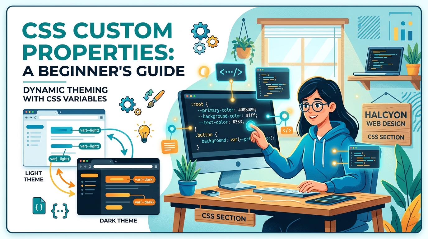
CSS custom properties (also called CSS variables) let you store values once and reuse them anywhere. Change one line, update your entire site. No preprocessor required. Just plain CSS that works in every modern browser.
CSS variables store reusable values like colors, spacing, and fonts in your stylesheet. Define them once with double-dash syntax, reference them with var(). They cascade like normal CSS, accept fallback values, and update dynamically with JavaScript. Perfect for theming, responsive design, and keeping your code maintainable as projects grow beyond a few hundred lines.
What makes CSS variables different from preprocessor variables
CSS variables live in the browser, not your build process.
Sass and Less variables get compiled away before your CSS reaches the user. They’re helpful during development, but once the stylesheet loads, those variables are gone. You can’t change them without rebuilding your entire CSS file.
CSS custom properties stick around. They exist in the DOM. JavaScript can read them, modify them, and respond to changes. Users can switch themes without reloading the page. Media queries can update variable values at different screen sizes.
The syntax looks different too. Preprocessor variables use dollar signs or at symbols. CSS variables use two dashes:
/* Sass variable (compile time) */
$primary-color: #3498db;

/* CSS variable (runtime) */
--primary-color: #3498db;
Both solve the repetition problem. But CSS variables solve it at a different layer, which opens up possibilities that preprocessors can’t match.
How to declare your first CSS variable
CSS variables need a scope. Most developers put global variables on the :root selector, which targets the document root (the <html> element in web pages).
:root {
  --primary-color: #2c3e50;
  --secondary-color: #e74c3c;
  --spacing-unit: 1rem;
  --font-body: 'Inter', sans-serif;
}
The double-dash prefix tells the browser this is a custom property. The name after the dashes can be anything you want, but keep it descriptive.
Variable names are case-sensitive. --primary-Color and --primary-color are two different variables.
You can declare variables anywhere in your CSS, not just on :root. Any selector works:
.card {
  --card-padding: 1.5rem;
  --card-radius: 8px;
}
Variables declared on a selector are only available to that element and its children. This scoping behavior is what makes CSS variables powerful for component-based designs.
Using variables with the var() function
After declaring a variable, reference it with var():
.button {
  background-color: var(--primary-color);
  padding: var(--spacing-unit);
  font-family: var(--font-body);
}
The browser looks up the variable value and substitutes it wherever you use var().
You can provide a fallback value as a second argument:
.button {
  background-color: var(--primary-color, #333);
}
If --primary-color isn’t defined anywhere in the scope chain, the browser uses #333 instead. This prevents broken styles when variables are missing.
Fallbacks are particularly useful when building reusable components that might work in different contexts:
.badge {
  background: var(--badge-color, var(--secondary-color, gray));
}
This checks for --badge-color first, falls back to --secondary-color, and finally uses gray if neither exists.
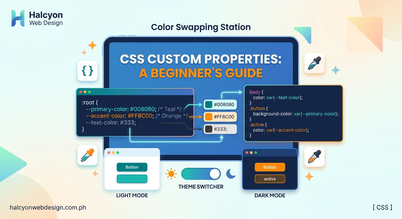
Building a simple theme switcher
Let’s create a practical example: a light and dark theme controlled by CSS variables.
Start with your base colors on :root:
:root {
  --bg-color: #ffffff;
  --text-color: #333333;
  --border-color: #dddddd;
}
Apply these variables to your elements:
body {
  background-color: var(--bg-color);
  color: var(--text-color);
}

.card {
  border: 1px solid var(--border-color);
}
Now add a dark theme by overriding the variables on a class:
.dark-theme {
  --bg-color: #1a1a1a;
  --text-color: #f0f0f0;
  --border-color: #444444;
}
Toggle the theme by adding or removing the dark-theme class on your <body> element. Every element that uses those variables updates automatically.
No need to write separate style rules for every component. The variables cascade down through your document tree, and everything just works.
Common mistakes and how to avoid them
| Mistake | Why it breaks | Fix |
|---|---|---|
| Using var() in media queries | Variables can’t be used in @media rules | Use the variable inside the rule block, not in the condition |
| Forgetting the double-dash | Browser doesn’t recognize it as a custom property | Always prefix with -- |
| Circular references | Variable references itself | Check your var() calls for loops |
| Missing fallback values | Styles break when variable is undefined | Add fallback: var(--color, blue) |
| Using variables in calc() without units | Math operations need consistent units | Include units: calc(var(--size) * 1px) |
The most common error is trying to use variables in places CSS doesn’t allow them:
/* This doesn't work */
@media (min-width: var(--breakpoint)) {
  /* styles */
}

/* This does */
:root {
  --breakpoint: 768px;
}

@media (min-width: 768px) {
  .container {
    max-width: var(--container-width);
  }
}
Media query conditions get evaluated before the CSS cascade runs, so variables aren’t available yet.
Practical color palette setup
Good color systems use variables for both exact colors and semantic meanings.
Start with your brand colors:
:root {
  /* Brand colors */
  --color-blue-500: #3b82f6;
  --color-blue-600: #2563eb;
  --color-gray-100: #f3f4f6;
  --color-gray-900: #111827;

  /* Semantic tokens */
  --color-primary: var(--color-blue-500);
  --color-primary-dark: var(--color-blue-600);
  --color-background: var(--color-gray-100);
  --color-text: var(--color-gray-900);
}
This two-tier system separates your palette from its usage. When you need to swap out blue for green, you only change the semantic tokens. All your components continue working.
The approach scales well when you need multiple themes. Each theme overrides the semantic tokens while keeping the base palette intact.
If you’re building a complete color system, consider reading about how to choose the perfect color palette for your website in 5 steps to understand the strategy behind effective color selection.
Setting up a spacing scale
Consistent spacing makes designs feel cohesive. Variables make spacing scales easy to maintain.
:root {
  --space-xs: 0.25rem;
  --space-sm: 0.5rem;
  --space-md: 1rem;
  --space-lg: 1.5rem;
  --space-xl: 2rem;
  --space-2xl: 3rem;
}
Use these for margins, padding, and gaps:
.card {
  padding: var(--space-lg);
  margin-bottom: var(--space-md);
}

.button {
  padding: var(--space-sm) var(--space-md);
}
The scale creates rhythm across your interface. Elements feel related because they use the same spacing increments.
Some developers prefer a multiplier system:
:root {
  --space-unit: 0.5rem;
}

.element {
  padding: calc(var(--space-unit) * 2); /* 1rem */
  margin: calc(var(--space-unit) * 4); /* 2rem */
}
Both approaches work. Pick the one that matches how you think about spacing.
Typography with CSS variables
Font stacks, sizes, and weights all benefit from variables.
:root {
  /* Font families */
  --font-sans: -apple-system, BlinkMacSystemFont, 'Segoe UI', sans-serif;
  --font-mono: 'Fira Code', 'Courier New', monospace;

  /* Font sizes */
  --text-xs: 0.75rem;
  --text-sm: 0.875rem;
  --text-base: 1rem;
  --text-lg: 1.125rem;
  --text-xl: 1.25rem;
  --text-2xl: 1.5rem;

  /* Font weights */
  --font-normal: 400;
  --font-medium: 500;
  --font-bold: 700;
}
Apply them consistently:
body {
  font-family: var(--font-sans);
  font-size: var(--text-base);
  font-weight: var(--font-normal);
}

h1 {
  font-size: var(--text-2xl);
  font-weight: var(--font-bold);
}

code {
  font-family: var(--font-mono);
  font-size: var(--text-sm);
}
This setup makes global typography changes simple. Need to increase all font sizes by 10%? Update the base values. Everything scales proportionally.
Typography mistakes can undermine your design faster than almost anything else. Learn about 7 typography mistakes that make your website look unprofessional to avoid common pitfalls.
Responsive design with CSS variables
Variables can change values at different breakpoints, creating responsive designs without duplicating rules.
:root {
  --container-padding: 1rem;
  --heading-size: 1.5rem;
}

@media (min-width: 768px) {
  :root {
    --container-padding: 2rem;
    --heading-size: 2rem;
  }
}

@media (min-width: 1024px) {
  :root {
    --container-padding: 3rem;
    --heading-size: 2.5rem;
  }
}

.container {
  padding: var(--container-padding);
}

h1 {
  font-size: var(--heading-size);
}
The .container and h1 rules never change. Only the variable values update at each breakpoint. This keeps your responsive code organized and reduces repetition.
You can also use variables for breakpoint values themselves, even though you can’t use them directly in media queries:
:root {
  --breakpoint-tablet: 768px;
  --breakpoint-desktop: 1024px;
}

/* Reference these values in your media queries */
@media (min-width: 768px) { /* Use the pixel value, not var() */
  /* styles */
}
Keep the pixel values in comments next to your variables so you remember what they are.
Component-scoped variables
Not every variable needs to be global. Component-specific variables keep related values together.
.card {
  --card-bg: white;
  --card-border: #e0e0e0;
  --card-shadow: 0 2px 4px rgba(0,0,0,0.1);

  background: var(--card-bg);
  border: 1px solid var(--card-border);
  box-shadow: var(--card-shadow);
}

.card.featured {
  --card-bg: #f8f9fa;
  --card-border: #3b82f6;
  --card-shadow: 0 4px 8px rgba(59,130,246,0.2);
}
The featured variant overrides the component variables without touching the base .card rules. This pattern works well with modifier classes.
Children inherit these variables too:
.card {
  --card-spacing: 1rem;
}

.card-header {
  padding: var(--card-spacing);
}

.card-body {
  padding: var(--card-spacing);
}
If you need tighter spacing on a specific card, override --card-spacing on that instance. All the child elements adjust automatically.
Working with calc() and CSS variables
The calc() function lets you perform math with variables.
:root {
  --base-size: 1rem;
  --multiplier: 1.5;
}

.element {
  font-size: calc(var(--base-size) * var(--multiplier));
  padding: calc(var(--base-size) / 2);
  margin: calc(var(--base-size) + 0.5rem);
}
This is particularly useful for creating relationships between values:
:root {
  --sidebar-width: 250px;
}

.sidebar {
  width: var(--sidebar-width);
}

.main-content {
  width: calc(100% - var(--sidebar-width));
}
The main content area automatically adjusts when you change the sidebar width. No need to update multiple values manually.
You can nest calc() inside var() fallbacks:
.element {
  width: var(--custom-width, calc(100% - 2rem));
}
If --custom-width isn’t defined, the element gets full width minus 2rem of padding.
Managing variables in larger projects
As projects grow, organize variables into logical groups. Some teams use separate stylesheets:
- Create a
variables.cssfile for all your custom properties - Import it before other styles
- Group related variables with comments
/* variables.css */

/* ========================================
   Colors
   ======================================== */
:root {
  --color-primary: #3b82f6;
  --color-secondary: #8b5cf6;
}

/* ========================================
   Typography
   ======================================== */
:root {
  --font-sans: system-ui, sans-serif;
  --text-base: 1rem;
}

/* ========================================
   Spacing
   ======================================== */
:root {
  --space-sm: 0.5rem;
  --space-md: 1rem;
}
Some developers prefer a naming convention that shows the category:
:root {
  /* Colors */
  --clr-primary: #3b82f6;
  --clr-secondary: #8b5cf6;

  /* Spacing */
  --sp-sm: 0.5rem;
  --sp-md: 1rem;

  /* Typography */
  --fs-base: 1rem;
  --fs-lg: 1.25rem;
}
The abbreviated prefixes keep variable names short while maintaining clarity about what each one controls.
Browser support and fallbacks
CSS variables work in all modern browsers. Internet Explorer doesn’t support them, but IE reached end-of-life in 2022.
If you need to support older browsers, provide fallback values:
.element {
  background: #3b82f6; /* Fallback */
  background: var(--primary-color);
}
Browsers that don’t understand var() ignore the second declaration and use the first one. Modern browsers override the fallback with the variable value.
Feature detection in JavaScript can help too:
if (window.CSS && CSS.supports('color', 'var(--test)')) {
  // Browser supports CSS variables
  document.documentElement.style.setProperty('--theme', 'modern');
} else {
  // Use fallback approach
  document.body.className = 'legacy-theme';
}
For most projects in 2024, fallbacks aren’t necessary. Focus on writing clean, maintainable variable-based CSS.
Debugging CSS variables
Browser DevTools show variable values and where they’re defined.
In Chrome or Edge:
* Open DevTools
* Select an element
* Look at the Styles panel
* Variables appear with their computed values
* Click the variable name to jump to its definition
In Firefox:
* Open DevTools
* Select an element
* Check the Rules panel
* Variables show their source and current value
* Invalid variables appear crossed out
Common debugging steps:
- Check if the variable is defined in scope
- Verify the syntax (double-dash prefix, valid characters)
- Look for typos in the variable name
- Confirm the variable has a value assigned
- Check if a more specific selector is overriding it
If a variable isn’t working, try using it on the :root selector first. If it works there, the problem is scope-related.
Combining variables with other CSS features
CSS variables work alongside other modern CSS features.
With Grid:
:root {
  --grid-gap: 1rem;
  --grid-columns: 3;
}

.grid {
  display: grid;
  gap: var(--grid-gap);
  grid-template-columns: repeat(var(--grid-columns), 1fr);
}
With Flexbox:
:root {
  --flex-gap: 1rem;
}

.flex-container {
  display: flex;
  gap: var(--flex-gap);
}
With animations:
:root {
  --animation-duration: 300ms;
  --animation-easing: ease-in-out;
}

.animated {
  transition: all var(--animation-duration) var(--animation-easing);
}
Variables make it easy to maintain consistent timing, spacing, and sizing across different layout methods. If you’re working with complex layouts, understanding 7 CSS grid layout patterns every WordPress developer should know can help you apply variables more effectively.
JavaScript integration for dynamic theming
JavaScript can read and write CSS variables, making dynamic theming straightforward.
Reading a variable:
const root = document.documentElement;
const primaryColor = getComputedStyle(root)
  .getPropertyValue('--primary-color');
console.log(primaryColor); // "#3b82f6"
Setting a variable:
document.documentElement.style
  .setProperty('--primary-color', '#8b5cf6');
Building a theme switcher:
const themes = {
  light: {
    '--bg-color': '#ffffff',
    '--text-color': '#333333'
  },
  dark: {
    '--bg-color': '#1a1a1a',
    '--text-color': '#f0f0f0'
  }
};

function setTheme(themeName) {
  const theme = themes[themeName];
  Object.keys(theme).forEach(property => {
    document.documentElement.style
      .setProperty(property, theme[property]);
  });
}

// Switch to dark theme
setTheme('dark');
This approach works without adding or removing classes. The variables update in place, and every element using them reflects the change immediately.
You can also store user preferences:
function saveTheme(themeName) {
  localStorage.setItem('theme', themeName);
  setTheme(themeName);
}

function loadTheme() {
  const saved = localStorage.getItem('theme');
  if (saved) {
    setTheme(saved);
  }
}

// Load on page load
loadTheme();
Real-world example: building a button system
Let’s build a complete button component using variables.
:root {
  /* Button base variables */
  --btn-padding-y: 0.5rem;
  --btn-padding-x: 1rem;
  --btn-font-size: 1rem;
  --btn-border-radius: 0.25rem;
  --btn-transition: 150ms ease;

  /* Button color variables */
  --btn-primary-bg: #3b82f6;
  --btn-primary-text: white;
  --btn-primary-hover: #2563eb;

  --btn-secondary-bg: #6b7280;
  --btn-secondary-text: white;
  --btn-secondary-hover: #4b5563;
}

.btn {
  padding: var(--btn-padding-y) var(--btn-padding-x);
  font-size: var(--btn-font-size);
  border-radius: var(--btn-border-radius);
  border: none;
  cursor: pointer;
  transition: background-color var(--btn-transition);
}

.btn-primary {
  background-color: var(--btn-primary-bg);
  color: var(--btn-primary-text);
}

.btn-primary:hover {
  background-color: var(--btn-primary-hover);
}

.btn-secondary {
  background-color: var(--btn-secondary-bg);
  color: var(--btn-secondary-text);
}

.btn-secondary:hover {
  background-color: var(--btn-secondary-hover);
}

.btn-lg {
  --btn-padding-y: 0.75rem;
  --btn-padding-x: 1.5rem;
  --btn-font-size: 1.125rem;
}

.btn-sm {
  --btn-padding-y: 0.25rem;
  --btn-padding-x: 0.75rem;
  --btn-font-size: 0.875rem;
}
This system is flexible. Size variants override only the variables they need to change. Color variants work the same way. You can combine them freely:
<button class="btn btn-primary btn-lg">Large Primary</button>
<button class="btn btn-secondary btn-sm">Small Secondary</button>
Adding a new size or color variant means defining a few variables. The base .btn class handles the rest.
Performance considerations
CSS variables have minimal performance impact. The browser evaluates them during the cascade, just like any other CSS property.
A few guidelines:
- Variables don’t slow down rendering
- Changing a variable triggers a repaint, just like changing any CSS value
- Using hundreds of variables is fine
- Deeply nested variable references can slow down DevTools, but not the actual page
Avoid unnecessary recalculations:
/* Less efficient */
.element {
  width: calc(var(--base) * var(--multiplier) * var(--scale));
}

/* More efficient */
:root {
  --computed-width: calc(var(--base) * var(--multiplier) * var(--scale));
}

.element {
  width: var(--computed-width);
}
Compute complex values once and store the result in a variable. Reference that variable instead of recalculating every time.
Troubleshooting checklist
When variables aren’t working:
- Is the variable name spelled correctly?
- Does it have the
--prefix? - Is it defined in a parent element or
:root? - Are you using
var()to reference it? - Does the property accept the type of value you’re providing?
- Are you trying to use it somewhere variables aren’t allowed (like media queries)?
- Is another rule overriding it with a more specific selector?
- Did you include a fallback value for safety?
Check the DevTools Styles panel. Invalid variables show up with a warning icon. Hover over them to see why they failed.
If a variable works in one component but not another, scope is usually the issue. Move the variable to :root or a common parent element.
Taking variables further
Once you’re comfortable with the basics, you can explore advanced patterns:
- CSS variables in custom properties for components
- Variable-driven animation systems
- Responsive typography with fluid variables
- Theme generation from a small set of base variables
- Component libraries built entirely on variables
The concepts you’ve learned here apply to all of these. Start simple, build real projects, and add complexity as you need it.
“CSS variables are the first native CSS feature that lets you store and reuse values across your entire stylesheet. They’re not just about convenience. They fundamentally change how you architect CSS for scale.” – CSS Working Group
Making variables work for you
CSS variables transform how you write and maintain stylesheets. They reduce repetition, make global changes simple, and enable dynamic theming without JavaScript.
Start by converting your most-repeated values into variables. Colors, spacing, and font sizes are good candidates. Build a small system, use it in a real project, and expand from there.
You don’t need to refactor everything at once. Add variables gradually as you touch different parts of your codebase. Over time, you’ll develop patterns that work for your projects and your team.
The best way to learn is to build something. Pick a small project, define a few variables, and see how they simplify your workflow. You’ll quickly find situations where variables save you time and make your code more maintainable.