Not everyone uses a mouse to browse the web. Some users navigate entirely with a keyboard due to motor disabilities, visual impairments, or simply preference. If your site doesn’t support keyboard navigation, you’re locking out a significant portion of your audience and failing WCAG compliance standards.
Keyboard navigation accessibility ensures all interactive elements on your website can be accessed and operated using only a keyboard. This guide covers WCAG requirements, implementation techniques, testing procedures, and fixes for common keyboard traps. You’ll learn how to create a logical tab order, style focus indicators, manage skip links, and handle modals without breaking the user experience for keyboard-only visitors.
Why keyboard navigation matters for your website
Approximately 15% of the global population lives with some form of disability. Many rely on keyboards, switch devices, or assistive technologies that simulate keyboard input. When you build a site that works without a mouse, you’re not just checking a compliance box. You’re making your content accessible to people with:
- Motor disabilities that make mouse control difficult or impossible
- Visual impairments who use screen readers with keyboard commands
- Temporary injuries like a broken arm or wrist strain
- Personal preferences for keyboard shortcuts and efficiency
WCAG 2.1 Level A requires that all functionality be available from a keyboard. Level AA adds requirements for visible focus indicators and no keyboard traps. If you’re building for government, education, or enterprise clients, these aren’t optional features.
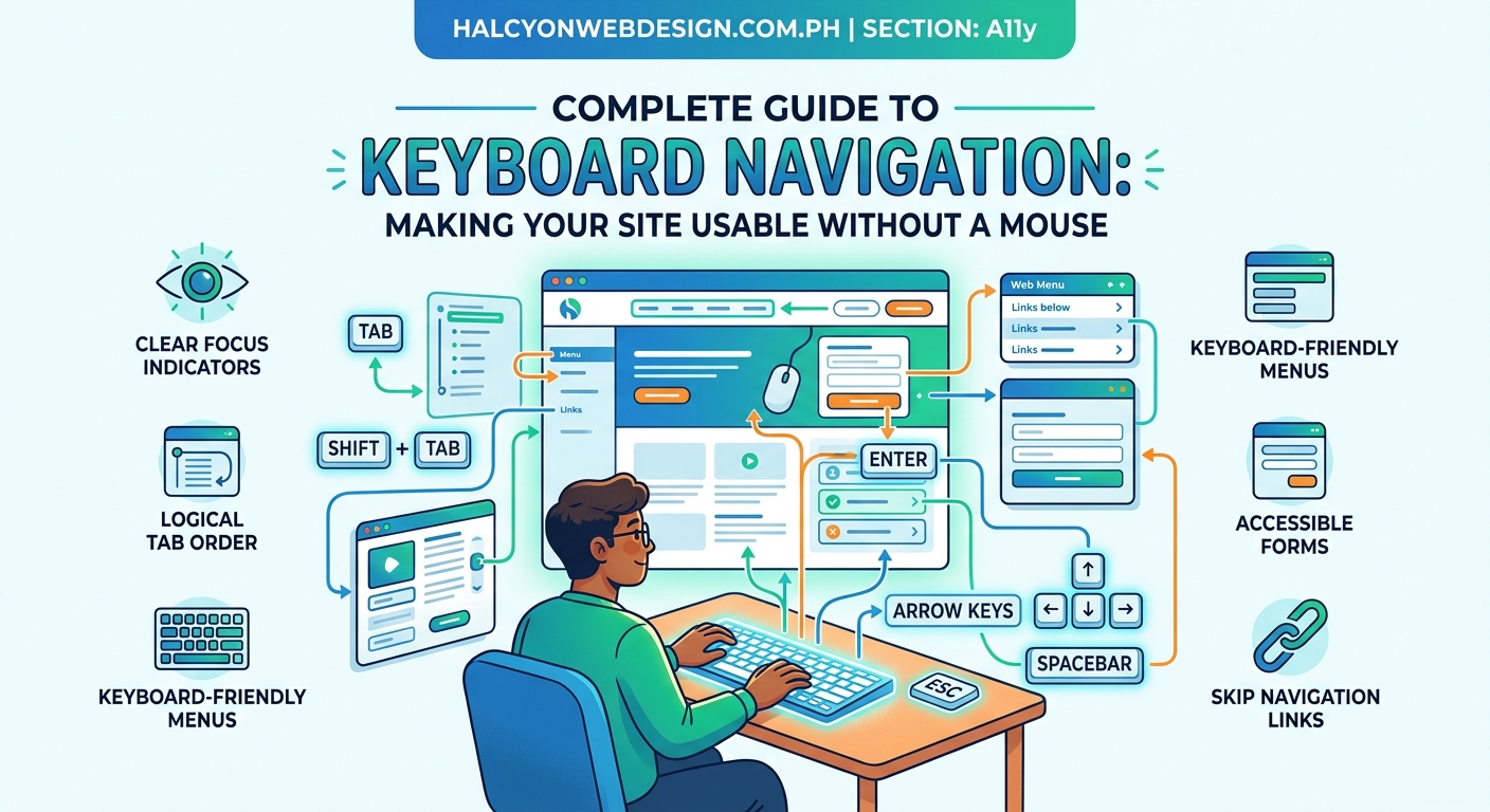
Understanding the tab order and focus management
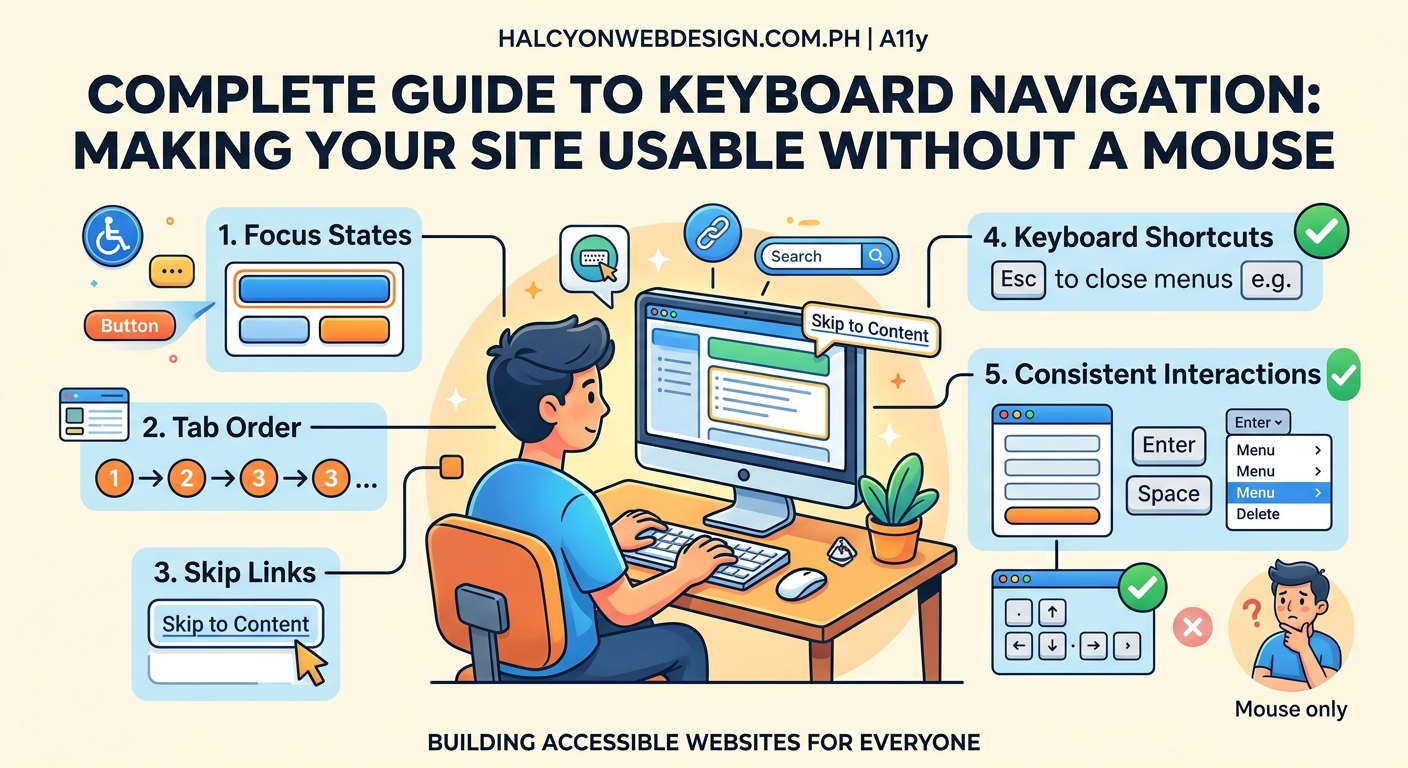
Tab order determines the sequence in which elements receive focus when a user presses the Tab key. Browsers calculate this automatically based on the DOM order, but you can override it with the tabindex attribute.
Here’s how tabindex values work:
| Value | Behavior | When to use |
|---|---|---|
tabindex="0" |
Element enters natural tab order | Making custom interactive elements keyboard accessible |
tabindex="-1" |
Element can receive focus programmatically but not via Tab | Managing focus in modals, skip links, or error messages |
tabindex="1+" |
Element enters tab order at specified position | Almost never (breaks expected flow) |
The DOM order should match the visual order. If your CSS positions elements differently than they appear in HTML, keyboard users will experience a confusing, jumping focus indicator.
“The most common keyboard navigation mistake I see is developers using positive tabindex values to ‘fix’ a broken layout. Instead of reordering the DOM, they create a tab sequence that makes no logical sense to users.” – Accessibility consultant review
How to implement keyboard navigation step by step
Follow this process to ensure your site supports keyboard navigation from the ground up.
1. Start with semantic HTML
Use native interactive elements whenever possible. Buttons, links, form inputs, and select menus are keyboard accessible by default. Custom divs styled as buttons are not.
Bad approach:
<div class="button" onclick="submitForm()">Submit</div>
Good approach:
<button type="submit">Submit</button>
If you must use a non-interactive element for interaction, add role, tabindex="0", and keyboard event handlers.
2. Create visible focus indicators
The default browser focus outline is often removed by developers who find it visually unappealing. Never remove :focus styles without replacing them with something equally visible.
Minimum requirements for WCAG 2.1 Level AA:
– Focus indicator must have a contrast ratio of at least 3:1 against adjacent colors
– Indicator must be at least 2 CSS pixels thick or have an area at least as large as a 1px border around the element
Example CSS:
a:focus,
button:focus,
input:focus {
  outline: 3px solid #0066cc;
  outline-offset: 2px;
}
Test your focus indicators by tabbing through your site. Can you always tell which element has focus? If you have to squint or guess, your indicator needs improvement. The guide on improving keyboard focus styles covers advanced techniques for different component types.
3. Add skip links for main content
Skip links let keyboard users bypass repetitive navigation and jump straight to the main content. This is a WCAG Level A requirement.
Implementation:
<body>
  <a href="#main-content" class="skip-link">Skip to main content</a>
  <header>
    <!-- Navigation -->
  </header>
  <main id="main-content" tabindex="-1">
    <!-- Page content -->
  </main>
</body>
The skip link should be the first focusable element on the page. You can hide it visually until focused using this CSS:
.skip-link {
  position: absolute;
  top: -40px;
  left: 0;
  background: #000;
  color: #fff;
  padding: 8px;
  z-index: 100;
}

.skip-link:focus {
  top: 0;
}
Learn more about implementing accessible skip links that work across all browsers.
4. Handle keyboard traps properly
A keyboard trap occurs when focus enters a component but cannot exit using standard keyboard commands. This violates WCAG 2.1 Level A.
Common trap scenarios:
– Modals that don’t allow Escape key to close
– Custom select dropdowns that don’t release focus
– Infinite carousels with no exit mechanism
– Embedded iframes without proper focus management
For modals, implement focus trapping that:
– Moves focus to the modal when opened
– Restricts Tab navigation to elements within the modal
– Returns focus to the trigger element when closed
– Closes on Escape key press
5. Test with keyboard only
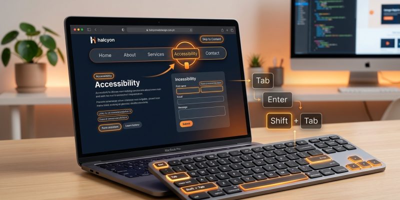
Unplug your mouse and navigate your entire site using only these keys:
- Tab: Move forward through interactive elements
- Shift + Tab: Move backward
- Enter: Activate links and buttons
- Space: Toggle checkboxes, activate buttons
- Arrow keys: Navigate within components like radio groups, dropdowns, sliders
- Escape: Close modals and dismiss overlays
Can you reach every interactive element? Can you complete every task? If you get stuck anywhere, you’ve found a keyboard trap that needs fixing.
Common keyboard navigation mistakes and fixes
Missing focus on custom components
Dropdowns, accordions, tabs, and carousels built with divs often lack keyboard support. Add role, tabindex, and appropriate ARIA attributes.
For a custom accordion:
<button
  aria-expanded="false"
  aria-controls="panel-1"
  id="accordion-trigger-1">
  Section Title
</button>
<div
  id="panel-1"
  role="region"
  aria-labelledby="accordion-trigger-1"
  hidden>
  Content here
</div>
The pure CSS accordion guide shows how to build this pattern without JavaScript while maintaining accessibility.
Invisible focus indicators
Some designs use outline: none globally without replacement styles. This makes keyboard navigation impossible to track.
Fix:
*:focus {
  outline: 2px solid currentColor;
  outline-offset: 2px;
}
Use currentColor to inherit the text color, ensuring the outline is visible against varied backgrounds. For better control, define focus styles for each component type.
Illogical tab order
When visual layout doesn’t match DOM order, tab navigation jumps unpredictably across the page.
Example problem: A sidebar appears on the right visually but comes after the main content in HTML. Users tab through all main content before reaching sidebar links.
Solution: Reorder your HTML to match visual flow, or use CSS Grid to position elements without changing DOM order. The CSS Grid layout patterns article demonstrates how to achieve complex layouts while maintaining logical source order.
Forms without proper labeling
Unlabeled form fields are confusing for screen reader users and difficult to navigate by keyboard.
Bad:
<input type="text" placeholder="Email address">
Good:
<label for="email">Email address</label>
<input type="text" id="email" name="email">
The placeholder is not a substitute for a label. Screen readers announce labels when fields receive focus, providing context for keyboard users. More details in the accessible forms guide.
Modals that trap or lose focus
When a modal opens, focus should move to the modal. When it closes, focus should return to the trigger element. Without this management, keyboard users get lost.
JavaScript pattern:
const modal = document.getElementById('modal');
const trigger = document.getElementById('open-modal');
const closeBtn = modal.querySelector('.close');

trigger.addEventListener('click', () => {
  modal.showModal();
  closeBtn.focus();
});

closeBtn.addEventListener('click', () => {
  modal.close();
  trigger.focus();
});

modal.addEventListener('keydown', (e) => {
  if (e.key === 'Escape') {
    modal.close();
    trigger.focus();
  }
});
Testing tools and techniques for keyboard accessibility
Manual testing catches most issues, but automated tools help identify problems you might miss.
Browser testing checklist
- Tab through every page and verify all interactive elements receive focus
- Confirm focus indicator is visible at every stop
- Test form submission using only Enter key
- Verify dropdowns open and close with keyboard
- Check that modals trap focus and release on close
- Test skip links actually jump to target content
Automated testing tools
These tools scan your HTML and flag potential keyboard accessibility issues:
- axe DevTools: Browser extension that identifies missing tabindex, focus issues, and ARIA problems
- WAVE: Visual feedback tool showing tab order and accessibility errors
- Lighthouse: Built into Chrome DevTools, includes keyboard navigation checks in accessibility audit
- Pa11y: Command-line tool for CI/CD integration
None of these replace manual testing. Automated tools can’t detect illogical tab order or confusing focus patterns that only become apparent through actual use.
Screen reader testing
Test with at least one screen reader to understand how keyboard navigation pairs with assistive technology:
- NVDA (Windows, free)
- JAWS (Windows, paid)
- VoiceOver (macOS/iOS, built-in)
- TalkBack (Android, built-in)
Screen readers use keyboard commands for navigation. Testing with them reveals whether your semantic HTML and ARIA labels provide sufficient context. The screen reader troubleshooting guide covers common issues and fixes.
Advanced keyboard navigation patterns
Managing focus in single-page applications
SPAs that update content without page refreshes need explicit focus management. When navigating to a new view, move focus to the main heading or content container.
function navigateToPage(pageId) {
  // Update content
  loadContent(pageId);

  // Move focus to new content
  const heading = document.querySelector('h1');
  heading.tabIndex = -1;
  heading.focus();
}
Setting tabindex="-1" allows non-interactive elements to receive programmatic focus without entering the tab order.
Keyboard shortcuts for complex interfaces
Applications with many interactive elements benefit from keyboard shortcuts. Document them clearly and avoid conflicts with browser or screen reader shortcuts.
Best practices:
– Use modifier keys (Ctrl, Alt, Shift) to avoid conflicts
– Provide a keyboard shortcut reference (often accessed via “?”)
– Allow users to customize or disable shortcuts
– Announce shortcuts to screen readers using aria-keyshortcuts
Focus visible vs focus within
CSS provides two pseudo-classes for focus styling:
:focusapplies when element has focus:focus-visibleapplies only when browser determines focus should be visible (typically keyboard navigation, not mouse clicks):focus-withinapplies to parent when any child has focus
Use :focus-visible to show outlines for keyboard users while hiding them for mouse users:
button:focus-visible {
  outline: 3px solid #0066cc;
  outline-offset: 2px;
}
Not all browsers support :focus-visible yet, so include a :focus fallback.
Keyboard navigation in WordPress themes
WordPress themes often include complex navigation menus, sliders, and interactive components that need keyboard support.
Accessible menu navigation
WordPress menus should support arrow key navigation within submenus. Many themes use JavaScript to enhance keyboard support beyond basic tab navigation.
Check your theme’s menu behavior:
– Can you open submenus with Enter or Space?
– Do arrow keys navigate between menu items?
– Does Escape close submenus?
– Can you reach all menu items without a mouse?
If your theme fails these tests, consider switching to one with better accessibility. The WordPress theme selection guide includes accessibility as a key evaluation criterion.
Plugin compatibility
Not all WordPress plugins support keyboard navigation properly. Before installing a plugin, check:
– Does the demo work with keyboard only?
– Are there documented accessibility features?
– Do reviews mention keyboard or screen reader compatibility?
The WordPress plugin selection guide covers how to evaluate plugins for accessibility before installation.
Block editor considerations
The WordPress block editor (Gutenberg) has its own keyboard shortcuts. Document these for content editors who prefer keyboard navigation:
Ctrl/Cmd + Alt + T: Insert new block beforeCtrl/Cmd + Alt + Y: Insert new block afterAlt + F10: Navigate to block toolbar/: Open block inserter
These shortcuts make content editing faster for keyboard users.
WCAG conformance levels for keyboard navigation
Understanding WCAG levels helps you prioritize implementation.
Level A (minimum)
- All functionality available from keyboard
- No keyboard traps (with documented exceptions for plugins like Flash)
- Focus order preserves meaning and operability
Level AA (recommended)
- Visible focus indicator for all interactive elements
- Focus indicator meets contrast requirements
- Multiple ways to find pages (search, sitemap, navigation)
Level AAA (enhanced)
- Keyboard shortcuts use only one character and can be turned off or remapped
- Focus indicator has enhanced visibility
- Help available for context-sensitive assistance
Most organizations target Level AA compliance. Level AAA is difficult to achieve across an entire site but may be required for specific sections serving users with disabilities.
Maintaining keyboard accessibility over time
Keyboard navigation isn’t a one-time fix. New features and updates can introduce accessibility regressions.
Include keyboard testing in your QA process
Before deploying any update:
– Tab through affected pages
– Test new interactive components
– Verify focus indicators remain visible
– Check that modals and overlays work properly
Add keyboard navigation tests to your deployment checklist alongside performance and browser compatibility checks.
Monitor for regressions
Use automated testing tools in your CI/CD pipeline to catch accessibility issues before they reach production. Tools like Pa11y or axe-core can run on every commit.
Set up alerts for:
– Missing alt text on images
– Form inputs without labels
– Interactive elements without keyboard support
– Focus indicator contrast failures
Train your team
Everyone who touches your website should understand keyboard navigation basics:
- Developers need to know semantic HTML and ARIA patterns
- Designers should include focus states in mockups
- Content editors must understand heading hierarchy and link text
- QA testers should include keyboard navigation in test plans
Regular training sessions keep accessibility top of mind as team members change and new features launch.
Building keyboard navigation into your workflow
Making keyboard accessibility a standard practice prevents problems before they start.
Start with semantic HTML. Native elements work out of the box. Custom components require extra effort to match that baseline functionality.
Test early and often. Don’t wait until launch to discover keyboard traps and missing focus indicators. Catch issues during development when they’re easier to fix.
Document your patterns. Create a component library showing how your team implements accessible dropdowns, modals, tabs, and other interactive elements. Consistency across your site makes maintenance easier.
Keyboard navigation accessibility isn’t about checking boxes for compliance. It’s about making sure everyone can use your website regardless of how they interact with their computer. When you build with keyboard users in mind, you create a better experience for everyone.