
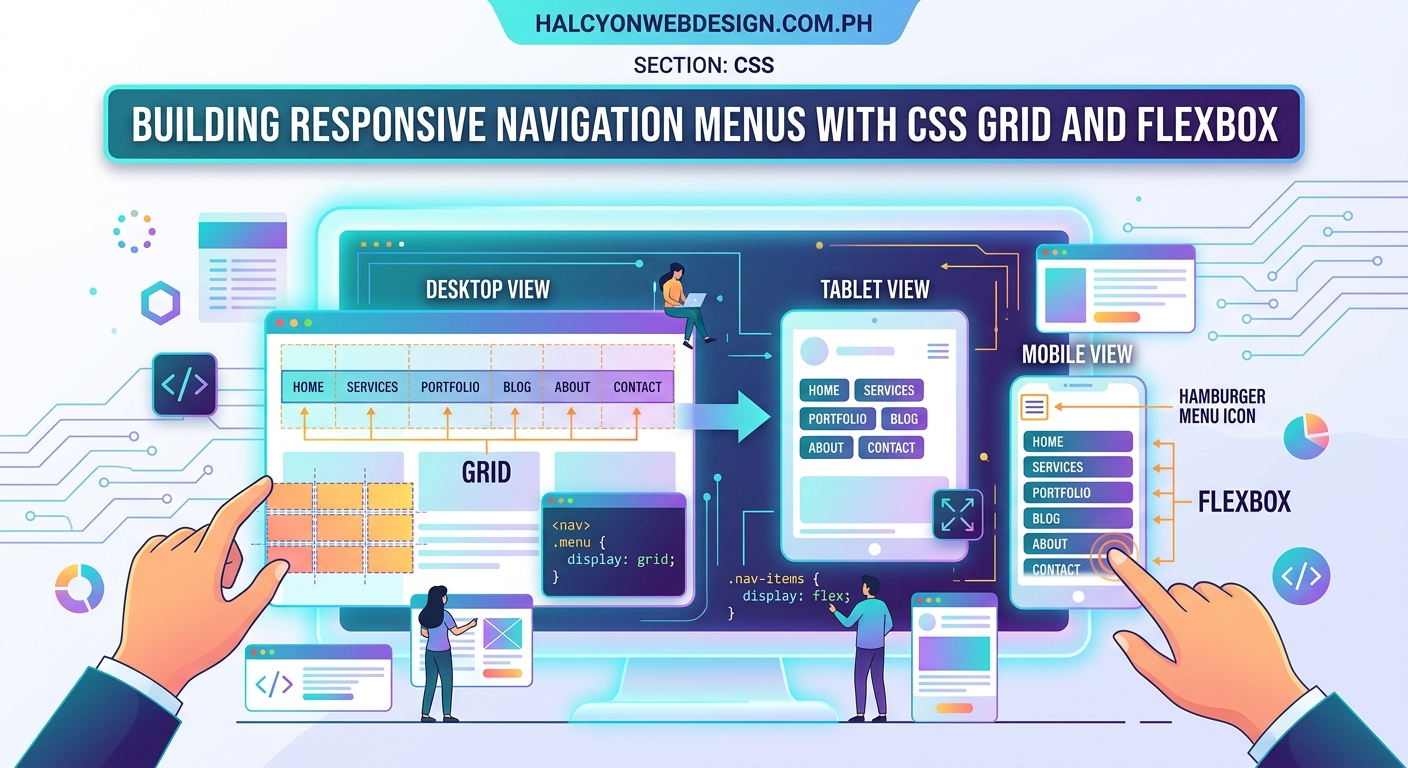
Building a navigation menu that works beautifully on every screen size used to mean wrestling with JavaScript libraries and complicated frameworks. Not anymore. Modern CSS layout techniques give you everything you need to create responsive navigation menu css that adapts smoothly from mobile to desktop without a single line of JavaScript.
CSS Grid and Flexbox provide powerful, JavaScript-free solutions for responsive navigation menus. Grid excels at complex layouts with multiple columns and rows, while Flexbox handles linear arrangements perfectly. Combining both techniques with media queries creates navigation that adapts seamlessly across all devices while maintaining accessibility and performance.
Why modern CSS layout methods matter for navigation
Your navigation menu is the first interactive element most visitors encounter. A broken or confusing menu on mobile sends people away before they see your content.
Traditional approaches relied on float-based layouts or JavaScript to toggle menu visibility. These methods created accessibility problems and added unnecessary weight to your pages.
CSS Grid and Flexbox solve these problems natively. They provide predictable, flexible layouts that respond to screen size changes automatically. Better yet, they work in every modern browser without polyfills or fallbacks.
Understanding when to use Grid versus Flexbox
Both layout methods have specific strengths. Picking the right one makes your code cleaner and your menu more maintainable.
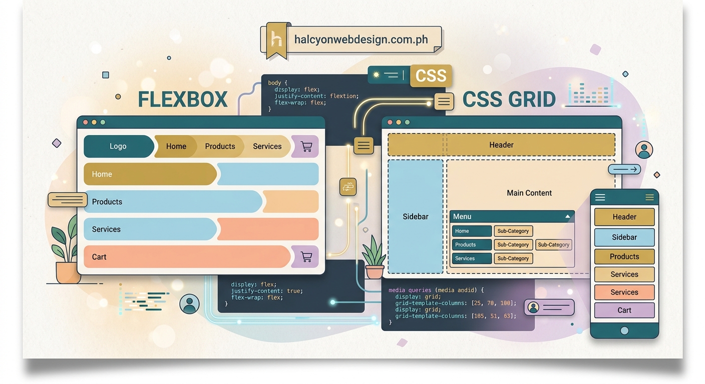
Flexbox works in one dimension at a time. Think of it as arranging items in a line, either horizontally or vertically. This makes it perfect for simple horizontal navigation bars or vertical mobile menus.
Grid works in two dimensions simultaneously. You can control both rows and columns at once. This shines when you need complex mega menus or navigation with multiple levels visible at once.
For most navigation menus, you’ll use both. Flexbox handles the main menu bar. Grid manages dropdown panels or mega menu content.
Building a basic horizontal navigation with Flexbox
Start with clean, semantic HTML. Screen readers and search engines both appreciate proper structure.
nav {
  display: flex;
  justify-content: space-between;
  align-items: center;
  padding: 1rem 2rem;
  background: #333;
}

.nav-links {
  display: flex;
  gap: 2rem;
  list-style: none;
  margin: 0;
  padding: 0;
}

.nav-links a {
  color: white;
  text-decoration: none;
  padding: 0.5rem 1rem;
  transition: background 0.3s;
}

.nav-links a:hover {
  background: rgba(255, 255, 255, 0.1);
  border-radius: 4px;
}
This creates a clean horizontal menu that automatically spaces items evenly. The gap property handles spacing without margin calculations.
The justify-content: space-between property pushes your logo to the left and menu items to the right. Change it to center if you want everything centered.
Creating a mobile-friendly hamburger menu
Mobile screens need a different approach. Horizontal menus become cramped and unusable on small screens.
Here’s how to transform your horizontal menu into a vertical mobile menu:
@media (max-width: 768px) {
  nav {
    flex-direction: column;
    align-items: flex-start;
  }

  .nav-links {
    flex-direction: column;
    width: 100%;
    gap: 0;
    display: none;
  }

  .nav-links.active {
    display: flex;
  }

  .nav-links a {
    width: 100%;
    padding: 1rem;
    border-bottom: 1px solid rgba(255, 255, 255, 0.1);
  }

  .hamburger {
    display: block;
    cursor: pointer;
  }
}
Add a checkbox input before your navigation links. This creates a pure CSS toggle without JavaScript:
.menu-toggle {
  display: none;
}

.menu-toggle:checked ~ .nav-links {
  display: flex;
}
This technique works because CSS can style elements that come after a checkbox based on its checked state. No JavaScript required.
Building mega menus with CSS Grid
Large sites need mega menus to organize many links. CSS Grid makes these layouts straightforward.
.mega-menu {
  position: absolute;
  top: 100%;
  left: 0;
  width: 100%;
  background: white;
  box-shadow: 0 4px 6px rgba(0, 0, 0, 0.1);
  display: none;
  padding: 2rem;
}

.nav-item:hover .mega-menu {
  display: grid;
  grid-template-columns: repeat(4, 1fr);
  gap: 2rem;
}

.mega-menu-column h3 {
  margin-top: 0;
  font-size: 1rem;
  font-weight: 600;
  margin-bottom: 1rem;
}

.mega-menu-column ul {
  list-style: none;
  padding: 0;
  margin: 0;
}

.mega-menu-column li {
  margin-bottom: 0.5rem;
}
This creates a four-column layout that appears when users hover over a menu item. The columns automatically adjust their width based on available space.
For mobile, switch to a single column:
@media (max-width: 768px) {
  .mega-menu {
    grid-template-columns: 1fr;
    max-height: 70vh;
    overflow-y: auto;
  }
}
Step-by-step process for building a complete responsive menu
Follow these steps to create a production-ready navigation menu:
- Write semantic HTML with proper heading hierarchy and list structure
- Style the desktop layout using Flexbox for the main navigation bar
- Add hover states and focus styles for keyboard navigation
- Create media queries for tablet and mobile breakpoints
- Implement the mobile menu toggle using the checkbox technique
- Test with keyboard navigation to ensure all items are reachable
- Verify color contrast meets WCAG AA standards
Each step builds on the previous one. Don’t skip ahead or you’ll create problems that are harder to fix later.
Common responsive navigation patterns
Different sites need different navigation patterns. Here are the most reliable options:
- Horizontal to hamburger: Works for sites with 5-8 main menu items
- Priority navigation: Shows as many items as fit, hides the rest in a “More” menu
- Sticky navigation: Stays visible as users scroll down the page
- Mega menu: Displays many links organized into columns
- Off-canvas menu: Slides in from the side on mobile devices
Pick one pattern and stick with it. Mixing patterns confuses users and creates inconsistent experiences.
The how to build a sticky header with pure CSS (no JavaScript required) guide covers making your navigation stay visible during scrolling.
Accessibility requirements for navigation menus
Screen reader users need proper navigation landmarks and keyboard access. These aren’t optional features.
Wrap your navigation in a <nav> element. This creates a landmark that screen readers can jump to directly.
Every interactive element must be reachable with the Tab key. Test this yourself by unplugging your mouse.
Focus indicators need sufficient contrast. The default browser outline works, but you can style it better:
.nav-links a:focus {
  outline: 2px solid #4A90E2;
  outline-offset: 2px;
}
Dropdown menus need ARIA attributes to announce their state:
<button aria-expanded="false" aria-controls="submenu-1">
  Products
</button>
<ul id="submenu-1" hidden>
  <!-- submenu items -->
</ul>
The complete guide to keyboard navigation: making your site usable without a mouse explains these requirements in detail.
Performance considerations for navigation CSS
Navigation CSS loads before your content renders. Bloated stylesheets delay the entire page.
Keep your navigation CSS under 5KB before compression. This ensures fast initial render times.
Avoid complex selectors that force the browser to recalculate styles:
/* Slow */
nav ul li a:hover span {
  color: red;
}

/* Fast */
.nav-link:hover .nav-label {
  color: red;
}
Use CSS custom properties for colors and spacing. This makes theme changes easier and reduces duplicate code:
:root {
  --nav-bg: #333;
  --nav-text: white;
  --nav-spacing: 1rem;
}

nav {
  background: var(--nav-bg);
  color: var(--nav-text);
  padding: var(--nav-spacing);
}
The CSS custom properties: a beginner’s guide to CSS variables for dynamic theming article shows how to implement this approach.
Troubleshooting common navigation layout problems
Even experienced developers hit layout issues. Here’s how to fix the most common problems:
| Problem | Cause | Solution |
|---|---|---|
| Menu items wrap to next line | Container too narrow | Add flex-wrap: nowrap or reduce item padding |
| Vertical alignment off center | Mismatched heights | Use align-items: center on flex container |
| Dropdown appears behind content | Z-index conflict | Set z-index: 1000 on dropdown container |
| Mobile menu doesn’t close | Missing toggle state | Add checkbox or button to control display property |
| Items don’t space evenly | Incorrect justify property | Use justify-content: space-between or gap |
| Focus outline cut off | Overflow hidden on parent | Add overflow: visible or use outline-offset |
Most layout problems come from misunderstanding how flex or grid properties interact. The why your CSS flexbox items won’t center (and the 3 properties you’re missing) guide covers these interactions.
Testing your navigation across devices
Your menu might look perfect on your laptop but break on actual phones. Real device testing catches problems simulators miss.
Test on these minimum device sizes:
- 320px width (small phones)
- 768px width (tablets)
- 1024px width (laptops)
- 1920px width (large monitors)
Use browser DevTools to simulate different screen sizes. Open the device toolbar and test each breakpoint.
Check touch target sizes on mobile. Buttons need at least 44×44 pixels to be easily tappable. Smaller targets frustrate users and hurt conversions.
The 5 mobile-first design principles every beginner should know article explains why mobile testing matters.
Combining Grid and Flexbox for complex layouts
Some navigation patterns need both layout methods working together. Here’s how to combine them effectively:
Use Flexbox for the outer navigation container. This handles the logo, menu items, and utility links in a single row.
Use Grid inside dropdown panels. This creates organized columns of links without float hacks.
.nav-container {
  display: flex;
  justify-content: space-between;
  align-items: center;
}

.dropdown-panel {
  display: grid;
  grid-template-columns: repeat(auto-fit, minmax(200px, 1fr));
  gap: 1rem;
}
The auto-fit keyword makes columns automatically wrap to new rows when space runs out. No media queries needed for basic responsiveness.
The complete guide to using Grid vs. Flexbox for your website layout explains when to use each method.
Handling navigation in WordPress themes
WordPress navigation requires special considerations. The menu system outputs specific HTML classes you need to style.
WordPress adds these classes automatically:
.menu-itemon each list item.current-menu-itemon the active page.menu-item-has-childrenon items with submenus
Style these classes instead of creating your own:
.menu-item a {
  padding: 0.5rem 1rem;
  display: block;
}

.current-menu-item a {
  background: rgba(255, 255, 255, 0.1);
}

.menu-item-has-children {
  position: relative;
}
The WordPress menu navigation: 5 common mistakes that confuse your visitors guide covers WordPress-specific issues.
Visual hierarchy in navigation design
Good navigation guides users to important pages first. Visual hierarchy makes this guidance obvious.
Primary navigation items need more visual weight than secondary items. Increase font size, weight, or add background colors.
Dropdown menus should appear less prominent than main menu items. Use lighter backgrounds or smaller text.
.primary-nav a {
  font-size: 1rem;
  font-weight: 600;
  color: white;
}

.dropdown-menu a {
  font-size: 0.875rem;
  font-weight: 400;
  color: #666;
}
The how to create a visual hierarchy that guides users through your content article explains hierarchy principles.
Advanced techniques for smooth transitions
Smooth animations make navigation feel polished. But bad animations hurt usability.
Animate only transform and opacity properties. These don’t trigger layout recalculations:
.nav-links {
  transform: translateY(-100%);
  opacity: 0;
  transition: transform 0.3s ease, opacity 0.3s ease;
}

.nav-links.active {
  transform: translateY(0);
  opacity: 1;
}
Never animate height directly. It forces the browser to recalculate layout on every frame. Use max-height instead:
.dropdown {
  max-height: 0;
  overflow: hidden;
  transition: max-height 0.3s ease;
}

.nav-item:hover .dropdown {
  max-height: 500px;
}
The how to create smooth CSS animations without hurting page performance guide covers animation best practices.
Debugging navigation with browser DevTools
Browser DevTools reveal why your navigation breaks. Learn these debugging techniques to fix problems faster.
Open DevTools and select the navigation element. The Computed tab shows which CSS rules actually apply.
Look for these common issues:
- Conflicting
displayproperties - Z-index stacking problems
- Overflow hidden cutting off content
- Margin collapse affecting spacing
The Layout panel in DevTools shows Flexbox and Grid containers visually. Enable the overlay to see gap spacing and alignment.
The how to debug CSS layout issues using browser DevTools like a pro article teaches advanced debugging techniques.
Start with the simplest navigation structure that meets your needs. You can always add complexity later. A simple menu that works perfectly beats a complex menu that breaks on mobile.
Making your navigation work for everyone
Responsive navigation isn’t just about screen sizes. It’s about creating an experience that works regardless of how someone accesses your site.
Someone using a screen reader needs clear landmarks and logical tab order. Someone on a slow connection needs fast-loading CSS. Someone with a motor disability needs large touch targets.
Build these considerations into your navigation from the start. Retrofitting accessibility later costs more time and creates worse results.
Your navigation menu connects people to your content. When it works smoothly across every device and input method, you remove barriers and let your content shine. Take the time to build it right the first time.