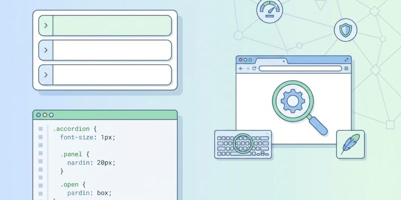
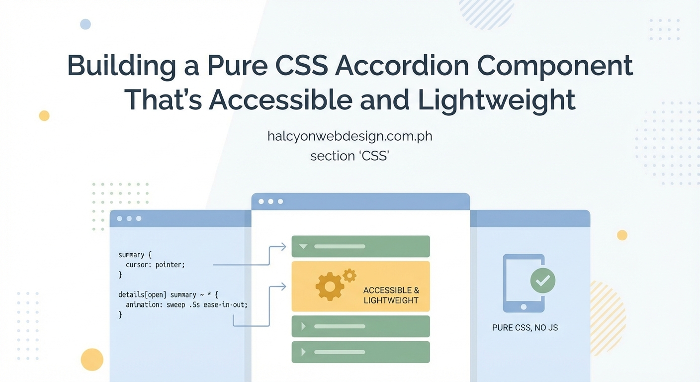
Accordion components hide and reveal content on demand, making them perfect for FAQs, navigation menus, and long-form content. You can build them without JavaScript. Pure CSS accordions load faster, require less maintenance, and work even when scripts fail. This tutorial walks you through two proven methods, from basic implementation to polished, accessible components.
This CSS accordion tutorial covers two methods: the modern details/summary approach and the checkbox hack. You’ll learn to add smooth animations, custom icons, and accessibility features. Both techniques work across modern browsers without requiring JavaScript libraries. The details element offers semantic HTML and built-in keyboard support, while the checkbox method provides more styling control.
Why Build Accordions with Pure CSS
JavaScript-free accordions reduce page weight and eliminate dependencies. They continue working when JavaScript fails or loads slowly. Users on low-bandwidth connections see content faster.
CSS accordions also simplify maintenance. You avoid version conflicts, security patches, and framework updates. The code stays readable and easy to modify.
Performance matters for user experience and search rankings. Lighter components mean faster page loads, which keeps visitors engaged.
Method One: The Details and Summary Elements
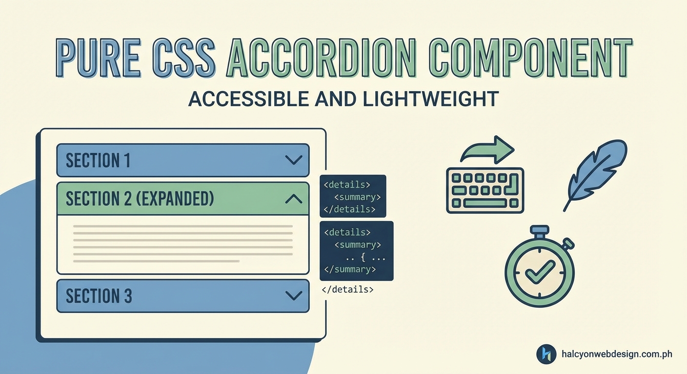
The HTML5 details element creates native accordions with zero JavaScript. Browsers handle the toggle behavior automatically.
Building the Basic Structure
Start with semantic HTML that works even without CSS:
“`html
What are your business hours?
We’re open Monday through Friday, 9 AM to 6 PM EST.
Do you offer refunds?
Yes, we provide full refunds within 30 days of purchase.
The summary element acts as the clickable header. Everything else inside details becomes the collapsible content. Browsers add a disclosure triangle automatically.
Styling the Accordion
Remove the default triangle and add your own design:
“`css
details {
border: 1px solid #ddd;
border-radius: 8px;
margin-bottom: 12px;
padding: 16px;
}
summary {
cursor: pointer;
font-weight: 600;
list-style: none;
position: relative;
padding-right: 30px;
}
summary::-webkit-details-marker {
display: none;
}
summary::after {
content: ‘+’;
position: absolute;
right: 0;
font-size: 24px;
line-height: 1;
}
details[open] summary::after {
content: ‘−’;
}
The list-style: none removes the triangle in most browsers. The webkit-specific selector handles Safari and Chrome. The ::after pseudo-element creates a custom plus/minus indicator.
Adding Smooth Animations
Animating height directly doesn’t work on details elements. Use max-height instead:
“`css
details > *:not(summary) {
max-height: 0;
overflow: hidden;
transition: max-height 0.3s ease;
}
details[open] > *:not(summary) {
max-height: 500px;
}
Set max-height larger than your tallest content. The transition creates a smooth reveal effect. This approach works but has limitations with very tall content.
Accessibility Features Built In
The details element includes keyboard support automatically. Users can press Enter or Space to toggle sections. Screen readers announce the expanded/collapsed state correctly.
Add ARIA labels for extra clarity:
“`html
What are your business hours?
We’re open Monday through Friday, 9 AM to 6 PM EST.
Method Two: The Checkbox Hack
This technique uses hidden checkboxes and label elements to control visibility. It offers more styling flexibility than details elements.
Setting Up the HTML
Create a checkbox for each accordion panel:
“`html
We’re open Monday through Friday, 9 AM to 6 PM EST.
The label’s for attribute connects to the checkbox ID. Clicking the label toggles the checkbox state.
Writing the CSS Logic
Hide checkboxes and control content visibility through the checked state:
“`css
.accordion-toggle {
display: none;
}
.accordion-header {
display: block;
cursor: pointer;
padding: 16px;
background: #f5f5f5;
border-radius: 8px;
position: relative;
margin-bottom: 8px;
font-weight: 600;
}
.accordion-content {
max-height: 0;
overflow: hidden;
transition: max-height 0.3s ease, padding 0.3s ease;
padding: 0 16px;
}
.accordion-toggle:checked + .accordion-header + .accordion-content {
max-height: 500px;
padding: 16px;
}
The adjacent sibling selector (+) targets elements that follow the checkbox. When checked, the content expands.
Creating Custom Icons
Style the icon span to rotate on toggle:
“`css
.accordion-header .icon {
position: absolute;
right: 16px;
width: 20px;
height: 20px;
}
.icon::before,
.icon::after {
content: ”;
position: absolute;
background: #333;
transition: transform 0.3s ease;
}
.icon::before {
width: 20px;
height: 2px;
top: 9px;
}
.icon::after {
width: 2px;
height: 20px;
left: 9px;
}
.accordion-toggle:checked + .accordion-header .icon::after {
transform: rotate(90deg);
}
The vertical line (::after) rotates to hide when checked, leaving only the horizontal line.
Comparing Both Methods
Each approach has strengths and tradeoffs:
| Feature | Details/Summary | Checkbox Hack |
|---|---|---|
| Semantic HTML | Yes, native element | No, requires workaround |
| Keyboard support | Built-in | Needs custom code |
| Browser support | Modern browsers only | All browsers |
| Animation control | Limited | Full control |
| Screen reader support | Automatic | Requires ARIA |
| Code complexity | Simpler | More complex |
Choose details/summary for projects prioritizing accessibility and simplicity. Use the checkbox method when you need precise animation control or must support older browsers.
Building a Single-Open Accordion
Sometimes you want only one panel open at a time. Radio buttons make this possible without JavaScript.
Replace checkboxes with radio inputs sharing the same name:
“`html
First answer here.
Second answer here.
The shared name attribute ensures only one radio button stays checked. Opening a new panel automatically closes others.
The CSS remains identical to the checkbox version. Radio buttons behave the same way in selectors.
Adding Polish and Refinement
Small improvements make accordions feel professional.
Smooth Hover States
Add visual feedback when users hover over headers:
“`css
.accordion-header:hover {
background: #e8e8e8;
}
details summary:hover {
color: #0066cc;
}
Subtle color changes guide interaction without overwhelming the design.
Focus Indicators for Keyboard Users
Make focus states visible and attractive:
“`css
summary:focus,
.accordion-header:focus {
outline: 2px solid #0066cc;
outline-offset: 2px;
}
Never remove focus outlines without providing alternatives. Keyboard users depend on them for navigation.
Respecting Motion Preferences
Some users experience discomfort from animations. Honor their system preferences:
“`css
@media (prefers-reduced-motion: reduce) {
details > *:not(summary),
.accordion-content {
transition: none;
}
}
This media query disables animations for users who’ve requested reduced motion in their operating system settings.
Common Mistakes and How to Avoid Them
Watch out for these frequent issues:
- Setting max-height too small: Content gets cut off. Always set it larger than your tallest panel.
- Forgetting focus states: Keyboard users can’t see where they are. Always style :focus selectors.
- Ignoring ARIA labels: Screen readers need context. Add descriptive labels to interactive elements.
- Using vague header text: “Click here” doesn’t help anyone. Write descriptive headers that explain the content.
Test your accordion with keyboard navigation before launching. Press Tab to move between panels and Enter or Space to toggle them. If you can’t operate it without a mouse, neither can keyboard users.
Testing Across Browsers
Details element support varies slightly between browsers. Test in:
- Chrome and Edge (Chromium-based browsers handle details similarly)
- Firefox (excellent support with minor rendering differences)
- Safari (requires webkit-specific CSS for complete styling control)
The checkbox method works consistently across all modern browsers and degrades gracefully in older ones.
Combining Accordions with Other Components
Accordions fit naturally into larger layouts. Pair them with sticky navigation for FAQ pages where users jump between sections.
Keep typography consistent throughout. Avoid common font mistakes that make accordions harder to read.
When JavaScript Makes Sense
Pure CSS works for most accordion needs. Consider JavaScript when you need:
- Complex animations beyond simple height transitions
- Dynamic content loaded from APIs
- Analytics tracking for panel interactions
- Synchronized behavior across multiple accordion groups
JavaScript adds flexibility but comes with maintenance costs. Start with CSS and add scripts only when necessary.
Practical Implementation Checklist
Follow these steps to build production-ready accordions:
- Choose between details/summary (better accessibility) and checkbox hack (more control)
- Write semantic HTML that makes sense without CSS
- Style headers with clear hover and focus states
- Add smooth transitions with appropriate max-height values
- Create custom icons using pseudo-elements or inline SVG
- Test keyboard navigation thoroughly
- Verify screen reader compatibility
- Add prefers-reduced-motion media query
- Test across target browsers
- Validate HTML and check for accessibility issues
Making Accordions Truly Accessible
Accessibility means everyone can use your accordions effectively. Beyond basic keyboard support:
- Use sufficient color contrast (4.5:1 minimum for text)
- Make clickable areas at least 44×44 pixels
- Provide clear visual indicators for expanded/collapsed states
- Write descriptive header text that works out of context
- Test with actual screen readers (NVDA, JAWS, or VoiceOver)
Screen reader users should hear the panel state and be able to toggle it without confusion. The details element handles most of this automatically.
Styling for Different Contexts
Accordions adapt to various design needs:
For FAQ pages: Use generous spacing and clear headers. Consider numbering questions for easy reference.
For navigation menus: Keep headers compact and use icons sparingly. Ensure touch targets work on mobile devices.
For settings panels: Group related options together. Use subdued colors that don’t compete with form elements.
For content-heavy pages: Add subtle borders between panels. Use consistent padding to maintain visual rhythm.
Match your accordion style to the surrounding interface. Consistency helps users understand how components work.
Optimizing for Mobile Devices
Touch interfaces need special consideration:
- Increase tap target sizes to at least 44×44 pixels
- Add enough padding around headers
- Test with actual fingers, not just mouse pointers
- Ensure animations perform smoothly on slower devices
- Consider larger fonts for readability on small screens
Mobile users often have limited bandwidth. CSS accordions load faster than JavaScript alternatives, improving the mobile experience.
Making Your Accordions Stand Out
While maintaining usability, you can add personality:
- Use brand colors for headers and icons
- Add subtle shadows for depth
- Include small icons that relate to content
- Apply gentle border-radius for softer edges
- Choose fonts that match your overall design
Balance creativity with clarity. Users should immediately understand how to interact with your accordions.
Real-World Use Cases
Accordions solve specific problems:
E-commerce product pages use them for specifications, shipping details, and reviews. This keeps pages scannable while providing depth.
Documentation sites organize API references and code examples. Developers can expand only the sections they need.
Contact forms hide optional fields until users need them. This reduces form intimidation while maintaining completeness.
Blog archives let readers browse posts by month or category without endless scrolling.
Choose accordions when you have content users might not need immediately but should access easily.
Browser Support and Fallbacks
The details element works in all modern browsers. Internet Explorer lacks support, but usage has dropped below 1% globally.
For the checkbox method, support extends back to IE9. Even older browsers show content in a usable (if not collapsible) format.
Consider your audience when choosing methods. Most projects can safely use details/summary today.
Debugging Common Issues
When accordions misbehave:
Content doesn’t expand: Check your max-height value. Set it higher than your tallest content.
Animations feel janky: Reduce transition duration or test on a faster device. Some older phones struggle with complex animations.
Keyboard navigation fails: Verify you haven’t removed focus outlines without replacement. Check that labels properly connect to inputs.
Screen readers announce incorrectly: Test your ARIA labels. Make sure state changes get communicated clearly.
Icons don’t rotate: Inspect your pseudo-element selectors. Confirm the checkbox/details state triggers the transform.
Use browser developer tools to inspect element states and CSS properties. The Elements panel shows exactly which styles apply.
Keeping Your Code Maintainable
Future you will thank present you for clean code:
- Use consistent class naming (BEM or similar methodology)
- Comment complex selectors that might confuse others
- Group related styles together
- Avoid overly specific selectors that become hard to override
- Document any browser-specific hacks you include
Well-organized CSS makes updates easier. You’ll spend less time figuring out what old code does.
Performance Considerations
CSS accordions already perform well, but you can optimize further:
- Minimize CSS file size by removing unused styles
- Avoid expensive properties like box-shadow on animated elements
- Use transform and opacity for animations when possible
- Test on slower devices to catch performance issues
- Consider lazy-loading accordion content if panels contain heavy media
Small optimizations add up. Users on older devices or slow connections notice the difference.
Your Next Steps with CSS Accordions
You now have two solid methods for building accordions without JavaScript. The details/summary approach offers simplicity and built-in accessibility. The checkbox hack provides more styling control.
Start with the details element for most projects. Its semantic HTML and automatic keyboard support make it the better choice unless you need specific features it can’t provide.
Build a test accordion on a practice page. Try both methods. See which fits your workflow better. Then implement it on a real project where it solves an actual user problem.
Accordions work best when they organize content users want to access selectively. Use them thoughtfully, test them thoroughly, and your visitors will appreciate the cleaner, more navigable interface you’ve created.