
Your homepage looks great. The design is clean. The content is solid. But visitors still leave without taking action.
The problem isn’t what you’re showing. It’s how you’re showing it.
Visual hierarchy determines the order in which people notice and process elements on your page. When done right, it guides users through your content like a well-marked trail. When done wrong, it creates confusion and sends people clicking away.
Visual hierarchy uses size, color, contrast, spacing, and positioning to direct attention through your content in a specific order. Strong hierarchy reduces [cognitive load](https://en.wikipedia.org/wiki/Cognitive_load), improves comprehension, and increases conversion rates by making important elements immediately obvious. This guide covers practical techniques for implementing hierarchy through typography, layout, [color theory](https://en.wikipedia.org/wiki/Color_theory), and spacing decisions that work across all screen sizes.
Why Most Websites Fail at Visual Hierarchy
Most designers treat every element like it deserves equal attention.
The result? Nothing stands out. Everything competes. Users scan randomly and miss your most important message.
Your brain processes visual information in layers. It looks for patterns, contrasts, and familiar structures. When a page lacks clear hierarchy, your brain works harder to make sense of what it’s seeing.
That extra effort translates to frustration. And frustrated users leave.
Good hierarchy removes that friction. It tells users exactly where to look first, second, and third. It creates a visual path that feels natural and effortless.
The Five Tools That Build Visual Hierarchy
You don’t need fancy design skills to create effective hierarchy. You need to understand five fundamental tools.
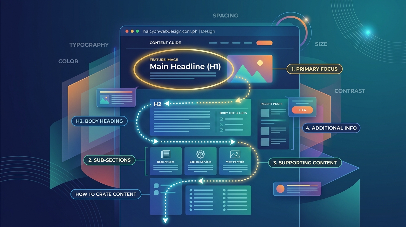
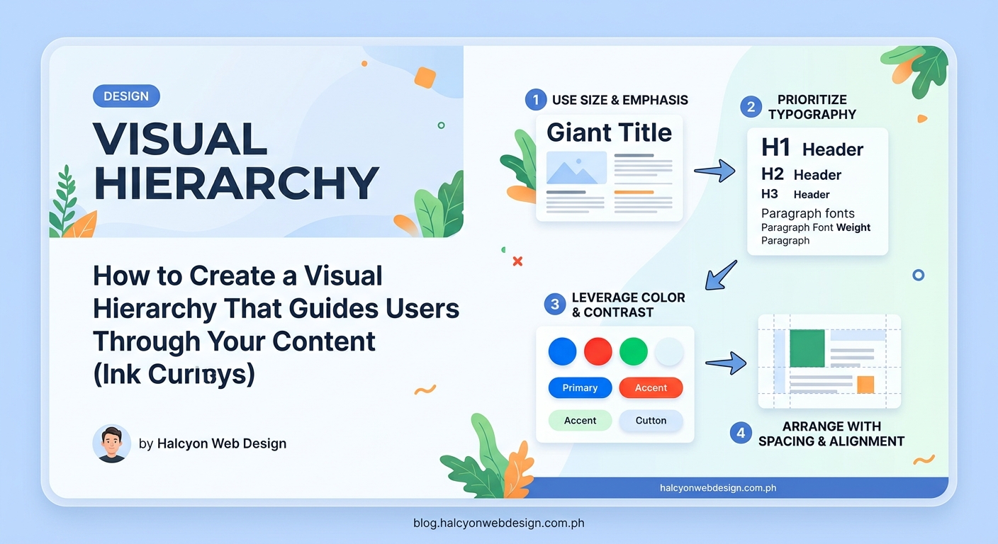
Size Creates Immediate Importance
Bigger elements grab attention first. It’s that simple.
Your headline should be the largest text on the page. Subheadings should be smaller than headlines but larger than body text. Buttons should be large enough to notice without overwhelming the layout.
But size isn’t just about text. Images, icons, and white space all use size to communicate importance.
A hero image that spans the full width of your screen tells users this content matters. A small thumbnail suggests supplementary information.
Color Directs Attention and Emotion
Color is your most powerful attention tool.
Bright, saturated colors pull focus. Muted, desaturated colors recede into the background. High contrast creates separation. Low contrast suggests relationship.
Your primary call to action should use your most attention-grabbing color. Secondary actions should use less prominent colors. Tertiary elements can blend with your neutral palette.
How to choose the perfect color palette for your website in 5 steps covers strategic color selection that supports hierarchy without overwhelming users.
Contrast Makes Elements Stand Out
Contrast works across multiple dimensions.
Light text on dark backgrounds creates contrast. Dark text on light backgrounds does the same. But contrast also applies to size, weight, style, and spacing.
A bold headline next to regular body text creates weight contrast. A large image next to small text blocks creates size contrast. Tight spacing in one section next to generous spacing in another creates density contrast.
The more contrast you create, the more separation you establish between elements.
Spacing Controls Relationships
White space isn’t empty space. It’s a design element that creates grouping and separation.
Elements close together feel related. Elements far apart feel independent. Generous margins around a section make it feel important. Tight spacing makes content feel dense and less critical.
Why your website looks cluttered and how to fix it with white space demonstrates how spacing transforms readability and visual flow.
Position Establishes Reading Order
Western users read left to right, top to bottom.
Place your most important content in the top left corner. Put secondary information in the top right. Position calls to action where the eye naturally lands after scanning content.
But position also means depth. Elements that appear to sit on top of others feel more important. Drop shadows, overlays, and layering all use position to create hierarchy.
Building Hierarchy Through Typography
Text makes up most of your content. Typography decisions have massive impact on hierarchy.
Establish a Clear Type Scale
A type scale defines size relationships between different text elements.
Start with your body text size. This is typically 16px to 18px for web content. Your H2 headings should be 1.5 to 2 times larger. Your H1 should be 2 to 3 times larger.
The exact numbers matter less than the relationships. Each level should feel distinctly different from the level above and below it.
Use Weight to Create Emphasis
Font weight adds another layer of hierarchy without changing size.
Bold headlines stand out from regular body text. Semibold subheadings create middle ground between headlines and paragraphs. Light text can de-emphasize less important information.
But don’t overuse bold. When everything is bold, nothing is bold.
7 typography mistakes that make your website look unprofessional covers common weight and sizing errors that break hierarchy.
Limit Font Families
Every additional font family adds visual noise.
Stick to two fonts maximum. One for headings, one for body text. Or use a single versatile font family with multiple weights.
Different fonts should serve different purposes. Serif fonts often work well for traditional, trustworthy brands. Sans-serif fonts feel modern and clean. Display fonts grab attention but tire eyes quickly.
Control Line Length for Readability
Line length affects how easily users can process text.
Aim for 50 to 75 characters per line for body text. Shorter lines work better on mobile. Longer lines work for desktop but shouldn’t exceed 90 characters.
Break long paragraphs into shorter chunks. Use subheadings every 200 to 300 words. Give readers visual breaks that make content feel manageable.
Creating Hierarchy Through Layout Structure
Layout determines how elements relate spatially.
Use Grid Systems for Consistency
Grids create predictable structure. They establish alignment, spacing, and proportion rules that maintain hierarchy across pages.
A 12-column grid gives you flexibility for different content widths. Important content can span 8 or 12 columns. Less important content can fit into 4 or 6 columns.
7 CSS grid layout patterns every WordPress developer should know provides practical grid implementation techniques.
Implement the F-Pattern for Content
Eye-tracking studies show users scan pages in an F-shaped pattern.
They read across the top, scan down the left side, then make shorter horizontal scans as they move down the page.
Place your most important information along this F-path. Put headlines, subheadings, and key points where the eye naturally lands.
Create Visual Anchors
Visual anchors are distinctive elements that break up content and provide navigation landmarks.
Images, icons, pull quotes, and colored sections all serve as anchors. They give users reference points as they scroll. They make long pages feel less overwhelming.
Space anchors evenly throughout your content. Too many create chaos. Too few make pages feel monotonous.
Balance Symmetry and Asymmetry
Symmetrical layouts feel stable and traditional. Asymmetrical layouts feel dynamic and modern.
Neither is better. Both can support strong hierarchy. Symmetry works well for formal content and traditional brands. Asymmetry works well for creative content and modern brands.
The key is consistency. Pick an approach and stick with it across similar content types.
Applying Hierarchy to Different Content Types
Different content needs different hierarchy approaches.
Landing Pages Need Clear Focus
Landing pages have one job. Get users to take a specific action.
Your headline should dominate the page. Your value proposition should be immediately obvious. Your call to action should stand out through size, color, and position.
Everything else is secondary. Remove or de-emphasize anything that doesn’t support the main conversion goal.
Blog Posts Need Scannable Structure
Blog readers scan before they read. They look for subheadings that promise relevant information.
Your H2 subheadings should tell a story on their own. Users should be able to scan just the headings and understand your main points.
Use bullet lists for scannable details. Use numbered lists for sequential steps. Use blockquotes to highlight key insights.
Strong visual hierarchy isn’t about making everything stand out. It’s about making the right things stand out at the right time. Every design choice should support your user’s journey through your content.
Navigation Menus Need Clear Priority
Not all navigation items deserve equal prominence.
Your most important pages should appear first. Your primary call to action should stand out through color or button styling. Dropdown menus should reveal secondary options without cluttering the main navigation.
How to design a navigation menu that users actually understand covers menu hierarchy in depth.
Forms Need Progressive Disclosure
Long forms overwhelm users. Break them into logical sections with clear hierarchy.
Group related fields together. Use spacing to show relationships. Label each section with a clear heading. Show progress indicators for multi-step forms.
How to build accessible forms that every user can complete demonstrates hierarchy techniques that improve form completion rates.
Step-by-Step Process for Implementing Visual Hierarchy
Here’s how to audit and improve hierarchy on any page.
-
Identify your page goals. What action do you want users to take? What information must they see first?
-
List all page elements. Write down every component: headlines, images, buttons, forms, navigation, footer content.
-
Rank elements by importance. Assign each element a priority level: critical, important, or supporting.
-
Apply size hierarchy. Make critical elements largest, important elements medium, supporting elements smallest.
-
Add color emphasis. Use your most attention-grabbing colors for critical actions. Use neutral colors for supporting content.
-
Adjust spacing. Add generous white space around critical elements. Use tighter spacing for less important content.
-
Test with fresh eyes. Show your page to someone unfamiliar with it. Ask them to describe what they see first, second, and third.
-
Refine based on feedback. Adjust size, color, or position if users miss important elements or focus on wrong things.
Common Visual Hierarchy Mistakes and Fixes
Even experienced designers make these errors.
| Mistake | Why It Breaks Hierarchy | How to Fix It |
|---|---|---|
| Too many font sizes | Creates visual chaos and confusion | Limit to 3-4 distinct sizes with clear size jumps |
| Everything is bold | Removes emphasis from truly important content | Use bold sparingly for headlines and key terms only |
| Weak color contrast | Makes text hard to read and hierarchy unclear | Ensure 4.5:1 contrast ratio minimum for body text |
| No white space | Makes content feel overwhelming and dense | Add generous margins around sections and between elements |
| Centered everything | Slows reading speed and feels amateurish | Left-align body text, center only headlines selectively |
| Competing focal points | Splits attention and confuses users | Choose one primary focal point per section |
| Inconsistent spacing | Breaks visual rhythm and feels sloppy | Use a spacing scale: 8px, 16px, 24px, 32px, 48px |
Testing Visual Hierarchy Effectiveness
You can’t improve what you don’t measure.
Use the Squint Test
Blur your eyes or zoom out until you can’t read text. What stands out? What disappears?
If your most important elements don’t stand out when squinted, your hierarchy is too weak. Increase size, contrast, or spacing around critical content.
Track User Behavior
Heatmaps show where users actually click. Scroll maps show how far users read. Session recordings show how users navigate your content.
If users ignore important elements or click wrong things, your hierarchy isn’t working. Adjust size, color, or position until behavior matches intent.
5 critical Google Analytics 4 reports every webmaster should monitor weekly covers behavior tracking techniques.
Run A/B Tests
Test different hierarchy approaches against each other. Change one variable at a time: button size, headline color, spacing between sections.
Measure conversion rates, time on page, and scroll depth. Let data tell you which hierarchy works better.
Making Hierarchy Work on Mobile Devices
Mobile screens change everything about hierarchy.
Simplify Ruthlessly
Mobile users have less screen space and shorter attention spans. Remove anything that doesn’t directly support your core message.
Stack elements vertically. Use full-width sections. Make buttons large enough to tap easily.
5 mobile-first design principles every beginner should know covers mobile-specific hierarchy techniques.
Increase Touch Target Sizes
Small buttons work on desktop. They fail on mobile.
Make buttons at least 44px tall. Add spacing between clickable elements. Use full-width buttons for primary actions.
Adjust Typography for Small Screens
Text that looks great on desktop often feels too small on mobile.
Increase body text to 16px minimum on mobile. Make headlines proportionally larger. Increase line height to improve readability.
Prioritize Above-the-Fold Content
Mobile users see less content initially. Your most important message must appear in the first screen.
Put your value proposition, headline, and primary call to action above the fold. Everything else can scroll.
Hierarchy Tools and Resources
These tools help you implement and test hierarchy.
Color Contrast Checkers
WebAIM’s contrast checker verifies your text meets accessibility standards. Contrast ratios affect hierarchy and readability.
5 color contrast fixes that make your website WCAG compliant covers contrast requirements in detail.
Typography Scales
Type-scale.com generates proportional font sizes. Modularscale.com creates harmonious size relationships.
Both tools help you establish consistent typography hierarchy without guessing.
Layout Grids
CSS Grid and Flexbox provide layout structure. Grid systems establish consistent spacing and alignment.
The complete guide to using grid vs. flexbox for your website layout explains when to use each approach.
Heatmap Tools
Hotjar, Crazy Egg, and Microsoft Clarity show where users click, scroll, and spend time. Visual data reveals hierarchy problems that analytics alone can’t show.
Hierarchy Checklist for Every Page
Use this checklist before publishing any page.
- Does my most important element dominate the page visually?
- Can users identify the primary action within three seconds?
- Do my headlines create a clear content outline when scanned alone?
- Is there enough contrast between text and background?
- Does spacing create clear grouping between related elements?
- Are my font sizes distinct enough to establish clear levels?
- Do my colors support rather than compete with hierarchy?
- Can users complete my desired action without scrolling on mobile?
- Does the page pass the squint test for visual weight?
- Have I removed or de-emphasized non-essential elements?
Making Hierarchy Work for Accessibility
Strong hierarchy helps everyone, especially users with disabilities.
Structure Content Semantically
Use proper HTML heading tags in order. H1 for page title, H2 for main sections, H3 for subsections.
Screen readers use heading structure to navigate content. Visual hierarchy should match semantic hierarchy.
Why screen readers break on your site and how to fix it covers semantic structure requirements.
Maintain Keyboard Navigation Order
Tab order should follow visual hierarchy. Users should move through content in the same order sighted users read it.
Test by navigating your page using only the Tab key. If focus jumps randomly, your hierarchy confuses keyboard users.
Complete guide to keyboard navigation making your site usable without a mouse provides keyboard testing techniques.
Use ARIA Labels Thoughtfully
ARIA labels can clarify hierarchy for screen reader users. But they shouldn’t replace good visual design.
Label navigation landmarks, identify button purposes, and describe complex interactions. Don’t use ARIA to fix poor visual hierarchy.
Hierarchy Transforms User Experience
Visual hierarchy isn’t decoration. It’s communication.
Every size choice, color decision, and spacing adjustment either helps or hinders your users. Strong hierarchy makes content feel effortless to consume. Weak hierarchy makes everything feel like work.
Start with one page. Apply the techniques in this visual hierarchy guide. Test with real users. Measure the results.
You’ll see higher engagement, longer time on page, and better conversion rates. Not because you changed your content, but because you made it easier to understand.
Good hierarchy respects your users’ time and attention. It guides them to the information they need without making them search for it. That respect builds trust, and trust builds lasting relationships with your audience.