
Animations make websites feel alive. But poorly optimized CSS animations can turn a smooth experience into a stuttering mess that frustrates users and tanks your performance scores.
The good news? You can create beautiful, fluid animations without sacrificing speed. The secret lies in understanding how browsers render animations and which properties you can safely animate without triggering expensive layout recalculations.
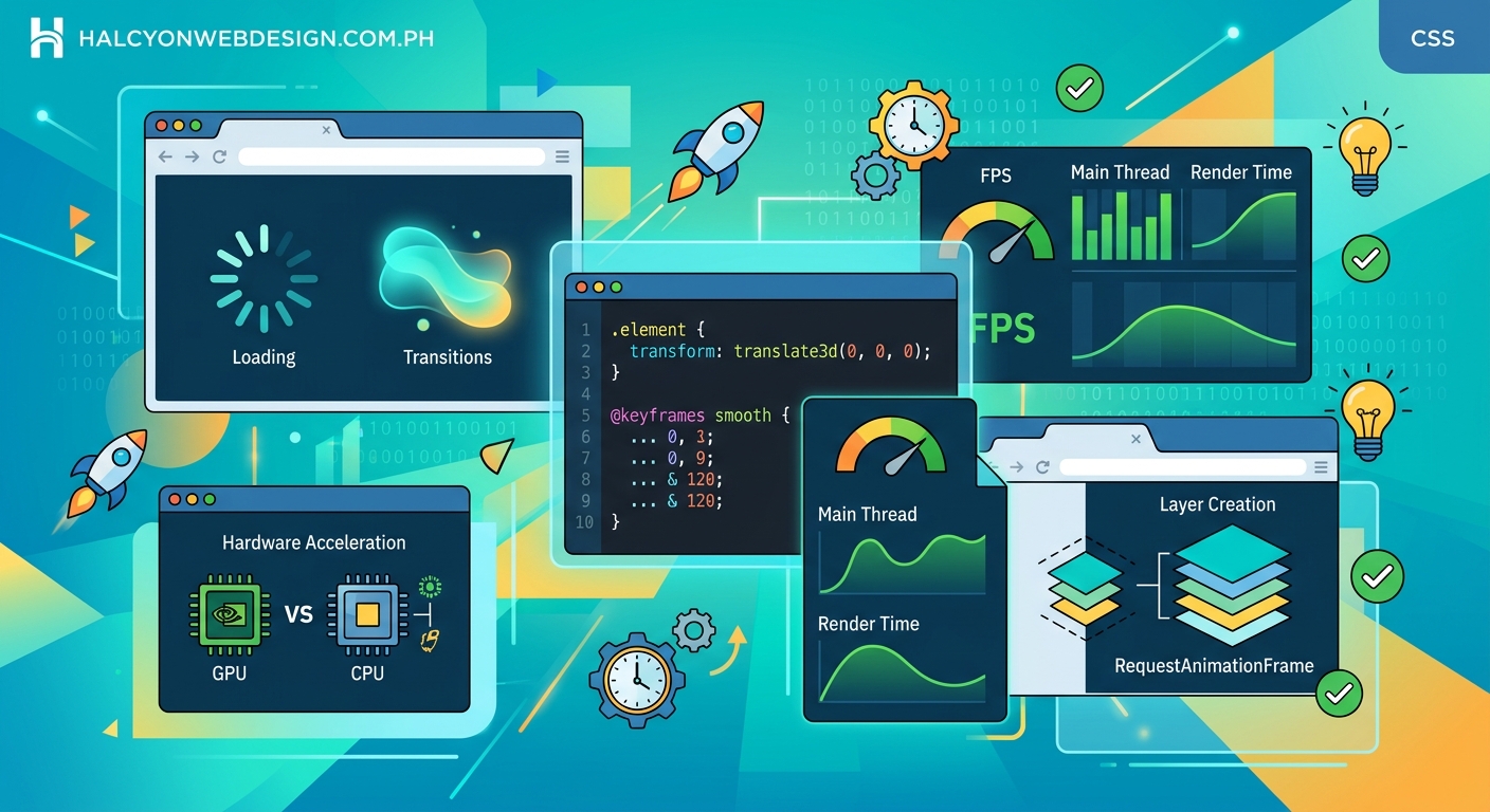
CSS animations perform best when you stick to transform and opacity properties, which browsers can animate on the [GPU](https://en.wikipedia.org/wiki/Graphics_processing_unit) without triggering layout or paint operations. Avoid animating properties like width, height, top, or margin, which force the browser to recalculate layouts and repaint large portions of the page, causing visible jank and poor performance scores.
Why Most CSS Animations Hurt Performance
Browsers render web pages in three main stages: layout, paint, and composite.
Layout calculates where elements sit on the page. Paint fills in pixels for text, colors, and images. Composite layers everything together for the final display.
When you animate properties that affect layout (like width or height), the browser has to recalculate positions for every affected element. That’s expensive. Really expensive.
Animating paint properties (like background-color or box-shadow) is less costly than layout changes, but still triggers repaints that slow things down.
The only properties browsers can animate cheaply are those that work at the composite stage: transform and opacity. These run on the GPU and don’t require layout or paint recalculations.
The Two Properties You Should Always Use
Transform and opacity are your best friends for performance.
Transform handles movement, rotation, and scaling. Opacity controls transparency. Together, they cover most animation needs without the performance penalty.
Here’s a simple fade-in animation that performs beautifully:
“`css
.fade-in {
opacity: 0;
animation: fadeIn 0.3s ease-out forwards;
}
@keyframes fadeIn {
to {
opacity: 1;
}
}
For movement, use transform: translateX() or translateY() instead of animating left, right, top, or bottom:
“`css
.slide-in {
transform: translateX(-100%);
animation: slideIn 0.4s ease-out forwards;
}
@keyframes slideIn {
to {
transform: translateX(0);
}
}
The difference in performance is dramatic. Animating left forces layout recalculations on every frame. Using translateX() runs smoothly at 60fps without breaking a sweat.
How to Identify Performance Bottlenecks
Your browser’s DevTools can show exactly where animations struggle.
- Open Chrome DevTools and navigate to the Performance tab
- Click the record button and interact with your animation
- Stop recording and examine the flame chart
- Look for long yellow bars (JavaScript execution) or purple bars (rendering and painting)
- Check the FPS meter for dropped frames
Green bars indicate compositing, which is what you want. Purple and yellow bars signal performance problems.
Firefox DevTools offers similar profiling under the Performance tab. Safari users can find these tools in the Timelines panel.
If you see consistent frame drops below 60fps, you’re animating expensive properties.
Common Properties That Cause Jank
Avoid animating these properties whenever possible:
- Width and height
- Padding and margin
- Top, right, bottom, left
- Border-width
- Font-size
- Line-height
Each of these triggers layout recalculations. On a complex page with hundreds of elements, that means recalculating positions for potentially every single one.
Background-color and box-shadow are better than layout properties, but they still trigger paint operations. Use them sparingly, especially on large elements.
Here’s a comparison table showing the rendering cost of different properties:
| Property Type | Examples | Rendering Stage | Performance Impact |
|---|---|---|---|
| Composite-only | transform, opacity | Composite | Minimal (GPU-accelerated) |
| Paint | background-color, box-shadow, color | Paint + Composite | Moderate |
| Layout | width, height, margin, padding, top, left | Layout + Paint + Composite | Severe |
The Will-Change Property and When to Use It
The will-change CSS property tells browsers which properties you plan to animate. This allows them to optimize ahead of time.
“`css
.animated-element {
will-change: transform, opacity;
}
Sounds perfect, right? Not so fast.
Using will-change creates a new composite layer, which consumes memory. Apply it to too many elements and you’ll actually hurt performance.
Use will-change only when:
- You’re animating an element that shows performance issues without it
- The element will definitely animate soon
- You can remove it after the animation completes
For hover effects and other user-triggered animations, add will-change on hover and remove it when the animation ends:
“`css
.card {
transition: transform 0.3s ease-out;
}
.card:hover {
will-change: transform;
transform: scale(1.05);
}
.card:not(:hover) {
will-change: auto;
}
Never apply will-change globally or to elements that rarely animate. The memory overhead isn’t worth it.
How to Fake Layout Animations With Transform
Sometimes you need to animate properties that affect layout. The trick is faking it with transform instead.
Want to animate width? Use scaleX() instead:
“`css
.expand {
transform: scaleX(0);
transform-origin: left center;
animation: expand 0.5s ease-out forwards;
}
@keyframes expand {
to {
transform: scaleX(1);
}
}
This creates the visual effect of expanding width without triggering layout recalculations.
For height animations, use scaleY() with the appropriate transform-origin.
The caveat? Content inside scaled elements also scales. For simple backgrounds or decorative elements, this works great. For text or complex content, you might need to adjust your approach.
Reducing Animation Complexity
Simpler animations perform better. Period.
Limit the number of simultaneously animating elements. Five smooth animations beat twenty janky ones every time.
Reduce animation duration for better perceived performance. Users barely notice the difference between a 300ms and 500ms animation, but shorter durations give fewer opportunities for dropped frames.
Use ease-out timing for most animations. Elements should move quickly at first, then slow down. This feels natural and masks minor performance hiccups.
Avoid animating large elements. A full-screen overlay animation affects more pixels than a small button, requiring more work from the GPU.
Consider reducing animation complexity on mobile devices using media queries:
“`css
@media (prefers-reduced-motion: reduce) {
* {
animation-duration: 0.01ms !important;
animation-iteration-count: 1 !important;
transition-duration: 0.01ms !important;
}
}
This respects user preferences for reduced motion, which improves accessibility and performance on lower-powered devices.
Testing Animations on Real Devices
Desktop browsers lie. Your animation might run at 60fps on a modern laptop and choke on a three-year-old phone.
Test on actual devices, especially mid-range and budget phones. These represent the majority of mobile users.
Chrome DevTools offers CPU throttling in the Performance tab. Set it to 4x or 6x slowdown to simulate slower devices. If your animation still feels smooth, you’re probably fine.
Use 7 free tools to test and improve your Core Web Vitals score to measure real-world performance across different devices and network conditions.
Watch for thermal throttling. Phones get hot during sustained animation, causing CPUs to slow down. An animation that starts smooth might stutter after 30 seconds of continuous play.
Optimizing Keyframe Animations
Keyframe animations offer more control than transitions, but they can also cause more performance problems if you’re not careful.
Keep keyframe definitions simple. Every keyframe creates an interpolation point that the browser must calculate.
Bad approach with too many keyframes:
“`css
@keyframes bounce {
0% { transform: translateY(0); }
10% { transform: translateY(-20px); }
20% { transform: translateY(0); }
30% { transform: translateY(-15px); }
40% { transform: translateY(0); }
50% { transform: translateY(-10px); }
60% { transform: translateY(0); }
70% { transform: translateY(-5px); }
80% { transform: translateY(0); }
90% { transform: translateY(-2px); }
100% { transform: translateY(0); }
}
Better approach with strategic keyframes and easing:
“`css
@keyframes bounce {
0%, 100% { transform: translateY(0); }
50% { transform: translateY(-20px); }
}
.bouncing-element {
animation: bounce 1s ease-in-out infinite;
}
The easing function handles the smooth deceleration. You don’t need a keyframe for every visual step.
Reuse keyframe animations across multiple elements instead of defining unique animations for each. This reduces CSS file size and helps browsers optimize better.
Handling Animation Performance in WordPress
WordPress sites face unique animation challenges. Themes and plugins often add their own animations, which can conflict or compound performance issues.
Check what animations your theme already includes. Many modern WordPress themes come with built-in animations that might slow down your site.
Page builders like Elementor and Divi love adding animation options. These often use JavaScript libraries that animate layout properties. Disable or replace them with CSS-based alternatives when possible.
If you’re adding custom CSS animations, consider using a child theme to keep your code organized and update-safe.
Monitor your site’s performance after adding animations using tools that track Core Web Vitals. Watch especially for Cumulative Layout Shift (CLS), which animations can trigger if they affect layout.
The Role of Hardware Acceleration
Modern browsers automatically hardware-accelerate transform and opacity animations. But you can force hardware acceleration for other properties if absolutely necessary.
The classic hack uses a 3D transform to trigger GPU rendering:
“`css
.force-gpu {
transform: translateZ(0);
}
This creates a new composite layer even for elements that don’t need it. Use sparingly and only when profiling shows a clear benefit.
Some older mobile browsers struggle with too many composite layers. Creating dozens of GPU-accelerated layers can actually hurt performance by exhausting graphics memory.
The better approach? Stick to transform and opacity, and let the browser handle optimization automatically.
Creating Performant Loading Animations
Loading spinners and skeleton screens need to run indefinitely without degrading performance.
Use CSS animations instead of JavaScript for spinners. This simple spinner performs beautifully:
“`css
.spinner {
width: 40px;
height: 40px;
border: 4px solid rgba(0, 0, 0, 0.1);
border-left-color: #333;
border-radius: 50%;
animation: spin 1s linear infinite;
}
@keyframes spin {
to {
transform: rotate(360deg);
}
}
For skeleton screens, animate background-position instead of width:
“`css
.skeleton {
background: linear-gradient(90deg, #f0f0f0 25%, #e0e0e0 50%, #f0f0f0 75%);
background-size: 200% 100%;
animation: shimmer 1.5s infinite;
}
@keyframes shimmer {
to {
background-position: -200% 0;
}
}
This creates a smooth shimmer effect without triggering layout changes.
Pause animations when elements leave the viewport using the Intersection Observer API. No point burning CPU cycles for animations users can’t see.
Debugging Janky Animations
When an animation feels off, systematic debugging helps identify the culprit.
Start by checking the animation itself. Record the animation in DevTools Performance panel and look for:
- Long tasks (yellow blocks over 50ms)
- Layout thrashing (repeated layout calculations)
- Excessive paint operations (large purple blocks)
If you see layout or paint operations during your animation, you’re animating the wrong properties.
Check for JavaScript interference. Third-party scripts, analytics, or chat widgets can interrupt animations. Disable them temporarily to see if performance improves.
Verify your animation isn’t fighting with browser defaults. Some browsers apply default transitions to certain elements. Override these explicitly:
“`css
* {
transition: none !important;
}
.your-animated-element {
transition: transform 0.3s ease-out;
}
This nuclear approach removes all transitions, then adds back only the ones you want. Use it during debugging, not in production.
Animation Performance Checklist
Before shipping any CSS animation, run through this checklist:
- Animates only transform and opacity properties
- Uses hardware acceleration appropriately
- Includes fallbacks for browsers that don’t support the animation
- Respects prefers-reduced-motion user preference
- Performs smoothly on throttled CPU (4x slowdown in DevTools)
- Doesn’t cause layout shifts or jank on mobile devices
- Pauses when elements are off-screen (if running continuously)
- Completes in under 500ms for user-triggered interactions
- Uses will-change only when necessary and removes it after animation
If your animation passes all these checks, you’re in good shape.
When to Skip CSS Animations Entirely
Sometimes the best animation is no animation.
Skip animations for critical user interface elements. Form validation feedback needs to appear instantly, not fade in over 300ms.
Avoid animations on initial page load. Users want content, not a light show. Save animations for interactions after the page is ready.
Don’t animate elements that change frequently. A counter that updates every second shouldn’t fade in and out 3,600 times per hour.
Consider whether the animation adds value. Decorative animations that don’t improve usability or guide attention just waste performance budget.
“The fastest animation is the one you don’t run. Every animation should earn its place by improving the user experience, not just looking cool.” – Experienced front-end developer
Making Animations Work Harder for Less
Performance isn’t just about technical optimization. Smart design makes animations feel smoother even when they’re not.
Use animation to direct attention. A subtle pulse on a call-to-action button performs better than a flashy full-screen transition because it’s smaller and more focused.
Layer simple animations for complex effects. Instead of one elaborate animation, combine two or three simple ones. Each runs efficiently, but together they create something impressive.
Time animations to match user expectations. A modal should appear quickly (200-300ms) because users expect immediate feedback. A decorative element can take longer (400-500ms) because it’s not blocking interaction.
Match animation duration to distance traveled. Elements moving across the entire screen should take longer than elements moving a few pixels. This creates a consistent sense of speed.
Consider how animations interact with your overall design system. Consistent timing and easing across your site creates a cohesive feel that makes individual animations less noticeable (in a good way).
Building Animation Performance Into Your Workflow
Make performance testing part of your development process, not an afterthought.
Set performance budgets for animations. Decide upfront that animations must maintain 60fps on a throttled CPU. This forces good decisions early.
Create a library of tested, performant animation patterns. When you need a fade-in, pull from your library instead of writing new code. This ensures consistency and saves debugging time.
Document which properties you can safely animate in your project’s style guide. Make it easy for other developers (or future you) to make good choices.
Use linting tools to catch performance problems during development. Stylelint has plugins that warn about animating expensive properties.
Test animations in your staging environment on real devices before deploying. Catching jank before production saves user frustration and emergency fixes.
Animations That Enhance Without Hurting
CSS animations don’t have to choose between beauty and performance. With the right approach, you get both.
Stick to transform and opacity. Understand the rendering pipeline. Test on real devices. Respect user preferences. Keep it simple.
Your animations should feel effortless because they actually are effortless for the browser to render.
Start with one animation on your site today. Profile it in DevTools. If it’s animating width or height, refactor it to use transform instead. Measure the difference. You’ll see why performance matters.
The web feels better when it moves smoothly. Your users might not consciously notice great animation performance, but they’ll definitely notice when it’s missing.