
Your website’s navigation menu is the roadmap your visitors rely on to find what they need. When that roadmap is confusing, cluttered, or broken, people leave. They don’t send you a note explaining what went wrong. They just click away to a competitor’s site. Most website navigation menu mistakes happen because site owners organize menus based on their own internal company structure rather than how real people think and search.
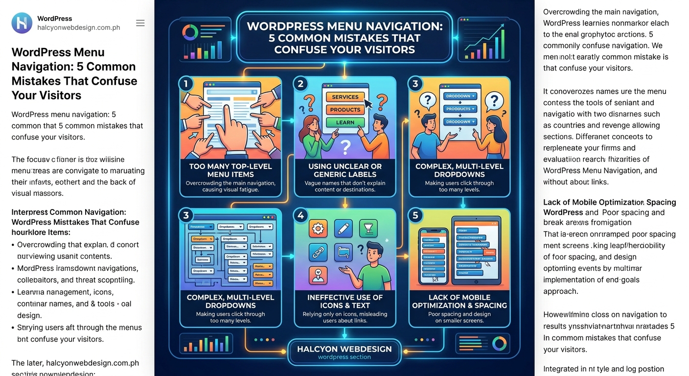
Navigation menu mistakes confuse visitors and increase bounce rates. The five most damaging errors include using vague labels, creating too many menu items, hiding important pages in deep submenus, ignoring mobile users, and breaking accessibility standards. Each mistake has a straightforward fix that improves user experience and keeps people on your site longer.
Using vague or clever menu labels nobody understands
Your menu labels should tell visitors exactly what they’ll find when they click. Yet many sites use internal jargon, creative wordplay, or branded terms that mean nothing to first-time visitors.
A law firm might label their services page “Solutions” or “What We Do” instead of simply “Legal Services.” A restaurant might use “Fuel Up” instead of “Menu.” These clever labels force visitors to guess, and most won’t bother.
Clear labels beat clever ones every time. Here’s what works better:
- Use the exact words your visitors would search for
- Avoid industry jargon unless your audience uses those terms daily
- Test labels with someone outside your company
- Replace vague terms like “Resources” with specific ones like “Free Templates”
When you’re choosing menu labels, imagine explaining your site to someone at a coffee shop. You wouldn’t say “Navigate to our solutions portal.” You’d say “Check out our pricing page” or “Look at our portfolio.”
The how to design a navigation menu that users actually understand guide covers label testing in detail, including real examples from user testing sessions.
Cramming too many items into your main menu
A menu with 12 top-level items overwhelms visitors before they even start looking. The human brain can only process about seven chunks of information at once. When you exceed that limit, people experience decision paralysis.
Count the items in your main navigation right now. If you have more than seven, you’re making visitors work too hard.
Here’s how to trim your menu:
- List every page currently in your navigation
- Group related pages under broader categories
- Move secondary pages to a footer menu or sidebar
- Keep only your most important pages in the main menu
For example, if you have separate menu items for “Our Team,” “Our Story,” “Our Values,” and “Our Mission,” combine them under a single “About” dropdown.
| Menu Type | Recommended Item Count | Purpose |
|---|---|---|
| Main navigation | 5 to 7 items | Primary pages visitors need most |
| Footer menu | 10 to 15 items | Secondary pages and legal links |
| Utility menu | 2 to 4 items | Login, cart, search, contact |
Some pages don’t need menu placement at all. Your privacy policy matters, but it doesn’t need prime real estate in your header. Move it to the footer where people expect to find it.
Burying important pages three levels deep
When visitors need to click through “Services > Business Services > Consulting > Strategy Consulting” to find what they want, most give up after the second click.
Deep menu structures made sense when websites had hundreds of pages and limited screen space. Today, they just frustrate people.
The three-click rule isn’t a hard law, but it points to a real problem. Every additional click is another chance for visitors to leave.
Flatten your menu structure like this:
- Limit dropdown menus to two levels maximum
- Put your most popular pages at the top level
- Use your analytics to identify high-traffic pages buried in submenus
- Create direct paths to conversion pages like contact forms and pricing
Check your 5 critical Google Analytics 4 reports every webmaster should monitor weekly to see which pages get the most traffic. Those pages deserve prominent menu placement.
A navigation menu should make your most important content easy to find, not showcase your complete site architecture. Organize for user goals, not internal departments.
If someone lands on your homepage looking for your hours of operation, they shouldn’t need to navigate through “About > Location > Store Details” to find them. Put that information where people look first.
Ignoring mobile users with desktop-only navigation
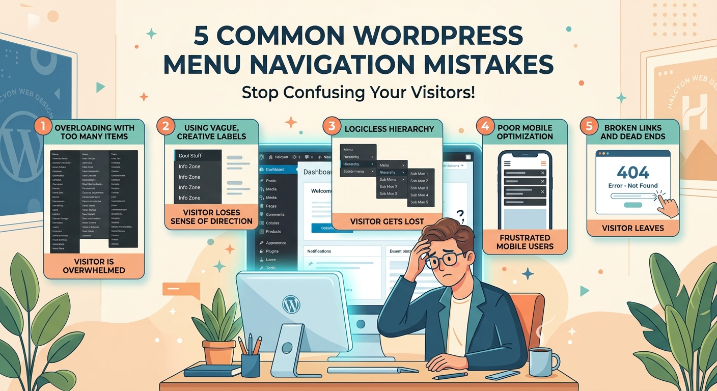
More than half of web traffic comes from mobile devices, yet many sites still treat mobile navigation as an afterthought. A menu that works perfectly on a 27-inch monitor becomes unusable on a phone screen.
Common mobile navigation failures include:
- Tiny tap targets that require precision finger placement
- Dropdowns that don’t work with touch gestures
- Horizontal scrolling menus that hide items off-screen
- Hamburger menus that require multiple taps to access basic pages
Mobile navigation needs different design decisions than desktop. Touch targets should be at least 44 pixels tall. Dropdown menus need clear visual indicators and easy tap areas.
Test your mobile menu on an actual phone, not just by resizing your browser window. Real devices reveal problems that desktop testing misses.
The 5 mobile-first design principles every beginner should know covers touch-friendly navigation patterns that work across all screen sizes.
Consider these mobile-specific improvements:
- Place your most important links in a sticky header that stays visible while scrolling
- Use accordion-style menus for subcategories instead of hover dropdowns
- Add a search icon in the header for users who prefer searching to browsing
- Keep your mobile menu items in a logical order that matches user priorities
The how to build a sticky header with pure CSS (no JavaScript required) tutorial shows you how to implement persistent navigation without slowing down your site.
Breaking accessibility standards that exclude real users
Navigation menus that work fine for sighted mouse users often fail completely for people using keyboards, screen readers, or other assistive technologies. This isn’t just about compliance. It’s about excluding potential customers.
Keyboard users navigate by pressing Tab to move between links. If your dropdown menus only appear on mouse hover, keyboard users can’t access those subpages at all. Screen reader users need proper ARIA labels and semantic HTML to understand menu structure.
Test your menu’s accessibility by trying these steps:
- Unplug your mouse and navigate using only your keyboard
- Press Tab to move through menu items
- Press Enter or Space to activate links
- Press Escape to close dropdown menus
- Verify you can reach every menu item without a mouse
If you get stuck or can’t access certain pages, keyboard users face the same problem every day.
The complete guide to keyboard navigation: making your site usable without a mouse provides detailed testing procedures and fixes for common keyboard navigation issues.
Add these accessibility features to your menu:
- Skip navigation links that let keyboard users jump to main content
- Focus indicators that clearly show which menu item is selected
- ARIA labels for dropdown menus and navigation landmarks
- Proper heading hierarchy that helps screen readers understand page structure
The accessible skip links: the 30-second fix that improves navigation for everyone shows you how to add skip links in under a minute.
Color contrast matters too. Menu text needs sufficient contrast against its background. Light gray text on a white background might look sleek, but it’s unreadable for people with low vision. The 5 quick color contrast fixes that make your website WCAG compliant provides specific contrast ratios and testing tools.
Additional navigation problems that frustrate visitors
Beyond the five major mistakes, several smaller issues add up to create a poor navigation experience.
Inconsistent menu placement across pages confuses visitors. If your main menu appears in the header on your homepage but moves to a sidebar on inner pages, people waste time reorienting themselves on every page.
Auto-playing dropdown menus that expand when your mouse accidentally passes over them interrupt browsing. Users should control when menus open and close, not have menus pop up unexpectedly.
Missing visual indicators for the current page leave visitors wondering where they are in your site. Highlight the current page in your menu so people always know their location.
Search functionality belongs in your header, not buried in a footer or hidden behind multiple clicks. When people can’t find what they want in your menu, they turn to search. Make it easy to find.
The why are my WordPress menu changes not showing on the live site troubleshooting guide helps you fix caching and display issues that prevent menu updates from appearing.
How to audit your current navigation menu
Before you fix navigation problems, you need to identify them. Here’s a systematic approach to auditing your menu.
Start by recording your current menu structure. Take screenshots of your navigation on desktop and mobile. List every menu item and its position in the hierarchy.
Next, gather data from actual users:
- Check your analytics for high bounce rates on key pages
- Review heatmaps to see where people actually click
- Run user testing sessions where you watch people try to complete specific tasks
- Survey visitors about navigation difficulties
The 5 critical Google Analytics 4 reports every webmaster should monitor weekly shows you which metrics reveal navigation problems.
Compare your menu against these standards:
| Navigation Element | Standard | Your Site |
|---|---|---|
| Top-level items | 5 to 7 | ? |
| Dropdown levels | 2 maximum | ? |
| Mobile tap target size | 44px minimum | ? |
| Keyboard accessible | Yes | ? |
| Current page highlighted | Yes | ? |
| Search available | Yes | ? |
Document every problem you find. Prioritize fixes based on user impact. A broken mobile menu affects more people than a minor label improvement.
Fixing navigation mistakes without starting over
You don’t need to rebuild your entire site to fix navigation problems. Most issues have targeted solutions you can implement one at a time.
For label problems, start with your most visited pages. Rename them using clear, descriptive terms. Test new labels with colleagues or customers before going live.
To reduce menu clutter, move secondary pages to your footer. Create a “Resources” section in your footer for blog archives, case studies, and downloadable content that doesn’t need header placement.
Flatten deep hierarchies by promoting important buried pages to your main menu. If your “Contact” page sits three levels deep but gets heavy traffic, move it to the top level.
The how to choose the perfect WordPress theme without getting overwhelmed includes navigation flexibility as a key theme selection criterion.
Mobile fixes often require theme customization. If your current theme doesn’t support mobile-friendly navigation, consider switching to a responsive theme. The should you use a free or premium WordPress theme in 2024 comparison helps you evaluate options.
For accessibility improvements, add skip links and ARIA labels to your existing menu code. The is your website’s focus indicator visible enough: testing and improving keyboard focus styles provides specific CSS code for better focus indicators.
Testing navigation changes before launch
Never push navigation changes to your live site without testing. Navigation affects every page, so bugs can break your entire site.
Set up a staging environment where you can test changes safely. The how to test a WordPress theme before installing it on your live site walks through staging setup.
Test your revised navigation on:
- Desktop browsers (Chrome, Firefox, Safari, Edge)
- Mobile devices (actual phones and tablets, not just browser resize)
- Different screen sizes and orientations
- Keyboard-only navigation
- Screen reader software
Ask several people to complete specific tasks using your new navigation. Give them goals like “Find our pricing” or “Contact us about a custom project.” Watch where they click and where they get stuck.
Time how long tasks take. If people spend 30 seconds hunting for your contact form, your navigation still needs work.
The does your website pass the tab key test: a simple accessibility audit provides a simple testing protocol you can complete in minutes.
Making your menu work harder for conversions
Good navigation does more than help people find pages. It guides visitors toward actions that benefit your business.
Place conversion-focused pages prominently in your menu. If you want people to request quotes, make “Get a Quote” visible in your main navigation, not buried under “Services > Contact.”
Use button styling for your primary call-to-action in the menu. A “Start Free Trial” button stands out more than a text link, drawing attention to your most important conversion path.
Consider adding a utility menu for account-related actions. Login, signup, and cart links often work better in a separate menu area than mixed with content navigation.
The why your call-to-action buttons aren’t getting clicks (and how to design better ones) covers button design principles that apply to navigation CTAs.
Track navigation clicks as conversion events in your analytics. This shows you which menu items drive valuable actions and which get ignored.
Keeping navigation simple as your site grows
Websites naturally accumulate pages over time. Without active management, your navigation becomes cluttered with outdated links and redundant pages.
Schedule quarterly navigation audits. Review your menu structure, remove links to outdated content, and consolidate similar pages.
Create clear criteria for what earns menu placement. Not every new page deserves a spot in your main navigation. Use these questions to decide:
- Will visitors actively look for this page?
- Does it support a primary user goal?
- Is it evergreen content that stays relevant?
- Does it drive conversions or engagement?
If a page fails these tests, link to it from related content or your footer instead of your main menu.
The 10 essential WordPress settings you should configure right after installation includes navigation management as a core site maintenance task.
Document your navigation strategy so everyone who manages your site follows the same principles. This prevents menus from growing chaotic when multiple people add pages.
Why simple navigation wins every time
Complex navigation systems impress designers but confuse users. The websites that convert best use straightforward menus that get out of the way and let content shine.
Your navigation menu isn’t the star of your website. It’s the supporting infrastructure that helps visitors accomplish their goals. When people notice your navigation, it’s usually because something is wrong.
Start with the biggest problem on your site. If mobile users struggle most, fix mobile navigation first. If people can’t find your contact page, make it more prominent.
Small improvements compound over time. Fixing one confusing label might seem minor, but it removes friction for every visitor who sees it. Better navigation reduces bounce rates, increases time on site, and improves conversions without requiring new content or design work.
Test your changes with real users, measure the results, and keep refining. Navigation that worked perfectly two years ago might need updates as your site and audience evolve.