Your website loads slowly. Visitors leave before your hero image appears. Google penalizes your rankings. The culprit? Unoptimized images that weigh down every page.
Most website owners upload photos straight from their camera or design software. A single product photo can exceed 5MB. Multiply that across a gallery, and you’re forcing visitors to download 50MB just to see your work. That’s unacceptable in 2024.
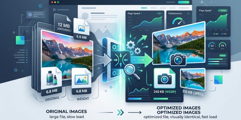
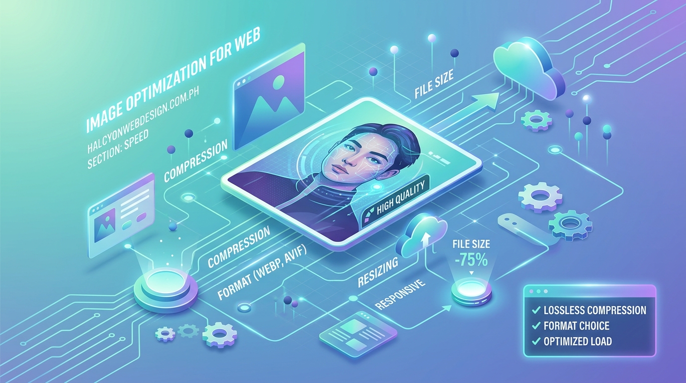
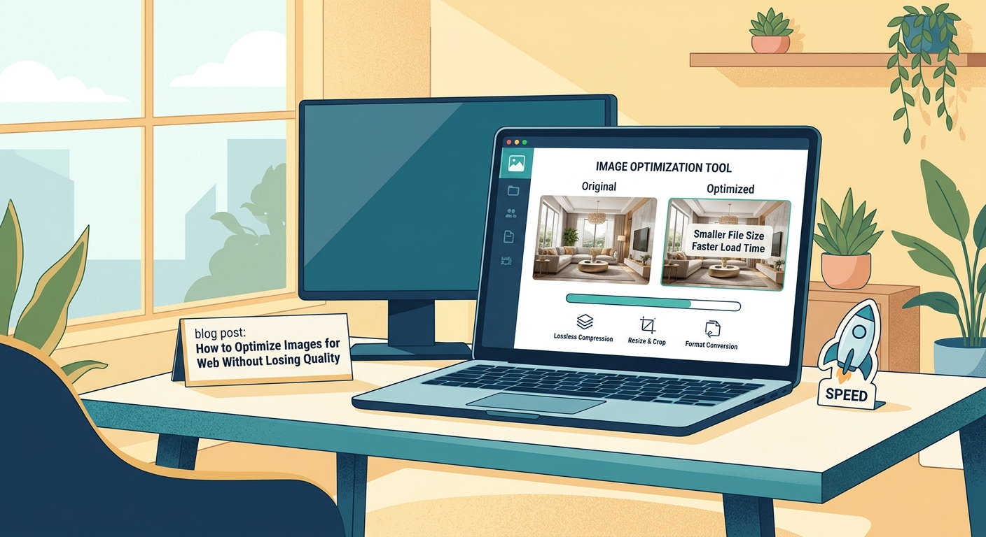
But here’s the good news: you can optimize images for web without losing quality. The right combination of format selection, compression techniques, and delivery methods will cut file sizes by 70% while keeping your visuals crisp.
Optimizing images for web requires choosing the right format (WebP for photos, SVG for logos), compressing files to 100-200KB, serving responsive sizes through srcset, and implementing lazy loading. These techniques reduce page weight by 60-80% while preserving visual quality, improving [Core Web Vitals](https://web.dev/articles/vitals) scores and user experience across all devices and connection speeds.
Understanding image formats and when to use each one
Not all image formats serve the same purpose. Using PNG for every photo wastes bandwidth. Using JPEG for logos creates fuzzy edges.
Here’s what each format does best:
JPEG handles photographs and complex images with gradients. It uses lossy compression, which means it discards some data to reduce file size. For web use, 80-85% quality settings provide the sweet spot between clarity and compression.
PNG preserves transparency and sharp edges. Use it for logos, icons, and graphics with text. PNG files are larger than JPEGs because they use lossless compression. Every pixel stays exactly as designed.
WebP combines the best of both worlds. It supports transparency like PNG and compresses photos like JPEG, but with 25-35% smaller file sizes. Browser support now exceeds 95%, making WebP the default choice for modern websites.
SVG stores vector graphics as code rather than pixels. Icons, logos, and illustrations scale to any size without quality loss. A 2KB SVG file can display perfectly at both 50px and 5000px wide.
AVIF offers even better compression than WebP but has limited browser support. Use it as a progressive enhancement with WebP fallbacks.
Choosing the right compression level for your images
Compression reduces file size by removing data your eyes won’t miss. But push too far and images become pixelated, blurry, or full of artifacts.
Start with these baseline settings:
- Photos and complex images: 80-85% quality for JPEG, 75-80% for WebP
- Product images: 85-90% quality to show details clearly
- Background images: 70-75% quality since they’re not the focal point
- Thumbnails: 70-80% quality at smaller dimensions
Test each image at different quality levels. Save three versions at 70%, 80%, and 90%. Compare them at actual display size, not zoomed in. Most people can’t distinguish between 85% and 100% quality on a typical screen.
“The human eye stops noticing quality improvements above 85% compression for most web images. That remaining 15% often doubles your file size with no perceptible benefit to visitors.” – Image optimization research, HTTP Archive
Tools like TinyPNG, Squoosh, and ImageOptim show you the exact file size reduction for each quality setting. Some reduce files by 80% before you notice any degradation.
Step by step process to optimize images before uploading
Follow this workflow every time you prepare images for your website:
-
Resize to actual display dimensions first. If your theme displays blog featured images at 1200px wide, don’t upload 4000px originals. Browsers will download the full file then shrink it with CSS, wasting bandwidth.
-
Convert to WebP format. Use a tool like Squoosh or Cloudflare Polish. Keep your original files as backups, but serve WebP to visitors. If you need to support older browsers, create JPEG fallbacks.
-
Compress at 80-85% quality. Run your images through TinyPNG or similar tools. Check the preview to confirm quality remains acceptable.
-
Strip metadata. Photos from cameras include EXIF data (location, camera settings, timestamps) that adds kilobytes without helping visitors. Most optimization tools remove this automatically.
-
Save with descriptive filenames. Use “red-leather-wallet-product-photo.jpg” instead of “IMG_2847.jpg”. This helps SEO and makes files easier to manage later. Make sure you also write alt text that actually helps visually impaired users when you upload.
-
Test file size. Aim for under 200KB for full-width hero images, under 100KB for in-content photos, under 50KB for thumbnails.
Setting up responsive images with srcset
Desktop visitors have fast connections and large screens. Mobile visitors have slower networks and smaller displays. Serving the same 2000px image to both wastes mobile data and slows load times.
The srcset attribute tells browsers to choose the right image size for each device:
<img src="photo-800w.jpg"
     srcset="photo-400w.jpg 400w,
             photo-800w.jpg 800w,
             photo-1200w.jpg 1200w"
     sizes="(max-width: 600px) 400px,
            (max-width: 1000px) 800px,
            1200px"
     alt="Mountain landscape at sunset">
This code provides three versions of the same image. Phones load the 400px version. Tablets get 800px. Desktops receive 1200px. Visitors only download what they need.
WordPress generates multiple sizes automatically when you upload images. Your theme needs to implement srcset properly to use them. Check by viewing page source and searching for “srcset” inside your image tags.
For background images in CSS, use media queries to load different sizes:
.hero {
  background-image: url('hero-mobile.jpg');
}

@media (min-width: 768px) {
  .hero {
    background-image: url('hero-tablet.jpg');
  }
}

@media (min-width: 1200px) {
  .hero {
    background-image: url('hero-desktop.jpg');
  }
}
Implementing lazy loading to defer offscreen images
Lazy loading delays image downloads until visitors scroll near them. Your homepage might contain 30 images, but visitors only see the first 3 without scrolling. Why make them download all 30 immediately?
Add the loading="lazy" attribute to any image below the fold:
<img src="photo.jpg" alt="Description" loading="lazy">
Browsers now support this natively. No JavaScript required. Images load about 500px before they enter the viewport, giving them time to appear smoothly as visitors scroll.
Don’t lazy load images in the viewport on page load. Your hero image, logo, and above-the-fold content should load immediately. Only defer images visitors need to scroll to see.
WordPress 5.5 and newer add lazy loading automatically to all images. Older sites need plugins or manual implementation. If you notice your WordPress site loads slowly, check whether lazy loading is active.
Using a CDN to serve images faster globally
Content Delivery Networks store copies of your images on servers around the world. When someone in Australia visits your US-hosted site, they download images from a Sydney server instead of crossing the Pacific Ocean.
CDNs also optimize images automatically:
- Convert to WebP or AVIF based on browser support
- Resize images to match device dimensions
- Compress files more aggressively
- Cache images at edge locations
Popular image CDNs include:
- Cloudflare Images: Automatic format conversion and resizing
- Cloudinary: Advanced transformations and optimization
- ImageKit: Real-time image optimization and delivery
- KeyCDN: Simple CDN with image optimization add-on
Most CDNs charge based on bandwidth or transformations. Free tiers work well for small sites. Growing sites should budget $10-50 monthly for image delivery.
Setting up a CDN takes 15-30 minutes. You change your DNS settings to route image requests through the CDN network. Some WordPress plugins handle this automatically. Learn more about why your website needs a CDN and how to configure one in 15 minutes.
Common image optimization mistakes to avoid
| Mistake | Impact | Solution |
|---|---|---|
| Uploading camera-resolution photos (4000px+) | Files exceed 5MB, slow page loads by 10+ seconds | Resize to display dimensions before upload |
| Using PNG for all images | Files 3-5x larger than necessary | Use JPEG or WebP for photos, PNG only for transparency |
| Compressing below 70% quality | Visible artifacts, blurry details | Stay between 75-85% for most images |
| Skipping alt text | Fails accessibility, hurts SEO | Write descriptive alt text for every image |
| Not testing mobile performance | Mobile visitors wait 20+ seconds for images | Use responsive images and test on 3G connections |
| Ignoring Core Web Vitals | Google penalizes search rankings | Monitor LCP and optimize largest images first |
The biggest mistake? Assuming optimization happens automatically. WordPress creates multiple sizes but doesn’t compress them. Plugins help but often apply generic settings that don’t match your specific needs.
Manual optimization takes more time upfront but produces better results. You control quality levels, formats, and delivery methods. Your site loads faster and looks better.
Tools and plugins that make optimization easier
Desktop applications:
- ImageOptim (Mac): Drag and drop compression for multiple files
- FileOptim (Windows): Batch optimization with multiple algorithms
- Squoosh (Web): Browser-based tool with real-time previews
- GIMP: Free alternative to Photoshop with “Export for Web” features
WordPress plugins:
- ShortPixel: Automatic compression on upload, supports WebP
- Imagify: Bulk optimization with three compression levels
- EWWW Image Optimizer: Local compression without external servers
- Smush: Free compression with premium CDN option
Command-line tools for developers:
- ImageMagick: Powerful batch processing and conversion
- jpegoptim: JPEG-specific optimization
- pngquant: PNG compression with quality control
- cwebp: Google’s WebP conversion tool
Most plugins work similarly. You install them, choose compression settings, and they process images automatically on upload. Some also bulk-optimize existing images in your media library.
Free tiers typically limit monthly optimizations (100-500 images). Paid plans start around $5-10 monthly for unlimited compression.
Testing your optimizations and measuring improvements
Numbers matter more than assumptions. Test before and after optimization to prove your changes work.
Page speed tools:
- Google PageSpeed Insights: Shows Core Web Vitals and image optimization opportunities
- GTmetrix: Detailed waterfall charts showing image load times
- WebPageTest: Tests from multiple locations and connection speeds
- Lighthouse: Built into Chrome DevTools, audits performance automatically
Look for these metrics:
- Largest Contentful Paint (LCP): Should be under 2.5 seconds
- Total page weight: Aim for under 1-2MB for content pages
- Number of requests: Fewer is better, combine when possible
- Time to Interactive: How long before visitors can click and scroll
Run tests on tools to test and improve your Core Web Vitals score before optimization. Note your scores. Optimize images. Test again. You should see 30-50% improvements in load times.
Test on real devices too. Your laptop might load pages instantly on fiber internet. Your customers might use phones on 4G in crowded areas. Throttle your connection in Chrome DevTools to simulate slower speeds.
Advanced techniques for performance enthusiasts
Once you’ve mastered basic optimization, these advanced methods squeeze out extra performance:
Progressive JPEGs load in multiple passes. Visitors see a low-quality preview immediately, then higher quality versions as data arrives. Convert with ImageMagick or Photoshop’s “Save for Web” feature.
Blur-up technique shows a tiny, heavily compressed placeholder while the full image loads. The placeholder is 20-50 bytes, loads instantly, and gets replaced when the real image arrives. Medium.com popularized this approach.
Art direction with picture element serves completely different images based on viewport size:
<picture>
  <source media="(max-width: 600px)" srcset="mobile-crop.jpg">
  <source media="(max-width: 1200px)" srcset="tablet-crop.jpg">
  <img src="desktop-wide.jpg" alt="Description">
</picture>
This isn’t just resizing. You can crop mobile images to focus on important details that get lost in wide desktop versions.
HTTP/2 Server Push sends images to browsers before they request them. Your server predicts which images visitors need and starts sending them immediately. This requires server configuration and careful testing to avoid wasting bandwidth.
Client hints let browsers tell your server what format, size, and quality they support. Your server responds with optimized images automatically. This requires server-side logic but eliminates the need for multiple srcset entries.
Maintaining image quality as your site grows
Optimization isn’t a one-time task. Every new blog post, product, or gallery adds images that need processing.
Build optimization into your workflow:
- Create templates with ideal dimensions for each image type (featured images, product photos, gallery thumbnails)
- Document your quality settings so team members use consistent compression
- Set up automated optimization through plugins or build processes
- Audit your site quarterly to find unoptimized images that slipped through
- Monitor page weight in Google Analytics to catch problems early
For team sites, create a simple checklist:
- Resize to template dimensions
- Convert to WebP
- Compress at 80% quality
- Check file size (under target)
- Add descriptive filename
- Write alt text
- Upload
Print this and keep it near workstations. New team members follow the process automatically.
If you manage client sites, optimization should be part of every maintenance package. Monthly audits catch new unoptimized images before they accumulate. This pairs well with checking whether your WordPress theme is slowing down your website.
Making image optimization part of your routine
You now have the techniques, tools, and workflow to optimize images for web without losing quality. The difference between a 5-second page load and a 1-second load often comes down to image handling.
Start with your homepage and most-visited pages. Optimize hero images first since they affect Largest Contentful Paint directly. Then work through product pages, blog posts, and galleries.
Set a target: reduce total page weight by 50% within two weeks. Use PageSpeed Insights to track progress. Each percentage point improvement translates to faster loads, better rankings, and happier visitors.
Your images will look just as good. Your pages will load three times faster. Your visitors will actually see your content instead of staring at loading spinners.