You set display: flex on your container. You add align-items: center. You refresh the browser. Nothing happens.
Your items stubbornly refuse to center, and you’ve triple-checked the CSS. The problem isn’t that flexbox doesn’t work. The issue is usually one of three missing properties that nobody tells beginners about until they’ve wasted an hour staring at their code.
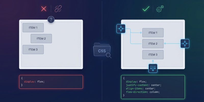
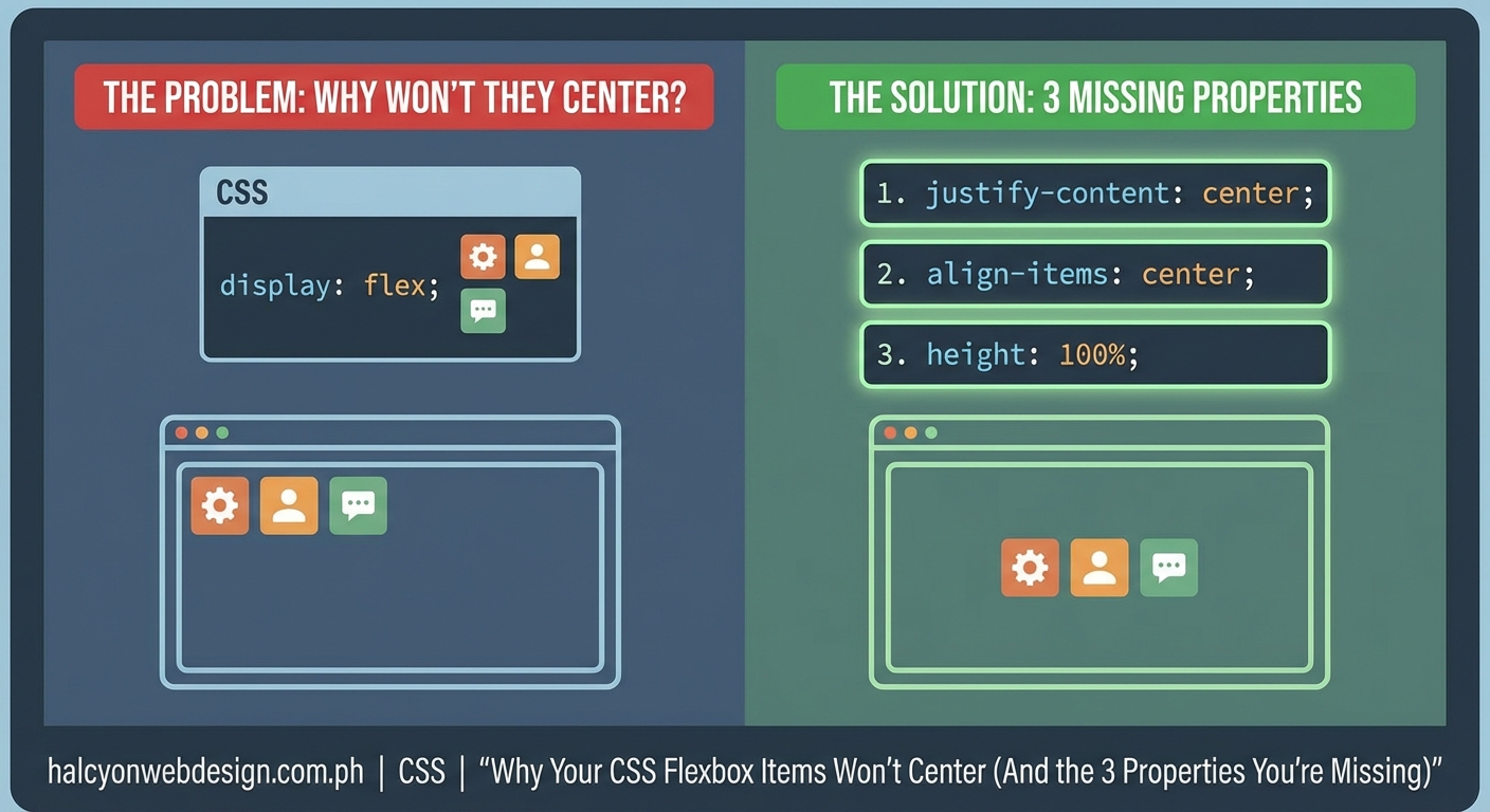
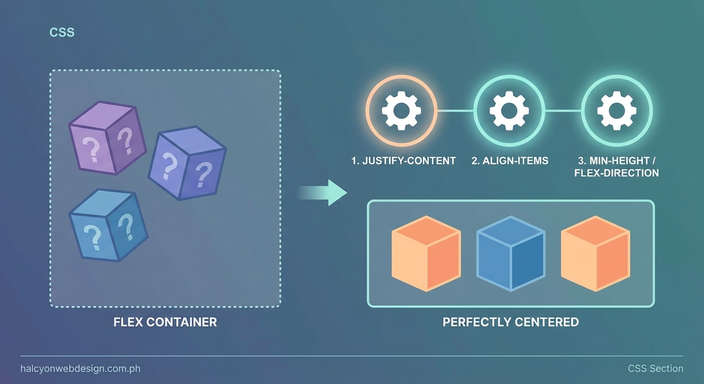
Flexbox not centering items usually happens because developers forget to set a container height, apply flexbox to the wrong parent element, or misunderstand the difference between justify-content and align-items. Fix these three properties and your alignment issues disappear. This guide shows you exactly which properties to check, why they matter, and how to troubleshoot centering problems in any layout.
The Three Properties That Break Flexbox Centering
Most flexbox alignment failures come down to three specific property issues. Understanding each one will save you hours of debugging.
Property One: Your Container Has No Height
Flexbox centers items within the available space of the container. If your container has no explicit height, it collapses to fit its content. There’s nothing to center within.
This is the most common reason flexbox not centering items happens to beginners.
“`css
.container {
display: flex;
align-items: center; / Does nothing without height /
}
The fix is simple. Give your container a height:
``css
.container {
  display: flex;
  align-items: center;
  min-height: 400px; /* Now there's space to center within */
}
You can useheight,min-height, or evenheight: 100vh` for full viewport centering. The key is that the container must have vertical space for vertical centering to work.
Property Two: You Applied Flexbox to the Wrong Element
Flexbox only affects direct children of the flex container. If you apply display: flex to an element, only its immediate children will respond to flex properties.
This trips up developers constantly:
“`html
If you set display: flex on .container, the flex properties only affect .wrapper, not .item. To center .item, you need flexbox on .wrapper too.
Property Three: You’re Confusing Justify-Content and Align-Items
These two properties control different axes, and mixing them up is why flexbox not centering items frustrates so many developers.
justify-contentcontrols the main axis (horizontal by default)align-itemscontrols the cross axis (vertical by default)
To center items both horizontally and vertically, you need both:
``css
.container {
  display: flex;
  justify-content: center; /* Centers horizontally */
  align-items: center; /* Centers vertically */
  min-height: 400px;
}
The axes flip if you changeflex-directiontocolumn. Thenjustify-contenthandles vertical alignment andalign-items` handles horizontal.
The Complete Flexbox Centering Checklist
Run through this checklist every time your items won’t center. It catches 95% of alignment problems.
- Check that display: flex is on the parent element. Not the item you want to center, but its container.
- Verify the container has height. Use browser dev tools to inspect the computed height. If it shows 0px or matches the content height exactly, add
min-height. - Confirm you’re using the right alignment property. Horizontal centering needs
justify-content: center. Vertical centering needsalign-items: center. - Look for conflicting CSS. Other rules might override your flex properties. Check for
float,position: absolute, or competing alignment values. - Test with a visible border. Add
border: 2px solid redto your container temporarily. This shows you exactly how much space flexbox has to work with.
Common Mistakes That Break Centering
| Mistake | Why It Breaks Centering | The Fix |
|---|---|---|
| No container height | Flexbox has no vertical space to center within | Add min-height or height to container |
| Flexbox on child instead of parent | Flex properties don’t affect the element itself | Move display: flex to parent element |
| Using only justify-content | Only centers on one axis | Add align-items: center for both axes |
| Items have margin: auto | Auto margins override flex alignment | Remove auto margins or use them intentionally |
| Container has padding but no height | Padding creates visual space but no centering space | Set explicit height larger than padding |
| Using align-content instead of align-items | align-content only works with wrapped flex lines | Use align-items for single-row centering |
Why Margin Auto Sometimes Works Better
Flexbox offers an alternative centering method that some developers prefer. Setting margin: auto on a flex item centers it both horizontally and vertically without needing alignment properties on the parent.
“`css
.container {
display: flex;
min-height: 400px;
}
.item {
margin: auto; / Centers in both directions /
}
This approach works great for centering a single item. It fails if you have multiple items that all need centering, because each item will try to claim all available space.
Use margin auto when you have one special item that needs perfect centering. Use justify-content and align-items when you have multiple items or need more control over spacing.
Debugging Flexbox Alignment Step by Step
When your flexbox not centering items and you can’t figure out why, follow this systematic debugging process.
- Open browser dev tools and inspect the container. Look at the computed styles panel. Verify
display: flexis actually applied and not overridden. - Check the container’s dimensions. In the box model viewer, confirm the container has the height you expect. If height shows 0px or a tiny value, that’s your problem.
- Inspect each flex item. Look for properties that remove items from flex flow like
position: absoluteorfloat: left. These properties break flex alignment. - Toggle flex properties on and off. In dev tools, uncheck and recheck
align-itemsandjustify-content. This shows you whether they’re having any effect at all. - Test with simplified CSS. Comment out all other styles temporarily and use only the essential flex properties. If centering works with minimal CSS, another rule is interfering.
The most reliable way to debug flexbox issues is to start with the simplest possible code that should work, then add complexity back one piece at a time until something breaks. This isolates the exact property causing problems.
Real Examples of Centering Problems and Solutions
Example One: The Login Form That Won’t Center
You’re building a login form that should sit in the middle of the page. You add flexbox to the body, but the form stays at the top.
The problem:
“`css
body {
display: flex;
justify-content: center;
align-items: center;
}
The body element has no height by default. It only grows to fit its content.
The solution:
“`css
body {
display: flex;
justify-content: center;
align-items: center;
min-height: 100vh; / Full viewport height /
}
Now the body fills the entire viewport, giving flexbox space to center the form vertically.
Example Two: The Card That Centers Horizontally But Not Vertically
Your card centers side to side but sticks to the top of its container.
The problem:
``css
.card-container {
  display: flex;
  justify-content: center;
  height: 500px;
}
You forgotalign-items. Horizontal centering works because you usedjustify-content`, but vertical centering needs its own property.
The solution:
“`css
.card-container {
display: flex;
justify-content: center;
align-items: center; / Add this /
height: 500px;
}
Example Three: The Icon That Won’t Center Inside a Button
You have a button with an icon and text. The icon won’t align vertically with the text.
The problem:
``css
button {
  display: flex;
}
Withoutalign-items, flex items align tostretch` by default, which doesn’t center them.
The solution:
“`css
button {
display: flex;
align-items: center; / Centers icon with text /
gap: 8px; / Adds space between icon and text /
}
When Flex-Direction Changes Everything
Changing flex-direction to column flips which property controls which axis. This confuses developers who memorize that align-items handles vertical centering.
With flex-direction: row (the default):
* justify-content controls horizontal alignment
* align-items controls vertical alignment
With flex-direction: column:
* justify-content controls vertical alignment
* align-items controls horizontal alignment
If you’re working with a vertical layout and flexbox not centering items the way you expect, check your flex-direction. You might need to swap which properties you’re using.
“`css
.vertical-container {
display: flex;
flex-direction: column;
justify-content: center; / Now this centers vertically /
align-items: center; / Now this centers horizontally /
min-height: 100vh;
}
The Browser DevTools Trick That Shows Everything
Modern browsers include a flexbox visualization tool that makes debugging alignment trivial. Here’s how to use it.
- Right-click your flex container and choose “Inspect Element”
- Look for a small flexbox icon next to
display: flexin the styles panel - Click that icon to enable flexbox debugging mode
- The browser draws colored overlays showing flex lines, gaps, and alignment
Chrome, Firefox, and Edge all support this feature. It shows you exactly where items are positioned and why, making it obvious when your container has no height or when you’re missing an alignment property.
This visual debugging catches problems faster than reading CSS ever could.
How Other CSS Properties Interfere with Flexbox
Certain CSS properties override or conflict with flex alignment. If your flexbox not centering items despite correct properties, one of these might be interfering.
- Position absolute or fixed: Removes the element from flex flow entirely. Flex properties won’t affect it.
- Float left or right: Floats are ignored on flex items, but they can cause confusion. Remove them.
- Display inline or block on flex items: Flex items ignore their display property. Setting
display: blockon a flex item does nothing. - Vertical-align: This property doesn’t work inside flexbox. Use
align-itemsinstead. - Text-align: Only affects inline content inside flex items, not the items themselves.
Clean up these legacy properties when you switch to flexbox. They create conflicts and make debugging harder.
Building Responsive Centered Layouts
Centering works great on desktop, but mobile layouts often need different alignment. Use media queries to adjust flex properties for smaller screens.
“`css
.container {
display: flex;
justify-content: center;
align-items: center;
min-height: 100vh;
}
@media (max-width: 768px) {
.container {
flex-direction: column;
justify-content: flex-start; / Stack items at top on mobile /
padding: 20px;
}
}
This pattern centers content on large screens but switches to a vertical stack on mobile, where perfect centering matters less than readable content flow.
Just like fixing typography problems can improve your site’s professional appearance with 7 typography mistakes that make your website look unprofessional, getting your layout alignment right makes everything look more polished.
Testing Your Centered Layout Across Browsers
Flexbox support is excellent in modern browsers, but older versions handle edge cases differently. Test your centered layouts in multiple browsers, especially if you support older devices.
The most common cross-browser issue involves min-height on flex containers. Some older browsers don’t recognize min-height as creating available space for flex alignment. Use height instead if you need to support these browsers.
``css
/* Better browser support */
.container {
  display: flex;
  align-items: center;
  height: 100vh; /* More reliable than min-height in old browsers */
}
Another issue appears in Safari with nested flex containers. Safari sometimes needs an explicit width on flex items to calculate centering correctly. Add
width: 100%` to inner flex containers if you see alignment problems only in Safari.
Centering Multiple Items with Gap
When you center multiple items, you probably want consistent spacing between them. The gap property handles this perfectly without needing margins.
``css
.container {
  display: flex;
  justify-content: center;
  align-items: center;
  gap: 20px; /* Space between all items */
  min-height: 400px;
}
Gap works on both axes. Userow-gapandcolumn-gap` separately if you need different spacing in each direction.
This is cleaner than adding margins to each item, and it doesn’t create extra space at the edges of your container.
Making Flexbox Centering Work in Navigation Bars
Navigation bars are a common use case for flexbox centering, but they need special handling. You typically want the nav items centered vertically within the bar, but spread horizontally across it.
“`css
nav {
display: flex;
justify-content: space-between; / Spreads items horizontally /
align-items: center; / Centers items vertically /
height: 60px;
padding: 0 20px;
}
This creates a professional navigation layout where logos, menu items, and buttons all align vertically while spacing themselves horizontally. You can see more navigation patterns in guides about how to build a sticky header with pure CSS.
Your Flexbox Centering Troubleshooting Toolkit
Keep these debugging steps handy for the next time flexbox not centering items drives you crazy:
- Add a visible border to your container to see its actual size
- Check computed height in dev tools, not just your CSS
- Verify
display: flexis on the parent, not the child - Remember both
justify-contentandalign-itemsfor full centering - Look for conflicting properties like position or float
- Use browser flex debugging tools for visual feedback
- Test with minimal CSS first, then add complexity
- Check if
flex-directionchanged which axis is which
Why Understanding Flexbox Matters Beyond Centering
Learning to fix centering issues teaches you how flexbox actually works. This knowledge applies to every layout challenge you’ll face.
The same properties that center items also create navigation bars, card grids, form layouts, and complex page structures. Master centering and you’ve mastered the foundation of modern CSS layout.
Every hour you spend understanding flexbox saves you ten hours of fighting with floats and positioning hacks. The investment pays off immediately and keeps paying off for your entire career as a developer.
Your layouts will load faster too, since flexbox is more efficient than older techniques, which matters if you’re concerned about performance issues like those covered in why your WordPress site loads slowly.
Getting Your Items Perfectly Centered
Flexbox centering fails because of missing height, wrong parent elements, or confused alignment properties. Fix those three issues and your items will center exactly where you want them.
Start with the checklist. Add explicit height to your container. Make sure display: flex is on the parent element. Use both justify-content: center and align-items: center for complete centering. Check for interfering properties. Use dev tools to visualize what’s happening.
These steps solve 95% of flexbox alignment problems in minutes. The other 5% usually involve browser quirks or complex nested layouts, but the debugging process stays the same. Isolate the problem, test with minimal code, and add complexity back piece by piece.
Now you know exactly what to check when your items won’t center. Go fix that layout.