
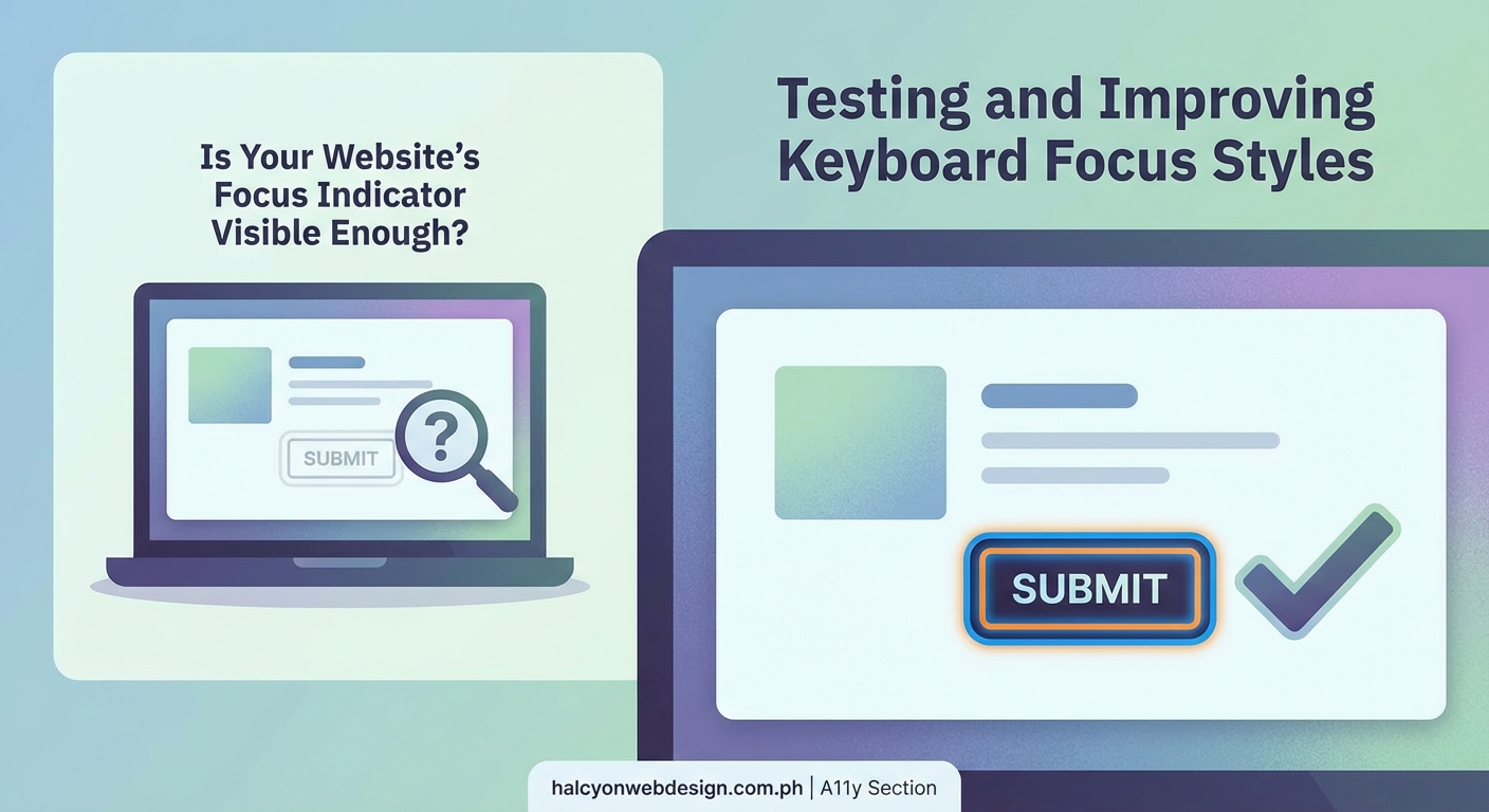
Millions of people navigate websites using only a keyboard. They press Tab to move between links, buttons, and form fields. Without visible focus indicators, they’re navigating blind. They can’t see where they are on the page or what element they’re about to activate. That’s not just frustrating. It’s a barrier that excludes people with motor disabilities, vision impairments, and anyone who prefers keyboard navigation.
Keyboard focus indicators accessibility ensures that every interactive element on your website shows a clear visual signal when keyboard users land on it. WCAG 2.2 requires focus indicators to meet specific contrast and size requirements. Testing with your keyboard and implementing CSS focus styles that pass these standards makes your site usable for everyone, regardless of how they navigate.
What keyboard focus indicators actually do
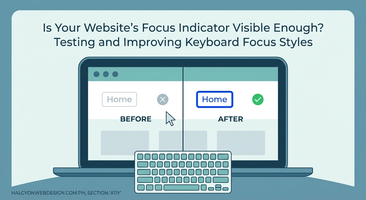
A focus indicator is the visual cue that shows which element currently has keyboard focus. When you press Tab, the browser moves focus from one interactive element to the next. The focus indicator follows along, highlighting each element as you land on it.
Most browsers provide a default focus indicator. It’s usually a thin outline around links and buttons. Chrome shows a blue ring. Firefox uses a dotted outline. Safari displays a blue glow.
These defaults work, but they’re often too subtle. Light outlines disappear against white backgrounds. Thin borders vanish on complex layouts. Users squint and lose their place.
That’s why custom focus styles matter. You control the color, thickness, and style. You make sure every user can see exactly where they are.
Who relies on visible focus styles
Keyboard navigation isn’t a niche use case. It’s how many people interact with the web every day.
- People with motor disabilities who can’t use a mouse or trackpad
- Screen reader users who combine audio feedback with keyboard commands
- Power users who prefer keyboard shortcuts for speed
- Anyone with a broken mouse or touchpad
- People using assistive technologies like switch controls or sip-and-puff devices
Without visible focus indicators, these users face a guessing game. They tab through a page and hope they’re landing on the right element. They can’t tell if focus moved to the next button or skipped ahead to the footer.
Good focus styles remove that uncertainty. They provide immediate visual feedback. They make navigation predictable and efficient.
WCAG requirements for focus indicators
WCAG 2.2 introduced Success Criterion 2.4.11, Focus Appearance. It sets specific standards for how visible focus indicators must be.
Here’s what your focus styles need to pass:
- Minimum area: The focus indicator must cover at least the perimeter of the focused element or have a thickness of at least 2 CSS pixels.
- Contrast ratio: The indicator must have at least a 3:1 contrast ratio against adjacent colors.
- No obscuring: The indicator cannot be hidden by other content or styling.
These requirements apply to all interactive elements. Links, buttons, form inputs, custom controls, navigation menus. If a user can tab to it, it needs a compliant focus indicator.
The 3:1 contrast requirement is lower than the 4.5:1 ratio for body text. That’s intentional. Focus indicators are often larger and bolder than text, making them easier to perceive at lower contrast levels.
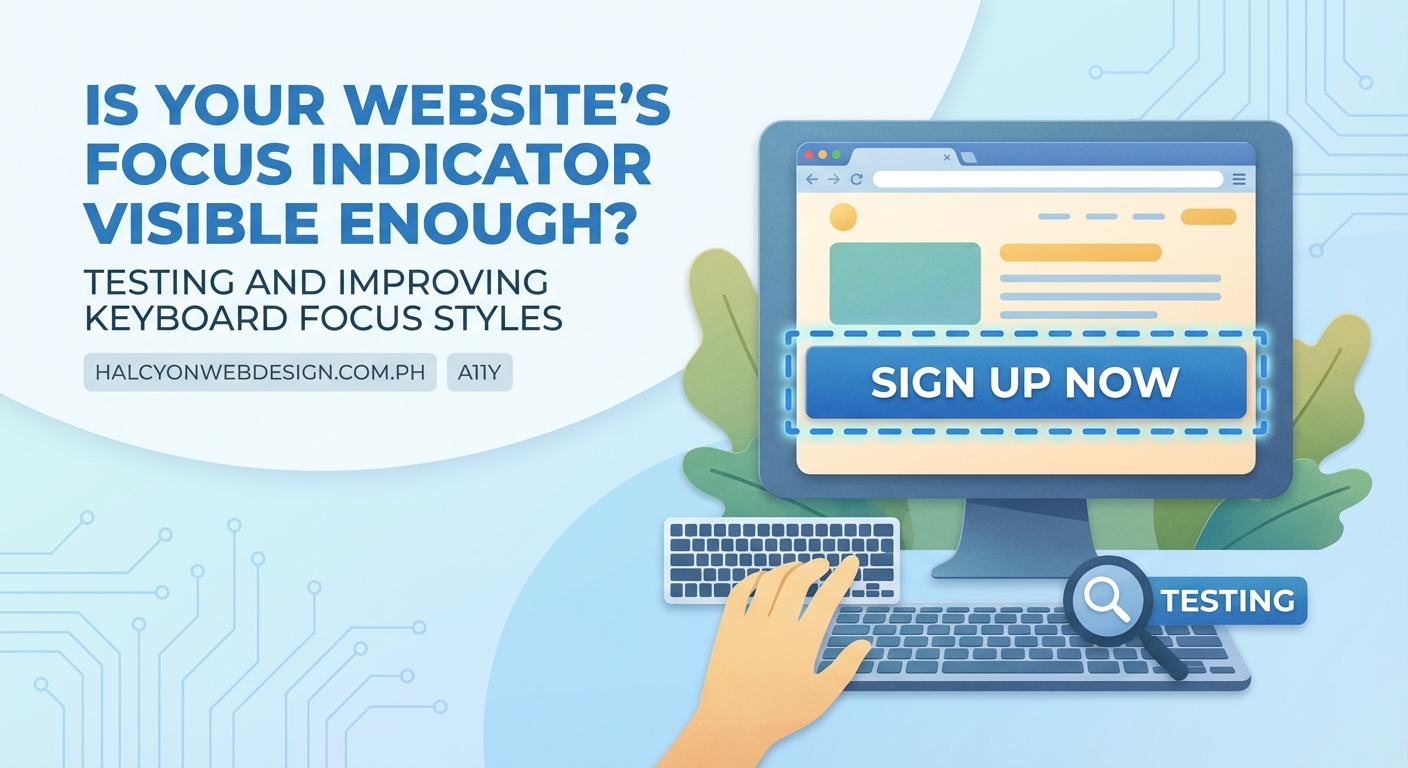
Testing your current focus indicators
You don’t need specialized tools to start testing. Your keyboard is the primary testing device.
- Open your website in a browser. Start on the homepage or any key landing page.
- Click in the address bar, then press Tab. This moves focus to the first interactive element on the page.
- Keep pressing Tab. Watch the focus indicator move from element to element. Note every spot where the indicator disappears, becomes faint, or blends into the background.
- Check form fields separately. Tab into text inputs, dropdowns, checkboxes, and radio buttons. Make sure each one shows a clear indicator when focused.
- Test on different backgrounds. Navigate through sections with light backgrounds, dark backgrounds, and images. The focus indicator should remain visible everywhere.
Take screenshots of problem areas. Document which elements lack visible focus. This gives you a clear roadmap for fixes.
The best focus indicator is one that works everywhere on your site, regardless of background color or layout complexity. Consistency helps users build muscle memory for navigation.
Common focus indicator mistakes and fixes
Many websites accidentally break focus visibility. Here are the most frequent problems and how to solve them.
| Mistake | Why it fails | Fix |
|---|---|---|
outline: none in CSS |
Completely removes the browser default focus indicator | Replace with a custom focus style that meets WCAG standards |
| Low contrast outlines | Indicator blends into background colors | Use a high-contrast color or add a contrasting border underneath |
| Thin 1px borders | Too subtle for users with low vision | Increase to at least 2px thickness |
| Focus only on mouse click | Shows focus for keyboard but hides it for mouse users who then switch to keyboard | Use :focus-visible to show indicators only for keyboard navigation |
| Invisible focus on custom elements | Divs and spans made interactive with JavaScript don’t receive default focus styles | Add tabindex="0" and explicit CSS focus styles |
The outline: none rule is the biggest culprit. Designers remove it because they think default focus indicators look ugly. But removing it without adding a replacement leaves keyboard users stranded.
If you find outline: none in your CSS, replace it immediately. Add a custom focus style that’s both attractive and functional.
Designing effective focus styles
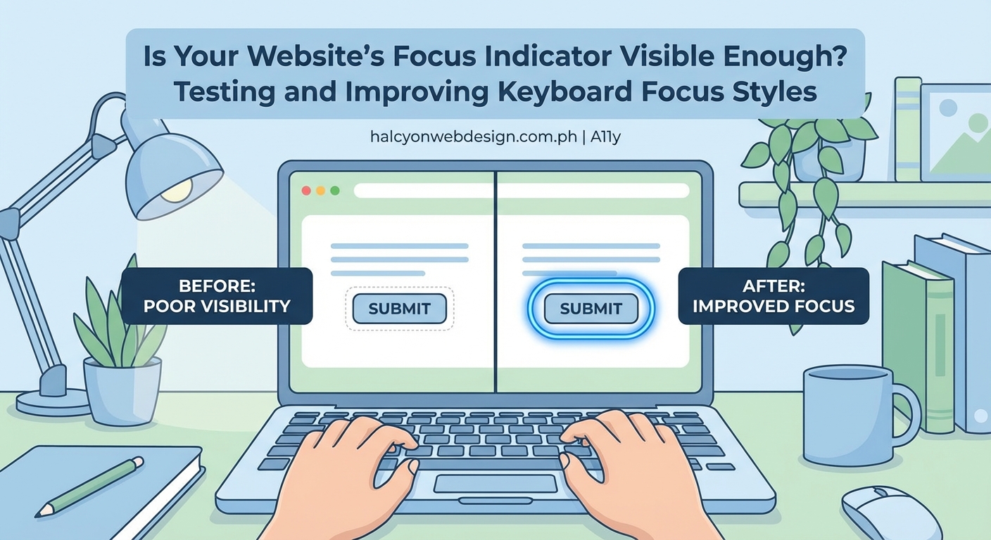
A good focus indicator is visible, consistent, and doesn’t interfere with content. Here’s how to design one that works.
Choose a high-contrast color. Pick a color that stands out against your most common background colors. If your site uses light backgrounds, try a dark blue or black outline. For dark backgrounds, use white or bright yellow.
Make it thick enough. A 2px outline meets the minimum requirement. A 3px or 4px outline is even better for users with low vision.
Consider a double outline. Use a colored outline with a contrasting border underneath. For example, a 2px white outline with a 2px black border beneath it. This combo works on any background.
Keep it simple. Avoid animations, gradients, or complex shapes. A solid outline or border is easiest to perceive.
Test with real users. If possible, ask people who rely on keyboard navigation to try your site. Their feedback is more valuable than any automated test.
Some sites worry that bold focus indicators look distracting. But accessibility isn’t about invisibility. It’s about making sure everyone can use your site. A visible focus indicator is a feature, not a flaw, especially when compared to typography mistakes that make your website look unprofessional.
Implementing focus styles with CSS
Modern CSS gives you precise control over focus indicators. The :focus and :focus-visible pseudo-classes are your main tools.
The :focus pseudo-class applies whenever an element receives focus, whether from keyboard, mouse, or touch. The :focus-visible pseudo-class applies only when the browser determines the focus indicator should be visible, typically during keyboard navigation.
Here’s a basic example:
``css
a:focus,
button:focus,
input:focus,
textarea:focus,
select:focus {
  outline: 3px solid #0066cc;
  outline-offset: 2px;
}
This adds a 3px blue outline to all interactive elements when they receive focus. The
outline-offset` property adds a 2px gap between the element and the outline, making it easier to see.
For a more refined approach, use :focus-visible:
“`css
a:focus-visible,
button:focus-visible,
input:focus-visible,
textarea:focus-visible,
select:focus-visible {
outline: 3px solid #0066cc;
outline-offset: 2px;
}
a:focus:not(:focus-visible),
button:focus:not(:focus-visible),
input:focus:not(:focus-visible),
textarea:focus:not(:focus-visible),
select:focus:not(:focus-visible) {
outline: none;
}
This shows the outline only during keyboard navigation. Mouse clicks won’t trigger the visible outline, reducing visual clutter for mouse users.
If your design requires removing the default outline, always replace it with a custom style. Never leave elements without any focus indicator.
Handling focus in custom components
Custom interactive components built with JavaScript need extra attention. Browsers don’t automatically apply focus styles to non-semantic elements like div or span.
If you’ve built a custom dropdown, modal, or tab panel, make sure it’s keyboard accessible. Add tabindex="0" to make the element focusable. Then add explicit focus styles.
“`css
.custom-button:focus-visible {
outline: 3px solid #0066cc;
outline-offset: 2px;
}
Test these components thoroughly. Tab through them. Make sure focus moves logically from one interactive element to the next. Ensure the focus indicator is always visible.
For complex components like modals or dropdowns, manage focus programmatically. When a modal opens, move focus to the first interactive element inside it. When it closes, return focus to the element that triggered it. This keeps keyboard users oriented.
If you’re using a sticky header with pure CSS, make sure the focus indicator remains visible when elements scroll behind the header.
Tools for automated focus testing
Manual testing catches most issues, but automated tools help you find problems faster.
Browser DevTools: Chrome, Firefox, and Edge all include accessibility inspectors. They highlight focusable elements and show you the computed focus styles. Use them to check contrast ratios and outline thickness.
axe DevTools: A browser extension that scans pages for accessibility issues, including missing or insufficient focus indicators. It flags elements that don’t meet WCAG standards.
WAVE: Another browser extension that visualizes accessibility issues. It shows you which elements are focusable and whether they have visible focus styles.
Lighthouse: Built into Chrome DevTools, Lighthouse runs accessibility audits and provides specific recommendations for improving focus indicators.
Run these tools regularly, especially after design updates or when adding new interactive components. They won’t catch every issue, but they’ll flag the most common problems.
Focus indicators in different contexts
Different types of elements need different focus treatments. Here’s how to handle the most common cases.
Links in body text: A simple outline works well. Make sure it doesn’t obscure the link text. An outline-offset of 2px or 3px helps.
Buttons: Buttons often have background colors. Make sure the focus outline contrasts with both the button background and the surrounding page background. A double outline technique works well here.
Form inputs: Text fields, dropdowns, and checkboxes need clear focus indicators. Many browsers provide decent defaults, but you can enhance them with custom styles. Avoid changing the background color alone, as it may not provide enough contrast.
Navigation menus: Focus should move logically through menu items. Each item needs a visible indicator. If you’re using dropdown menus, make sure focus moves into and out of submenus predictably.
Cards and tiles: If entire cards are clickable, the focus indicator should wrap the entire card. A border or outline around the card perimeter works well.
Custom controls: Sliders, toggles, and other custom controls need explicit focus styles. Don’t rely on browser defaults for non-semantic elements.
Maintaining focus indicators over time
Focus styles aren’t a one-time fix. They need ongoing attention as your site evolves.
Every time you add a new component, test its focus behavior. Every design update should include a focus indicator review. Every new page or template needs keyboard testing.
Add focus testing to your QA checklist. Make it a standard step before launching new features. Train your team to think about keyboard navigation from the start, not as an afterthought.
If you’re working with a design system, document your focus styles. Include code snippets, contrast ratios, and usage guidelines. Make it easy for developers to implement consistent focus indicators across the entire site.
Performance matters too. If your site loads slowly, focus indicators might not appear immediately, confusing keyboard users. Optimize your CSS delivery to ensure focus styles load with the initial page render.
Focus indicators and color blindness
Color alone isn’t enough to indicate focus. Some users can’t distinguish certain color combinations.
If your focus indicator relies only on a color change, add another visual cue. Increase the border thickness. Add an underline. Change the background pattern.
The double outline technique solves this problem elegantly. A white outline with a black border (or vice versa) creates a visible indicator regardless of color perception.
Test your focus styles with a color blindness simulator. Tools like Colorblindly or browser extensions that simulate different types of color vision deficiency help you spot problems before users encounter them.
Making focus indicators part of your design language
Focus indicators don’t have to be boring. They can reinforce your brand while remaining functional.
Use your brand colors, as long as they meet contrast requirements. Match the thickness and style to your overall design aesthetic. If your site uses rounded corners, consider rounded focus outlines.
Just don’t sacrifice visibility for style. The focus indicator’s primary job is to show where the user is. Everything else is secondary.
Some designers create custom focus indicators that match their button styles, navigation patterns, or form designs. That’s fine, as long as the indicators remain visible and consistent.
Document your focus styles in your style guide. Treat them with the same care you give to typography, color palettes, and spacing systems.
Why this matters for every website
Keyboard focus indicators aren’t just a compliance checkbox. They’re a fundamental part of making your website usable for everyone.
Good focus styles help users navigate confidently. They reduce cognitive load. They make complex interactions manageable. They turn frustration into efficiency.
When you implement clear, consistent focus indicators, you’re not just meeting WCAG standards. You’re building a better experience for millions of people who rely on keyboard navigation every day.
Start with a keyboard test today. Tab through your site. Find the gaps. Fix them. Your users will thank you.