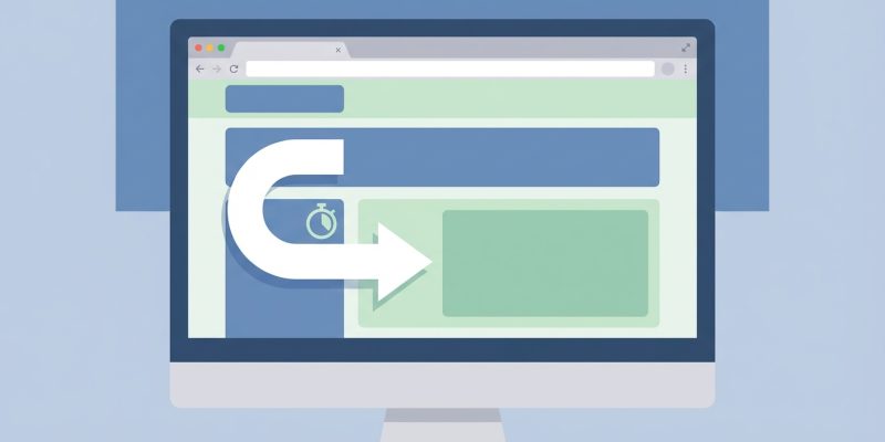
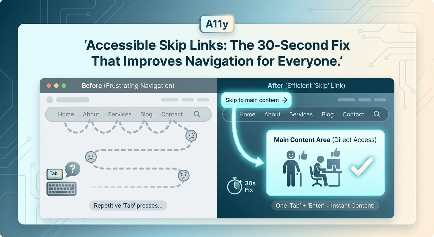
Keyboard users navigate websites by pressing Tab over and over again. Every navigation link, every button, every form field gets focus. On a site with 30 header links, that’s 30 tab presses before reaching the actual content. A skip to content link solves this problem in seconds.
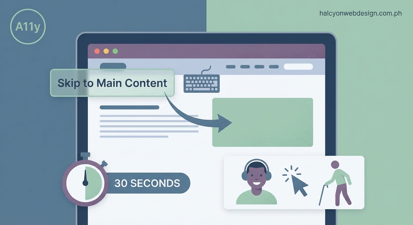
A skip to content link is a hidden anchor that appears when keyboard users press Tab. It lets them bypass repetitive navigation and jump straight to the main content. This single line of code improves accessibility for keyboard and screen reader users while meeting WCAG 2.1 Level A compliance. Implementation takes less than five minutes.
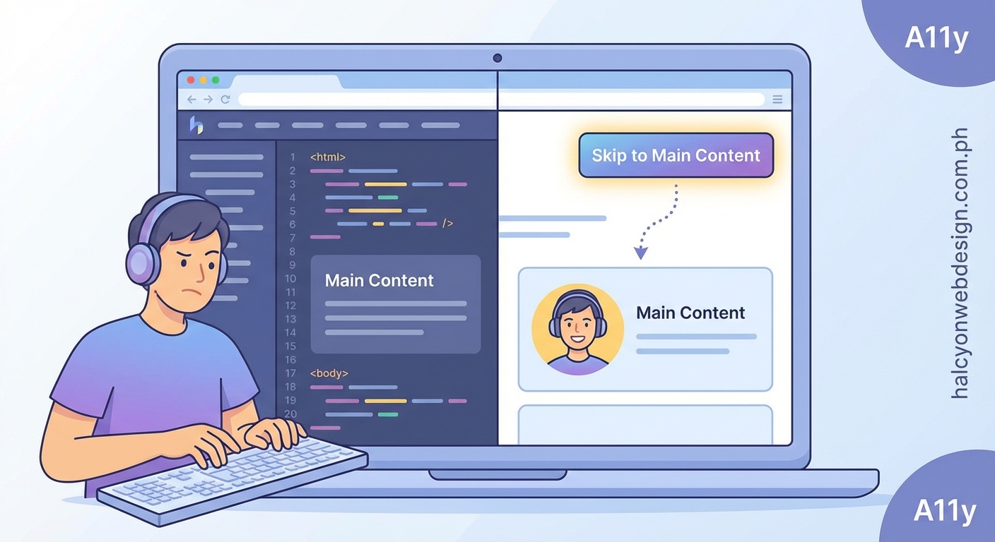
What a Skip to Content Link Actually Does
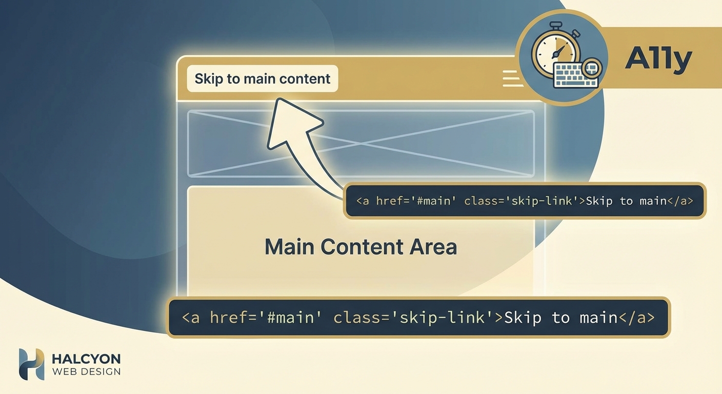
A skip to content link is an anchor element placed at the very top of your HTML. It points to the main content area using a fragment identifier.
When someone presses Tab on your homepage, the skip link appears. They press Enter, and focus moves past the header, navigation, sidebar, and any other repeated elements.
Screen reader users hear the option announced immediately. Keyboard users see it appear visually.
Without this link, every page visit forces users to tab through the same header elements. On a blog with 20 navigation items, that’s 20 unnecessary stops before reading a single paragraph.
The link doesn’t change how your site looks to mouse users. It only appears when someone presses Tab.
Why WCAG Requires This Feature
The Web Content Accessibility Guidelines include skip links as a Level A requirement under Success Criterion 2.4.1: Bypass Blocks.
Level A is the minimum accessibility standard. It addresses the most severe barriers.
Repetitive navigation blocks create real problems. Users with motor disabilities may take several seconds per tab press. Forcing them through 30 links on every page isn’t just annoying, it’s exhausting.
Screen reader users face the same issue. They can use heading navigation to skip ahead, but a skip link provides a faster, more predictable option.
Meeting WCAG Level A isn’t just about compliance. It’s about respecting your users’ time and energy.
How to Add a Skip to Content Link in Five Steps
Adding this feature requires basic HTML and CSS knowledge. Here’s the complete process.
-
Add the link at the top of your body tag. Place it before your header or navigation. Use an href that matches the ID of your main content container.
-
Give your main content area an ID. If your main content is wrapped in a
<main>tag, addid="main-content"to it. -
Style the link to be visually hidden by default. Use CSS to position it off screen or make it transparent.
-
Make it visible on focus. When someone presses Tab, the link should appear at the top of the viewport with clear styling.
-
Test it with your keyboard. Press Tab on your homepage. The skip link should appear. Press Enter. Focus should jump to the main content.
Here’s the HTML:
Skip to content
Here’s the CSS:
.skip-link {
position: absolute;
top: -40px;
left: 0;
background: #000;
color: #fff;
padding: 8px;
text-decoration: none;
z-index: 100;
}
.skip-link:focus {
top: 0;
}
The link sits 40 pixels above the viewport. On focus, it moves to the top edge.
Common Mistakes That Break Skip Links
Many developers add skip links incorrectly. Here are the errors that make them useless.
| Mistake | Why It Fails | How to Fix |
|---|---|---|
Using display: none |
Removes the link from the tab order | Use position: absolute with negative top value |
| Linking to a div without tabindex | Focus doesn’t move properly in some browsers | Link to a <main> element or add tabindex="-1" to the target |
| Placing the link after the header | Defeats the purpose of skipping navigation | Put it as the first element inside <body> |
| Using low color contrast on focus | Sighted keyboard users can’t see it | Ensure 4.5:1 contrast ratio minimum |
| Forgetting the focus state | Link never becomes visible | Always include :focus styles |
The most common error is using display: none or visibility: hidden. These properties remove elements from the accessibility tree entirely.
Use position: absolute instead. Move the element off screen, but keep it in the DOM.
Where the Skip Link Should Point
Your skip link should target the main content container. This is usually a <main> element or a div with id="content".
Don’t point it to the first heading. That forces users to hear the heading announced before reaching the paragraph text.
Don’t point it to the middle of your content. The goal is to bypass navigation, not to skip half your article.
The target should be the container that wraps all your unique page content. Everything inside that container is what users came to read.
If you have a sticky header with pure CSS, make sure your skip link appears above it in the z-index stack. Otherwise, the header might cover it when it becomes visible.
What to Call Your Skip Link
The most common labels are:
- Skip to content
- Skip to main content
- Skip navigation
- Jump to content
All of these work. The key is clarity.
Avoid creative labels like “Jump ahead” or “Fast forward.” Screen reader users scan for familiar patterns. Stick with conventional wording.
“Skip to content” is short and clear. It’s the label most users expect.
Don’t overthink this. Pick one phrase and use it consistently across your site.
Multiple Skip Links for Complex Layouts
Most sites only need one skip link. But complex layouts with multiple navigation areas might benefit from more.
For example, a news site might include:
- Skip to main content
- Skip to navigation
- Skip to search
Each link should appear in sequence when users press Tab.
Only add multiple skip links if your site has genuinely complex navigation. Most blogs and business sites need just one. Adding too many skip links creates the same problem you’re trying to solve: too many tab stops before reaching content.
If you’re unsure, start with one. You can always add more based on user feedback.
How to Test Your Skip Link
Testing takes two minutes. Here’s what to check:
- Press Tab on your homepage. Does the skip link appear?
- Check the styling. Is the text readable? Does it have enough contrast?
- Press Enter. Does focus move to the main content?
- Press Tab again. Does focus move to the first interactive element inside the main content?
Test in multiple browsers. Chrome, Firefox, Safari, and Edge all handle focus slightly differently.
Use a screen reader if possible. NVDA on Windows and VoiceOver on Mac are both free. Press Tab and listen for the skip link announcement.
If focus doesn’t move properly, check your target element. Some browsers require tabindex="-1" on the target to receive focus programmatically.
Styling Skip Links for Maximum Visibility
Your skip link should be impossible to miss when it appears.
Use high contrast colors. Black text on white background or white text on black background both work well.
Make the padding generous. Small click targets are hard to use.
Position it at the top of the viewport, not tucked in a corner.
Some designers match skip link styling to their site’s design system. That’s fine, as long as contrast remains high.
Avoid animations or transitions on the focus state. Users need instant feedback when they press Tab.
The skip link is a functional element, not a design showcase. Clarity beats creativity here.
Skip Links and Mobile Navigation
Mobile users typically don’t use keyboards, so skip links don’t appear for them.
But responsive sites often serve the same HTML to all devices. Your skip link will be in the code even on mobile.
That’s fine. It won’t hurt anything. Mobile users will never see it because they’re not pressing Tab.
If you’re building a mobile-first site, you still need the skip link for desktop keyboard users.
Don’t remove it based on viewport width. You can’t reliably detect whether someone is using a keyboard or touch input.
How Skip Links Fit Into Your Accessibility Strategy
A skip to content link is one piece of a larger accessibility picture.
It works alongside proper heading structure, ARIA landmarks, and semantic HTML.
If your headings are a mess, adding a skip link won’t fix the underlying navigation problems. Users need both.
Think of skip links as the first step. They’re easy to implement and provide immediate value.
Once you’ve added the skip link, tackle other accessibility issues. Fix typography mistakes that make your site look unprofessional, improve color contrast, and ensure all images have alt text.
Accessibility isn’t a checklist. It’s an ongoing process of making your site work for more people.
Skip Links in Popular Frameworks
Most modern frameworks make skip links easy to add.
WordPress themes should include a skip link by default. If yours doesn’t, add it to your header.php file right after the opening <body> tag.
React developers can add the skip link in their App component, before the header component renders.
In Next.js, put it in your layout file.
The implementation is the same regardless of framework. HTML at the top, CSS for positioning, and a target ID on your main content.
If you’re using a page builder, you might need to add the skip link through custom HTML. Check your theme documentation.
Troubleshooting Common Skip Link Issues
Problem: The skip link appears but pressing Enter doesn’t move focus.
Solution: Add tabindex="-1" to your main content container. Some browsers need this to programmatically receive focus.
Problem: The skip link is visible all the time.
Solution: Check your CSS. The default state should position the link off screen or make it transparent. Only the :focus state should be visible.
Problem: The skip link doesn’t appear when I press Tab.
Solution: Make sure you’re not using display: none or visibility: hidden. Use position: absolute with a negative top value instead.
Problem: The skip link appears behind my header.
Solution: Increase the z-index of your skip link. It should be higher than your header’s z-index.
Problem: Focus moves to the main container but then jumps somewhere else.
Solution: Check for JavaScript that might be managing focus. Some frameworks have focus management that interferes with native browser behavior.
Real Impact on Real Users
Adding a skip to content link takes five minutes. For keyboard users, it saves hours over time.
Consider someone who reads 10 articles on your blog each week. If your navigation has 25 links, that’s 250 tab presses saved per week.
For users with motor disabilities, each tab press might take three to five seconds. You’re saving them actual physical effort.
Screen reader users benefit too. They can navigate by headings, but a skip link provides a consistent, predictable option on every page.
This isn’t theoretical. Users notice when sites respect their time and energy.
Making Skip Links Part of Your Workflow
Add skip links to your site template or component library. Make them automatic.
If you build client sites, include skip links in your base theme. Don’t make it optional.
When you’re reviewing a site before launch, test the skip link along with site speed and security.
Document the skip link in your style guide. Make sure everyone on your team knows where it is and how it works.
This feature should be as automatic as adding a logo or setting up navigation.
Why This Small Feature Matters More Than You Think
A skip to content link won’t transform your entire site. It won’t fix broken navigation or poor information architecture.
But it will make your site better for thousands of users who navigate with keyboards.
It shows you’re thinking about accessibility from the start, not bolting it on later.
It’s a signal that you care about user experience for everyone, not just the majority.
And it takes less time to implement than writing a meta description.
Add the skip link today. Test it. Then move on to the next accessibility improvement. Every small change compounds over time.