
Your navigation menu is the most critical interface element on your website. It determines whether visitors find what they need or leave in frustration. A well-designed menu feels invisible because it just works. A poorly designed one creates confusion, increases bounce rates, and tanks conversions. The difference between these two outcomes comes down to understanding how people actually use menus and applying proven design principles.
Effective navigation menu design balances simplicity, consistency, and clarity. Users should find what they need within three clicks, using familiar patterns and clear labels. Mobile-first thinking, proper hierarchy, and accessibility standards ensure your menu works for everyone. Test with real users, measure behavior, and refine based on data rather than assumptions.
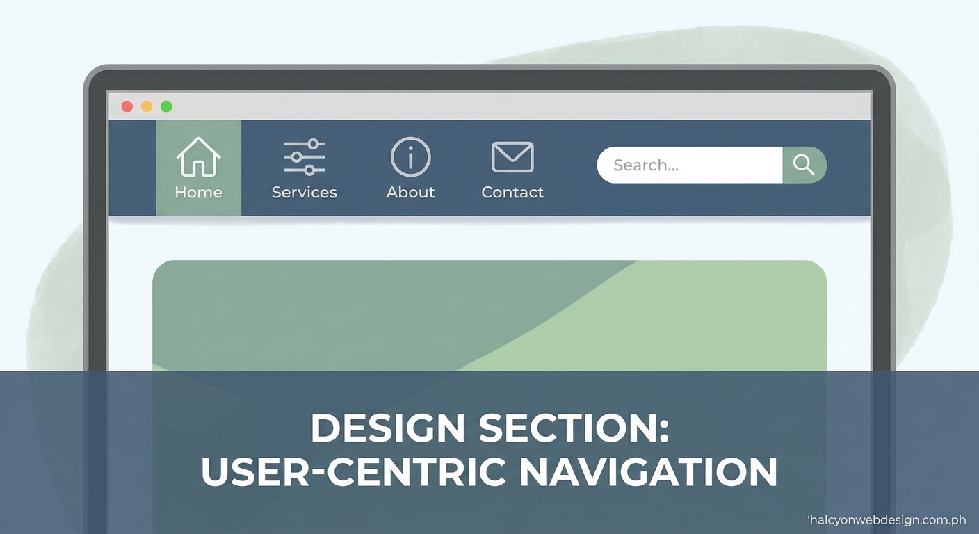
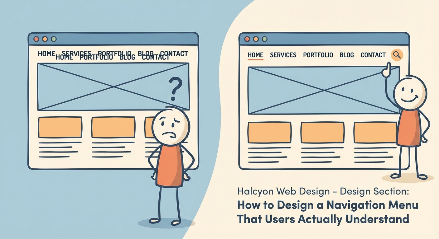
Why navigation menu design makes or breaks user experience
Users arrive at your site with specific goals. They want information, products, or services. Your menu is their roadmap.
When navigation fails, users abandon your site. They won’t struggle through confusing labels or hunt for hidden options. They’ll go to a competitor instead.
Good navigation menu design reduces cognitive load. It presents choices clearly without overwhelming visitors. Each menu item should be predictable and lead exactly where users expect.
Research shows users spend most of their time on other websites. They bring expectations formed by those experiences. Fighting against established patterns creates unnecessary friction.
Your menu also affects search engine optimization. Clear structure helps search engines understand your site hierarchy. Descriptive labels improve crawlability and keyword relevance.
Performance matters too. Heavy dropdown menus with animations can slow page loads, especially on mobile devices. Why your WordPress site loads slowly often traces back to bloated navigation code.
Core principles that guide effective menu design
Simplicity reduces decision fatigue
Limit top-level menu items to seven or fewer. This follows cognitive psychology research about working memory capacity.
Each additional option increases the time users need to make a decision. More choices create analysis paralysis.
Group related items under logical parent categories. A mega menu can work if you organize content into clear sections with visual hierarchy.
Consistency builds confidence
Use the same menu structure across all pages. Users should never wonder where the navigation went or why it changed.
Position matters. Most websites place primary navigation in the header. Deviating from this convention without strong reason confuses visitors.
Label consistency extends beyond the menu itself. The menu item “Services” should lead to a page titled “Services,” not “What We Do.”
Visibility ensures accessibility
Your menu should be immediately recognizable. Don’t hide navigation behind abstract icons or require users to scroll to find it.
Color contrast between menu text and background must meet WCAG AA standards at minimum. Poor contrast affects users with visual impairments and anyone viewing your site in bright sunlight.
Hover and focus states provide feedback. Users need to know which menu item they’re about to click.
Clear hierarchy guides exploration
Primary navigation handles your most important pages. Secondary navigation supports deeper content without cluttering the main menu.
Breadcrumbs show users their current location within your site structure. They’re especially valuable for e-commerce sites and content-heavy platforms.
Footer navigation can include utility links like privacy policies, contact information, and site maps without competing for attention in the header.
Common navigation patterns and when to use them
| Pattern | Best For | Avoid When |
|---|---|---|
| Horizontal bar | Desktop sites with 5-7 main sections | You have many categories or mobile-first design |
| Hamburger menu | Mobile interfaces with limited screen space | Desktop sites where space isn’t constrained |
| Mega menu | Sites with complex hierarchies like e-commerce | Simple sites with few pages |
| Sidebar navigation | Web applications and admin panels | Marketing sites and blogs |
| Tabs | Switching between related views in one context | Site-wide navigation |
| Sticky header | Long-form content and scrolling pages | Short pages where it wastes screen space |
Horizontal navigation bars
The classic top bar works well for most business websites. It provides clear visibility and works with established user expectations.
Keep labels short. Long text wraps awkwardly or gets truncated on smaller screens.
Space items evenly. Cramped navigation looks unprofessional and reduces tap target size on mobile devices.
Hamburger menus for mobile
The three-line icon has become universally recognized on mobile devices. It saves screen space while keeping all options accessible.
But hamburger menus hide your navigation. Users must take an extra action to see their options. This reduces discoverability compared to visible menus.
Consider a hybrid approach. Show your most important links visibly, then tuck secondary options behind the hamburger.
Mega menus for complex sites
When you have dozens of pages across multiple categories, mega menus prevent deep nesting. They display multiple levels of hierarchy at once.
Organize mega menu content into clear columns with headings. Visual grouping helps users scan options faster.
Add images or icons to major categories. Visual cues improve recognition and make the menu more scannable.
Include a search box within mega menus. Users with specific goals can jump directly to content without browsing categories.
Sticky headers that follow users
A sticky header stays visible as users scroll down the page. This keeps navigation accessible without requiring users to scroll back to the top.
Sticky headers work best on content-heavy sites where users scroll significantly. They’re less useful on short landing pages.
Keep sticky headers compact. A full-height header that stays fixed wastes valuable screen space, especially on mobile devices.
Step-by-step process for designing your navigation menu
1. Map your content structure
Start with a complete inventory of your pages. List everything you need to include in your site.
Group related pages into logical categories. Look for natural themes that make sense to your users, not just your internal organization.
Create a sitemap diagram. Visual representation helps you spot structural problems before you start designing.
2. Prioritize based on user goals
Identify the top tasks users come to accomplish. Analytics data from existing sites reveals what people actually do versus what you think they do.
Survey real users if you’re building something new. Ask what information they’d look for first.
Rank pages by importance. Your menu should feature high-priority items prominently while making everything else accessible without clutter.
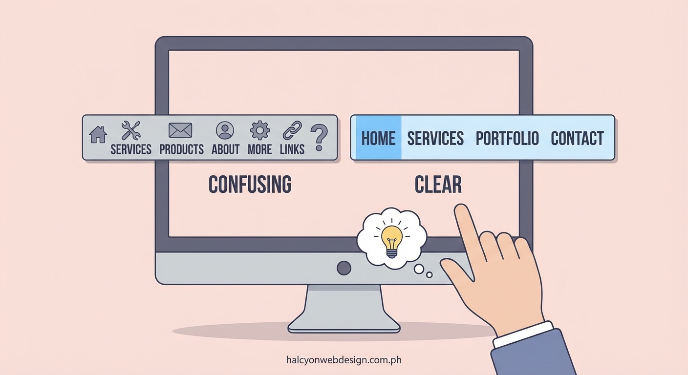
3. Write clear, descriptive labels
Use plain language that your audience understands. Avoid internal jargon or clever wordplay that obscures meaning.
Keep labels short. One or two words work best for top-level items. Longer phrases work in dropdown menus where space is less constrained.
Test labels with people outside your organization. What seems obvious to you might confuse users unfamiliar with your industry.
“The best navigation is the one users don’t notice. They find what they need without thinking about the interface. That’s when you know you’ve succeeded.” — Steve Krug, usability expert
4. Choose appropriate patterns
Match navigation patterns to your content structure and user needs. A blog with five categories needs different navigation than an e-commerce site with 50 product types.
Consider mobile users first. More than half of web traffic comes from mobile devices. Design for small screens, then enhance for larger displays.
Prototype different approaches. Create mockups of two or three navigation styles to compare before committing to development.
5. Design with accessibility in mind
Use semantic HTML for navigation elements. The <nav> tag tells screen readers this is navigation content.
Ensure keyboard navigation works perfectly. Users should be able to tab through menu items and activate them with Enter or Space keys.
Test with actual assistive technology. Screen readers reveal problems you won’t catch through visual inspection alone.
Provide skip links. These let keyboard users jump past navigation to reach main content faster.
6. Test with real users
Watch people use your navigation. Usability testing reveals problems that seem obvious once you see them but are invisible during design.
Track where users hesitate or give up. Heat maps and session recordings show where confusion happens.
Measure task completion rates. Can users find specific pages within a reasonable time? Aim for 80% success rate or higher.
A/B test variations. Try different label wording or menu structures with live traffic to see what performs better.
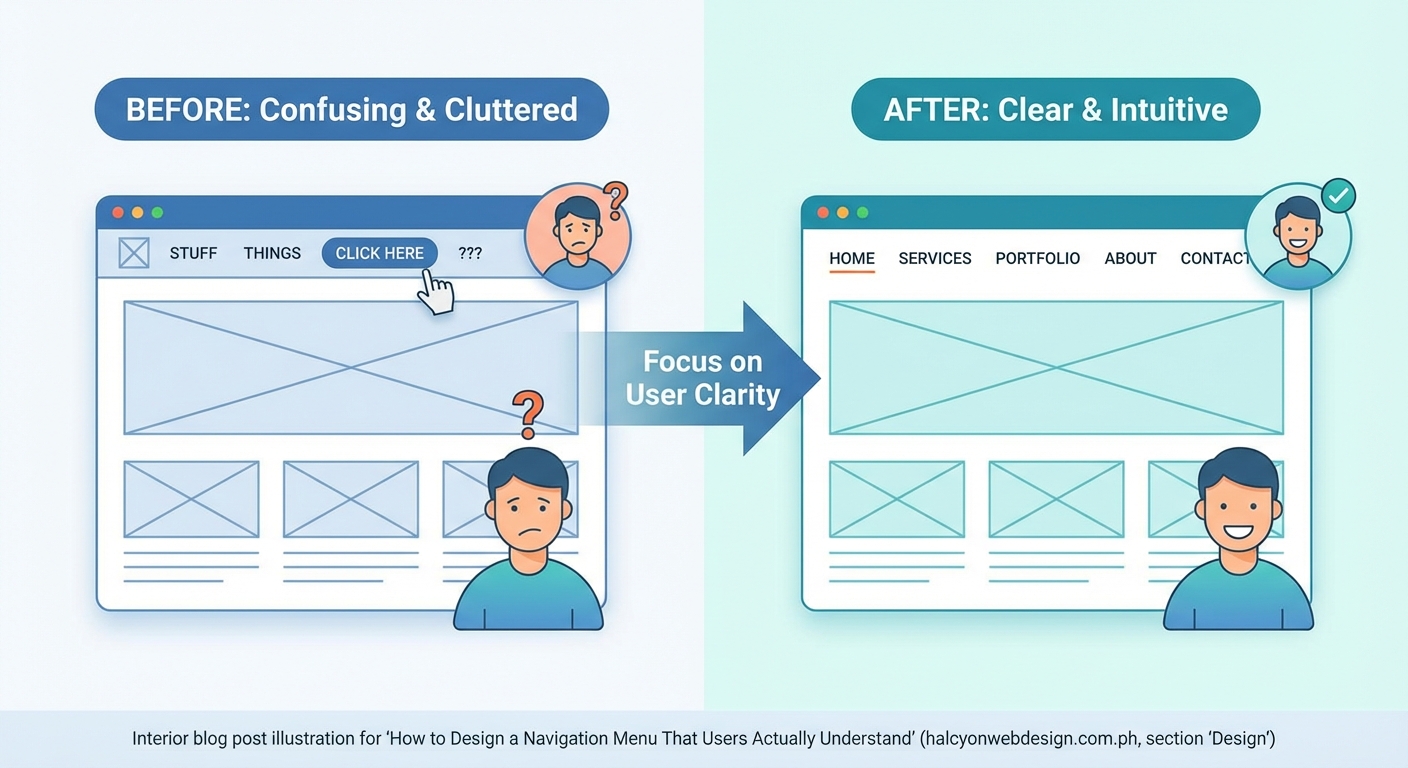
Mistakes that sabotage navigation menu design
Overly creative navigation
Unusual navigation patterns might look impressive in your portfolio, but they confuse users who expect standard conventions.
Hidden navigation that requires discovery frustrates people trying to accomplish tasks. Save creativity for your content, not your interface.
Too many options
Presenting 15 top-level menu items overwhelms users. They’ll spend more time reading options than taking action.
Deep nesting creates problems too. Requiring users to hover through three levels of dropdowns to reach a page is excessive.
Inconsistent labeling
Using different terms for the same concept creates confusion. If you call it “Services” in the menu but “Solutions” on the page, users question whether they’re in the right place.
Mixing label types causes problems. Don’t combine action verbs (“Shop Now”) with category names (“Products”) in the same menu level.
Poor mobile optimization
Tiny tap targets cause frustration on touchscreens. Menu items should be at least 44×44 pixels to accommodate finger taps accurately.
Dropdowns that require hover don’t work on touch devices. Design touch-friendly alternatives that reveal submenus on tap.
Ignoring typography fundamentals
Menu text that’s too small, lacks contrast, or uses decorative fonts reduces readability. Typography mistakes affect navigation more than any other interface element because users interact with menus constantly.
All-caps text is harder to read. Use sentence case for better scanability.
Forgetting about performance
Heavy JavaScript-dependent menus delay interactivity. Users clicking before the menu fully loads get no response, creating frustration.
Large dropdown menus with images can slow page loads. Optimize images and lazy-load content that isn’t immediately visible.
Essential features for modern navigation menus
Search functionality
Search complements navigation by offering an alternative path to content. Users who know exactly what they want can skip browsing entirely.
Place search prominently, typically in the header. The icon is universally recognized.
Make the search box large enough for typical queries. A tiny input field that only shows five characters is frustrating.
Visual feedback
Highlight the current page in your menu. Users should always know where they are within your site structure.
Hover states show which item users are about to click. This prevents accidental clicks on adjacent items.
Active states during page transitions provide feedback that something is happening. Even a brief delay feels responsive when users see acknowledgment of their action.
Call-to-action differentiation
Your primary conversion action deserves visual distinction. If “Get Started” or “Contact Us” is your main goal, style it differently from informational menu items.
Use a button treatment with contrasting color. This draws attention without relying solely on position.
Breadcrumb navigation
Breadcrumbs show the path from homepage to current page. They’re especially valuable on sites with deep hierarchies.
Place breadcrumbs above the page title. This position is conventional and doesn’t compete with primary navigation.
Make each breadcrumb level clickable. Users should be able to jump back to any parent level easily.
Mobile-first navigation strategies
Progressive disclosure
Show only essential navigation by default. Reveal additional options through interaction rather than displaying everything at once.
Use expandable sections for categories with subcategories. This keeps the initial view simple while making everything accessible.
Priority-based visibility
Display your most important links visibly. Less critical options can hide behind a menu icon without hurting usability.
Analytics reveal which pages users visit most. Feature those prominently in mobile navigation.
Touch-friendly targets
Size clickable areas generously. Small tap targets cause users to miss and tap the wrong item.
Space items apart. Cramped menus lead to accidental taps on adjacent items.
Simplified mega menus
Full desktop mega menus don’t translate well to mobile. Simplify the structure for small screens.
Use accordion-style expansion instead of showing multiple columns simultaneously. This works better with vertical scrolling.
Testing and refining your navigation menu design
Launching your navigation isn’t the end. Continuous improvement based on real usage data keeps your menu effective as your site evolves.
Set up analytics tracking for menu interactions. Know which items users click most and which get ignored.
Monitor bounce rates from landing pages. High bounces might indicate users can’t find what they expected.
Track internal site search queries. Repeated searches for topics that should be in your menu suggest labeling or hierarchy problems.
Run periodic usability tests. User behavior changes over time. What worked last year might need adjustment now.
Pay attention to support questions. If users frequently ask where to find something, your navigation isn’t clear enough.
Consider seasonal adjustments. E-commerce sites often feature different categories during holidays or sales periods.
Document your navigation decisions. Future team members need to understand the reasoning behind your structure.
Building navigation that guides users home
Navigation menu design isn’t about following trends or impressing other designers. It’s about creating clear paths that help real people accomplish their goals without friction.
Start with user needs, not your organizational chart. Test your assumptions with actual users. Measure what works and refine what doesn’t.
The best navigation feels effortless. Users don’t think about it because it just works. That’s your target.
Build your menu with accessibility, performance, and clarity as non-negotiable requirements. Everything else is secondary.
Your navigation will never be perfect, and that’s fine. Make it good enough to serve users well, then improve it based on evidence rather than opinions.