
Your website loaded in 2.3 seconds. That sounds decent, right? But during the first 1.8 seconds, visitors saw invisible text or clunky fallback fonts. By the time your custom typeface appeared, some users already bounced. This is the hidden cost of poorly loaded web fonts, and it directly tanks your Core Web Vitals scores.
Preloading fonts tells browsers to fetch critical typefaces immediately, reducing layout shifts and invisible text periods. This technique improves Largest Contentful Paint and Cumulative Layout Shift scores, two vital Core Web Vitals metrics. Proper implementation requires selecting only essential font files, using correct MIME types, and adding crossorigin attributes to avoid double downloads.
Why fonts break your Core Web Vitals scores
Browsers discover font files late in the page load process. First, they parse HTML. Then they download CSS. Only after reading your stylesheet do they realize they need that custom WOFF2 file sitting on your CDN.
This delay creates two performance problems.
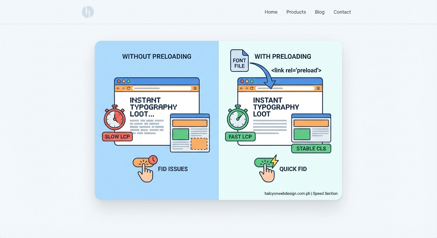
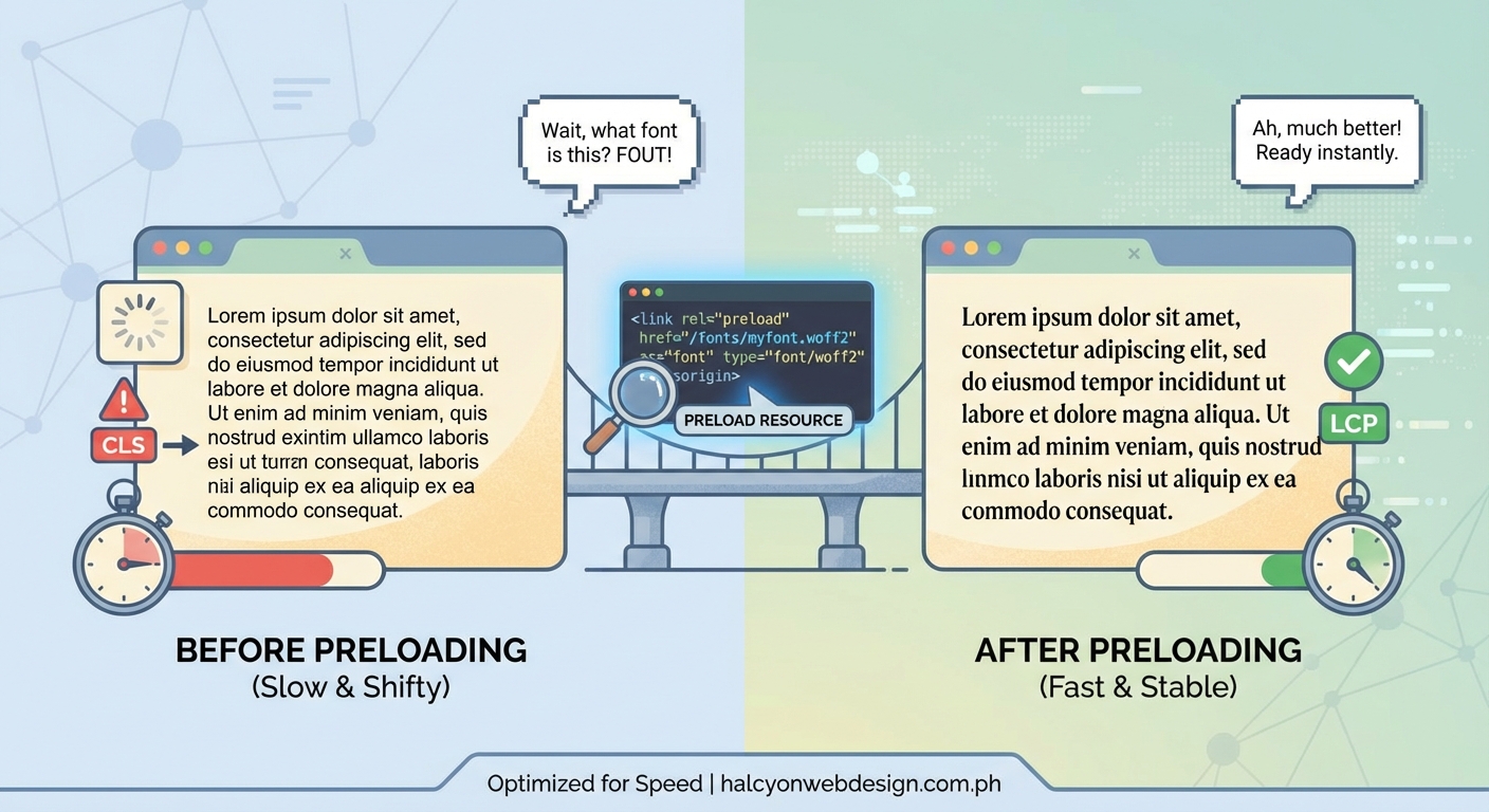
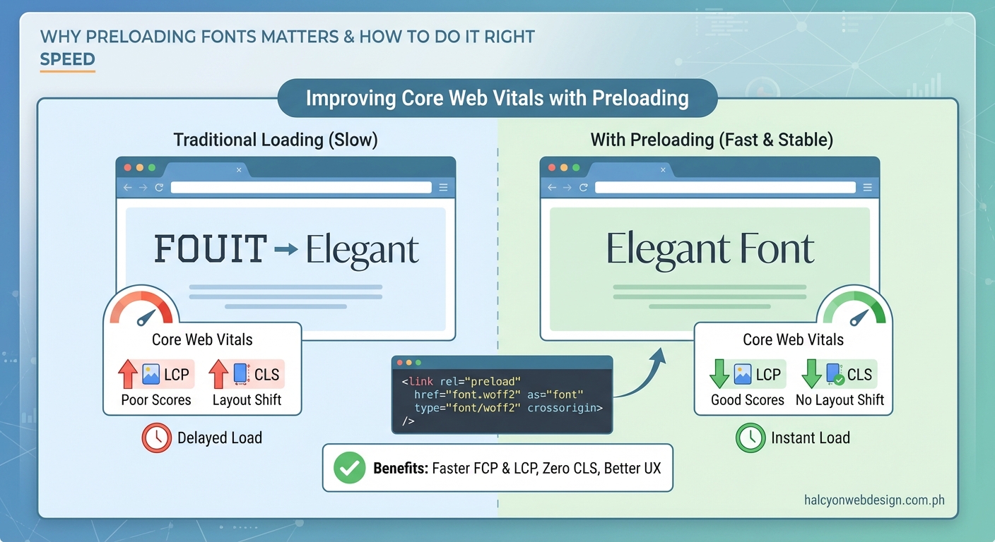
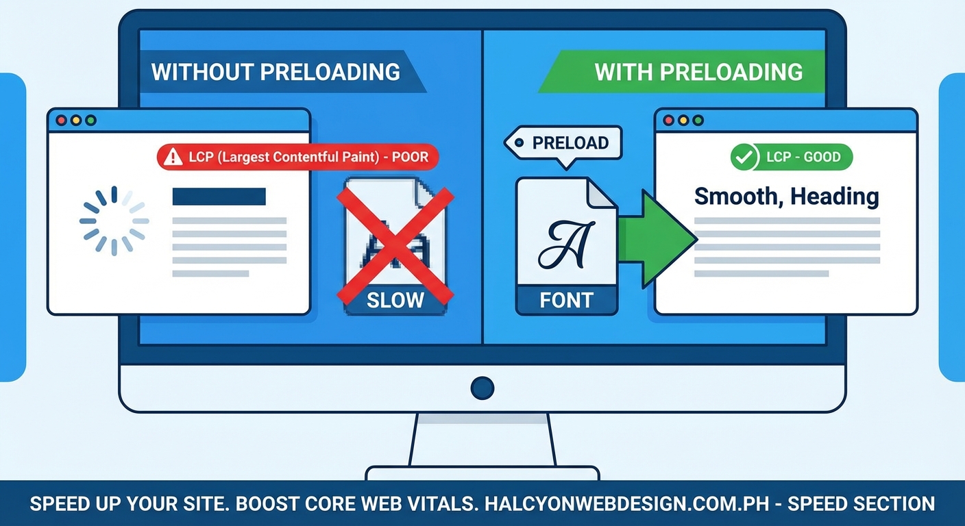
First, text stays invisible while the browser waits for fonts. Users see blank spaces where headlines should appear. This phenomenon, called Flash of Invisible Text or FOIT, extends your Largest Contentful Paint metric. Google measures LCP as the time until your largest visible element renders. If that element contains text using a web font, you’re stuck waiting.
Second, when fonts finally load, text reflows. A paragraph set in Arial suddenly switches to your brand typeface. The new font has different spacing and width. Content jumps around. Buttons shift down the page. This movement gets recorded as Cumulative Layout Shift, another Core Web Vitals metric that penalizes your rankings.
Most sites load between two and six font files. Each one adds 20 to 100 KB of data. Without preloading, browsers treat these files as low priority resources, fetching them only after images, scripts, and other assets compete for bandwidth.
How preloading changes the loading sequence
The “ tag tells browsers to fetch specific resources immediately, before the HTML parser discovers them naturally through CSS rules.
When you preload a font, the browser downloads it during the initial page request. By the time your stylesheet loads and requests that same font, it’s already cached and ready. Text renders instantly with the correct typeface.
Here’s what happens without preloading:
- Browser requests HTML
- Browser parses HTML and finds stylesheet link
- Browser downloads CSS file
- Browser reads font-face rules in CSS
- Browser finally requests font files
- Text renders after fonts arrive
With preloading:
- Browser requests HTML
- Browser sees preload hints and immediately fetches fonts
- Browser downloads CSS file in parallel
- CSS references fonts that are already downloading or cached
- Text renders faster with correct typography
The performance gain comes from parallelization. Instead of waiting for each step to complete sequentially, critical resources load simultaneously.
Implementing font preloading correctly
Add preload tags inside your HTML <head> section, before your stylesheet links. This placement ensures browsers see the hints as early as possible.
Each attribute serves a specific purpose:
- rel=”preload” tells the browser this is a high-priority resource
- href points to your font file location
- as=”font” specifies the resource type for proper prioritization
- type=”font/woff2″ helps browsers skip files they can’t use
- crossorigin prevents double downloads, even for same-origin fonts
That last attribute trips up many developers. Browsers fetch fonts using anonymous CORS mode by default. If your preload lacks the crossorigin attribute, the browser downloads the file twice: once for the preload, once when CSS requests it. This wastes bandwidth and delays rendering.
Always use WOFF2 format for modern browsers. It offers the best compression and widest support. Skip WOFF, TTF, and EOT formats unless you need to support Internet Explorer, which you probably don’t in 2024.
Choosing which fonts to preload
Preloading every font file creates the opposite problem. Too many preload hints force browsers to download resources that might not appear above the fold. This wastes bandwidth and delays other critical assets.
Follow this selection process:
- Identify fonts used in your largest contentful paint element
- Include fonts for above-the-fold headings and body text
- Limit yourself to two or three font files maximum
- Skip fonts used only in footers or secondary pages
Most sites need just two preloads: one for body text, one for headings. If your headline uses a bold weight and your paragraph uses regular weight of the same family, preload both. If your footer uses a decorative font that doesn’t appear until users scroll down, skip it.
Common typography mistakes that make your website look unprofessional often include loading too many font weights. If you’re using eight different weights of the same typeface, you’re hurting performance and confusing readers.
Check your actual usage with browser DevTools. Open the Network tab, filter by Font, and reload your page. Note which files load first and which ones users see immediately. Those are your preload candidates.
Preloading Google Fonts requires extra steps
Google Fonts hosts files on their CDN, which adds complexity. You need to preload both the CSS file and the font files themselves.
First, preconnect to Google’s domains:
Then load the font CSS:
The problem: you don’t know the exact font file URLs because Google generates them dynamically and changes them based on browser capabilities.
Solution: copy the font files to your own server.
- Visit the Google Fonts CSS URL in your browser
- Copy the @font-face rules showing WOFF2 file URLs
- Download those WOFF2 files
- Host them on your domain
- Update your CSS to reference local files
- Add preload tags for your local copies
This approach gives you complete control and eliminates third-party requests, which often slow down your WordPress site.
Alternatively, use the &display=swap parameter in your Google Fonts URL. This tells browsers to show fallback text immediately, then swap in the web font when ready. It reduces invisible text periods but doesn’t eliminate layout shift.
Common preloading mistakes and fixes
| Mistake | Impact | Fix |
|---|---|---|
| Missing crossorigin attribute | Font downloads twice | Always add crossorigin even for same-origin fonts |
| Wrong MIME type | Browser ignores preload | Use type=”font/woff2″ for WOFF2 files |
| Preloading unused fonts | Wastes bandwidth | Audit which fonts appear above fold |
| Preload after stylesheet | Browser discovers CSS fonts first | Place preload tags before stylesheet links |
| Using font-display: block | Creates invisible text periods | Switch to font-display: swap in CSS |
| Preloading variable fonts incorrectly | Large file sizes hurt mobile | Subset variable fonts or use static weights |
The font-display property in your CSS works alongside preloading. Setting it to swap prevents invisible text by showing system fonts immediately:
@font-face {
font-family: ‘Inter’;
src: url(‘/fonts/inter-regular.woff2’) format(‘woff2’);
font-display: swap;
}
Combine preloading with font-display: swap for the best results. Preloading reduces the swap period, while the display property ensures text always remains visible.
Measuring your font loading performance
After implementing preloads, verify they’re working with these tools.
Chrome DevTools Network tab: Filter by Font and reload your page. Preloaded fonts should show “Highest” priority and load in the first few requests. If they appear late or show “Low” priority, your preload tags aren’t working.
PageSpeed Insights: Run your URL through Google’s tool. Look for the “Preload key requests” audit. Properly preloaded fonts won’t appear in this warning list. Check your LCP score before and after implementing preloads.
WebPageTest: This tool shows a filmstrip view of your page loading. Watch when text becomes visible and when fonts swap in. The gap between these moments should shrink after adding preloads.
Test on real mobile connections, not just desktop. A preload strategy that works on fast WiFi might overwhelm a 3G connection. Limit preloads to truly critical fonts, especially for mobile users.
Compare your Core Web Vitals in Google Search Console. Navigate to the Experience section and check your LCP and CLS scores. Improvements might take a few weeks to appear as Google collects field data from real users.
Handling font subsetting and unicode ranges
Large font files containing thousands of glyphs slow down even preloaded resources. Subsetting removes unused characters to create smaller files.
If your site uses only English text, you don’t need Cyrillic, Greek, or Asian character sets. Tools like glyphhanger analyze your HTML and generate subsetted font files containing only the characters you actually use.
For multilingual sites, use unicode-range in your @font-face rules:
@font-face {
font-family: ‘Inter’;
src: url(‘/fonts/inter-latin.woff2’) format(‘woff2’);
unicode-range: U+0000-00FF, U+0131, U+0152-0153;
}
@font-face {
font-family: ‘Inter’;
src: url(‘/fonts/inter-cyrillic.woff2’) format(‘woff2’);
unicode-range: U+0400-045F, U+0490-0491;
}
Browsers download only the font files needed for the characters on your page. A page with purely English text skips the Cyrillic file entirely.
Preload only the Latin subset if that’s what appears above the fold. Let other unicode ranges load on demand.
WordPress-specific implementation tips
WordPress themes often enqueue fonts through functions.php or theme files. You need to add preload tags before these scripts run.
Add this to your theme’s functions.php:
function add_font_preload() {
echo ”;
}
add_action(‘wp_head’, ‘add_font_preload’, 1);
The priority of 1 ensures this runs early in the wp_head hook, before other scripts and styles.
Many WordPress plugins load their own fonts. Page builders like Elementor and Divi bundle custom typefaces. Choosing the right WordPress plugin means checking whether it loads fonts efficiently or adds unnecessary weight.
For sites using caching plugins, clear your cache after adding preload tags. Some plugins like WP Rocket have built-in font optimization features, but they might conflict with manual preloads. Test thoroughly.
Troubleshooting checklist when preloads don’t work
If you’ve added preload tags but still see layout shifts or slow text rendering, work through this list:
- Verify the font file path is correct and returns 200 status
- Check that crossorigin appears on every font preload
- Confirm the MIME type matches your actual file format
- Look for duplicate font loads in DevTools Network tab
- Ensure preload tags appear before your stylesheet link
- Test that your CSS @font-face src URL exactly matches the preload href
- Disable any lazy loading plugins that might defer font requests
- Check your server sends proper CORS headers for font files
- Verify your CDN or caching layer doesn’t strip preload headers
Font files must be served with Access-Control-Allow-Origin: * header to work with crossorigin preloads. Some servers block this by default.
Add this to your .htaccess file if you’re on Apache:
Header set Access-Control-Allow-Origin “*”
For Nginx, add to your server block:
location ~ .(woff|woff2|ttf|otf|eot)$ {
add_header Access-Control-Allow-Origin ;
}
Balancing preload with other performance strategies
Font preloading works best as part of a broader optimization strategy. It won’t fix a fundamentally slow site.
Combine font preloads with:
- Image optimization and lazy loading below the fold
- Minified and deferred JavaScript
- Critical CSS inlined in the head
- CDN delivery for static assets
- Proper WordPress hosting that handles traffic efficiently
Preloading competes for bandwidth during initial page load. If you preload three fonts, two hero images, and four JavaScript files, you’ve created a new bottleneck. Browsers can only download so many resources simultaneously.
Prioritize ruthlessly. Your LCP element matters most. If that’s a hero image with a text overlay, preload the image and the font used in that text. Everything else can wait.
Consider using system fonts for body text and web fonts only for headings. This hybrid approach gives you brand personality where it counts while keeping the bulk of your text readable instantly.
Making preloading work for your site
Font preloading isn’t magic. It’s a targeted fix for a specific problem: browsers discovering critical typefaces too late in the loading process.
Start small. Add preloads for one or two fonts that appear in your largest contentful paint element. Test the results. Measure your Core Web Vitals scores. If you see improvement, great. If not, revisit which fonts you chose or check for implementation mistakes.
Remember that perfect Core Web Vitals scores mean nothing if your content doesn’t serve your visitors. A site with beautiful typography that loads in 2.8 seconds beats a plain text site that loads in 1.9 seconds if the slower one actually converts readers into customers.
Use preloading as one tool in your performance toolkit. Combine it with smart CSS techniques like sticky headers that don’t require JavaScript overhead. Test on real devices with real connections. And always prioritize the experience of the person actually using your site.