
Picking colors for your website feels overwhelming when you stare at millions of options. You want something that looks professional, represents your brand, and actually helps visitors take action. The good news? You don’t need design school to get this right.
Choosing a website color palette starts with understanding your brand personality and audience expectations. Select one dominant color, add two to three supporting colors, and use neutral backgrounds. Test your choices for readability and accessibility. Free tools like Coolors and Adobe Color make the process simple, even without design experience.
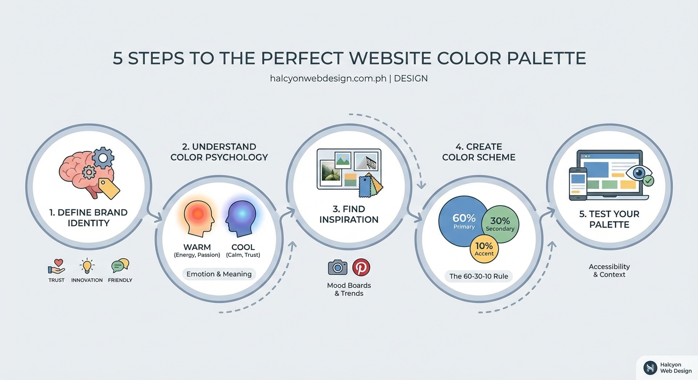
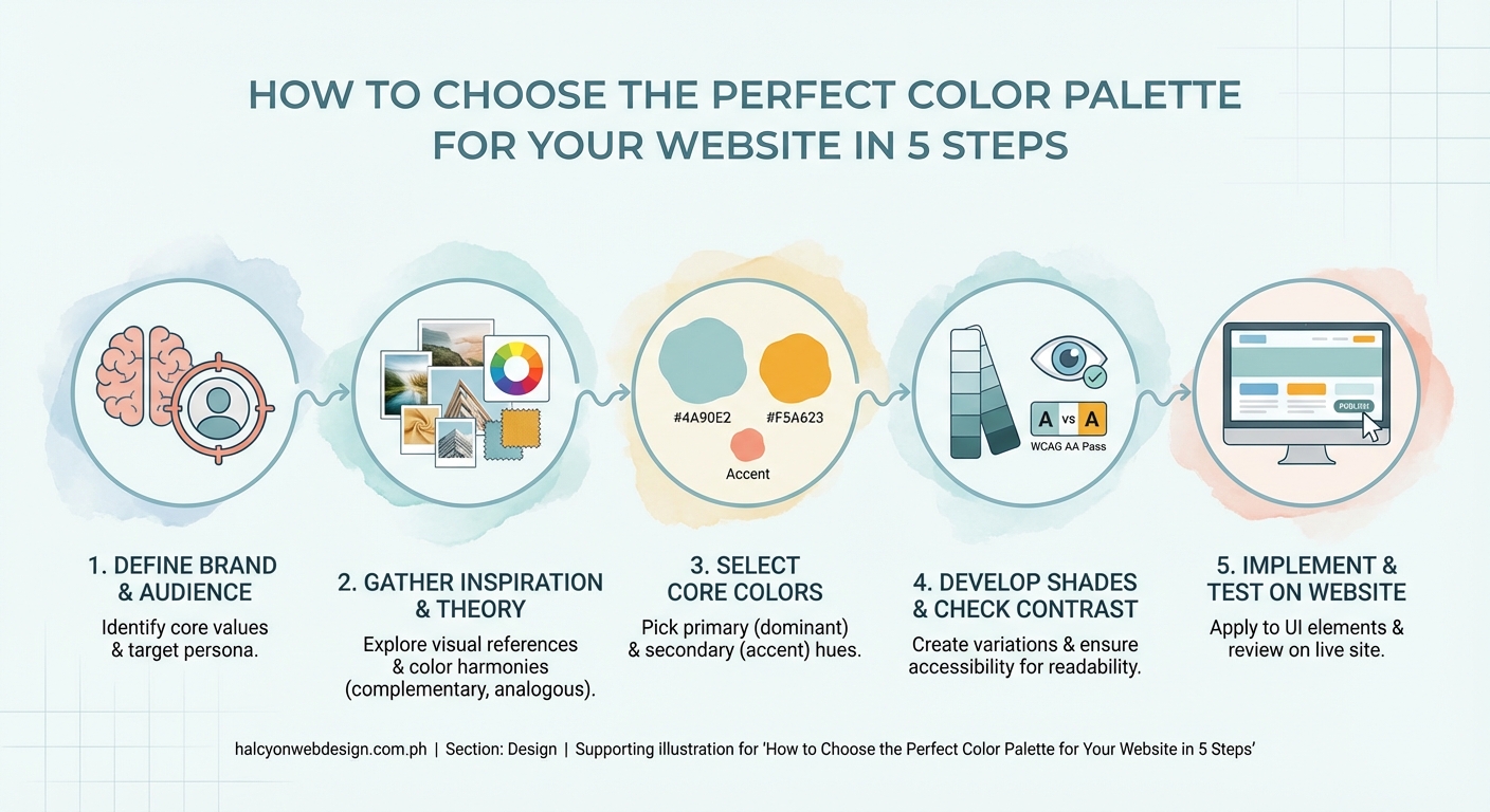
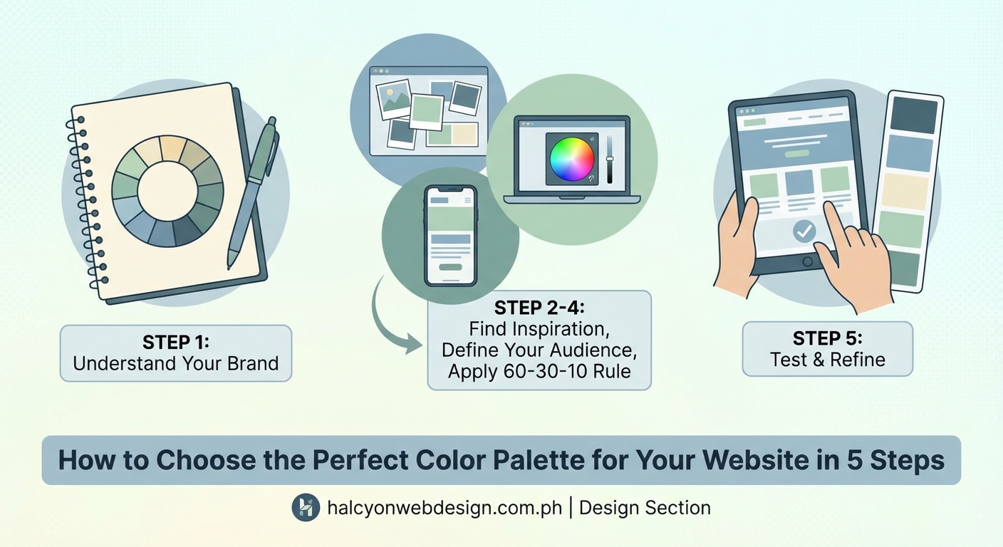
Start with your brand personality
Your color palette should reflect what your business stands for.
Think about the feeling you want visitors to experience. A law firm needs trust and stability. A children’s party planner wants energy and fun. A wellness coach might prioritize calm and growth.
Colors carry psychological weight:
- Blue builds trust and professionalism
- Green suggests health, nature, and growth
- Red creates urgency and excitement
- Purple implies creativity and luxury
- Orange feels friendly and approachable
- Black adds sophistication and elegance
- Yellow brings optimism and warmth
Write down three adjectives that describe your business. A bakery might choose “warm, homey, artisan.” A tech startup could pick “innovative, reliable, modern.”
Match your adjectives to color families. Warm tones (reds, oranges, yellows) feel inviting. Cool tones (blues, greens, purples) feel calm and professional. Neutrals (grays, beiges, whites) provide balance.
Your existing logo or brand materials give you a starting point. Pull the main color from your logo and build around it.
Understand the 60-30-10 rule
Professional designers use this ratio to create balanced color schemes.
Your dominant color covers 60% of your website. This usually means backgrounds, large sections, and major visual areas. Pick something easy on the eyes that people can look at for extended periods.
Your secondary color takes up 30%. Use it for secondary backgrounds, sidebars, or alternating sections. This color should complement your dominant choice without competing for attention.
Your accent color fills the remaining 10%. This is your action color for buttons, links, important headlines, and calls to action. Make it bold enough to stand out.
Here’s a practical breakdown:
| Element | Color Type | Percentage | Example Use |
|---|---|---|---|
| Main backgrounds | Dominant | 60% | Page backgrounds, headers |
| Section backgrounds | Secondary | 30% | Alternate sections, cards |
| Buttons and links | Accent | 10% | CTAs, highlights |
A real example: A fitness coaching website might use light gray (60%) for backgrounds, deep teal (30%) for section breaks and navigation, and bright coral (10%) for “Book Now” buttons.
Choose your base color first
Start with one color that represents your brand core.
Look at competitors in your industry. Notice patterns but don’t copy them. If every competitor uses blue, you might stand out with green or purple while still feeling professional.
Consider your audience expectations. Healthcare visitors expect blues and greens. Creative agencies can experiment with bolder choices. Financial services lean toward blues, grays, and deep greens.
Test your base color against white and black backgrounds. It should look good in both contexts since you’ll use it in various situations.
Use a color picker tool to get the exact hex code. Coolors and Adobe Color both let you generate palettes from a single starting color.
Your base color becomes your primary brand color. You’ll use it in your logo, navigation, main buttons, and anywhere you want brand recognition.
Build complementary colors around your base
Once you have your base color, add supporting colors that work together.
Color harmony models make this easier:
- Monochromatic: Use different shades and tints of your base color. Safe and cohesive but can feel flat.
- Analogous: Pick colors next to your base on the color wheel. Creates gentle contrast with natural harmony.
- Complementary: Choose the color opposite your base on the wheel. High contrast and energetic.
- Triadic: Select three colors evenly spaced on the wheel. Vibrant and balanced.
For beginners, analogous schemes work best. They’re hard to mess up and look naturally coordinated.
Add neutral colors to your palette. Every website needs:
- A light neutral (white, cream, light gray) for backgrounds and breathing room
- A dark neutral (charcoal, deep gray, black) for text and contrast
- One mid-tone neutral (medium gray, beige) for borders and subtle elements
Your final palette should have five to six colors total:
- One dominant color
- Two supporting colors
- Two to three neutrals
More colors create confusion. Fewer colors limit your design options.
“A restricted palette forces you to be more creative and usually results in a more cohesive design. Three colors plus neutrals give you everything you need.” — Design principle from color theory basics
Test for readability and accessibility
Beautiful colors mean nothing if people can’t read your content.
Check contrast ratios between text and backgrounds. The Web Content Accessibility Guidelines (WCAG) require:
- 4.5:1 contrast ratio for normal text
- 3:1 contrast ratio for large text (18pt or 14pt bold)
- 3:1 for graphical elements and UI components
Use WebAIM’s Contrast Checker to test your combinations. Enter your text color and background color. The tool tells you if it passes accessibility standards.
Common mistakes that hurt readability:
| Mistake | Why It Fails | Better Approach |
|---|---|---|
| Light gray text on white | Too little contrast | Use dark gray or black |
| Colored text on colored background | Strains eyes | One color, one neutral |
| Multiple bright colors together | Creates visual chaos | Bright accent, calm base |
| Pure black on pure white | Too harsh for screens | Charcoal on off-white |
Test your palette on actual content. Create a mockup page with headlines, body text, buttons, and images. View it on your phone and computer.
Ask someone else to look at it. Fresh eyes catch readability issues you might miss after staring at your screen for hours.
Consider colorblind users. About 8% of men and 0.5% of women have some form of color vision deficiency. Don’t rely on color alone to convey information. Use icons, labels, or patterns alongside color coding.
Use free tools to generate and refine palettes
You don’t need expensive software to create professional color schemes.
Coolors lets you generate random palettes or build from a starting color. Lock the colors you like and press spacebar to generate new options for the remaining slots. Export your palette as hex codes, RGB values, or even as a PDF.
Adobe Color (formerly Kuler) shows color relationships on a wheel. Pick your harmony rule (complementary, triadic, analogous) and adjust the wheel. Browse thousands of palettes created by other designers for inspiration.
Paletton focuses on color theory relationships. Choose your base color and it automatically generates harmonious combinations. The preview shows your palette on sample website layouts.
Canva Color Palette Generator extracts colors from photos. Upload an image that matches your brand vibe. The tool pulls a coordinated palette from the image. Great for matching website colors to product photography or brand imagery.
Material Design Color Tool helps you preview colors on actual UI components. See your palette on buttons, cards, and navigation bars before committing.
Save your final palette somewhere accessible. Create a simple document with:
- Color names (primary, secondary, accent, neutral-light, neutral-dark)
- Hex codes (#2C5F8D)
- RGB values (44, 95, 141)
- Where each color gets used (buttons, backgrounds, text)
Share this document with anyone who works on your website. Consistency matters more than perfection.
Common palette mistakes to avoid
Learning what not to do saves time and frustration.
Using too many colors: Stick to your core palette. Every additional color dilutes your brand and complicates decisions.
Ignoring your content: Your palette should enhance your content, not compete with it. If you sell colorful products, use neutral website colors. If your content is text-heavy, ensure excellent readability.
Following trends blindly: That trendy neon palette might look dated next year. Choose colors that fit your brand for the long term.
Forgetting about images: Your color palette should work alongside your photos and graphics. Test your colors with actual images you’ll use on the site.
Not testing on different screens: Colors look different on phones, tablets, and monitors. Check your palette across devices before finalizing.
Choosing colors you personally like: Your preferences don’t matter. Choose colors your target audience responds to. A 60-year-old financial advisor and a 25-year-old tattoo artist need different palettes.
Making everything colorful: White space and neutral areas let your accent colors shine. A page covered in color feels overwhelming.
Adjust based on your industry
Different industries have color expectations that affect user trust.
Healthcare and wellness: Blues and greens dominate because they signal cleanliness, health, and calm. Add white for sterility and professionalism.
Finance and legal: Deep blues, grays, and dark greens build trust and stability. Avoid bright, playful colors that might seem unprofessional.
Food and restaurants: Warm colors (red, orange, yellow) stimulate appetite. Earth tones work for organic or farm-to-table concepts.
Technology and software: Blues remain popular but purple and bright accent colors show innovation. Clean, modern palettes with plenty of white space.
Creative services: You have more freedom here. Unique color combinations help you stand out, but maintain enough contrast for usability.
E-commerce: Your palette should complement product photos. Neutral backgrounds let products pop. Use accent colors for “Add to Cart” and “Buy Now” buttons.
Children’s products or services: Bright, cheerful colors work well but avoid going overboard. Parents (who make buying decisions) still need to trust you.
Look at successful sites in your industry. Notice the patterns but find ways to differentiate yourself while meeting basic expectations.
Create color variations for different uses
Your main palette needs flexibility for different situations.
Create lighter tints by mixing your colors with white. Use these for:
- Hover states on buttons
- Background sections that need subtle differentiation
- Less important UI elements
- Alert boxes and notifications
Create darker shades by mixing with black or gray. Use these for:
- Text on light backgrounds
- Borders and dividers
- Footer backgrounds
- Pressed button states
Most color tools let you generate shades and tints automatically. In Coolors, click any color and adjust the brightness slider to create variations.
Document these variations in your style guide. Label them clearly:
- Primary (your main brand color)
- Primary-light (for backgrounds)
- Primary-dark (for text or emphasis)
This system keeps your design consistent while giving you options for different contexts.
Test your palette with real users
Theory only takes you so far. Real feedback reveals what actually works.
Show your palette to five people in your target audience. Ask:
- What feeling does this give you?
- Does this match what you’d expect from [your business type]?
- Can you easily read all the text?
- What stands out most?
Their answers might surprise you. What feels “professional” to you might feel “boring” to them. What you think is “energetic” might read as “chaotic.”
Create two versions if you’re torn between options. Simple A/B testing on a landing page shows which palette drives better results.
Watch for:
- Time on page (good colors keep people engaged)
- Button click rates (poor contrast hurts conversions)
- Bounce rate (overwhelming palettes drive people away)
Be willing to adjust. Your first palette rarely ends up being your final one.
Keep your palette simple and consistent
Simplicity beats complexity every time.
Resist the urge to add “just one more color.” Every addition makes your site harder to manage and less cohesive.
Use your palette consistently across:
- Your website
- Social media graphics
- Email newsletters
- Business cards and print materials
- Product packaging
Consistency builds brand recognition. People should recognize your brand by color alone.
Create templates that lock in your colors. Most website builders let you set global color variables. Change your palette in one place and it updates everywhere.
Review your site every few months. Look for places where you drifted from your palette. Tighten up any inconsistencies.
Your palette sets the tone for everything else
Colors create the first impression before visitors read a single word.
Start with your brand personality, pick a base color, and build a small palette around it. Test for readability. Use free tools to refine your choices. Keep it simple and stay consistent.
Your color palette isn’t permanent. Brands evolve and refresh their colors over time. But starting with a solid, well-thought-out palette gives you a professional foundation that serves you well for years.
Pick your colors with intention. Apply them with consistency. Your website will look more professional and your visitors will have a better experience.