
You’ve built a beautiful website, but your accessibility audit just flagged dozens of color contrast failures. Your text looks great to you, but assistive technology users and people with visual impairments struggle to read it. Fixing these issues doesn’t mean sacrificing your design vision.
Color contrast accessibility fixes ensure text remains readable for users with visual impairments by meeting WCAG standards. Test your current contrast ratios, identify failing elements, adjust colors systematically, and validate changes with automated tools and real user testing. Most fixes take minutes once you understand the 4.5:1 ratio requirement for normal text and 3:1 for large text.
Understanding WCAG Color Contrast Requirements
WCAG defines specific contrast ratios between text and background colors. Normal text needs a 4.5:1 ratio for Level AA compliance. Large text (18pt regular or 14pt bold) only needs 3:1.
These numbers represent the difference in relative luminance between two colors. Pure black on pure white gives you 21:1, the maximum possible ratio. Light gray on white might only achieve 1.5:1, failing accessibility standards.
The requirements exist because low contrast makes reading difficult or impossible for users with:
- Low vision conditions
- Color blindness (affecting 8% of men and 0.5% of women)
- Age-related vision changes
- Situational limitations like screen glare
Your brand colors might look stunning in your design mockups. But if they fail contrast tests, they create barriers for millions of users.
Testing Your Current Color Combinations
Before fixing anything, you need to know what’s broken. Start with these testing methods.
Browser-Based Testing Tools
Most browsers include built-in accessibility checkers. Chrome DevTools shows contrast ratios directly in the color picker. Firefox Accessibility Inspector highlights contrast failures across entire pages.
Install the WAVE browser extension for visual feedback. It overlays icons on your page showing exactly which elements fail contrast requirements.
Automated Scanning Services
Run your entire site through axe DevTools or Lighthouse. These tools generate reports listing every contrast failure with specific element selectors and current ratios.
Pa11y and Accessibility Insights provide command-line options for testing during development. Integrate them into your build process to catch issues before deployment.
Manual Verification Steps
Automated tools miss some edge cases. Test manually by:
- Taking screenshots of your pages
- Converting them to grayscale
- Checking if all text remains readable
This simulates how users with certain types of color blindness experience your site. If text disappears or becomes hard to read in grayscale, you have contrast problems.
Use the WebAIM Contrast Checker for spot-checking specific color pairs. Enter your foreground and background hex codes to see if they pass WCAG requirements.
Common Color Contrast Mistakes
Certain design patterns consistently create accessibility barriers. Recognizing these helps you avoid them.
| Mistake | Why It Fails | Better Approach |
|---|---|---|
| Light gray text on white | Ratio often below 3:1 | Use #767676 or darker for AA compliance |
| Colored text on colored backgrounds | Brand colors rarely meet ratios | Test every combination, adjust saturation |
| Transparent overlays on images | Background varies, contrast unpredictable | Add solid color backgrounds or text shadows |
| Placeholder text in forms | Browser defaults often fail | Style placeholders with sufficient contrast |
| Disabled button states | Often intentionally low contrast | Maintain 3:1 minimum even for disabled states |
The “light gray on white” problem appears everywhere. Designers love #999999 or #CCCCCC for secondary text, but both fail WCAG AA. You need at least #767676 to pass.
Overlay text on hero images creates nightmare scenarios. The same text might have perfect contrast on dark image areas but disappear completely on light sections. Solutions include adding semi-transparent backgrounds behind text or using thick text shadows.
Systematic Fixing Process
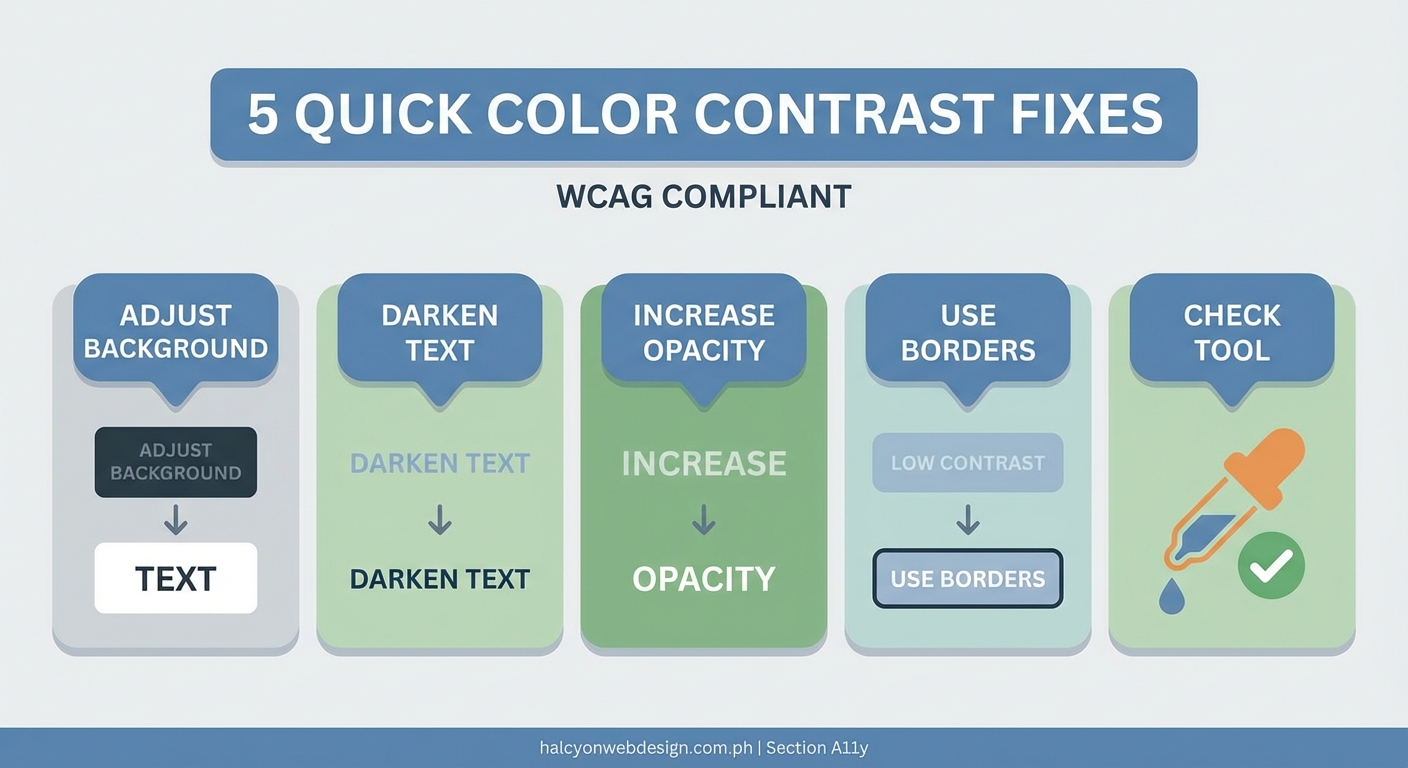
Fix contrast issues methodically to avoid missing elements or creating new problems.
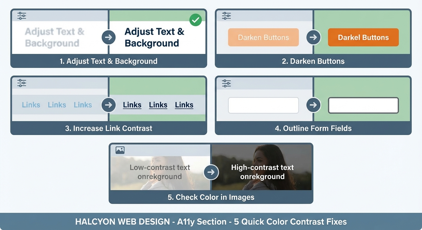
1. Prioritize by Impact
Start with elements users encounter most:
- Navigation menus
- Body text
- Form labels and inputs
- Calls to action
- Error messages
These appear on every page or block critical user tasks. Fix them first.
2. Adjust Colors Strategically
You have three options when a color pair fails:
Darken the foreground. This works well for text on light backgrounds. Move from #666666 to #595959 to gain the contrast you need.
Lighten the background. Effective for dark themes. Change your background from #333333 to #1a1a1a to improve ratios.
Increase both simultaneously. Sometimes you need to darken text AND lighten backgrounds to maintain your design aesthetic while meeting requirements.
Test each change immediately. Small adjustments in hex values can swing your ratio from failing to passing.
3. Document Your Color System
Create a reference table of approved color combinations. This prevents future violations.
Primary Text: #2c2c2c on #ffffff (15.8:1) ✓
Secondary Text: #595959 on #ffffff (7.0:1) ✓
Link Text: #0056b3 on #ffffff (8.2:1) ✓
Button Primary: #ffffff on #0056b3 (8.2:1) ✓
Button Secondary: #0056b3 on #e7f1ff (6.1:1) ✓
Share this with your team. Make it part of your design system documentation.
4. Update Your CSS Variables
Modern sites use CSS custom properties for colors. Update these once and fix hundreds of instances.
:root {
  --text-primary: #2c2c2c;
  --text-secondary: #595959;
  --text-muted: #767676;
  --link-color: #0056b3;
  --link-hover: #003d82;
}
This approach ensures consistency and makes future updates easier.
Handling Special Cases
Some situations require creative solutions beyond simple color adjustments.
Text Over Images
You can’t control image content, so you need techniques that work regardless of background variation.
Add a semi-transparent overlay between the image and text:
.hero-text {
  background: rgba(0, 0, 0, 0.6);
  padding: 1rem;
}
This guarantees sufficient contrast while keeping images visible.
Alternatively, use text shadows for smaller text elements:
.image-caption {
  text-shadow: 0 0 8px rgba(0, 0, 0, 0.8);
}
Test these solutions with various image types. What works on dark photos might fail on light ones.
Gradient Backgrounds
Gradients change color across their range. Your text might pass contrast requirements on one end but fail on the other.
Test contrast at both the lightest and darkest points of your gradient. If either fails, adjust your gradient stops or add a solid background behind text.
Brand Color Constraints
Your brand guidelines might specify colors that fail accessibility tests. You have options.
Use brand colors for decorative elements like borders, icons, or backgrounds where contrast doesn’t matter. Choose accessible alternatives for text.
Many brands maintain both standard and accessible color palettes. Nike uses different blue shades for logos versus body text. Microsoft adjusted their brand colors specifically to meet accessibility requirements.
“Accessibility doesn’t mean abandoning your brand. It means being thoughtful about where and how you apply brand colors. Reserve your exact brand colors for high-contrast situations or non-text elements, and develop accessible variants for everything else.” – WebAIM Color Contrast Guidelines
Validation and Testing After Fixes
Making changes is only half the job. Verify your fixes actually work.
Run the same automated tests you used initially. Compare before and after reports to confirm you’ve eliminated failures.
Test with actual assistive technology. Screen readers announce color information differently than you might expect. NVDA and JAWS handle contrast differently than automated tools report.
Get feedback from users with visual impairments. They catch issues automated tools miss and provide context about real-world usability.
Check your fixes across different devices and lighting conditions. What passes on your calibrated monitor might fail on a cheap laptop screen in bright sunlight.
Maintaining Compliance Over Time
You’ve fixed your current issues. Now prevent new ones from appearing.
Add Contrast Checks to Your Workflow
Install pre-commit hooks that test color contrast before code reaches production. Tools like Husky combined with pa11y-ci catch violations automatically.
Include accessibility testing in your QA checklist. Every new feature should pass contrast requirements before launch.
Train Your Team
Designers need to understand contrast requirements during the mockup phase. Developers should test as they build, not after.
Create simple reference materials. A one-page cheat sheet showing approved color combinations prevents most violations.
Regular Audits
Schedule quarterly accessibility audits. Sites evolve, and new content or features can introduce contrast problems.
Use services like Monsido or Siteimprove for continuous monitoring. They alert you when new pages fail accessibility standards.
Building Contrast into Your Design System
The best fix is prevention. Build accessibility into your design process from the start.
Create a limited palette of pre-tested color combinations. When designers and developers can only choose from accessible options, they can’t accidentally create violations.
Use design tokens that enforce contrast requirements. Tools like Style Dictionary let you define relationships between colors, ensuring text and backgrounds always meet minimum ratios.
Document not just what colors to use, but why. Explain the contrast requirements so team members understand the reasoning behind color choices.
Making Accessibility Sustainable
Color contrast fixes don’t have to disrupt your design vision or slow down development. Test early, fix systematically, and build compliance into your workflow.
Start with the highest-impact elements on your most-visited pages. Use browser tools and automated scanners to identify failures. Adjust colors strategically, document your decisions, and validate changes thoroughly.
Your users with visual impairments will notice the difference immediately. So will the millions of people reading your site on phones in bright sunlight, on old monitors with poor color accuracy, or with temporary vision issues from eye strain or medication.
Fix your contrast issues today. Your content deserves to be read by everyone.