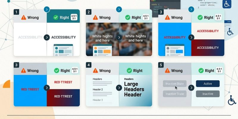
You pick a color palette. You love the way it looks on your screen. But when you show it to a friend with low vision, they squint and say they can’t read a thing. That moment stings. Color contrast is one of those design details that seems minor until it blocks someone from using your site. The good news is that fixing it is usually straightforward. Let’s walk through the five most common color contrast mistakes that hurt accessibility and how to fix each one.
Poor color contrast is the most common accessibility issue on the web. It affects people with low vision, color blindness, and even users in bright sunlight. The WCAG standard requires a minimum contrast ratio of 4.5:1 for normal text and 3:1 for large text. Most failures come from five repeatable mistakes. This article shows you exactly how to spot and fix each one.
What the WCAG Contrast Rules Actually Say
Before we fix mistakes, we need a target. The Web Content Accessibility Guidelines (WCAG) 2.2 Level AA sets two main contrast requirements:
- Normal text: A contrast ratio of at least 4.5:1 between text and background.
- Large text (18px and above, or 14px bold): A ratio of at least 3:1.
- Non-text elements (icons, buttons, form borders): A ratio of at least 3:1 against adjacent colors.
These ratios are not suggestions. They are pass/fail thresholds. If your site fails them, it is technically not compliant. Many businesses in the United States have faced legal action over accessibility issues, and poor contrast is often the first thing auditors flag.
Mistake 1: Light Gray Text on White Backgrounds
This is the number one offender. You see it everywhere. Blog posts, product descriptions, footer links. Designers choose a soft gray like #999999 because it looks clean and minimal. On a white background, that gray is almost invisible to someone with low vision.
The fix is simple. Darken your text. A safe starting point is #4A4A4A for body copy on white. That gives you a contrast ratio of about 8:1, well above the 4.5:1 minimum. If you want to keep a light feel, use a slightly off-white background like #F5F5F5 with a dark gray text. But never, ever use gray text lighter than #666666 on white. Test it yourself. Stand six feet from your monitor. If you can’t read it easily, neither can your users.
“If you have to ask whether the contrast is high enough, it probably isn’t. The best contrast choices are obvious to the naked eye.” – Accessibility consultant Sarah Horton
Mistake 2: Colored Text on Colored Backgrounds
Red text on a green background looks festive. It is also unreadable for roughly 8% of men with red-green color blindness. The same problem happens with blue text on purple, orange on yellow, or any pairing where the two colors share similar lightness.
Color contrast is not just about hue. It is about luminance. Two colors can be very different in hue but have almost identical brightness. When that happens, the text blends into the background for anyone with a color vision deficiency.
The solution is to check the luminance value of both colors. Use a tool like the WebAIM Contrast Checker to get the ratio. If the ratio is below 4.5:1, change one of the colors. A good rule of thumb is to pair a very dark color with a very light color. Dark navy blue on pale cream works. Dark maroon on light tan works. Bright red on bright green does not work.
Mistake 3: Using Color Alone to Convey Information
This one is not strictly a contrast ratio problem, but it is a contrast mistake that hurts accessibility. Imagine a form where required fields are marked only with red text. A user who is colorblind may not see the red. They submit the form and get an error. They are frustrated.
Another example: a line chart that uses green for profit and red for loss. Without patterns or labels, a colorblind user sees two identical lines.
The fix is to always add a second visual cue. Use an asterisk for required fields. Use dashed and solid lines in charts. Use icons alongside color. This approach helps everyone, not just people with color blindness. It makes your interface more robust.
For a deeper look at how color choices affect the overall look of your site, check out our guide on how to choose the perfect color palette for your website in 5 steps.
Mistake 4: Low-Contrast Buttons and Call-to-Action Elements
You want your call-to-action buttons to look sleek. So you use a soft blue button with white text. The contrast ratio is 2.8:1. That fails the 3:1 minimum for large text and definitely fails the 4.5:1 for normal text. Users with low vision cannot tell where the button ends and the background begins.
This mistake is common in minimalist designs. The trend toward muted colors and low saturation creates buttons that blend into the page.
The fix is to make buttons bold. Use a dark background with white text, or a very light background with dark text. A button with a #005A9C background and #FFFFFF text gives a contrast ratio of about 7:1. That is readable by almost everyone. If you want to keep a softer aesthetic, use a darker shade of your accent color. The button should be the most contrasting element on the page, not the least.
Mistake 5: Disabled Elements That Fade Too Much
Disabled buttons, grayed out form fields, and dimmed menu items are supposed to look inactive. But many designers fade them to a point where the text is illegible. A disabled button with #CCCCCC text on a white background has a contrast ratio of about 1.6:1. That is useless.
The WCAG guidelines apply to all content, including disabled elements. If a user cannot read the text, they cannot understand why the button is disabled.
The fix is to use a moderate fade. A disabled button can use #999999 text on a #E0E0E0 background. That gives a ratio of around 2.5:1, which is still low but acceptable for non-interactive text. Better yet, add a tooltip or an icon that explains why the element is disabled. That way, even if the contrast is lower, the information is still accessible.
How to Test Your Color Contrast in Three Steps
You do not need expensive software. Here is a practical process you can use right now.
- Pick a page on your site that has text, buttons, and form fields. The homepage is a good start, but also check a product page and a contact form.
- Use a contrast checker tool. The WebAIM Contrast Checker is free and works well. Enter the hex code for your text and background colors. The tool gives you the ratio and tells you if it passes WCAG AA.
- Simulate color blindness. Use a browser extension like Colorblindly or the built-in simulation tools in Chrome DevTools. Navigate through your page. If anything becomes hard to read, you have a problem.
Make this part of your design workflow. Test contrast before you push code to production.
Common Color Contrast Failures at a Glance
| Mistake | Typical Hex Pair | Contrast Ratio | Passes WCAG AA? |
|---|---|---|---|
| Light gray text on white | #999999 on #FFFFFF | 2.8:1 | No |
| Red text on green | #FF0000 on #00FF00 | 1.2:1 | No |
| Soft blue button, white text | #6CA6D9 on #FFFFFF | 2.5:1 | No |
| Disabled button text | #CCCCCC on #FFFFFF | 1.6:1 | No |
| Dark text on light background | #333333 on #F5F5F5 | 12:1 | Yes |
A Note on Brand Colors
You might worry that fixing contrast will ruin your brand identity. It does not have to. You can keep your brand colors and still meet accessibility standards. The trick is to use your brand colors for large elements like headers or backgrounds, and reserve high-contrast combinations for body text and interactive elements.
For example, if your brand uses a pale yellow and a light gray, do not use those together for text. Use the pale yellow as a background wash and pair it with dark charcoal text. The brand feel stays. The readability improves.
If you are building a new site from scratch, consider starting with a child theme so you can safely customize colors without breaking core files.
Why These Mistakes Persist
Designers make these mistakes for a few reasons. They design on high-end monitors with perfect lighting. They do not test with real users. They prioritize aesthetics over readability. And sometimes, they simply do not know the rules.
The good news is that contrast is one of the easiest accessibility issues to fix. It does not require rewriting code. It does not require a complete redesign. It requires checking a few hex codes and making small adjustments.
For more guidance on creating content that works for everyone, read our article on how to write alt text that actually helps visually impaired users.
Making Contrast Checks Part of Your Routine
Here is a short checklist you can use before launching any page or update.
- All body text has a contrast ratio of at least 4.5:1 against its background.
- All large text (18px+) has a ratio of at least 3:1.
- All buttons and interactive elements have a ratio of at least 3:1.
- No information is conveyed through color alone.
- Disabled elements are still readable.
- You have tested with a color blindness simulator.
Print this list. Stick it next to your monitor. Use it every time.
Your Next Step Toward Better Accessibility
Color contrast is not the only accessibility issue on the web, but it is the one that affects the most people. By fixing these five mistakes, you make your site usable for millions of users with low vision, color blindness, or anyone reading on a screen in harsh sunlight.
Start with one page today. Run it through a contrast checker. Fix the worst offender. Then do the next page. In a week, your whole site will be more accessible. And that is a win for everyone.