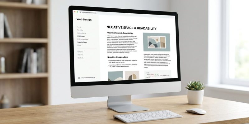
You just spent an hour tweaking the font size and line height on a landing page. The copy is solid. The colors match the brand. But something still feels off. Readers bounce before they reach the call to action. The problem is not the words themselves. It is the lack of room around them. Negative space, also called white space, is the breathing room between elements on a page. When used well, it does not just make a layout look clean. It directly improves how fast and comfortably people can read your content.
Negative space is a core tool for readability in web design. It reduces cognitive load, guides the eye, and makes text easier to scan. This guide covers why it works, a step by step process to apply it, a checklist for your next project, and a table of common mistakes to avoid. You will leave with actionable steps to improve your site today.
What Negative Space Does for Readability
Negative space is not just empty background. It is an active design element that shapes how users interact with your content. When you increase the space around a paragraph, you create a visual pause. That pause helps the brain process one idea before moving to the next.
Think about reading a newspaper column. The margins are generous. The space between lines is wide enough that your eye does not jump to the next row. The same principle applies to web pages. If your text blocks are crammed together, readers feel overwhelmed. They leave. If you give each section room to breathe, visitors stay longer and understand more.
Research from the Nielsen Norman Group shows that proper use of white space can improve reading comprehension by up to 20 percent. That is a measurable gain from something that costs nothing to implement.
The Connection Between Negative Space and Visual Hierarchy
Visual hierarchy is the order in which a user sees elements on a page. Negative space helps you control that order. When you leave more space around a headline, it becomes a focal point. When you reduce space around a secondary piece of text, it recedes.
A common mistake is to treat all content equally. You give the same padding to a main heading and a footnote. That confuses the reader. They do not know where to start. Use negative space to signal importance. The more important the element, the more empty room it deserves around it.
For example, your primary call to action button should have generous padding on all sides. That isolation makes it stand out. A secondary link can sit closer to surrounding text because you want it to be noticeable but not dominant.
How to Apply Negative Space: A Step by Step Process
Here is a repeatable process you can use on any page layout to improve readability with negative space.
-
Audit your current spacing. Open your page in a browser and take a screenshot. Draw boxes around every content block: headlines, paragraphs, images, buttons, and navigation. Look at the gaps between each box. Are they consistent? Are any gaps uncomfortably tight? Mark the areas that feel crowded.
-
Set a baseline unit for spacing. Pick a value for your base spacing unit. This could be 16 pixels, 24 pixels, or 1 rem. Use this unit for margins, padding, and gaps between elements. Consistency helps the user predict where the next piece of content will appear.
-
Increase line height for body text. Set your line height to at least 1.5 times the font size. For a 16 pixel font, that means a line height of 24 pixels. This prevents lines from blending together and makes long paragraphs easier to read.
-
Add padding around interactive elements. Buttons, links, and form fields need internal breathing room. Aim for at least 12 pixels of padding on the top and bottom, and 24 pixels on the sides. This makes them easier to tap on mobile and more visible on desktop.
-
Test with a content audit tool. Use a tool like the WAVE accessibility checker to see the distribution of elements on your page. A clean report often correlates with good use of negative space. If the tool flags dense blocks of text, you likely need more spacing.
-
Reduce clutter before adding space. Removing unnecessary elements is faster than fixing a packed layout. Delete any decorative images, redundant text, or extra navigation links. Then apply your spacing rules to the remaining content.
Checklist for Applying Negative Space
Use this checklist when you review a page for readability.
- [ ] Line height is at least 1.5x the font size.
- [ ] Margins around the main content area are at least 80 pixels on desktop.
- [ ] No two content blocks touch each other without a gap.
- [ ] Call to action buttons have padding of 12px top/bottom and 24px left/right.
- [ ] Navigation links have at least 16px of space between them.
- [ ] Images have a margin of at least 20px from surrounding text.
- [ ] The page uses a consistent spacing unit throughout.
- [ ] Mobile view maintains at least 16px of padding from the edge of the screen.
- [ ] Paragraphs are separated by at least one line of space.
- [ ] Headings have more space above them than below them.
Common Mistakes and How to Fix Them
Not every spacing decision works. Here is a table of frequent errors and their solutions.
| Mistake | Why It Hurts Readability | How to Fix It |
|---|---|---|
| Equal spacing around all elements | Creates a flat visual hierarchy | Give primary elements more space than secondary ones |
| Too much space between lines of text | Makes paragraphs look disconnected | Keep line height between 1.4 and 1.8 times the font size |
| No padding inside buttons | Makes text touch the button border | Add at least 12px vertical and 24px horizontal padding |
| Inconsistent margins on different pages | Confuses returning visitors | Establish a site wide spacing system using CSS custom properties |
| Ignoring mobile breakpoints | Cramped text on small screens | Use media queries to increase spacing on screens under 768px wide |
A Note on Mobile First Spacing
Mobile screens are narrow. Every pixel of space counts. But negative space becomes even more critical on small devices because the brain has less context to work with. On a phone, a paragraph that looks fine on a 27 inch monitor can become a wall of text.
Set your mobile breakpoints to increase padding around text blocks. A good rule is to keep at least 16 pixels of padding between your content and the edge of the screen. This prevents the text from touching the bezel and makes it easier to read without zooming.
Also, consider that fingers are larger than mouse cursors. Buttons and links need more internal padding on mobile to prevent accidental taps. If you follow the button padding guidelines in the checklist above, you will cover most mobile scenarios.
When Negative Space Hurts Readability
It is possible to use too much negative space. If you spread content too far apart, the user has to scroll excessively to find information. The page feels empty, and the user may think the site lacks substance.
The balance is context dependent. A landing page for a premium brand can get away with generous white space because the goal is to feel luxurious. A documentation page for a software tool needs denser information because the user wants to scan quickly for answers.
If you are unsure, test both versions. Run an A/B test with a page that has standard spacing and one with increased negative space. Measure time on page, scroll depth, and click through rate. The data will tell you which approach works for your audience.
Expert advice: “Negative space should be intentional, not accidental. Every gap on your page either helps or hurts the user’s ability to read. If you cannot explain why a gap exists, remove it or adjust it.” This principle comes from years of watching designers add space without purpose. Treat each margin as a design decision, not a default.
Putting It All Together
Open your most visited page right now. Look at the area around your main headline. Is there enough room for it to breathe? Check the gap between your navigation and your first paragraph. If it feels tight, increase the margin by 20 pixels. Refresh the page. Does it feel easier to read?
That one change can shift how a visitor perceives your site. They may not notice the space itself, but they will notice that the page feels calmer and more professional. That feeling translates into trust, and trust translates into conversions.
For more help cleaning up your layout, read our guide on why your website looks cluttered and how to fix it with white space. If you want to go deeper into how users scan content, check out designing for scannability: how to structure web content that users actually read.
Making Negative Space a Habit
The best designers do not add negative space as an afterthought. They build it into their workflow from the start. When you create a new page, set your spacing rules before you add content. Define your base unit, your line height, and your button padding in your CSS framework. That way, every new element inherits the right spacing automatically.
If you work with a team, document your spacing standards in your style guide. Include screenshots of good and bad examples. New team members will learn faster, and your site will stay consistent even as people come and go.
Negative space is not a trend. It is a fundamental part of making text readable on the web. Start with one page today. Apply the checklist. See how your readers respond. Then carry those lessons to the rest of your site.