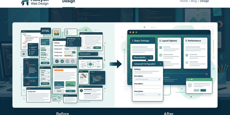
Have you ever landed on a website and felt your brain short-circuit? Too many options. Too much text. A wall of buttons, links, and form fields all screaming for attention. That feeling is information overload, and it is the fastest way to lose a visitor. The solution is not to remove content. The solution is to control when people see it. That is where progressive disclosure comes in.
Progressive disclosure reveals information in layers, showing only what users need at each step. This design technique reduces cognitive load, keeps interfaces clean, and helps visitors complete tasks without feeling overwhelmed. By hiding advanced options until they are needed, you create a smoother experience for beginners while still supporting expert users who want deeper controls. The result is higher engagement, fewer errors, and more confident decision-making across your entire website or application.
What Progressive Disclosure Really Means (and Why It Works)
Progressive disclosure is a design pattern that prioritizes information by importance. You show the essential stuff first. Then you let users pull back the curtain on secondary details when they are ready.
Think about the last time you booked a flight online. The search form asked for your destination and travel dates. That was it. The airline did not ask about seat preference, meal choices, or baggage add-ons until after you selected a flight. That is progressive disclosure in action.
The technique works because it respects how the human brain processes information. When people visit your site, they have limited mental bandwidth. Every extra option, label, or link eats into that bandwidth. By staging information across multiple screens or expandable sections, you help users focus on one decision at a time.
This approach is especially powerful for complex sites like SaaS dashboards, ecommerce checkouts, or government portals. But even a simple blog can benefit from hiding comments behind a click or using a read-more toggle for long articles.
Common Progressive Disclosure Patterns You Already Use
You have probably used progressive disclosure many times today without realizing it. Here are the most common UI patterns that rely on this technique.
-
Accordions and expandable sections. A user clicks a heading, and the content below slides open. This keeps the page short while still offering full access to details. FAQ pages use this pattern all the time.
-
Multi-step forms. Instead of showing twenty form fields at once, you break the process into steps with a progress bar. Each step asks for a small, manageable chunk of information. Checkout flows and survey tools do this well.
-
Tooltips and hover cards. When a user hovers over a term or icon, a small popup appears with a definition or explanation. The main interface stays clean, but help is always one hover away.
-
Tabs. Related content is grouped under tabbed headings. Users see only one panel at a time, but they can switch between sections freely. This works great for product descriptions, pricing tables, and dashboard views.
-
Advanced search toggles. A simple search bar hides filters like date range, category, or author behind an “Advanced” link. Most users do not need those options, but power users can access them with one click.
-
Progressive loading (lazy loading). Images and videos load only when they scroll into view. The page feels fast because the browser does not download everything at once.
-
Conditional form fields. A dropdown asks “Do you have a business account?” If the user selects “Yes,” new fields appear for company name and tax ID. If “No,” those fields stay hidden.
Each of these patterns follows the same principle: show less now, reveal more later.
When to Use Progressive Disclosure on Your Site
Progressive disclosure is not right for every situation. Sometimes hiding content frustrates users, especially if they need that information to make a decision. The key is knowing when to apply it and when to leave everything visible.
| Good time to use progressive disclosure | Bad time to use progressive disclosure |
|---|---|
| Long forms with more than seven fields | Login forms or checkout fields |
| Settings panels with rarely used options | Primary navigation labels |
| Content-heavy landing pages | Legal disclaimers or terms of service |
| Onboarding flows for new users | Error messages and alerts |
| Mobile interfaces with limited space | Pricing tables where users compare plans |
A good rule of thumb: if hiding something could cause a user to miss critical information, keep it visible. If hiding something reduces noise and helps focus, tuck it away.
Common Mistakes That Undermine Progressive Disclosure
Even experienced designers slip up when implementing this pattern. Here are the most frequent errors and how to avoid them.
| What goes wrong | Why it hurts users | How to fix it |
|---|---|---|
| Hiding essential steps like shipping costs until the last screen | Users feel tricked and abandon the purchase | Show total costs early, disclose optional details later |
| Using vague labels like “More” or “Details” | Users do not know what they will find | Use descriptive labels: “See payment options” instead of “More” |
| Requiring a click to reveal content that most users need | Adds friction to the main task | Default to open for high-use features, closed for rare ones |
| Animating reveals too slowly | Users get impatient waiting for content to appear | Keep transitions under 300 milliseconds |
| Not providing a way to expand all sections at once | Power users have to click each section individually | Add an “Expand all” toggle for long accordion lists |
Avoiding these pitfalls keeps your progressive disclosure helpful instead of annoying.
Expert advice: “When in doubt, test your progressive disclosure with real users. Watch where they hesitate. If three out of five people click a ‘Learn more’ link expecting something else, your label is wrong. If they miss a critical step because it was hidden, your disclosure threshold is off. Iterate until the path feels natural.”
A Simple Process to Apply Progressive Disclosure to Your Next Project
You do not need a complete redesign to start using this technique. Follow these steps to simplify any page on your site.
-
Audit your content hierarchy. List every element on the page. Rank each one by how often users need it and how important it is for completing the primary task.
-
Identify the must-see elements. These are the items that belong in the first layer. Everything else is a candidate for disclosure.
-
Group secondary content into logical clusters. All payment options go together. All shipping details go together. All help text goes together. This makes the reveal predictable.
-
Choose the right UI pattern for each group. Accordions work well for text-heavy details. Tabs work well for switching between related views. Tooltips work well for inline definitions.
-
Label every disclosure trigger clearly. Tell users exactly what they will find behind the click. “Show shipping rates” is better than “More info.” If you write clear labels, you also improve your SEO by making page structure more understandable to search engines. For more on that, check out our guide on how to write meta descriptions that actually get clicks.
-
Set sensible defaults. If 80% of your users need a certain section, leave it open by default. Let the 20% who do not need it collapse it. Defaults should favor the majority behavior.
-
Test with real people. Run a simple usability test. Ask five people to complete the main task on your page. Note where they pause, where they click, and where they miss something. Adjust based on what you see.
Putting Progressive Disclosure to Work on Your Next Project
Progressive disclosure is one of those rare design techniques that makes everyone happier. Beginners feel less intimidated because the interface does not throw everything at them at once. Power users feel respected because the advanced tools are still there, just a click away. And you get to keep all your content without overwhelming your audience.
The best part? You can start small. Pick one page that feels cluttered. Apply the technique to one section. See how it performs. Then expand from there. Over time, you will build a site that feels calm, focused, and easy to use. And that is the kind of experience people remember.
If you are also working on making your site feel less crowded, you might enjoy our article on why your website looks cluttered (and how to fix it with white space). Clean layouts and progressive disclosure work hand in hand to create interfaces that users actually enjoy using.