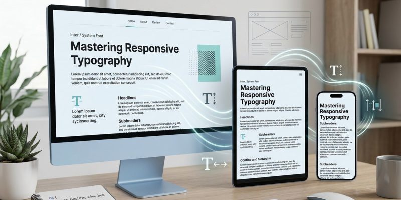
Responsive typography is the backbone of a user-friendly website. It ensures that your content remains clear, readable, and engaging no matter what device your visitors use. In 2026, with the proliferation of smartphones, tablets, and desktops, mastering responsive typography is more important than ever. It’s not just about making text look good but about creating a seamless experience that guides your visitors through your content effortlessly.
Responsive typography adapts font sizes, line heights, and spacing to different screen sizes, enhancing readability and user engagement. Implementing it correctly involves understanding CSS techniques, viewport units, and best practices to create a consistent experience across devices in 2026.
Understanding the Role of Responsive Typography
Responsive typography is about making text adaptable. It ensures that font sizes scale smoothly on different screens. This adaptability prevents users from zooming or squinting to read content. Think of it as the difference between reading a billboard from a car and reading a book comfortably. When typography adjusts to the device, users stay engaged longer, and your content feels natural.
In 2026, people access websites from a variety of devices. This diversity makes responsive typography essential for accessibility and usability. It’s no longer enough to have a fixed font size. Instead, you want your text to resize and reflow naturally, maintaining clarity at every breakpoint.
Techniques for Building Responsive Typography
Creating responsive typography is a mix of CSS techniques, strategic planning, and testing. Here’s a step-by-step approach to ensure your site looks great everywhere:
1. Use CSS Viewport Units
Viewport units are a powerful way to scale font sizes dynamically based on the device’s viewport dimensions. These units include vw (viewport width), vh (viewport height), vmin, and vmax. For example, setting font size as 5vw makes the text adjust as the screen width changes.
2. Implement CSS Clamp() Function
The clamp() function is a game-changer in responsive typography. It allows you to set a font size that scales between a minimum and maximum value depending on the viewport width. For instance:
h1 {
  font-size: clamp(2rem, 5vw, 4rem);
}
This ensures the header’s font size never drops below 2 rems or exceeds 4 rems, but scales fluidly in between.
3. Define Responsive Breakpoints
While fluid techniques handle most cases, defining specific breakpoints helps refine your typography for particular device sizes. Use media queries to adjust font-size, line-height, and spacing at different screen widths.
4. Maintain Consistent Line Heights and Spacing
Responsive typography isn’t just about font size. Adjust line heights and margins to match. When font sizes change, line spacing should scale proportionally to keep text comfortable to read.
5. Test Across Devices and Conditions
Always check how your typography appears on various screens. Use browser developer tools, real devices, or emulators to see how your fonts scale and reflow.
Common Mistakes to Avoid
| Mistake | Why it hurts | How to fix it |
|---|---|---|
| Fixed pixel font sizes | Doesn’t scale well on different screens | Use relative units like em, rem, or viewport units |
| Ignoring line height | Text becomes cramped or too sparse | Set line-height proportional to font size |
| Overusing media queries | Creates inconsistent experience | Combine fluid techniques with media queries for fine-tuning |
| Not testing on real devices | Surprises in user experience | Always preview on multiple devices |
Practical Process for Implementing Responsive Typography
-
Audit Your Current Typography
Review your existing font sizes and spacing. Identify areas where text appears too small or large on certain devices. -
Choose a Fluid Technique
Decide whether to usevwunits,clamp(), or a combination based on your design needs. -
Update Your CSS Styles
Replace fixed font sizes with responsive units. Useclamp()for headings and body text to maintain flexibility. -
Set Breakpoints for Fine-Tuning
Add media queries for specific adjustments where necessary. For instance, increase font size on very large screens for better readability. -
Test and Iterate
Use tools like Chrome DevTools device emulation and real devices. Adjust your styles until the text is comfortable everywhere.
A Responsive Typography Checklist
- [ ] Use relative units (
em,rem) for font sizing - [ ] Implement
clamp()for scalable font sizes - [ ] Adjust line-height proportionally
- [ ] Define breakpoints for specific devices
- [ ] Test on multiple devices and browsers
- [ ] Avoid fixed pixel font sizes for primary text
- [ ] Ensure sufficient contrast and readability
- [ ] Use consistent spacing and scale
Troubleshooting Common Issues
When implementing responsive typography, you might find some text too small on mobile or overflowing on large screens. To fix this, review your
clamp()ranges to ensure they fit your design. Also, verify your media queries are not overriding your fluid settings unintentionally. Regular testing and incremental adjustments help prevent these issues.
How to address font overflow problems
- Ensure your container has proper
overflowsettings. - Use
max-widthto prevent text from spilling outside. - Adjust
clamp()ranges if fonts are too large or small.
Handling inconsistent line spacing
- Use
line-heightset to 1.5 or 1.6 times the font size. - Adjust at breakpoints if necessary for readability.
Embracing a Modern Approach to Typography
Responsive typography is no longer a luxury but a necessity. It’s about designing with flexibility in mind. Techniques like clamp() and viewport units are now standard tools. Combining these with thoughtful breakpoints and thorough testing ensures your website remains accessible and engaging at all sizes.
Remember, the goal is a seamless reading experience. When your text adapts naturally, users feel comfortable and stay longer. Your content becomes more impactful, and your site’s professionalism shines through.
Keep Your Typography Fluid and Friendly
Applying these techniques takes some trial and error but pays off in user satisfaction. Start small by updating your headings and body text. Gradually refine your styles as you see how your audience interacts with your site. With patience and attention to detail, your typography will become a smooth, adaptable feature of your web design.
Final Thoughts on Responsive Typography in 2026
Responsive typography is a vital part of modern web design. It balances aesthetic appeal with usability across all devices. By understanding and applying CSS techniques like clamp() and viewport units, you ensure your content always looks its best. Remember to test thoroughly and adjust your styles for the best results.
Making your typography responsive is an investment in your site’s success. It creates a more welcoming, accessible environment where visitors can engage with your content effortlessly. Take the time to experiment with these methods today, and watch your website’s readability improve dramatically.
Happy designing! Implement these strategies, and your website will deliver a consistent, delightful experience for every visitor, no matter their device in 2026.