Building a website involves more than just choosing pretty colors and nice images. Your layout is what guides visitors, communicates your message, and adds professionalism. Yet, many websites fall into common pitfalls that make them look amateurish. These mistakes can turn off visitors, undermine your credibility, and limit your success. The good news is, with some simple adjustments, you can fix these issues and present a more polished, confident online presence.
Avoid layout mistakes that look amateur by paying attention to visual alignment, white space, consistency, and typography. Small tweaks can dramatically improve your website’s professionalism and appeal.
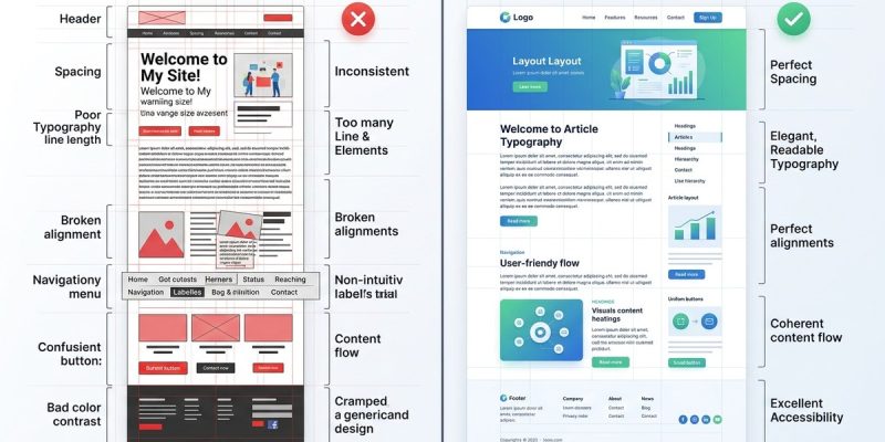
Recognizing layout mistakes that look amateur
Many self-publishers, designers, and creative pros unknowingly include layout errors that scream inexperience. These mistakes often stem from neglecting basic design principles or rushing through the process. Recognizing and fixing these issues can boost your site’s credibility and user experience.
Common layout mistakes that make websites look amateur
| Mistake | Why it looks amateur | Professional fix | Example |
|---|---|---|---|
| Cluttered pages | Overloading with elements creates chaos | Use white space strategically | Simplify a crowded homepage by removing unnecessary images and text blocks |
| Misaligned elements | Crooked images and uneven text create disorganization | Use grid systems or alignment tools | Align images and text consistently in a sidebar or header |
| Inconsistent spacing | Varying padding and margins confuse the eye | Set uniform spacing rules | Maintain consistent spacing between headings, paragraphs, and images |
| Poor typography choices | Mixing fonts or using unreadable fonts looks unprofessional | Use limited, well-chosen fonts | Stick to 2-3 complementary fonts and ensure readability |
| Overuse of colors | Bright, clashing colors distract and overwhelm | Use a harmonious color palette | Limit colors to 3-4 shades that complement each other |
| Ignoring hierarchy | No clear visual flow confuses visitors | Create clear hierarchies with size and contrast | Make headings larger and bolder than body text |
| Lack of visual balance | Heavy elements on one side create imbalance | Use symmetrical or balanced layouts | Place images and text to distribute visual weight evenly |
| Crooked lines or crooked images | Lines that aren’t straight look unpolished | Use guides and grids | Use design software to straighten elements |
| Overly busy backgrounds | Distracting backgrounds hide content | Choose subtle backgrounds or solid colors | Use light textures or neutral tones for backgrounds |
| Ignoring responsive design | Content breaks on different devices looks unprofessional | Test on multiple devices | Use flexible grids and media queries for adaptability |
Practical steps to correct amateur layout mistakes
- Audit your current design. Walk through every page and note misalignments, clutter, or inconsistent elements.
- Introduce a grid system. Use guides in your design software or layout frameworks like CSS Grid to align items perfectly.
- Limit your font choices. Pick 2 fonts maximum. Use font size, weight, and color to establish hierarchy.
- Use white space wisely. Don’t fill every inch of space. Let content breathe and give your design room to relax.
- Set consistent spacing rules. Use padding and margin consistently across sections.
- Test responsiveness. Resize your browser or view on different devices. Fix any content shifts or overlaps.
- Simplify your color palette. Use color schemes that are harmonious and calming.
- Straighten crooked elements. Use alignment tools in your design software or CSS to keep everything tidy.
- Prioritize clarity over complexity. Avoid overloading pages with too many elements or effects.
- Get feedback. Ask peers or clients to review your site for any layout inconsistencies.
Techniques and mistakes at a glance
| Technique | Mistake | How to fix | Impact |
|---|---|---|---|
| Using grids | Crooked or uneven elements | Use CSS grid or guides | Creates order and balance |
| Consistent margins | Varying spacing | Set standard spacing rules | Improves visual flow |
| Clear hierarchy | No size contrast | Use font size and weight | Guides user attention |
| White space | Cluttered look | Add padding and margins | Improves readability |
| Responsive testing | Content breaks | Use media queries | Ensures mobile friendliness |
“A well-structured layout doesn’t just look good, it makes your content easier to understand. Consistency and alignment are the backbone of professionalism.” — Design expert Jane Doe
Final words on elevating your website’s layout
Avoiding layout mistakes that look amateur requires attention to detail and patience. Focus on alignment, spacing, hierarchy, and consistency. These principles are simple but powerful. As you fix these common errors, your website will project confidence and professionalism. Remember, a clean, balanced layout invites visitors to engage and trust your brand. Take the time to review your design regularly. Small improvements can lead to big results. Keep refining, and your website will look polished and credible every time.
Staying sharp with layout mastery
By recognizing these layout pitfalls and applying straightforward fixes, you set your website apart from the crowd. Practice makes perfect, and each adjustment brings your design closer to that professional look. Don’t be afraid to experiment with grids, spacing, and typography. Your future self will thank you for investing in a layout that communicates quality and care. Now, go ahead and give your website the professional touch it deserves.