Your website looks perfect on your laptop. You hit publish, check it on your phone, and the navigation collapses into an unreadable mess. Sound familiar?
Most developers new to responsive design struggle with breakpoints because they treat them like magic numbers instead of strategic decision points. Breakpoints aren’t about hitting specific pixel values. They’re about making sure your content remains readable and functional across every device your users own.
Responsive breakpoints are CSS media query values where your layout adjusts to fit different screen sizes. Instead of designing for specific devices, focus on where your content breaks down. Start with mobile layouts, add breakpoints when content becomes difficult to read, and test across real devices to ensure navigation, images, and text remain usable at every viewport width.
What responsive breakpoints actually do
Breakpoints tell your CSS when to switch layout rules.
Think of them as checkpoints. When a screen width crosses a breakpoint threshold, different styles activate. Your three-column grid becomes two columns. Your horizontal navigation stacks vertically. Your large hero image swaps for a mobile-optimized version.
Without breakpoints, you’d have two choices. Build separate websites for every device type, or force desktop layouts onto mobile screens. Both options create terrible user experiences.
Media queries make breakpoints possible. Here’s the basic syntax:
“`css
/ Default styles for mobile /
.container {
width: 100%;
padding: 1rem;
}
/ Tablet breakpoint at 768px /
@media (min-width: 768px) {
.container {
width: 750px;
margin: 0 auto;
}
}
/ Desktop breakpoint at 1024px /
@media (min-width: 1024px) {
.container {
width: 960px;
}
}
The browser checks the viewport width. When it matches a media query condition, those styles apply.
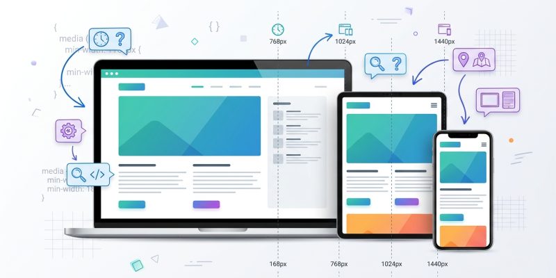
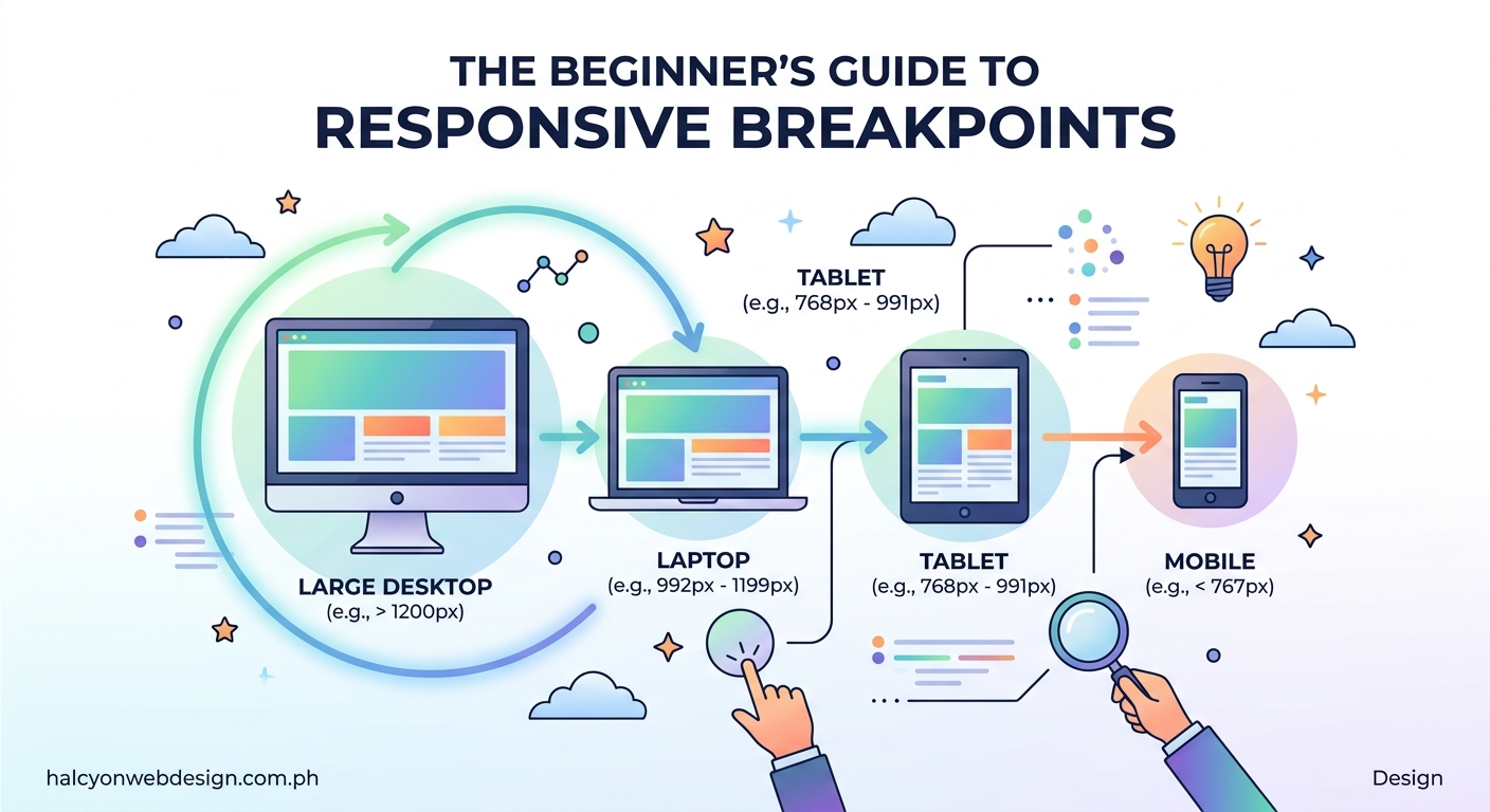
Common breakpoint values developers use
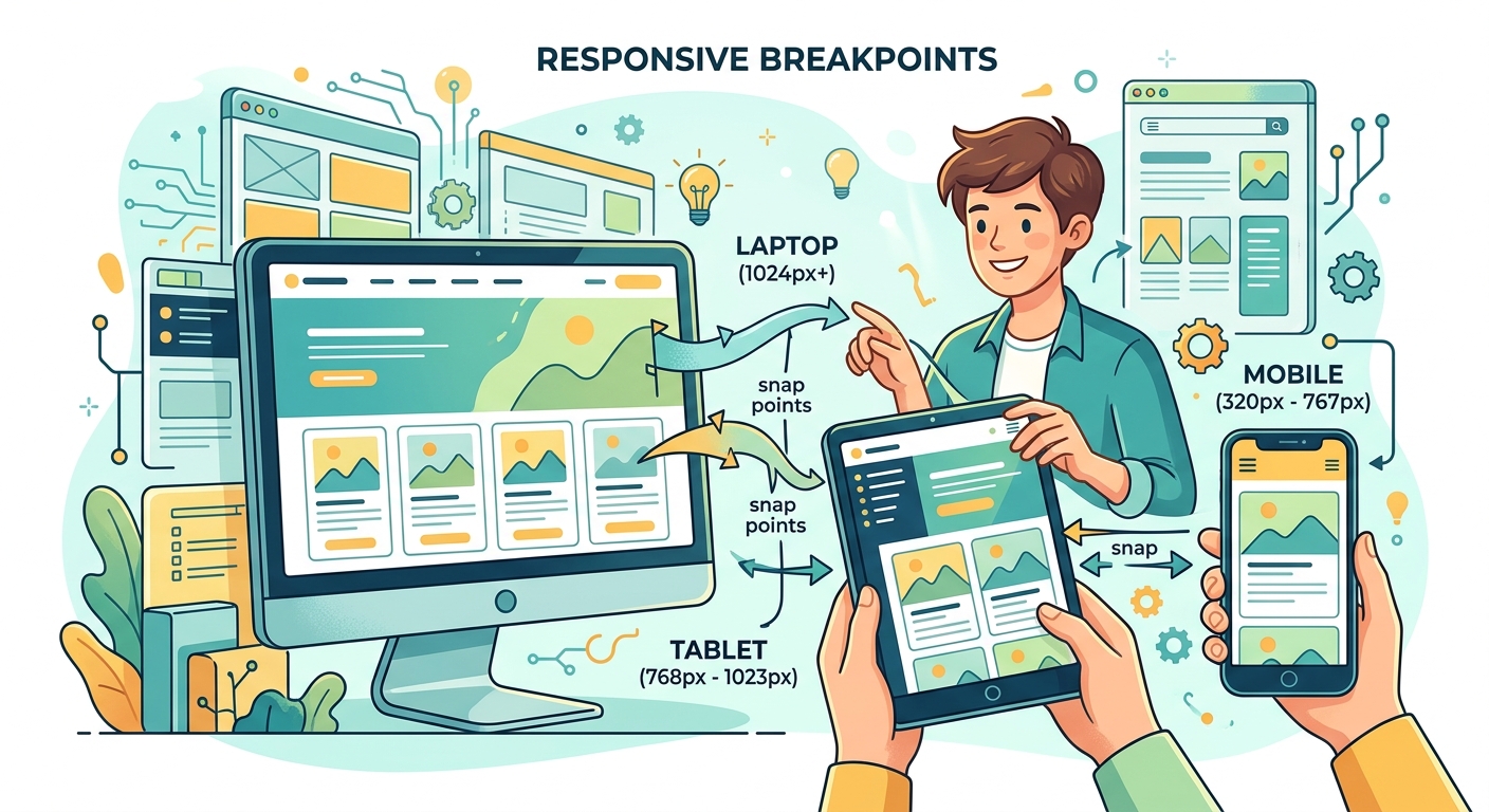
Most frameworks use similar breakpoint ranges because they match real device categories.
Here are the most widely adopted values:
| Device Category | Typical Breakpoint | Common Width Range |
|---|---|---|
| Mobile phones | 320px to 480px | Portrait orientation |
| Tablets | 768px | iPad and similar devices |
| Small laptops | 1024px | Smaller desktop screens |
| Desktop monitors | 1200px to 1440px | Standard desktop experience |
| Large displays | 1920px and above | Wide monitors and TVs |
Bootstrap uses 576px, 768px, 992px, 1200px, and 1400px. Tailwind CSS defaults to 640px, 768px, 1024px, 1280px, and 1536px.
These numbers aren’t sacred. They’re starting points based on device statistics.
Your breakpoints should match where your specific content needs adjustment. A photography portfolio might need different breakpoints than a text-heavy blog.
How to choose breakpoints based on your content
Stop picking breakpoints based on device names. Start picking them based on where your layout breaks.
Here’s the process:
-
Start with your mobile design at 320px width. This ensures your site works on the smallest common phones.
-
Slowly expand your browser window. Watch your content carefully. Does text become too wide to read comfortably? Does your navigation look cramped? Do images start leaving awkward gaps?
-
Add a breakpoint exactly where something looks wrong. Don’t force yourself to use 768px if your content needs adjustment at 650px.
-
Repeat until you reach large desktop sizes. Most sites need between three and five breakpoints total.
-
Test on real devices, not just browser tools. Desktop browser responsive modes help, but nothing replaces testing on actual phones and tablets.
This approach creates breakpoints that serve your users, not arbitrary device categories.
For example, if you’re working on building responsive navigation menus with CSS grid and flexbox, you might find your menu items need to stack at 580px rather than the standard 768px. That’s perfectly fine.
Mobile-first versus desktop-first approaches
The order you write your media queries matters more than most beginners realize.
Mobile-first means you write base styles for small screens, then use min-width queries to add complexity as screens get larger:
“`css
/ Mobile base styles /
.card {
width: 100%;
}
/ Add columns on larger screens /
@media (min-width: 768px) {
.card {
width: 50%;
}
}
@media (min-width: 1024px) {
.card {
width: 33.33%;
}
}
Desktop-first means you write base styles for large screens, then use max-width queries to simplify as screens get smaller:
“`css
/ Desktop base styles /
.card {
width: 33.33%;
}
/ Simplify on smaller screens /
@media (max-width: 1023px) {
.card {
width: 50%;
}
}
@media (max-width: 767px) {
.card {
width: 100%;
}
}
Mobile-first has become the standard for good reasons. More people browse on phones than desktops. Starting mobile forces you to prioritize essential content. It’s easier to add features than remove them.
The principles in 5 mobile-first design principles every beginner should know explain why this approach creates better user experiences.
Desktop-first still works if you’re building primarily for desktop users, like complex web applications or admin dashboards.
Pick one approach and stick with it. Mixing both creates confusing CSS that’s hard to maintain.
Common breakpoint mistakes that break layouts
Even experienced developers make these errors:
Using too many breakpoints. Every breakpoint adds complexity. Most sites work fine with three to five. More than seven usually means you’re fighting your design instead of letting it flex naturally.
Targeting specific devices. The iPhone 12 Pro Max won’t be the most popular phone forever. Design for width ranges, not device names.
Forgetting about landscape orientation. Phones in landscape mode have different dimensions than portrait. Test both.
Ignoring the content between breakpoints. Your site doesn’t just exist at 768px and 1024px. It also exists at 850px, 920px, and every pixel in between. Use flexible units like percentages and em values so content adapts smoothly.
Setting breakpoints in pixels without considering zoom. Users with vision impairments zoom their browsers. Pixel-based breakpoints don’t respond to zoom. Using em units for media queries respects user preferences.
Here’s how to convert pixels to ems for breakpoints:
“`css
/ 768px ÷ 16px (browser default) = 48em /
@media (min-width: 48em) {
/ Tablet styles /
}
/ 1024px ÷ 16px = 64em /
@media (min-width: 64em) {
/ Desktop styles /
}
Not testing on real devices. Browser DevTools are helpful but imperfect. A layout that looks perfect in Chrome’s device simulator might have issues on an actual Android phone. Borrow devices from friends or use a device lab if possible.
If you’re experiencing issues after updates, the troubleshooting steps in 5 fixes for broken CSS after a WordPress update can help identify breakpoint-related problems.
Writing maintainable media queries
Organization prevents headaches six months from now when you need to update something.
Keep related breakpoints together:
“`css
/ Navigation component /
.nav {
/ Mobile styles /
}
@media (min-width: 48em) {
.nav {
/ Tablet styles /
}
}
@media (min-width: 64em) {
.nav {
/ Desktop styles /
}
}
This component-based approach keeps all navigation styles in one place. You don’t need to hunt through multiple files to change how the menu behaves at different sizes.
Use CSS custom properties for breakpoint values:
“`css
:root {
–breakpoint-tablet: 48em;
–breakpoint-desktop: 64em;
–breakpoint-wide: 80em;
}
@media (min-width: var(–breakpoint-tablet)) {
/ Styles /
}
Wait, that doesn’t work. CSS custom properties can’t be used in media queries yet. But you can use preprocessor variables in Sass or Less:
“`scss
$breakpoint-tablet: 48em;
$breakpoint-desktop: 64em;
@media (min-width: $breakpoint-tablet) {
/ Styles /
}
This makes updating breakpoints across your entire site much easier.
Comment your breakpoint decisions:
“`css
/ Breakpoint at 48em (768px)
Navigation switches from stacked to horizontal
Sidebar appears next to main content /
@media (min-width: 48em) {
/ Styles /
}
Future you will appreciate knowing why you chose that specific value.
Testing breakpoints across browsers and devices
Your site needs to work everywhere, not just on your development machine.
Use browser DevTools first. Chrome, Firefox, and Safari all include responsive design modes. Toggle between preset device sizes and drag the viewport to custom widths.
Look for these issues:
- Text that becomes too wide or narrow to read comfortably
- Images that overflow containers or leave large gaps
- Navigation that overlaps or disappears
- Buttons that become too small to tap accurately
- Forms that extend beyond the viewport
Test on physical devices. Simulators can’t replicate everything. Touch interactions feel different. Performance varies. Some CSS properties render differently on mobile browsers.
You don’t need every device ever made. Focus on:
- One modern iPhone
- One Android phone (Samsung or Google Pixel)
- One tablet (iPad or Android tablet)
- Your development laptop
- One large desktop monitor if possible
Use online testing services. BrowserStack and LambdaTest let you test on hundreds of device and browser combinations without buying hardware.
Check your analytics. Look at what devices your actual visitors use. If 40% of your traffic comes from iPhones, test on iPhones. If nobody visits from tablets, maybe you don’t need to obsess over tablet breakpoints.
The performance testing strategies in 7 free tools to test and improve your core web vitals score help identify how breakpoints affect loading speed across devices.
Breakpoints for specific layout techniques
Different CSS layout methods need different breakpoint strategies.
CSS Grid breakpoints:
Grid excels at complex layouts that need dramatic changes between screen sizes. You can completely restructure your grid at each breakpoint:
“`css
.grid-container {
display: grid;
gap: 1rem;
grid-template-columns: 1fr;
}
@media (min-width: 48em) {
.grid-container {
grid-template-columns: repeat(2, 1fr);
}
}
@media (min-width: 64em) {
.grid-container {
grid-template-columns: repeat(3, 1fr);
}
}
The patterns in 7 CSS grid layout patterns every WordPress developer should know demonstrate how grid-based breakpoints create flexible layouts.
Flexbox breakpoints:
Flexbox works better for components that need to flow naturally. You might only need to change flex direction:
“`css
.flex-container {
display: flex;
flex-direction: column;
gap: 1rem;
}
@media (min-width: 48em) {
.flex-container {
flex-direction: row;
}
}
Typography breakpoints:
Text needs different sizes at different viewport widths. Too small on mobile hurts readability. Too large on desktop wastes space:
“`css
body {
font-size: 1rem;
line-height: 1.5;
}
@media (min-width: 48em) {
body {
font-size: 1.125rem;
}
}
@media (min-width: 64em) {
body {
font-size: 1.25rem;
}
}
Better yet, use the clamp() function to create fluid typography that scales smoothly without breakpoints:
“`css
body {
font-size: clamp(1rem, 0.875rem + 0.5vw, 1.25rem);
}
The techniques in 7 typography mistakes that make your website look unprofessional cover common text sizing errors at different breakpoints.
Advanced breakpoint techniques
Once you master basic breakpoints, these techniques give you more control.
Range media queries:
Instead of just checking minimum width, you can target specific ranges:
“`css
/ Only between 768px and 1023px /
@media (min-width: 48em) and (max-width: 63.9375em) {
.sidebar {
width: 30%;
}
}
This helps when you need styles that only apply at medium sizes.
Orientation queries:
Sometimes width alone isn’t enough. Orientation matters:
“`css
@media (orientation: landscape) {
.hero-image {
height: 50vh;
}
}
@media (orientation: portrait) {
.hero-image {
height: 30vh;
}
}
Resolution queries:
High-resolution displays need different images:
“`css
.logo {
background-image: url(‘logo.png’);
}
@media (min-resolution: 2dppx) {
.logo {
background-image: url(‘[email protected]’);
}
}
Container queries:
This newer CSS feature lets components respond to their container size instead of viewport size:
“`css
.card-container {
container-type: inline-size;
}
@container (min-width: 400px) {
.card {
display: flex;
}
}
Container queries solve problems that viewport breakpoints can’t. A card component can adapt based on where it’s placed, not just how wide the browser window is.
Browser support is improving but check compatibility before using container queries in production.
How frameworks handle breakpoints
Popular CSS frameworks include breakpoint systems you can use or customize.
Bootstrap 5 breakpoints:
“`scss
$grid-breakpoints: (
xs: 0,
sm: 576px,
md: 768px,
lg: 992px,
xl: 1200px,
xxl: 1400px
);
Bootstrap provides utility classes that respond to these breakpoints automatically. You can hide elements, change layouts, or adjust spacing without writing custom CSS.
Tailwind CSS breakpoints:
``javascript
module.exports = {
  theme: {
    screens: {
      'sm': '640px',
      'md': '768px',
      'lg': '1024px',
      'xl': '1280px',
      '2xl': '1536px',
    }
  }
}
Tailwind uses prefix modifiers:
md:w-1/2` means “apply 50% width at medium screens and above.”
Foundation breakpoints:
“`scss
$breakpoints: (
small: 0,
medium: 640px,
large: 1024px,
xlarge: 1200px,
xxlarge: 1440px,
);
Foundation calls them “named breakpoints” and provides mixins for easy use.
You can customize any framework’s breakpoint values. Don’t feel locked into defaults if your content needs different values.
When working with WordPress themes, understanding how your theme handles breakpoints matters. The guide on how to choose the perfect WordPress theme without getting overwhelmed covers what to look for in theme responsiveness.
Debugging breakpoint problems
Something’s not working. Here’s how to figure out what.
Check media query syntax carefully. Missing parentheses or incorrect units break everything:
“`css
/ Wrong – missing parentheses /
@media min-width: 768px {
/ Won’t work /
}
/ Wrong – missing unit /
@media (min-width: 768) {
/ Won’t work /
}
/ Correct /
@media (min-width: 768px) {
/ Works /
}
Verify specificity isn’t overriding your breakpoint styles. A more specific selector earlier in your CSS might win:
“`css
/ This is more specific /
body .container .card {
width: 100%;
}
/ This breakpoint won’t apply /
@media (min-width: 768px) {
.card {
width: 50%;
}
}
/ Fix by matching specificity /
@media (min-width: 768px) {
body .container .card {
width: 50%;
}
}
Use browser DevTools to inspect which styles apply. The computed styles panel shows exactly what CSS is active at the current viewport size.
Check for conflicting breakpoints. If you mix min-width and max-width queries carelessly, you create overlaps where multiple rules fight each other.
Clear your cache. CSS changes sometimes don’t appear because your browser cached the old version. Hard refresh with Ctrl+Shift+R (Windows) or Cmd+Shift+R (Mac).
The debugging techniques in how to debug CSS layout issues using browser DevTools like a pro provide more troubleshooting strategies.
Breakpoints and performance considerations
More breakpoints don’t necessarily mean slower sites, but implementation matters.
Avoid loading unnecessary resources at every breakpoint. Don’t load desktop-sized images on mobile:
“`html

Consider using different image formats at different sizes. WebP offers better compression for modern browsers.
Test loading speed at each major breakpoint. A site that loads fast on desktop might struggle on mobile networks. The strategies in why your WordPress site loads slowly and how to fix it in 30 minutes help identify performance bottlenecks.
Minimize CSS file size. Every media query adds bytes. Remove unused breakpoint styles before deployment.
Don’t hide content with CSS if you can avoid loading it entirely. Using display: none at mobile breakpoints still downloads the content. Users pay for that data even though they never see it.
Creating a breakpoint strategy for your next project
Start your next project with a plan instead of adding breakpoints randomly.
The best breakpoint strategy is the one you document and your whole team understands. Consistency matters more than perfect pixel values.
Document your breakpoint decisions. Create a simple reference:
Project Breakpoints:
– Mobile: 320px to 767px (base styles, no media query)
– Tablet: 768px to 1023px (@media min-width: 48em)
– Desktop: 1024px to 1439px (@media min-width: 64em)
– Wide: 1440px and above (@media min-width: 90em)
Rationale:
– 768px: Navigation switches to horizontal
– 1024px: Sidebar appears, three-column grid activates
– 1440px: Max content width applied, prevent line length issues
Review breakpoints during design handoff. If you’re working with designers, discuss breakpoints before coding. Ask which layouts they envision at different sizes.
Test early and often. Don’t wait until you’ve built the entire site to check mobile. Test each component as you build it.
Plan for content changes. Your breakpoints should work even when someone adds more menu items, longer headlines, or different images later.
Keep accessibility in mind. Breakpoints affect how people with disabilities experience your site. Touch targets need to be large enough at mobile breakpoints. Text needs adequate contrast at all sizes. The checklist in 7 accessibility mistakes WordPress site owners make and simple fixes covers common responsive accessibility issues.
Making your breakpoints work for real users
Breakpoints aren’t about hitting specific numbers or following framework defaults blindly.
They’re about making sure your content remains accessible and usable regardless of how someone accesses your site. The person on a five-year-old Android phone deserves the same quality experience as someone on the latest MacBook Pro.
Start with your content. Watch where it breaks. Add breakpoints only where they solve actual problems. Test on real devices whenever possible. Document your decisions so future you (or your teammates) understand the reasoning.
Your users won’t notice perfect breakpoints, but they’ll definitely notice when layouts break or content becomes unreadable. That’s the real measure of success.