Your WordPress site might look great, but can everyone actually use it? Millions of visitors with disabilities struggle to access websites every day because site owners accidentally create barriers. These barriers aren’t intentional. They’re the result of common oversights that happen during theme selection, plugin installation, and content creation.
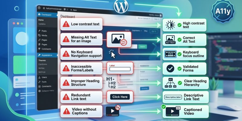
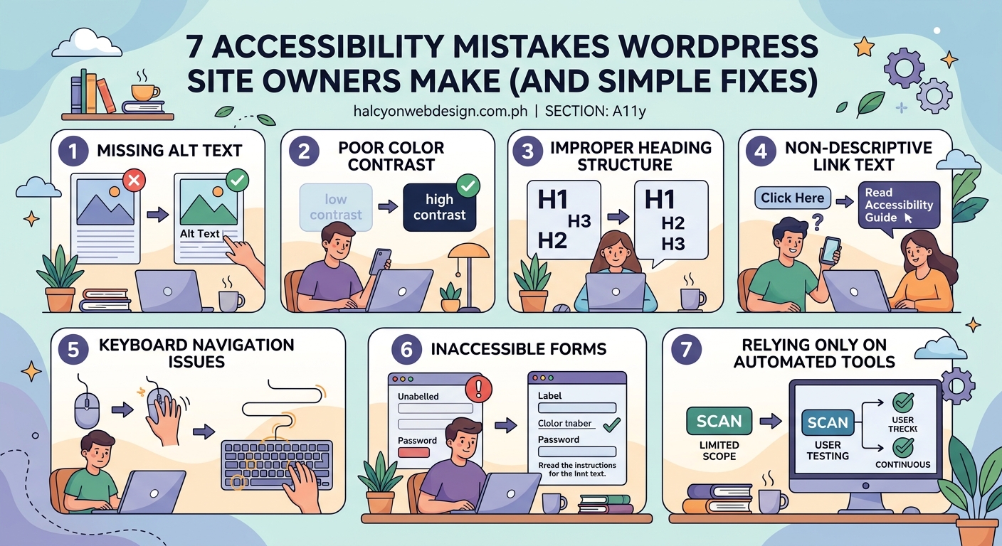
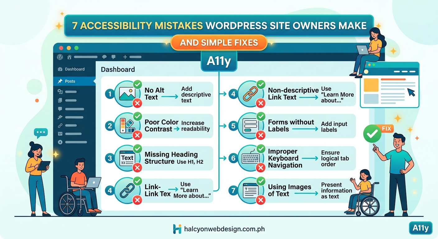
WordPress accessibility mistakes affect 15% of the global population who live with disabilities. The seven most common errors include missing alt text, poor color contrast, broken keyboard navigation, inaccessible forms, empty links, skipped heading levels, and auto-playing media. Each mistake has straightforward fixes that improve both user experience and WCAG compliance without requiring advanced technical skills or expensive plugins.
Missing Alt Text on Images Blocks Screen Reader Users
Screen readers announce images by reading their alt text aloud. Without it, users hear “image” or the filename instead of understanding what the picture shows.
This happens constantly. You upload a product photo, a team headshot, or a diagram. WordPress prompts you for alt text, but you skip it to save time. Now visitors using screen readers miss that information completely.
The fix takes seconds per image:
- Open your Media Library in WordPress
- Click any image to open its details
- Add descriptive alt text in the “Alternative Text” field
- Save the changes
Good alt text describes the image purpose, not just what it shows. For a photo of someone typing on a laptop, write “Team member updating website content” rather than “person with laptop.”
Decorative images that add no information should have empty alt attributes (alt=””) so screen readers skip them entirely. This includes divider lines, background patterns, and purely aesthetic graphics.
| Image Type | Alt Text Approach | Example |
|---|---|---|
| Informative | Describe the purpose | “Monthly revenue chart showing 23% growth” |
| Decorative | Use empty alt | alt=”” |
| Linked | Describe destination | “Read our accessibility guide” |
| Complex | Provide summary + long description | “Organization chart (full description below)” |
For detailed guidance on writing effective descriptions, check out how to write alt text that actually helps visually impaired users.
Poor Color Contrast Makes Text Unreadable
Light gray text on white backgrounds looks modern and minimalist. It also fails WCAG standards and frustrates users with low vision, color blindness, or anyone reading in bright sunlight.
WCAG requires a contrast ratio of at least 4.5:1 for normal text and 3:1 for large text. Most WordPress themes ship with contrast ratios below these thresholds because designers prioritize aesthetics over accessibility.
You can test your site’s contrast ratios with free browser tools:
- Chrome DevTools has a built-in contrast checker in the color picker
- WebAIM’s Contrast Checker lets you test hex codes manually
- WAVE browser extension highlights contrast failures across your entire page
Common problem areas include:
- Navigation menu text
- Button labels
- Form field placeholders
- Footer links
- Breadcrumb trails
The solution often means darkening your text color or lightening your background. A text color of #767676 on white (#FFFFFF) fails at 4.54:1. Change it to #595959 and you pass at 7:1.
Your color palette choices should account for accessibility from the start, not as an afterthought.
“Accessible design is good design. It benefits people who don’t have disabilities as well as people who do. Accessibility is all about removing barriers and providing the benefits of technology for everyone.” — Steve Ballmer, former Microsoft CEO
Broken Keyboard Navigation Traps Users
Not everyone uses a mouse. Some visitors navigate entirely with keyboards, using Tab to move forward and Shift+Tab to move backward through interactive elements.
WordPress accessibility mistakes in this area show up when:
- Focus indicators disappear or become invisible
- Tab order jumps around illogically
- Custom menus trap keyboard focus
- Modal dialogs can’t be closed with Escape
- Skip links are missing or broken
Test your site right now. Press Tab repeatedly and watch where focus moves. Can you see which element is active? Does the order make sense? Can you access every interactive element?
Many themes remove focus outlines because developers think they look ugly. This makes keyboard navigation impossible for users who need it.
Add visible focus styles to your theme:
a:focus,
button:focus,
input:focus,
textarea:focus {
    outline: 2px solid #0066cc;
    outline-offset: 2px;
}
Never use outline: none without providing an alternative focus indicator. This single CSS rule breaks accessibility for millions of users.
For comprehensive keyboard navigation guidance, read the complete guide to keyboard navigation.
Inaccessible Forms Block User Input
Contact forms, search boxes, and registration pages often contain accessibility barriers that prevent completion. These mistakes frustrate all users, not just those with disabilities.
Common form accessibility problems include:
- Missing or improperly associated labels
- Placeholder text used instead of labels
- No error identification or correction guidance
- Required fields not marked programmatically
- Submit buttons with vague labels like “Submit” or “Go”
Every form field needs a visible label that remains visible when the field has focus. Placeholder text disappears when you start typing, which causes problems for users with memory or cognitive disabilities.
Fix form labels properly:
<label for="email-address">Email Address (required)</label>
<input type="email" id="email-address" name="email" required aria-required="true">
The for attribute on the label must match the id on the input. This creates a programmatic association that screen readers announce.
Error messages need to be specific and helpful. “Error in form” tells users nothing. “Email address is missing” explains exactly what to fix.
Learn more about creating usable forms in how to build accessible forms that every user can complete.
Empty Links and Buttons Confuse Everyone
“Click here” and “Read more” links appear throughout WordPress sites. They make sense visually because surrounding context explains where they lead. Screen reader users who navigate by links alone hear “click here, click here, read more, read more” with no context.
This creates confusion. Which “read more” link leads to which article? Where does “click here” go?
Descriptive link text solves this:
- Bad: “To learn about our services, [click here].”
- Good: “Learn more about [our web design services].”
The link text itself should make sense when read alone. Screen reader users often pull up a list of all links on a page to scan them. Context-free links like “here” or “more” become meaningless in that list.
Buttons face similar problems. A button labeled only with an icon and no text alternative leaves screen reader users guessing what it does.
Add visually hidden text for icon-only buttons:
<button aria-label="Close dialog">
    <span aria-hidden="true">×</span>
</button>
The aria-label provides a text alternative that screen readers announce while sighted users see only the × icon.
Skipped Heading Levels Break Document Structure
Screen reader users navigate by headings. They jump from H2 to H2 to scan page sections, then drill into H3 subheadings for details. This only works when heading levels follow a logical hierarchy.
WordPress accessibility mistakes with headings happen when you:
- Choose heading levels based on visual size instead of structure
- Skip from H2 to H4 without an H3 in between
- Use multiple H1 tags on the same page
- Style regular paragraphs as headings for visual effect
WordPress automatically creates an H1 from your page title. Your content should start with H2 for main sections, H3 for subsections, and so on.
Correct heading structure looks like this:
H1: Page Title (automatic)
  H2: First Main Section
    H3: Subsection
    H3: Another Subsection
  H2: Second Main Section
    H3: Subsection
      H4: Detailed Point
Never skip levels going down (H2 to H4), but you can skip levels going up (H4 back to H2 for a new section).
Most WordPress themes handle H1 correctly, but your content editor controls everything else. The block editor makes it tempting to choose heading levels based on size. Resist that urge. Use heading levels for structure, then adjust the visual appearance with CSS if needed.
Typography choices should support readability for all users, as explained in 7 typography mistakes that make your website look unprofessional.
Auto-Playing Media Disrupts Screen Reader Users
Videos and audio that start automatically create chaos for screen reader users. The media audio competes with the screen reader voice, making both incomprehensible.
Auto-play also causes problems for:
- Users with cognitive disabilities who get distracted easily
- People in quiet environments who can’t have sound playing
- Anyone with limited bandwidth whose connection slows down
- Users with vestibular disorders triggered by motion
WordPress makes it easy to embed auto-playing videos through the block editor. The Embed block includes an autoplay option that you should leave disabled.
If you must use auto-play for design reasons:
- Mute the audio by default
- Provide visible controls to pause or stop
- Ensure controls are keyboard accessible
- Consider using reduced motion preferences
<video autoplay muted loop playsinline>
    <source src="background-video.mp4" type="video/mp4">
</video>
The muted attribute prevents audio disruption. The playsinline attribute stops mobile browsers from forcing fullscreen.
Better yet, replace auto-playing videos with static images and a play button. Let users choose when to start the media.
Simple Accessibility Testing You Can Do Today
You don’t need expensive tools or technical expertise to find wordpress accessibility mistakes on your site. These manual tests reveal most common problems:
The Tab Key Test
- Click in your browser’s address bar
- Press Tab repeatedly
- Watch where focus moves
- Verify you can access every interactive element
- Check that focus indicators are visible
Learn more about this essential test in does your website pass the tab key test.
The Screen Reader Test
Every major operating system includes a free screen reader:
- Windows: NVDA (free download) or Narrator (built-in)
- Mac: VoiceOver (built-in, press Cmd+F5)
- iOS: VoiceOver (Settings > Accessibility)
- Android: TalkBack (Settings > Accessibility)
Turn on the screen reader, close your eyes, and try to complete a task on your site. Can you navigate the menu? Fill out a form? Read an article? This reveals problems immediately.
The Color Contrast Test
Install the WAVE browser extension and run it on your pages. It highlights contrast failures with red icons. Fix each one by adjusting colors until they pass.
The Keyboard-Only Test
Unplug your mouse or trackpad. Use only your keyboard to navigate your site for 10 minutes. Any task you can’t complete reveals an accessibility barrier.
WordPress Plugins That Help With Accessibility
While manual fixes work best, some plugins can automate common accessibility improvements:
WP Accessibility
This free plugin adds:
- Skip to content links
- Toolbar for font size and contrast adjustments
- Removal of title attributes that create redundant screen reader announcements
- Focus outline enforcement
Accessibility Checker
Scans your content for common accessibility issues as you write:
- Missing alt text
- Incorrect heading structure
- Poor link text
- Color contrast problems
It displays warnings in the editor before you publish.
UserWay Accessibility Widget
Adds a toolbar that lets visitors customize:
- Text size
- Color contrast
- Cursor size
- Content highlighting
Note that overlay tools like this don’t replace proper accessibility fixes. They supplement them.
Choose plugins carefully using the guidance in how to choose the right WordPress plugin without breaking your site.
WCAG Compliance Levels Explained
Web Content Accessibility Guidelines (WCAG) define three conformance levels:
Level A (Minimum)
The most basic accessibility features. Sites that fail Level A have severe accessibility barriers. This level includes requirements like:
- Text alternatives for images
- Keyboard accessibility
- Meaningful link text
Level AA (Standard)
The target for most websites. Legal requirements in many countries reference Level AA. Additional requirements include:
- Color contrast ratios of 4.5:1
- Multiple ways to find pages
- Consistent navigation
- Error identification in forms
Level AAA (Enhanced)
The highest level, not required for most sites. Includes stricter requirements like:
- Color contrast ratios of 7:1
- Sign language interpretation for videos
- Extended audio descriptions
Most WordPress sites should aim for Level AA compliance. It balances accessibility needs with practical implementation.
Theme Selection Impacts Accessibility
Your WordPress theme choice determines your accessibility baseline. Some themes ship with excellent accessibility features. Others require extensive customization to meet basic standards.
Look for themes that advertise “accessibility ready” status. WordPress.org reviews themes for accessibility before applying this tag. These themes include:
- Proper heading hierarchy
- Keyboard navigation support
- ARIA landmarks
- Skip links
- Sufficient color contrast
- Focus indicators
Popular accessible themes include:
- Astra
- GeneratePress
- Kadence
- Twenty Twenty-Four (default WordPress theme)
Test any theme before committing by checking the areas covered in how to test a WordPress theme before installing it on your live site.
Avoid themes that:
- Use image text instead of HTML text
- Implement custom navigation that breaks keyboard access
- Remove focus outlines without alternatives
- Fail color contrast tests
- Include auto-playing media
Your theme sets the foundation. You can improve accessibility with code changes, but starting with an accessible theme saves hours of work.
Content Editor Accessibility Responsibilities
WordPress site owners often blame themes and plugins for accessibility problems while overlooking content issues they create themselves.
Every time you publish content, you make accessibility choices:
Image Uploads
Add alt text immediately. Don’t tell yourself you’ll add it later. You won’t.
Link Creation
Write descriptive link text. Avoid “click here” and “read more” unless you add context.
Heading Selection
Use the Heading block for structure, not for styling. Follow the hierarchy.
Table Creation
Add header rows and scope attributes. Tables without headers confuse screen readers.
Video Embedding
Upload caption files (WebVTT format). YouTube’s auto-captions work but need editing for accuracy.
PDF Uploads
Create accessible PDFs in your source application (Word, InDesign) before converting. Retrofitting accessibility into PDFs is difficult.
Color Use
Never convey information through color alone. Add text labels or patterns.
The block editor includes accessibility features, but you must use them. WordPress can’t force you to write good alt text or use proper headings.
Legal Requirements for Website Accessibility
Accessibility isn’t just good practice. It’s legally required in many jurisdictions.
United States
The Americans with Disabilities Act (ADA) applies to websites of businesses open to the public. Courts have ruled that inaccessible websites violate ADA Title III. Lawsuits increased 14% in 2023.
European Union
The European Accessibility Act requires digital accessibility for products and services by June 2025. This includes websites, mobile apps, and e-commerce platforms.
Canada
The Accessible Canada Act (ACA) requires federally regulated organizations to identify and remove accessibility barriers, including on websites.
Australia
The Disability Discrimination Act (DDA) prohibits discrimination on the basis of disability, which courts have interpreted to include website accessibility.
Legal compliance typically means meeting WCAG 2.1 Level AA standards. Courts reference these guidelines even when laws don’t explicitly mention them.
Making Accessibility Part of Your Workflow
Fixing wordpress accessibility mistakes once isn’t enough. You need systems that prevent new barriers from appearing.
Build accessibility into your process:
Before Launch
- Run automated accessibility tests
- Complete manual keyboard navigation tests
- Test with screen readers
- Verify color contrast ratios
- Check heading structure
- Review all images for alt text
During Content Creation
- Write alt text as you upload images
- Use heading blocks correctly
- Create descriptive link text
- Test forms before publishing
- Add captions to videos
After Updates
- Test accessibility after theme updates
- Verify plugins don’t break keyboard navigation
- Recheck contrast if you change colors
- Confirm forms still work with screen readers
Schedule monthly accessibility audits. Spend 30 minutes checking your most-visited pages. Catch problems before they affect users.
Building Websites That Work for Everyone
Accessible websites aren’t special accommodations. They’re better websites for everyone. Clear navigation helps all users. Good contrast improves readability for everyone. Keyboard access benefits users with broken trackpads and mobility disabilities alike.
The wordpress accessibility mistakes covered here affect millions of users daily. The fixes require no special tools, expensive plugins, or advanced coding skills. They need only awareness and intention.
Start with one fix today. Add alt text to your images. Test your site with the Tab key. Check your color contrast. Each small improvement makes your site more usable for more people.
Your website exists to serve your audience. Make sure it actually does that for everyone who visits.