Your website might be losing customers before they even read your content. Poor typography sends visitors running, even if your product or service is exactly what they need.
Typography shapes how people perceive your brand. A single font choice can make you look trustworthy or careless. Line spacing that’s too tight makes reading painful. Color combinations that seemed fine on your screen might be invisible to half your audience.
The good news? These problems are fixable. You don’t need a design degree or expensive software. You just need to know what to look for and how to fix it.
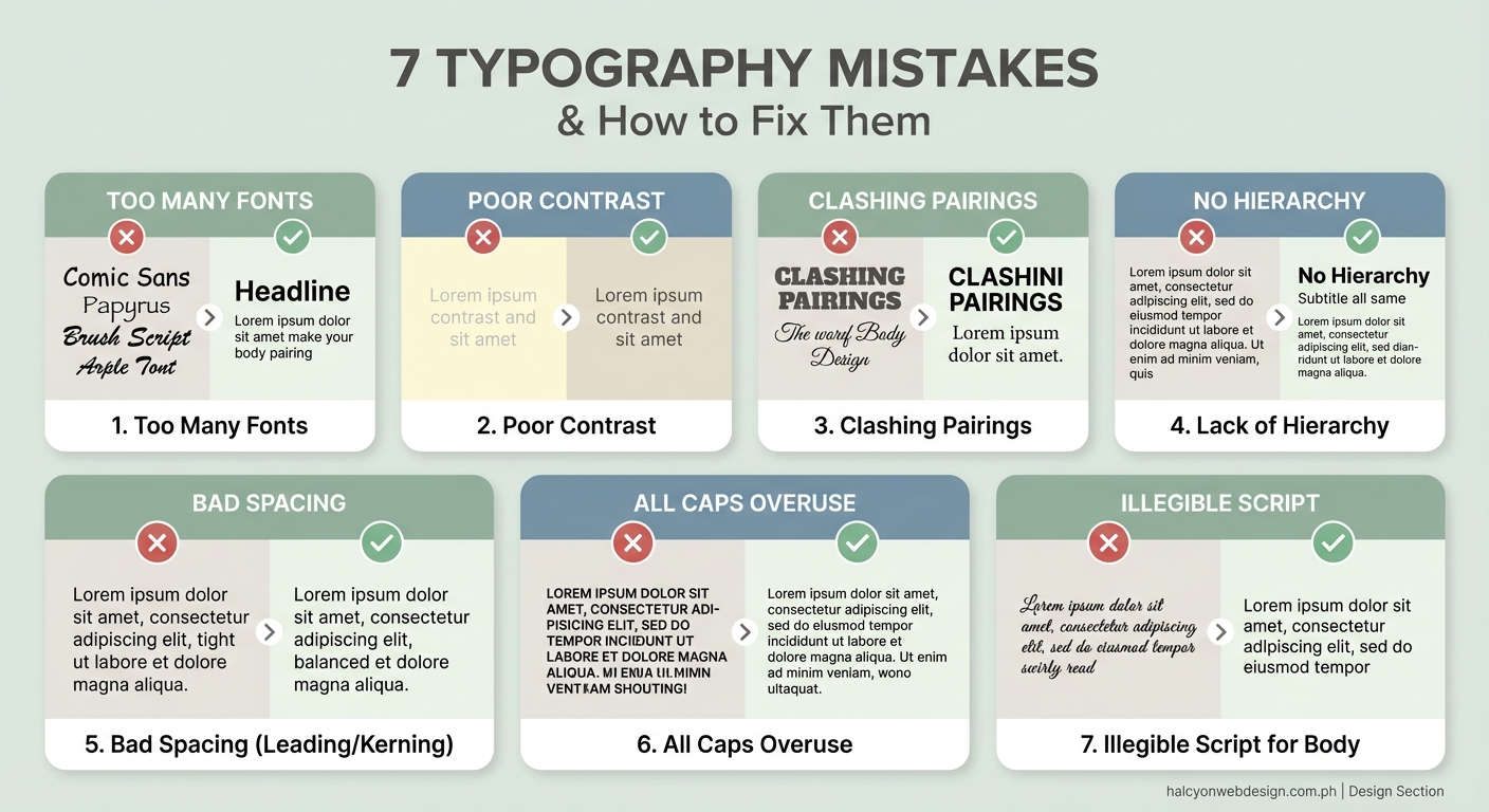
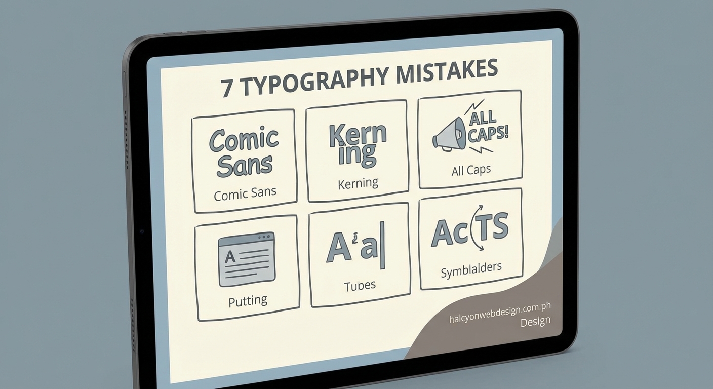
Typography mistakes website owners make include using too many fonts, poor contrast, incorrect line spacing, and ignoring mobile screens. Fix these issues by limiting your font families to two, ensuring sufficient color contrast, setting line height between 1.5 and 1.8, and testing on actual devices. Professional typography builds trust and keeps visitors reading your content instead of leaving for competitor sites.
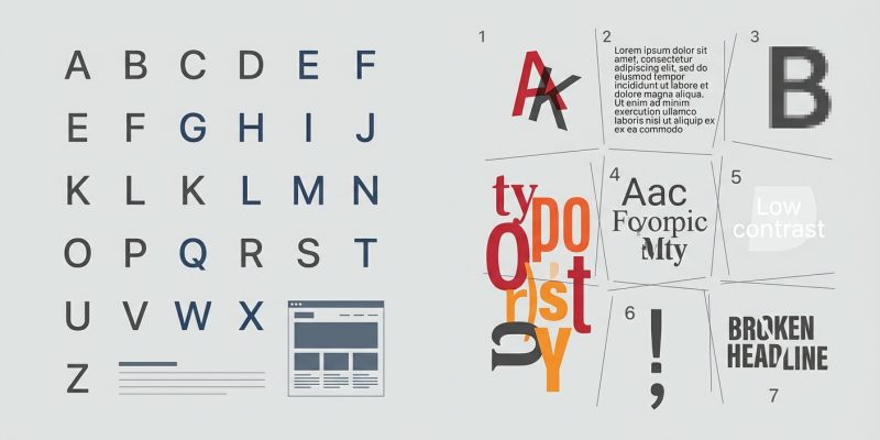
Using too many different fonts
Mixing five or six different typefaces makes your site look like a ransom note.
Each font carries its own personality. When you pile them together, they fight for attention. Your visitor’s brain has to process each new style, which creates mental fatigue.
Stick to two font families maximum. One for headings, one for body text. This creates visual hierarchy without chaos.
Google Fonts and other free services offer thousands of options. The temptation to use them all is real. Resist it.
Here’s a simple framework:
- Choose a clear sans-serif font for body text (the paragraphs people actually read).
- Pick a complementary font for headings that adds personality without sacrificing readability.
- Use font weight (bold, regular, light) and size to create variety within those two families.
Your website will instantly look more professional. Visitors can focus on your message instead of decoding your font choices.
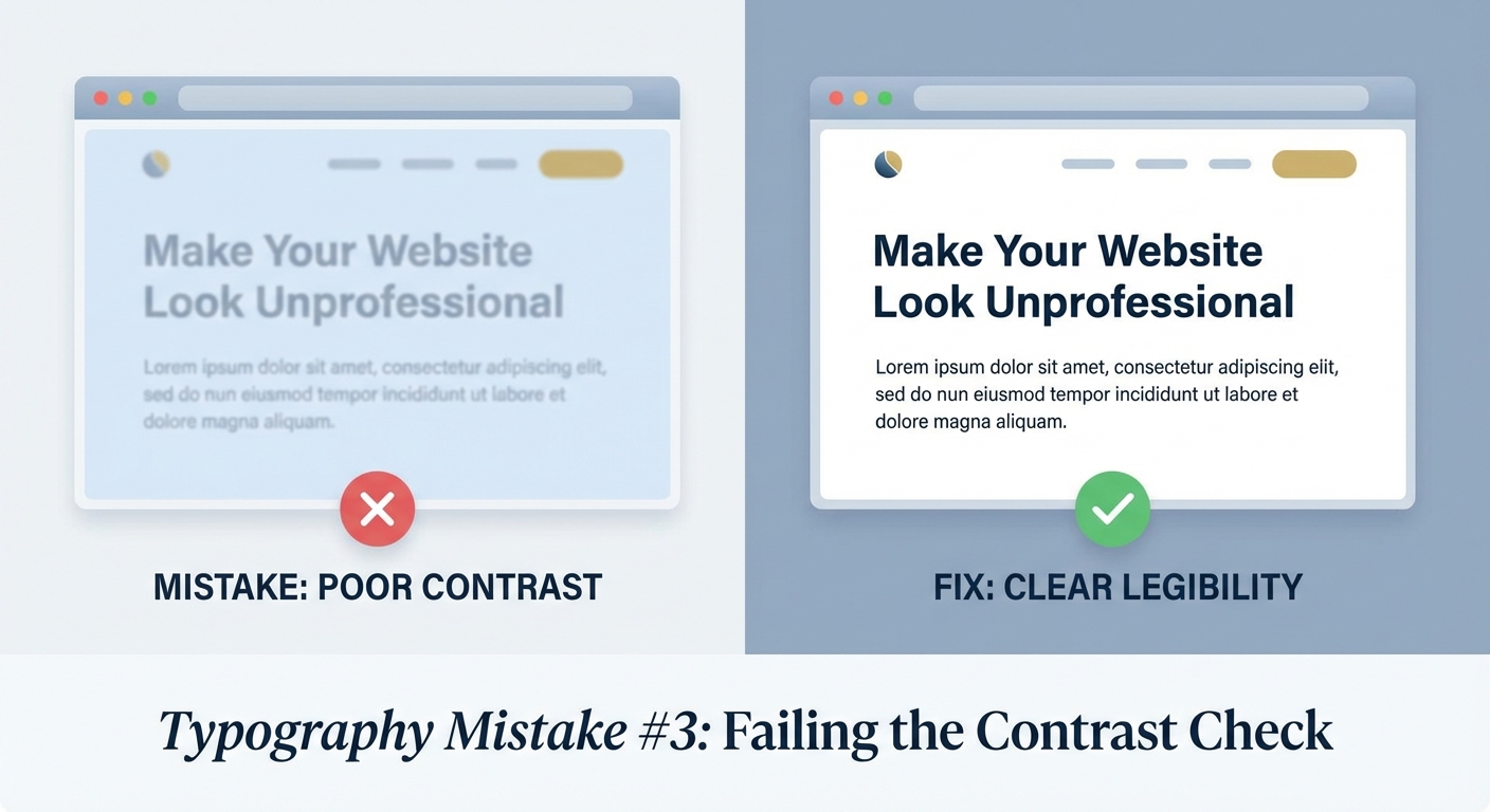
Ignoring contrast between text and background
Light gray text on a white background might look modern to you. To your visitors, it’s a blur.
Insufficient contrast is one of the most common typography mistakes website owners make. It excludes people with vision impairments and frustrates everyone else.
The Web Content Accessibility Guidelines recommend a contrast ratio of at least 4.5:1 for normal text and 3:1 for large text. Tools like WebAIM’s Contrast Checker let you test your combinations in seconds.
Dark text on light backgrounds works. Light text on dark backgrounds works. Anything in between usually doesn’t.
Common mistakes include:
- Gray text (#999999 or lighter) on white backgrounds
- White text on yellow or light blue backgrounds
- Colored text on colored backgrounds without testing
- Overlay text on busy background images
Test your color combinations before publishing. What looks fine on your high-end monitor might be unreadable on a phone in sunlight or an older laptop screen.
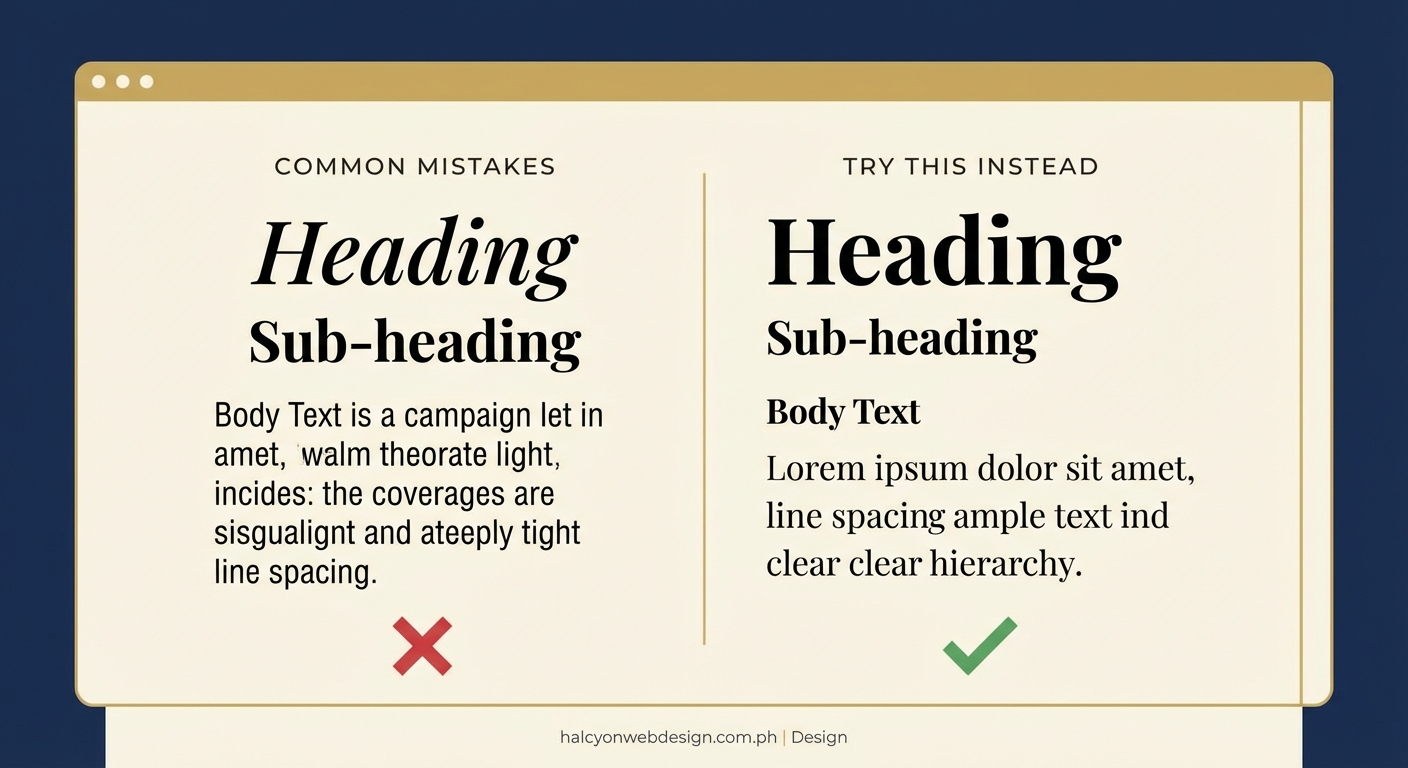
Setting line spacing too tight or too loose
Cramped text makes reading feel like work. Lines that are too far apart break the reading rhythm.
Line height (also called leading) controls the vertical space between lines of text. CSS calls it line-height. Getting this wrong is a typography mistake that website owners rarely notice but visitors always feel.
The sweet spot for body text sits between 1.5 and 1.8 times your font size. A 16px font needs 24px to 29px of line height.
Here’s what happens at different settings:
| Line Height | Reading Experience | Best Use |
|---|---|---|
| 1.0 to 1.2 | Cramped, hard to track lines | Headings only |
| 1.5 to 1.8 | Comfortable, easy scanning | Body text, paragraphs |
| 2.0 or higher | Disconnected, breaks flow | Decorative elements |
Headings can handle tighter spacing because they’re short. Long paragraphs need breathing room.
Adjust line height based on line length too. Wider text blocks need more line spacing to help eyes find the next line.
Choosing decorative fonts for body text
Script fonts and display typefaces look beautiful in headlines. They become torture in paragraphs.
Your body text needs to disappear. Not literally, but functionally. Readers shouldn’t notice the font. They should absorb the information without friction.
Decorative fonts demand attention. Every letter becomes a small puzzle. After three sentences, your visitor’s eyes hurt.
Save the personality for headings, buttons, and accents. Use simple, readable fonts for everything people need to read:
- Sans-serif fonts like Inter, Open Sans, or System UI for modern sites
- Serif fonts like Georgia, Merriweather, or Lora for traditional or editorial sites
- Monospace fonts only for code snippets
Test readability by writing a full paragraph in your chosen font. If you notice the letterforms more than the words, pick something simpler.
Making text too small for mobile screens
Sixteen pixels used to be the standard body text size. On phones, it’s the bare minimum.
Small text forces visitors to pinch and zoom. Most people just leave instead.
Mobile devices now make up more than half of web traffic. If your typography doesn’t work on a phone, it doesn’t work.
Set your base font size to at least 16px for body text. On mobile, consider bumping it to 18px or even 20px. Older visitors and anyone reading in bright light will thank you.
“Typography is two-dimensional architecture, based on experience and imagination, and guided by rules and readability.” – Hermann Zapf
Line length matters on mobile too. Keep paragraphs narrow enough that eyes don’t have to travel far. Forty to sixty characters per line feels comfortable.
Test on real devices, not just browser tools. Chrome’s device emulator is helpful, but nothing beats holding an actual phone and trying to read your content while walking or in poor lighting.
Forgetting about font loading performance
Beautiful typography means nothing if visitors leave before it loads.
Web fonts add extra HTTP requests. Each font file takes time to download. During that delay, visitors might see invisible text, a flash of unstyled text, or a completely different fallback font that breaks your layout.
Here’s how to fix it:
- Use system fonts when possible (they’re already on every device and load instantly).
- Limit custom fonts to two families with only the weights you actually use.
- Implement font-display: swap in your CSS to show fallback text immediately.
Loading five font weights across three font families can add 500KB or more to your page. That’s painful on slow connections.
Check your font files. A single weight of a well-optimized font should be under 50KB. If it’s bigger, look for a more efficient version or subset the font to include only the characters you need.
Google Fonts and similar services handle optimization automatically. Self-hosted fonts give you more control but require manual optimization.
Ignoring paragraph width and readability
Wall-to-wall text on a wide monitor creates lines that stretch 150 characters or more. Reading becomes a chore.
Your eyes have to travel too far from the end of one line to the beginning of the next. You lose your place. Comprehension drops.
The ideal line length sits between 50 and 75 characters, including spaces. This applies to blog posts, product descriptions, and any other body text.
Control line length with max-width in CSS. Set your text container to 65ch (characters) or around 700px, depending on your font size.
Different content types need different widths:
- Blog posts and articles: 60 to 75 characters
- Product descriptions: 50 to 65 characters
- Sidebar content: 40 to 50 characters
- Mobile screens: Let the viewport width control it, but ensure adequate padding
Break up long sections with subheadings, lists, and images. Even perfect line length gets boring after ten paragraphs.
White space around text blocks helps too. Padding and margins give readers’ eyes a place to rest.
Fixing your typography mistakes today
Start with one change. Pick the issue that bothers you most and fix it today.
Check your font count. Remove any extras. Test your color contrast and adjust if needed. Set your line height to 1.6 and see how it feels. Make your mobile text bigger.
Each small fix compounds. Your site will look more professional. Visitors will stay longer and actually read your content. Some might even become customers.
Typography mistakes website owners make are common, but they’re also fixable. You now know what to look for and how to correct it. The only question left is which fix you’ll implement first.