
Building modern WordPress layouts gets easier when you know the right CSS Grid patterns. These layout techniques work across themes, plugins, and custom projects. You can adapt them to any design without wrestling with floats or positioning hacks.
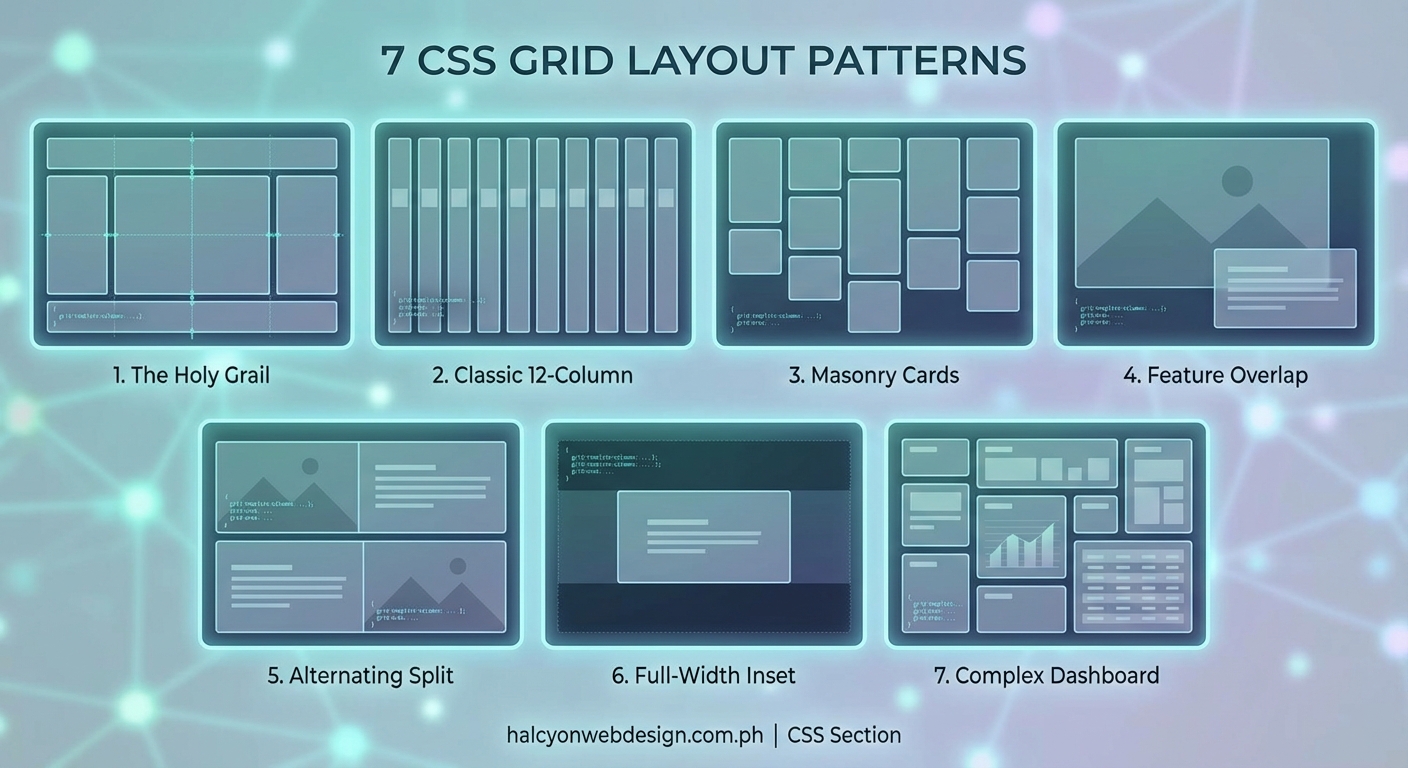
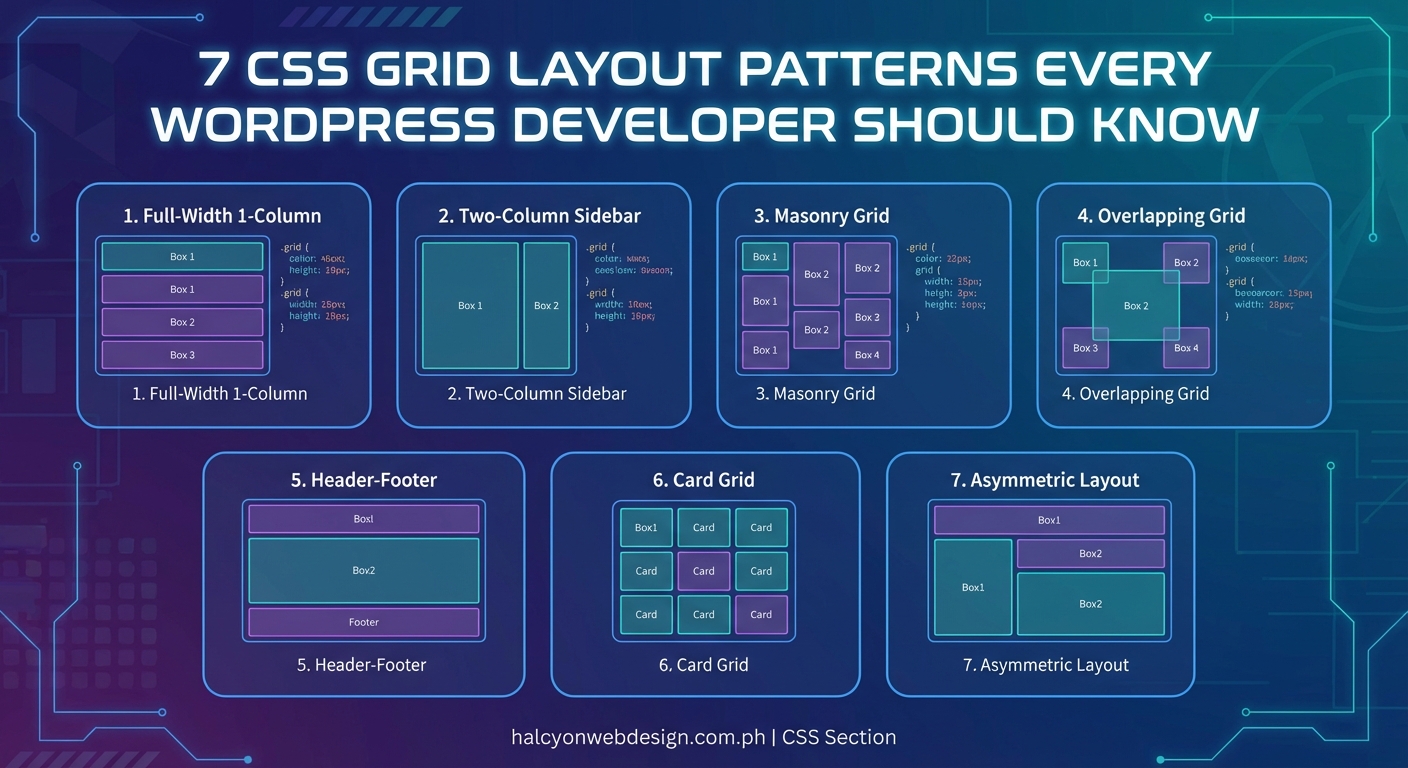
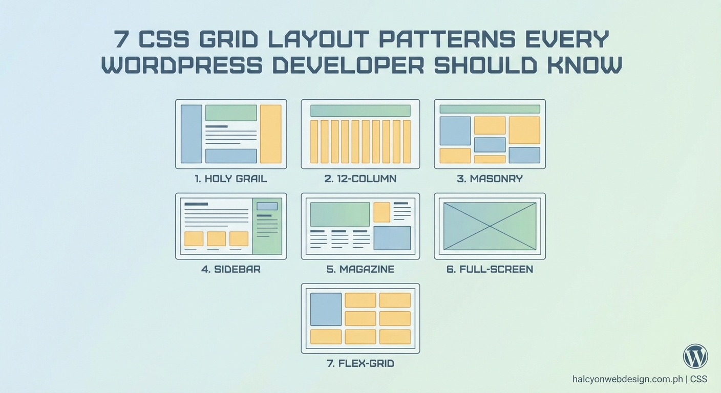
CSS Grid layout patterns give WordPress developers reusable code structures for common design challenges. These seven patterns cover holy grail layouts, card grids, asymmetric designs, sidebar configurations, magazine layouts, full bleed sections, and form structures. Each pattern uses modern grid syntax that works in all current browsers and adapts to different screen sizes without media query overload.
Why CSS Grid Beats Older Layout Methods
CSS Grid replaced the need for complex float clearing and absolute positioning. You define rows and columns once, then place items exactly where they belong.
WordPress developers benefit because Grid works with block themes, classic themes, and custom page builders. The syntax stays consistent across projects.
Flexbox handles one dimensional layouts well. Grid excels at two dimensional structures where you control both rows and columns simultaneously. Many layouts need both, but Grid provides the foundation for page structure.
Browser support reached universal levels years ago. Every modern browser understands Grid syntax. You can use these patterns in production today without fallbacks.
The Holy Grail Layout Pattern
This pattern creates a header, footer, sidebar, and main content area. The sidebar stays fixed width while the main area grows.
.holy-grail {
  display: grid;
  grid-template-columns: 250px 1fr;
  grid-template-rows: auto 1fr auto;
  min-height: 100vh;
}

.header {
  grid-column: 1 / -1;
}

.sidebar {
  grid-column: 1 / 2;
  grid-row: 2 / 3;
}

.main {
  grid-column: 2 / 3;
  grid-row: 2 / 3;
}

.footer {
  grid-column: 1 / -1;
}
The 1fr unit tells the main content to take all remaining space. The -1 value means “span to the last grid line” without counting columns manually.
For responsive behavior, stack everything on mobile:
@media (max-width: 768px) {
  .holy-grail {
    grid-template-columns: 1fr;
  }

  .sidebar,
  .main {
    grid-column: 1 / -1;
  }
}
This pattern works perfectly for WordPress admin pages, documentation sites, and dashboard layouts.
Responsive Card Grid Pattern
Card grids appear everywhere in WordPress. Post archives, product listings, team member pages, and portfolio galleries all use this structure.
.card-grid {
  display: grid;
  grid-template-columns: repeat(auto-fit, minmax(280px, 1fr));
  gap: 24px;
}
The auto-fit keyword creates as many columns as fit in the container. The minmax() function sets a minimum card width of 280px and maximum of 1fr (equal distribution).
Cards automatically wrap to new rows when the viewport shrinks. No media queries needed.
For tighter control over column counts:
.card-grid-strict {
  display: grid;
  grid-template-columns: repeat(3, 1fr);
  gap: 24px;
}

@media (max-width: 900px) {
  .card-grid-strict {
    grid-template-columns: repeat(2, 1fr);
  }
}

@media (max-width: 600px) {
  .card-grid-strict {
    grid-template-columns: 1fr;
  }
}
Use auto-fit when content amount varies. Use explicit column counts when design requires exact layouts.
Asymmetric Featured Content Pattern
This pattern highlights one piece of content while showing others in a grid. Magazine homepages and blog archives use this frequently.
.featured-grid {
  display: grid;
  grid-template-columns: repeat(4, 1fr);
  gap: 20px;
}

.featured-item {
  grid-column: span 2;
  grid-row: span 2;
}
The featured item takes up four times the space of regular items (2 columns × 2 rows). Other items flow around it automatically.
You can place the featured item anywhere:
- Top left: Default behavior
- Top right: Add
grid-column: 3 / 5; - Bottom left: Add
grid-row: 2 / 4;
For mobile, make the featured item full width:
@media (max-width: 768px) {
  .featured-grid {
    grid-template-columns: 1fr;
  }

  .featured-item {
    grid-column: 1;
    grid-row: auto;
  }
}
Sidebar Switching Pattern
Many WordPress sites need sidebars on different sides depending on page template. Grid makes this trivial.
.layout-left-sidebar {
  display: grid;
  grid-template-columns: 300px 1fr;
  gap: 40px;
}

.layout-left-sidebar .sidebar {
  order: -1;
}

.layout-right-sidebar {
  display: grid;
  grid-template-columns: 1fr 300px;
  gap: 40px;
}
The order property moves items without changing HTML structure. WordPress templates can use the same markup with different CSS classes.
For no sidebar layouts:
.layout-no-sidebar {
  display: grid;
  grid-template-columns: 1fr;
  max-width: 800px;
  margin: 0 auto;
}

.layout-no-sidebar .sidebar {
  display: none;
}
This approach keeps your template files clean. One HTML structure serves multiple layouts.
Magazine Style Multi Column Pattern
News sites and content heavy WordPress installations need complex multi column layouts. Grid handles these without nested containers.
.magazine-layout {
  display: grid;
  grid-template-columns: repeat(6, 1fr);
  grid-auto-rows: 200px;
  gap: 16px;
}

.article-large {
  grid-column: span 4;
  grid-row: span 2;
}

.article-medium {
  grid-column: span 2;
  grid-row: span 2;
}

.article-small {
  grid-column: span 2;
  grid-row: span 1;
}
Articles automatically fill available space. You control prominence by changing span values.
When building magazine layouts with CSS Grid, start with the desktop layout and work backwards to mobile. The desktop structure reveals your content hierarchy, which makes responsive decisions clearer.
For tablets and phones:
@media (max-width: 1024px) {
  .magazine-layout {
    grid-template-columns: repeat(4, 1fr);
  }
}

@media (max-width: 768px) {
  .magazine-layout {
    grid-template-columns: 1fr;
    grid-auto-rows: auto;
  }

  .article-large,
  .article-medium,
  .article-small {
    grid-column: 1;
    grid-row: auto;
  }
}
Full Bleed Section Pattern
Full bleed sections break out of the content container to span the entire viewport width. Hero sections, testimonials, and call to action blocks use this pattern.
.page-wrapper {
  display: grid;
  grid-template-columns:
    1fr
    min(1200px, 100% - 40px)
    1fr;
}

.page-wrapper > * {
  grid-column: 2;
}

.full-bleed {
  grid-column: 1 / -1;
}
The min() function creates a content column that never exceeds 1200px but shrinks on small screens. Side columns absorb extra space on wide monitors.
Regular content stays in the center column. Full bleed sections span all three columns.
This pattern eliminates the need for negative margins or breaking out of containers with absolute positioning. WordPress block themes can implement this at the theme level.
Form Layout Pattern
Forms benefit from Grid because labels, inputs, and error messages align naturally without manual positioning.
.form-grid {
  display: grid;
  grid-template-columns: 200px 1fr;
  gap: 20px 16px;
  align-items: start;
}

.form-grid label {
  grid-column: 1;
  padding-top: 8px;
}

.form-grid input,
.form-grid textarea,
.form-grid select {
  grid-column: 2;
}

.form-grid .full-width {
  grid-column: 1 / -1;
}
Labels sit in the first column. Inputs take the second column. The align-items: start property prevents labels from stretching to match tall textareas.
For mobile:
@media (max-width: 600px) {
  .form-grid {
    grid-template-columns: 1fr;
  }

  .form-grid label,
  .form-grid input,
  .form-grid textarea,
  .form-grid select {
    grid-column: 1;
  }
}
Contact Form 7, Gravity Forms, and WPForms all work with this structure. Add classes to your form markup and apply the Grid styles.
Common Mistakes and Solutions
| Mistake | Problem | Solution |
|---|---|---|
| Using Grid for everything | One dimensional layouts get overcomplicated | Use Flexbox for navigation menus, button groups, and simple rows |
| Forgetting gap property | Margins create inconsistent spacing | Replace margins with gap for uniform spacing between all items |
| Hardcoding pixel widths | Layouts break on different screen sizes | Use fr units, minmax(), and auto-fit for flexible sizing |
| Too many media queries | Code becomes hard to maintain | Let Grid handle responsiveness with auto-fit and minmax() |
| Not testing in WordPress | Styles conflict with theme CSS | Use specific class names and test in actual WordPress environment |
| Ignoring grid-auto-flow | Items stack incorrectly | Set grid-auto-flow: dense for masonry-like filling |
Implementing Patterns in WordPress
Adding these patterns to WordPress takes different approaches depending on your setup.
For block themes:
- Add Grid CSS to your theme.json or separate stylesheet
- Create custom block patterns that use Grid classes
- Register pattern categories for different layout types
- Document patterns for content editors
For classic themes:
- Add Grid styles to your main stylesheet
- Create page templates that include Grid wrapper classes
- Use body classes to apply different layouts per page
- Add Grid classes to widget areas
For page builders:
- Create custom CSS classes in builder settings
- Apply Grid classes to sections and containers
- Test across different builder layouts
- Save Grid structures as reusable templates
WordPress Gutenberg blocks work naturally with Grid. The block editor outputs clean HTML that Grid styles enhance without fighting the markup.
Testing Grid Layouts Across Browsers
Modern browsers render Grid identically, but older versions need attention.
These browsers fully support Grid:
- Chrome 57 and later
- Firefox 52 and later
- Safari 10.1 and later
- Edge 16 and later
Internet Explorer 11 has partial Grid support with old syntax. For IE11 users, provide a single column fallback:
.grid-container {
  display: block;
}

@supports (display: grid) {
  .grid-container {
    display: grid;
    grid-template-columns: repeat(3, 1fr);
  }
}
The @supports rule applies Grid only when the browser understands it. Older browsers get the block layout.
Check your WordPress analytics. If IE11 traffic sits below 2%, skip the fallback. Most WordPress sites stopped supporting IE11 in 2022.
Performance Considerations
CSS Grid affects performance minimally. The browser calculates layouts efficiently.
Tips for optimal Grid performance:
- Avoid deeply nested grids (3 levels maximum)
- Use simple grid definitions when possible
- Combine Grid with container queries for component based layouts
- Minimize the number of grid items (under 100 per container)
- Let Grid handle responsiveness instead of JavaScript
WordPress sites with hundreds of posts benefit from pagination rather than infinite scroll with Grid. Loading 50 grid items per page performs better than 500 items with lazy loading.
Debugging Grid Layouts
Browser DevTools show Grid overlays that make debugging visual.
In Chrome and Edge:
- Open DevTools
- Select an element with display: grid
- Click the grid badge next to the element
- See numbered lines, gaps, and areas highlighted
In Firefox:
- Open DevTools
- Go to the Layout panel
- Check “Grid” under Overlay Grid
- See all grids on the page with customizable colors
These tools reveal why items don’t align as expected. You can see exact grid line numbers and track placement.
Common debugging scenarios:
- Items overlap: Check grid-column and grid-row values for conflicts
- Extra space appears: Verify gap values and implicit grid tracks
- Items don’t fill space: Check if you need 1fr instead of auto
- Mobile layout breaks: Test grid-template-columns at each breakpoint
Combining Grid with WordPress Features
WordPress features integrate smoothly with Grid patterns.
Custom post types display in card grids using WP_Query loops. Each post becomes a grid item with consistent styling.
Widget areas can use Grid for multi column footers. Register a footer widget area and apply Grid to the container.
Navigation menus work better with Flexbox, but mega menus benefit from Grid for organizing submenus into columns.
Featured images in Grid layouts need object-fit to maintain aspect ratios:
.card-grid img {
  width: 100%;
  height: 200px;
  object-fit: cover;
}
Custom fields from ACF or Pods display in Grid form layouts. Field groups become grid items with automatic alignment.
Accessibility in Grid Layouts
Grid changes visual order without affecting HTML order. Screen readers follow HTML sequence, not Grid placement.
Keep these accessibility principles:
- HTML order should make sense when read linearly
- Don’t use Grid to create confusing reading orders
- Ensure keyboard navigation follows logical tab order
- Test with screen readers after applying Grid
The order property changes visual sequence. Use it sparingly because it disconnects visual and semantic order.
For skip links and focus management:
.skip-link {
  grid-column: 1 / -1;
  grid-row: 1;
}
Place skip links in the first grid row so keyboard users reach them first.
Browser DevTools Grid Features
Modern DevTools include Grid specific features that speed up development.
Grid line numbers show exact positions. You can click and drag items to new positions and see the resulting CSS.
Gap visualization displays spacing between items with measurements.
Grid area names appear when you use grid-template-areas. This makes complex layouts easier to understand.
Implicit tracks show in a different color than explicit tracks. This helps identify when grid-auto-rows creates unexpected rows.
Firefox offers the most advanced Grid tools. Chrome and Edge catch up with each release. Safari’s tools lag slightly but cover the basics.
Real World WordPress Examples
These patterns appear across popular WordPress sites:
WooCommerce product grids use the responsive card pattern with auto-fit. Products wrap naturally on all screen sizes.
Portfolio sites combine asymmetric featured content with card grids. The first project gets prominence while others fill remaining space.
News sites use magazine layouts for category pages. Breaking news gets large placement, secondary stories get medium cards, and older content fills small spaces.
Landing pages use full bleed sections for hero areas, testimonials, and pricing tables. Content sections stay contained while impact areas span full width.
Documentation sites use holy grail layouts with persistent sidebars. Navigation stays visible while content scrolls.
Maintaining Grid Code
CSS Grid code stays maintainable when you follow patterns consistently.
Create utility classes for common patterns:
.grid-2-col { grid-template-columns: repeat(2, 1fr); }
.grid-3-col { grid-template-columns: repeat(3, 1fr); }
.grid-4-col { grid-template-columns: repeat(4, 1fr); }
.grid-auto { grid-template-columns: repeat(auto-fit, minmax(280px, 1fr)); }
Document your Grid patterns in a style guide. Include code examples and live previews.
Use CSS custom properties for consistent spacing:
:root {
  --grid-gap: 24px;
  --grid-gap-small: 16px;
  --grid-gap-large: 40px;
}

.card-grid {
  gap: var(--grid-gap);
}
This approach makes global changes easy. Update one variable to adjust spacing across all Grid layouts.
Making These Patterns Your Own
These seven CSS Grid layout patterns solve common WordPress design challenges. Start with one pattern and adapt it to your current project.
The holy grail layout works for admin interfaces and dashboards. Card grids fit blog archives and product listings. Asymmetric layouts highlight featured content on homepages.
Try combining patterns. Use a holy grail layout with a card grid in the main content area. Add full bleed sections between content blocks.
Grid syntax takes practice, but these patterns give you working code to modify. Change column counts, adjust gaps, and experiment with different responsive breakpoints.
Your WordPress projects will benefit from cleaner markup and more flexible layouts. Grid eliminates the need for clearfix hacks, float clearing, and complex positioning.