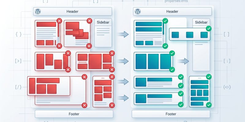
You’ve added a few lines of CSS flexbox to your WordPress theme, and suddenly your sidebar is floating in the wrong place or your navigation menu is stacking vertically on desktop. The layout looks perfect in your head, but the browser has other ideas.
Flexbox is powerful, but it’s also unforgiving when you miss a property or misunderstand how flex items behave. Most WordPress developers run into the same five mistakes, and each one creates a different kind of layout chaos.
WordPress flexbox mistakes usually stem from missing flex-wrap, forgetting flex-shrink, or misunderstanding flex-direction. This guide shows you how to diagnose each problem using browser DevTools, fix the underlying CSS issue, and prevent the same mistake from breaking your layout again. You’ll learn practical troubleshooting steps that work whether you’re editing a child theme or adding custom CSS through the WordPress Customizer.
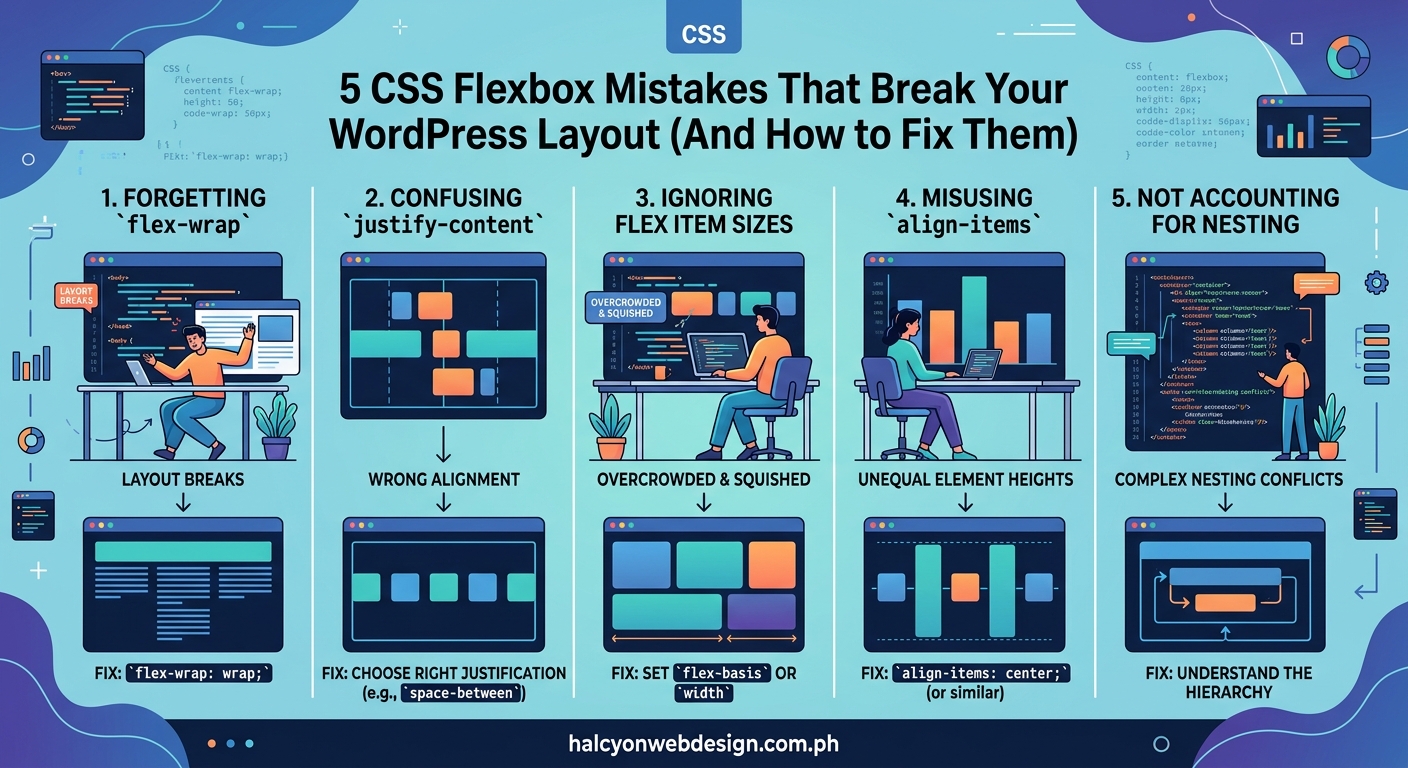
Forgetting to set flex-wrap on the container
Your flex container looks fine with three items. Then you add a fourth, and suddenly everything shrinks to fit on one line instead of wrapping to a new row.
This happens because the default value for flex-wrap is nowrap. Flexbox will squeeze all your items onto a single line, no matter how many you add.
Here’s what breaks:
- Card grids that should wrap to multiple rows
- Navigation menus that need to stack on smaller screens
- Product galleries that overflow the viewport
The fix is simple. Add flex-wrap: wrap; to your flex container.
.product-grid {
  display: flex;
  flex-wrap: wrap;
  gap: 20px;
}
Now your items will wrap to a new line when they run out of space. The container respects the width you’ve set on each flex item.
If you’re working with a WordPress theme that uses flexbox for widget areas, check the container element in your browser’s DevTools. Look for the computed styles panel and verify that flex-wrap is set to wrap.
Some page builders add inline styles that override your custom CSS. If your flexbox rules aren’t applying, inspect the element and check the cascade. You might need to increase specificity or use !important as a last resort.
Setting width instead of flex-basis
You want each flex item to take up exactly 300px. You add width: 300px; and expect flexbox to respect it. Instead, your items shrink or grow unpredictably.
The problem is that width is a suggestion in flexbox, not a command. Flex items will shrink below their width if the container is too small, and they’ll grow beyond it if there’s extra space.
Use flex-basis instead. It works like width, but it’s designed specifically for flexbox and interacts correctly with flex-grow and flex-shrink.
.flex-item {
  flex-basis: 300px;
  flex-grow: 0;
  flex-shrink: 0;
}
Or use the shorthand:
.flex-item {
  flex: 0 0 300px;
}
That shorthand sets flex-grow, flex-shrink, and flex-basis in one line. It’s cleaner and easier to maintain.
Here’s a comparison table showing when to use each property:
| Property | Use Case | Flexbox Behavior |
|---|---|---|
width |
Non-flex layouts | Ignored when flex-grow or flex-shrink apply |
flex-basis |
Flex item sizing | Respected as starting point before growth/shrink |
flex: 0 0 300px |
Fixed-size flex items | Prevents growing or shrinking |
flex: 1 |
Equal-width items | Distributes available space evenly |
If you’re building a WordPress layout with a fixed-width sidebar and a flexible content area, this distinction matters. Set flex: 0 0 300px; on the sidebar and flex: 1; on the main content.
The content area will take up all remaining space, and the sidebar will stay exactly 300px wide.
Misunderstanding how flex-shrink works
You’ve set flex-basis: 400px; on your flex items, but they’re rendering at 250px. You check your CSS three times. The math doesn’t add up.
The culprit is flex-shrink. By default, it’s set to 1, which means flex items are allowed to shrink below their basis when the container is too small.
This breaks layouts when you expect items to maintain a minimum size. Your carefully planned card grid collapses into unreadable slivers on tablet screens.
Here’s how to fix it:
- Set
flex-shrink: 0;on items that should never shrink below their basis. - Use
min-widthas a safety net to prevent items from becoming too small. - Combine both for bulletproof sizing.
.card {
  flex: 0 0 400px;
  min-width: 300px;
}
Now your card will try to be 400px wide, but it won’t shrink below 300px. If the container is smaller than 300px, the card will overflow instead of collapsing.
That overflow might seem like a problem, but it’s actually better than unreadable content. You can handle it with overflow-x: auto; on the container or by using media queries to adjust the layout at smaller breakpoints.
WordPress themes that use flexbox for post grids often run into this issue. The grid looks perfect on desktop, then turns into a jumbled mess on mobile because the theme author forgot to account for flex-shrink.
If you’re troubleshooting a flexbox layout in WordPress, open DevTools and check the computed flex value. If you see flex: 1 1 0%, that means the item is allowed to shrink and grow, which might not be what you want.
Using margin auto without understanding flex alignment
You add margin-left: auto; to push a navigation item to the right side of your header. It works, but then you try to vertically center the same item with align-items: center; and nothing happens.
The problem is that margin: auto; in flexbox absorbs all available space in that direction. When you set margin-left: auto;, you’re telling the browser to push everything to the left of that item as far left as possible.
This technique is useful for splitting navigation items:
.header-nav {
  display: flex;
  align-items: center;
}

.nav-item:last-child {
  margin-left: auto;
}
Now the last navigation item sits on the far right, and all other items cluster on the left.
But here’s where it gets tricky. If you also set margin-top: auto; or margin-bottom: auto;, you override the align-items property on the container. The margin takes precedence.
Use margin: auto; when you want to position a single item. Use align-items and justify-content when you want to align all items as a group.
Here’s a practical example for WordPress. You’re building a custom header with a logo on the left and a menu on the right:
.site-header {
  display: flex;
  align-items: center;
  padding: 20px;
}

.site-logo {
  margin-right: auto;
}

.main-navigation {
  margin-left: auto;
}
The logo stays on the left, the navigation stays on the right, and both are vertically centered. Clean and predictable.
If you need more control over layout patterns in WordPress, 7 CSS grid layout patterns every WordPress developer should know covers alternative approaches that might work better for complex designs.
Stacking flex-direction changes without resetting alignment
You set flex-direction: column; to stack your items vertically. Then you wonder why justify-content: center; isn’t centering them horizontally.
The answer is that flex-direction swaps the main axis and cross axis. When you change from row to column, justify-content now controls vertical alignment, and align-items controls horizontal alignment.
This is the opposite of what most developers expect, and it breaks layouts constantly.
Here’s a visual reference:
- flex-direction: row →
justify-contentcontrols horizontal,align-itemscontrols vertical - flex-direction: column →
justify-contentcontrols vertical,align-itemscontrols horizontal
If you’re using media queries to switch from a horizontal layout on desktop to a vertical layout on mobile, you need to update both properties:
.feature-list {
  display: flex;
  flex-direction: row;
  justify-content: space-between;
  align-items: center;
}

@media (max-width: 768px) {
  .feature-list {
    flex-direction: column;
    justify-content: flex-start;
    align-items: stretch;
  }
}
Without resetting those alignment properties, your mobile layout will look wrong. Items might be centered when you want them stretched, or aligned to the start when you want them centered.
WordPress block themes and the block editor use flexbox extensively. If you’re adding custom CSS to adjust block layouts, pay close attention to how flex-direction affects your alignment properties.
When you’re debugging a flexbox layout, use how to debug CSS layout issues using browser DevTools like a pro to visualize the main and cross axes. Most modern browsers highlight flex containers and show you which direction each axis runs.
Common flexbox troubleshooting steps for WordPress
When your flexbox layout breaks in WordPress, follow this process:
- Open DevTools and inspect the flex container.
- Check the computed styles for
display,flex-direction,flex-wrap,justify-content, andalign-items. - Inspect each flex item and verify
flex-grow,flex-shrink, andflex-basis. - Look for inline styles added by page builders or plugins that might override your CSS.
- Test your layout at different viewport widths to catch responsive issues.
Most flexbox problems in WordPress come from one of these sources:
- Theme CSS that conflicts with your custom styles
- Page builder plugins that inject their own flexbox rules
- Missing or incorrect media queries
- Inline styles added through the WordPress Customizer
- Specificity issues where your rules get overridden
If you’re editing a child theme, make sure your stylesheet is loading after the parent theme. Use wp_enqueue_style() with the correct dependencies instead of adding CSS through the Customizer, which can create maintenance headaches.
For layout issues that appear after a WordPress update, 5 fixes for broken CSS after a WordPress update covers common causes and solutions.
“The biggest flexbox mistake I see in WordPress themes is developers treating flex items like block elements. They add width, height, and margin without understanding how those properties interact with flex-grow and flex-shrink. Always start with flex-basis and work from there.” — CSS troubleshooting best practice
When to use flexbox versus CSS grid in WordPress
Flexbox excels at one-dimensional layouts. Use it for navigation menus, card rows, button groups, and any layout where items flow in a single direction.
CSS Grid is better for two-dimensional layouts. Use it for page-level structure, complex dashboards, and any design where you need precise control over both rows and columns.
Many WordPress developers try to build entire page layouts with flexbox. It works, but it’s harder to maintain than using Grid for the overall structure and Flexbox for individual components.
If you’re building a WordPress theme from scratch, consider this approach:
- Use Grid for the main page layout (header, sidebar, content, footer)
- Use Flexbox for navigation menus, widget areas, and post grids
- Use regular block layout for typography and content flow
This combination gives you the right tool for each job. You’re not forcing flexbox to do things it wasn’t designed for, and you’re not overcomplicating simple layouts with Grid.
For a deeper comparison, the complete guide to using grid versus flexbox for your website layout explains when each approach makes sense.
Preventing flexbox mistakes before they break your site
The best way to avoid flexbox mistakes is to test your layout at multiple viewport widths while you’re building it. Don’t wait until you’re done to check mobile responsiveness.
Use these practices:
- Set up a live reload workflow so you see CSS changes instantly
- Keep DevTools open with the device toolbar active
- Test on actual mobile devices, not just browser emulation
- Use a CSS reset or normalize.css to eliminate browser inconsistencies
- Document your flexbox patterns in comments so you remember why you made specific choices
If you’re working with a WordPress theme that already uses flexbox, create a child theme before making changes. That way, theme updates won’t overwrite your custom CSS.
For themes that rely heavily on page builders, check whether the builder has its own flexbox controls. Some builders let you adjust flex properties through a visual interface, which can be easier than writing custom CSS.
When you’re choosing a WordPress theme, look for ones that use modern CSS layout techniques correctly. How to choose the perfect WordPress theme without getting overwhelmed includes a checklist for evaluating theme code quality.
Testing your flexbox layout across browsers
Flexbox has excellent browser support, but older versions of Safari and Internet Explorer have quirks that can break your layout.
The most common issues:
- Safari requires
-webkit-prefixes for some flexbox properties - Internet Explorer 11 has bugs with
min-heighton flex containers - Older Android browsers mishandle
flex-basis: auto
If you need to support older browsers, use a tool like Autoprefixer to add vendor prefixes automatically. Most WordPress build tools include it by default.
For Internet Explorer support, avoid using min-height on flex containers. Use a fixed height or wrap your flex container in another element that has the minimum height.
Modern WordPress sites typically don’t need to support Internet Explorer anymore, but check your analytics before dropping support. Some corporate or government users might still be on older browsers.
Making your flexbox layouts accessible
Flexbox can create accessibility problems if you’re not careful. The visual order of items can differ from the source order in your HTML, which confuses screen readers.
Follow these rules:
- Never use
flex-direction: row-reverse;orcolumn-reverse;just to change visual order - Keep your HTML source order logical and semantic
- Use flexbox for visual adjustments, not for reordering content
- Test your layout with a screen reader to verify reading order
If you need to reorder items visually, consider whether you should change the HTML instead. Flexbox is powerful, but it shouldn’t replace good semantic structure.
For more accessibility guidance, how to build accessible forms that every user can complete covers related principles that apply to flexbox layouts.
Fixing flexbox mistakes in live WordPress sites
If you’ve already launched a site with broken flexbox layouts, here’s how to fix it without causing downtime:
- Create a staging copy of your site using your host’s staging tools or a plugin.
- Identify the broken layouts using DevTools and the troubleshooting steps above.
- Test your fixes on staging at multiple viewport widths.
- Check for conflicts with other plugins and themes.
- Deploy your changes during low-traffic hours.
- Monitor your error logs for JavaScript or CSS loading issues.
If you’re fixing flexbox issues in a live theme, use a child theme to make your changes. That protects your fixes from being overwritten when the parent theme updates.
For sites with heavy traffic, consider using a CSS versioning strategy. Add a version number to your stylesheet filename and update it each time you make changes. This forces browsers to download the new CSS instead of serving a cached version.
When you’re troubleshooting complex layout issues, why your CSS flexbox items won’t center and the 3 properties you’re missing covers specific centering problems that trip up most developers.
Building flexbox confidence through practice
The best way to master flexbox in WordPress is to build small components and test them thoroughly before adding them to production sites.
Create a test page in WordPress and experiment with different flexbox patterns. Try building:
- A responsive navigation menu that collapses on mobile
- A card grid that wraps to multiple rows
- A split layout with a fixed sidebar and flexible content area
- A footer with multiple widget areas
Each of these components teaches you something different about how flexbox behaves. You’ll make mistakes, but you’ll learn faster by seeing the results immediately.
Keep a code snippet library of flexbox patterns that work well for you. When you build something that solves a tricky layout problem, save it for future projects.
WordPress makes it easy to test CSS changes through the Customizer or by adding custom CSS in your child theme. Use that flexibility to experiment and build your skills.
Your flexbox layouts can be reliable
Flexbox mistakes break WordPress layouts, but they’re fixable once you understand the underlying properties. Most problems come from forgetting flex-wrap, using width instead of flex-basis, or misunderstanding how flex-shrink works.
Start with the troubleshooting checklist in this guide. Check your flex containers and items in DevTools. Verify that your alignment properties match your flex-direction. Test at multiple viewport widths before you deploy.
Your layouts will be more predictable, your CSS will be easier to maintain, and you’ll spend less time debugging mysterious spacing issues. That’s worth the effort of learning flexbox properly.